Cmon…let it the way it is…
I know what you’re saying, it’s not exactly a high-priority feature that needs to be implemented soon ![]() .
.
All that’s being discussed is different interpretations of what the tool box could do in the future, just from a user standpoint.
While this discussion might not progress past the theory stage, it’s still valuable to gain ideas in an open forum, right?
Well I am probably wrong but you could try and edit the Krita’s *.ui files and fool around with those, and change what you feel is relevant. But it can mess up your Krita so heads up to that.
*.ui files are edited in Qt Designer. if your in windows Qt Designer is installed via the PyQt5 pack via pip install. The pip install is enabled via Python.
then you can open the files and check what is happening. I imagine if you don’t change the names of the objects or delete them you should be good. I imagine a reorganization is more what you want.
However I imagine to change as much as you want you would need to make your own Krita Build. I Donno if you can really do what I just said it is just something I would try first if it was me.
Cheers for the advice on this ![]() !
!
I think it would be a reasonable step for me to read some documentation on how .ui files work before I edit anything, so that I can read the probably very confusing code fluently!
I did download the Open Source Licensed Qt Creator program, so I might read up on that too…
okay now that we are on the topic what are you guys thoughts for a radial menu?
I have installed a radial menu editor addon for blender and I must say I am actually in love with it. I am sculpting there and I have only one key shortcut that gives me access to 9 brushes. but the cool thing about this addon is that I can hook up any command python command to it.
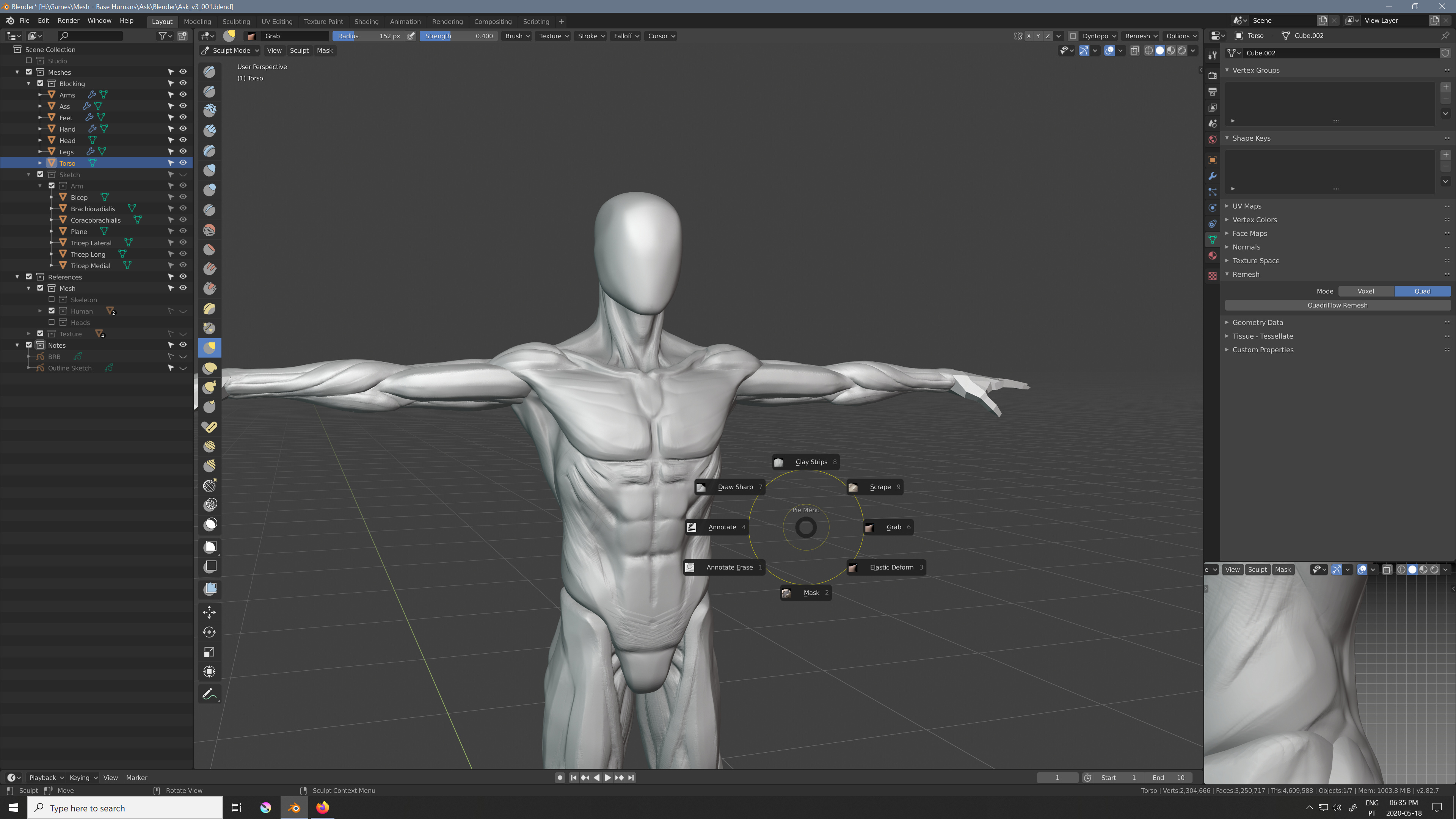
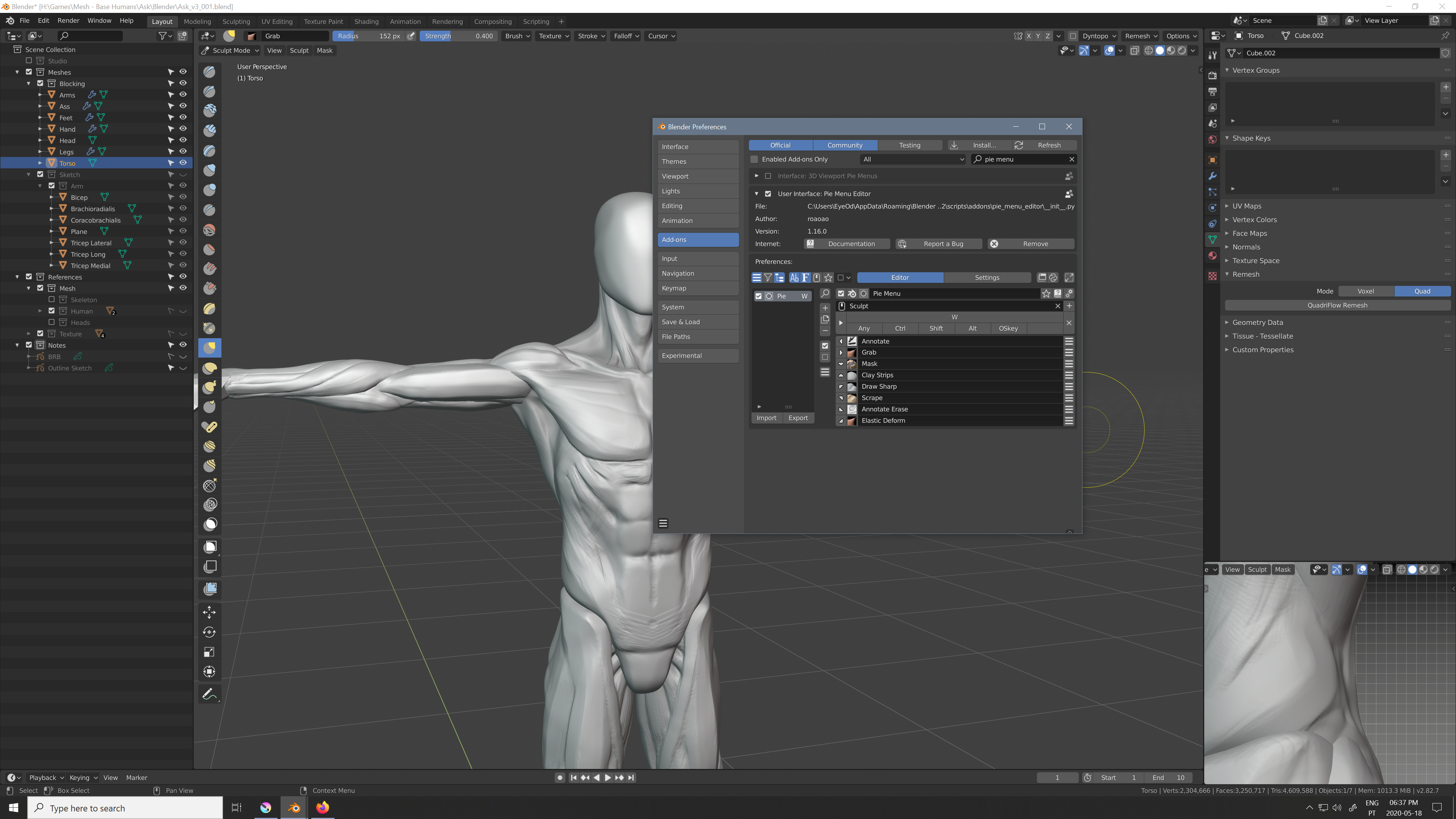
Here when I press the “W” key shortcut I am able to access these brushes under the context of sculpting that I have been using.
I think this would be cool to have like a key shortcut for example that could represent all the selection methods. and another key shortcut that represents all the assistant tools and so on and so forth. Radial are weird at first but they are a huge time saver. I started using them on Maya and now I am on Blender with them and I really do recommend greatly. It gives more options than all the modifier key combinations (most of which are very unpractical to press). Not to mention I am Right Handed so my left hand is on the keyboard, so combinations like Ctrl+Alt+P are not practical, I guess you could with gymnastics. Pressing P and wiggling the pen would be a lot more feasible and quicker.
Like this I think you could have the whole ToolBox in maybe 8 keys? that frees up alot of Keys =0
Just pressing the key would just select the last tool of that “key” group, and “key hold + pen direction” would change the active tool of that key. it those settings would remain saved on the file of krita itself would make this very natural after a couple of uses I think.
It would make the UI interactions alot better since you would not be focused on buttons all the time. So you could organize things alot better.
You can edit some stuff by poking around the .ui files but a lot of stuff are not in the ui files.
For mockups, Inkscape is the best tool around if we are talking about FOSS. And about proprietary ones I have see a lot of UI/UX people using Adobe XD, but I haven’t used it, nor I know much about it.
My mockup was made in Qt itself where I just made a new widget do all the drawing and popups in the code which is of course C++. Note, we use the same stuff in Krita too. If you want to go that path, of course you can download QtCreator and experiment yourself, there is lot of stuff online.
If you want to hack on Krita itself, we can surely help. A couple of years back, a law student who didn’t have done much C++ stuff, contributed a patch, so it is not impossible. Take a look at this thread.
I would love to have this! Right now I have my favorite brushes set to 1 2 3 4 5 6, and then the “Weird key besides the numbers that is different depending on country”-key as a modifier for 4 more brushes.
The downside to this is that when I have to write numbers in for instance the Size-slider, I need to use Ctrl as a modifier to start writing, and that the numbers farther away from me (like 5 and 6) is hard to instinctively press without looking down at the keyboard. I have wished for radial menus like those in Blender for switching brushes in Krita! It would be such a timesaver!
I think that’s an awesome idea for toolbars especially! Having it work like a popup palette triggered by a key input would be nice!
Depends how many tools you use regularly too ![]()
All in all that’s a terrific premise, it’s great how many ideas this topic is generating aha.
That’s what prompted me to download Qt Creator ![]() I’m looking forward to experimenting in it!
I’m looking forward to experimenting in it!
I will be sure to ask questions if I’m stuck ![]() . Thanks for the support!
. Thanks for the support!
That’s an unique workaround ![]() . I definitely agree a radial menu would be an awesome feature, might need some mockups first
. I definitely agree a radial menu would be an awesome feature, might need some mockups first ![]() !
!

This is another progress shot:
-
Lifted a few more Blender ideas into the Docker system- coloured icons, sorted dockers etc.
-
I wonder how successful a Docker layout accessed through a sidebar would be? There would need to be accommodation for dragging dockers around the screen, but having a vertical category of Docker icons might be easier to select upon.
Of course this might be going too far in one direction and completely copying another program, but I’m throwing out ideas to you guys.
I also used the Blender icons in the Layer Docker not out of spite, but because I couldn’t find the related Krita icons anywhere. I’ll search again for them later ![]() .
.
That’s the most of what I can explain for now, I’m going to bed ![]() .
.
Edit: Mind the tiny bottom Layer Docker icons, they won’t be that small obviously!
Cheers!
Nice, how did you get that display? I generally use Ctrl + whatever buttons my left fingers can reach ![]() .
.
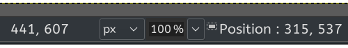
Selection dimensions are on the button in the very bottom left of the application; the button switches between viewing selections with marching ants or masked mode. (I think the button may be in the wrong place too., but don’t know the design reasons for its placement.)
A vertical stack of menus is not exclusive to Blender, Modo also does it and PS too when you set it up that way.
I don’t really know but if any program I feel it to be cool to borrow ideas without worries would be Blender. And currently Blender has one of the best UI out there too. They invested really alot of time in adjusting the UI. Alot of back and forth until they arrived to what they have now.
Colored Icons is not a good idea unless you really need to color code stuff. But if you do you need to, the color intensity on all icons should be the same. Stuff like yellow cyan have naturally higher intensity compared to other colors, stuff like that makes your gaze shift more often to the icons with higher intensity. My suggestion for the icons would be to preserve the same white as much as possible and if you need another single color, maybe a color that contrasts with the theme? Like your theme is red so your icons have touches of blue.
Not a fan of Pie menus in Blender, but Blender is very keyboard-centric. Pie menus might be more reasonable in a tablet-centric app like Krita. Still, each item in the menu needs to be super easy to see and few items, or it will become hunt-and-peck every time a menu is open. For that reason, I say no to text-only pie menus and yes to pie menus with images. Whether or not some particular thing should become a pie menu always depends on context, so case-by-case for that.
Yep, that’s why in my suggestion for colors I mentioned using a perception-adjusted color space. Then colors can even be generated programatically without worrying about contrast. Whether or not we ‘really need to color code stuff’ is debatable; I bring up the point mainly for the tools, which can be colored in sections (i.e. the selection tools can all be blue-tinted). That I would find useful.
I agree so much. As a newcomer to blender, I must say the 2.8 update made the UI very user-friendly for beginners. As other software companies unify their products, it seems like a nice idea to follow this “open-source suite” a bit, as most people who use krita, also often have basic knowledge of blender, inkscape, GIMP etc. Showing trough some little UI unification, how krita is a part of the same family as blender, (in terms of being open-source) would surely encourage new users. And just improve it, as there are a lot of good ideas and solutions there.
Ooh thanks, I didn’t take care about the tooltip on this button.
But in fact the way it’s currently implemented it not useful [from me].
What I like in Gimp is:
- When the cursor moves over the canvas, the coordinates are displayed in real time in status bar
- When you start a selection, the status bar display the current selected size while you move the cursor
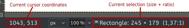
- When you move an object on canvas, the object position is displayed
This is very useful when you’re used to work at pixels level ![]()
(For painting maybe it’s useless ![]() )
)
In fact I know that information is available in tool options docker, but I use tool option in toolbar rather than docker because in docker it takes too much place and then, I don’t have this information available ![]()
This is why having it in status bar for me would be a big +
Grum999
I use selection bounds to align things (in lots of different ways) and also do horizontal or vertical flips manually. I of course really agree; in fact I think it’s essential. Pixel art folks would also agree I imagine.
Ooh, that reminds me, can we make it so that tooltips appear even if the mouse is moving in place? I know we probably rely on Qt but realistically, I can’t access any tooltips by hovering with a tablet pen unless I super carefully lift the pen away from the tablet so it stops registering motion above the tablet and the mouse lies still. That’s a lot of effort; would be a huge improvement.
For all people wanting to make UI mockups for Krita easier (which will for sure improve the speed of any UX/UI improvements, not necessarily the overhaul like here but just for smaller things as well) - I recently wanted to make a library of vector shapes similar to what you have in Settings → Dockers → Vector Libraries, you have by default three libraries: Pepper & Carrot comic bubbles, some other comic bubbles and Brush Presets Icons library. I love the ease of putting shapes from the library into Krita (I don’t really use it though since I’m not doing comics… or brush icons), so I think it would be awesome to have a similar library but with Krita’s button shapes, tool icons, dockers, general-rectangle-with-grey-background, sliders and stuff.
@RamonM gave me an SVG file recently with some of the UI elements and afaik it wasn’t a library, just a file, but we could convert it into a library - but (1) I don’t know if he’d be ok with releasing it on a permissive licence so we could use it for the mockup library, (2) it was made for a specific mockup in mind so it lacks some important elements.
We could start small and add things as we go, but I couldn’t do that alone, I have too much on my TODO list already ![]() So if anyone wants to help out with that, please let me know! Or best, if someone could just do it
So if anyone wants to help out with that, please let me know! Or best, if someone could just do it ![]() I can make a list of things to do in case we might need to coordinate work if there are more people interested, and generally to plan it all out.
I can make a list of things to do in case we might need to coordinate work if there are more people interested, and generally to plan it all out.
The manual method to convert shapes into library is here: Reddit - Dive into anything but I’m pretty sure that with a lot of shapes, using Inkscape will be easier and faster even adding the time to research and learning how to do it ![]()
I would not mind helping with the UI design and mock up.
I could do it in Inkscape or blender. but I did had an idea where blender can show it far better with animation.
a SVG library for the menus? would that mean you could replace it and customize krita ?
stuff like icons too I imagine would be required?
I must say i never quite got to terms where PyQt gets its look inside Krita.
For whatever it’s worth, there’s a website called Figma which I use for illustrating UI and it has a prototype feature used for demonstrating interactivity. It’s not as smooth as an actual animation, but you can share out the files in edit or view mode, define reusable components, etc.
Probably better to go with ad-hoc UI designs because creating components in Figma for all the elements and windows that already exist in Krita would be a hassle. Just sharing thoughts.