Awesome! Are you suggesting a mode where docker transparency can be varied? Could you say how this would help with your creative process, as opposed to having the dockers opaque?
It would be interesting to see, definitely, or maybe having toggled icons for layer dockers in canvas mode..
But this brings us to @raghukamath’s point, where the existing capabilities of the program (and developers) should be considered. I wonder how that could be implemented
An importance of these ideas is that we can show developers the support of users for these features, in the understanding that these features will make creating in Krita more accessible.
I don’t have a lot pf experience with Qt, I know there are other users in this topic like @EyeOdin and @Lynx3d who definitely have more experience, it’s an important idea to address Qt within the mockups as well. It’s good to set some range on how Qt treats dockers (and UI) in this sense, before our mockups reach impossibility .
While I’m trying to experiment with Qt aside from this topic, it might be sensible define the limits with how far Qt can be customised (I know @Lynx3d was talking about this before), or maybe there’s an explanatory video or document somewhere?
Minor addition to this thread:
I decided to play around with Qt stylesheets in the Python API. Basically just grabbing Krita’s QMainWindow and feeding some CSS into its setStyleSheet() function
I’m not about to bring us any cool new tabbed workspaces or floating-on-canvas toolbar, but with some minor tweaks I was able to bring about some new looks to the UI. I tried my best re-styling everything I could find how to re-style, but some things (like Krita’s custom slider spinboxes) doesn’t like being poked at
If someone wants to try the script and see if they can figure something more out, copy and paste the following into Krita’s scripter (and maybe save the script just in case). It’s specifically made for the “Krita darker” theme, so switch over to that for things to look correct.
OMG that looks unbelievable @Kapyia!
My smile is wider than the cat’s smile from Alice in Wonderland!
That made my day, I am so excited! I can’t express my gratitude enough! Thank you thank you!
Though, it did not work on the 4.3.0-beta1, I can send you the script error I got on a direct message!
But it worked wonders on 4.2.9!
This is enough for me to want to downgrade to 4.2.9 again for the time being!
Will the plugin be updated for 4.3 once it is officially released?
I’m sure you don’t mean any harm, but I work on Breeze (icons, desktop theme and widget style), so I’d appreciate if you didn’t spread misinformation about it.
By the way, we (KDE) have been working on an overhaul to the look of Breeze and if Krita could get a visual upgrade just by switching to Breeze, I’m sure that would save a lot of time an effort for Krita developers. IIRC, Krita switched to Fusion because of a bug they were facing with the Breeze theme which has been fixed for a while now.
I believe it is breeze I mentioned here in that quote.
Breeze looks beautiful and I would love to have it on the Windows version. Before I read your reply to this post I thought that Breeze would not be an option on the Windows version. So hearing that it might be possible is great! As you say, I think that will do a lot to improve the UI, with less work!
@Kapyia awesome work! This looks so good in Krita already . And I didn’t know Krita had an inbuilt scripter, so thanks for pointing that out for me too!
@noahdvs that would be a great development for this topic too I think!
This is awesome! I can see this being useful in a tablet interface perhaps, the icons might need to be grouped more but that’s for future improvements I think.
Makes me want to experiment more with style sheets, if I had the time aha.
@fullerhill_art
I think that could probably work.
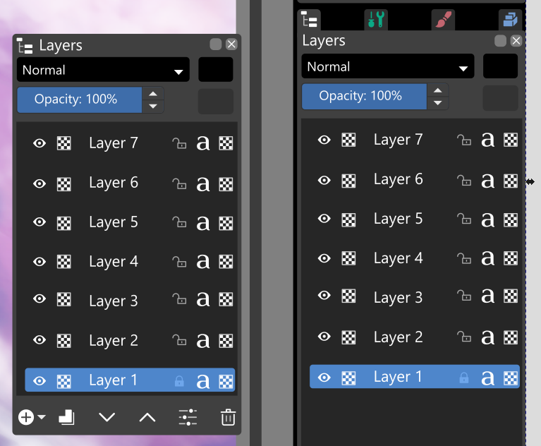
I not to certain if he would not insist in placing the icon on both stages of the docker though. It would certainly need a exception made for it to happen if it’s possible.
On between the visibility icon and layer. I wouldn’t advocate removing the indicator of type of layer it is. I use clone layers extensively for painting/editing, and it would be ideal for me to know what type of layer it is.
Oh yes, sorry, that was just an accidental omission, because I don’t know where the icons for the Layer Docker are held; at the moment I’m substituting Blender icons if you couldn’t tell .
I think I was waiting for @tiar to link the .svg mockup icons from David Revoy, but I could be mistaken on that front!
Also, I think I prefer the current symbol for alpha inheritance. That symbol is used in a lot of papers associated with image processing, and that’s why I prefer it like that.