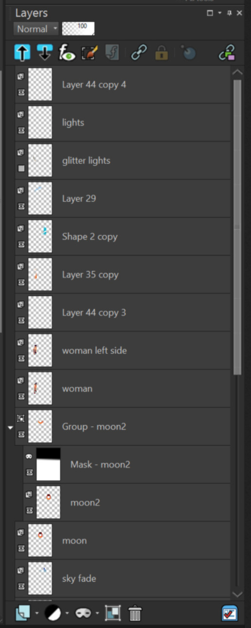
Since the thread of inherit alpha improvement moved to tangent of layer docker top button redesign mock-ups. I am starting this thread here to bring the conversation and posts in one place.
@Deif_Lou That my be why I have been confused by lots of proposals on clipping layers.
To me clipping layers MUST be top-down, contrary to inherit alpha. That’s how it works in Affinity. And to me that makes it clear that the ‘content’ (= clipped layer) is lower in hierarchy than the mask that clips it. In a similar way, artboards are usually displayed above the layers that they contain. That’s why I kept saying that this difference in order makes for different workflows, from top to bottom (taking clipping masks from Affinity) and from bottom to top (with inherit alpha).
E: I see Photoshop is the other way around. Been so long, I memorised it being the other way around.
Here’s one with opacity and blending modes on the top:

Although the hamburger menu would be better suited on top, it would make the bars too narrow imo. So I moved the hamburger menu down to where the other buttons are (I think the arrangement is clearer than with the buttons on the top).
@Hologram Your mockup is really good. I really like the dark gray separator of the layer. I would suggest keeping separator for a unit as in a layer along with its masks etc one. but that is different dicussion ![]()
@Deif_Lou @Hologram the issue with having opacity and blending mode in one line is that opacity bar becomes small and it might be difficult to slide it to desired value due to space being less. Having said that we can try to see it gives any problem.
you can right click on any slider to input numbers.
In any case i think we are going on a tangent for opacity and slider mockups in a thread for inherit alpha. ![]() so i would suggest we stop that discussion or make a new topic for it. let us focus on inherit alpha
so i would suggest we stop that discussion or make a new topic for it. let us focus on inherit alpha
Maybe we should first discuss if the layer docker needs a redesign on another topic. It is possible that then some of the inherit alpha ux issues become irrelevant.
If i am not mistaken when porting to qml/qt6 there will be a chance to redo things. I am just guessing here. Stopping the improvement for bigger layer docker improvement seems not necessary to me. I mean layer docker has many things and it will delay inherrit alpha improvements . If we are trying to redesign the layer docker in subtle way then it is okay I think.
Ok, but I think that we should try to have some of the possible changes in mind and make it future proof.

Sorry if the post order is messy. I have moved the messages relating to layer docker mockups with top buttons here if you think myour message was moved wrongly here then please message me. Please use this thread to post mockups and discuss the potential redesign of layer docker with buttons at top.
For me, the main advantage of alpha inheritance going from bottom to top is the ability to build an inverted pyramid of layers, without additional grouping, because alpha is formed from the sum of layers without inheritance: we can have a main silhouette, and a separate layer extending alpha for details beyond the main silhouette. In addition, layers that give an extension can alternate with layers that have inheritance, which allows you to bypass some effects.
No, no, no, no! Awful. I can already imagine these torments when setting up several layers and groups at once. Why are you even thinking about this?
There is also an animated “onion skin” icon that needs to be solved…
We once discussed a structure similar to affinity, and I personally opposed it. And what we need to consider Improvements to PSD compatibility (clipping mask) in Krita
What exactly you think is awful? How would these changes impact you? What problems do you see with this approach?
To why this is being discussed maybe check the thread on the alpha inheritance improvements.
Imo adding the buttons to outside the layer stack makes things more clear. It’s a common practice in many programs to have the controls outside the layer stack and only show icons to indicate the properties changes.
This also allows more space for layer names.
The only issues i can imagine is you wanting to change the property of many layers at once. But if that’s the case wouldn’t the buttons be able to affect all selected layers solve the problem? In fact i think this makes batch operations easier.
But if is something else please elaborate.
I am also opposed to it cause from what I understood it’s very different from everything else, in Hologram mockup as an example i would put the indicator on the layer that is clipping to the layer underneath as this is how basically any other program i used has it. I also feel it’s important to say all them so it’s made clear that it’s a considerable amount: csp, sai,firealpaca,medibang,ibis paint, infinite painter, artflow.
When designing interface it should be familiar to the users maybe the affinity approach would be ok for people coming form that software but honestly i find confusing and considering how every other program i tested has it different i think more people would be confused too.
I don’t like it either, neither the mockups, nor the examples of it happening in other programs already.
(Screenshots taken from google, so maybe the newest version looks different, in which case just tell me that and maybe provide a screenshot of your own).
This is just pure awfulness, who came up with this?! (CSP):

This is better, but still terrible (PS, better icons design for sure):

This is awful as well (SAI, somewhat better than CSP because of better segregation):

Medibang looks quite good but only because it doesn’t have too many features and takes plenty of space:

Paintstorm Studio has an… acceptable version of this:

Corel PaintShop 2020 Pro is another montrosity, with colors:
Corel Painter 2020 is more acceptable:

This looks like an older version of CSP.
I just want to say that you can change which icons show up there, it’s configurable mine has less buttons but i can’t post an image now.
Edit: the medibang seems like it’s the mobile version, desktop looks a bit different but it’s also just text no icons.
However having easy access to various properties might be a good idea, so please let me suggest a compromise.
A small folded area that would hide the less used options and protect little innocent newcommers and old dogs who don’t like to learn new tricks (that’s me ![]() ) from the shock:
) from the shock:
Closed version:

I believe the folding arrow could be even shorter in height, but even that is acceptable imho. I know some people would say: “but it takes just about the same amount of space as a row of icons” - but there are three reasons I prefer it: 1) it is smaller, like half of the icon size, 2) it protects from the CSP-like visual mess, you can hide the mess in the drawer and 3) it’s more future proof, as in, this allows for two rows of icons easily. More space = less mess, because you can organize the icons nicely.
Opened:

I added buttons I think would be most useful, but of course we could add stuff or maybe make it configurable like CSP apparently is (good for them).
From the left:
- lock icon
- inherit alpha icon: it will allow the user to change the current inherit alpha for the layer, and maybe it could affect the default inherit alpha for other layers too?
- lock alpha
- color label button
- Layer styles button
- merge down button (this is the only action button, so maybe it shouldn’t be there, I dunno).
What do you think?
And as I said, I’m sure there would be a way to make the folding control arrow’s height shorter, or maybe it could even be put in the same row as Opacity slider, if anyone thinks it takes too much space. For now I just borrowed the one from Onion Skins.

If you want icons that already exist in Krita, you can use this: Krita Scripting School
- Search for the icon you need and select it
- Right-click on the icon on the right, and use “Save As” or “Show the image in new tab”, it’s SVG.
(I just used the easy route and screenshoted stuff instead ![]() )
)
Oh I hadn’t thought of that honestly, this will help me a lot.
Thank you so much! ![]()