I would actually prefer the layer properties to move up, at least none of my screens are big.
This something worth considering heavily because of the krita version for the Android.
Also been thinking about layer mockups a bit. Been having usability issues with layers in general as much as design to use them.

I believe that part has already been settled. No updates though.
Oh I see, I understood that they had not made progress because there were no proposals, I still hope that they incorporate the clipping mask in the layers soon, I feel that this prevents many users from migrating to Krita since it does not fit their workflow .
To be honest, the main sore thumb for me is that the layer type icons are still rather small. Could these be improved so you can tell the type on first glance? One of the Affinity V2 improvements is to get these icons roght, which I think is very important especially considering that Affinity and Krita both have so many types of layers (raster+vector) and masks and adjusment layer and groups, etc. Maybe there should be a common icon part to differentiate between the types that is more pronounced than it currently is, whereas the detail then indicates whether the adjustment type is HSL or levels, etc.
Ps style clipping layer is something that I want to become true. In my research I noticed that in ps those layers get intertwined with the “blending options” and “layer effects” of the clipping layer. For example, the clipped layers show underneath the inner effects (inner glow/shadow, color/pattern,/gradient overlays) There is even an option in the blending options (“blend clipped layers as a group”) that alters how the clipped layers are rendered. So, for that reason and because improving ps’ blending options and layer effects were in my todo list, I think it is better to try making the whole thing just right. So I’m researching how all that works in ps and trying to replicate it in some test apps to understand it better.
It may delay the clipping layer feature but I think the overall outcome will be much better, killing two birds with one stone.
I have proposals but get locked by raghukamath mod 
suggest layer organize
and the older topic in 2021 also get locked so no one can talk about it
Potential improvements to Inherit Alpha in Krita
tiar Chief Bug Wrangler seem dislike it too
As you can see the old post of the mod cannot be interacted with, my separate post is blocked, except for this new post of the mod, which is not blocked.
This means that a user cannot make a post on the Layers UI UX topic without being blocked for duplicate reasons unless it is a mod’s post (although the mod’s post is also a duplicate)
So there are suggestions, please read the old post.
But it seems that people are tired, because every time a proposal is made, instead of being simply accepted, they will be forced to repeat explanations, which are in the direction of the mod questions. From post to article, from person to person, they don’t absorb, keep asking again and again. The questions suggest that mods want their krita to be what they want, not what the user wants it to be.
In short, if the mod really follows the order of Layers like other software, like Photoshop for example, it will be perfect, easy to understand, no hassle, no need to discuss Layers over the years and months.
But no, they simply don’t want to.
That is not the case. The topic is closed because there was a heated debate and many people have given their opinions on it. After a certain point the discussion was just repeating same points hence it is closed to cool it down. Proposals are not discarded. They are there for the devs to take note on. Nobody from official dev team said it will not be implemented. Again this is not related to the topic of this thread. If you have issues with moderation please open a new topic on Site Feedback and we can discuss this.
This post is about moving buttons related to layer properties and action to the top bar and not about clipping mask as a whole.
As you can see from @Deif_Lou’s post there is work being done to get us PS style clipping mask. I do not think what you said is true about mods not wanting their krita to be what they want, not what the user wants it to be.
I think you are misunderstanding the exact topic of this thread.
Which are mockups of moving some if not all of the layer property buttons to the top [including the incoming alpha inheritance, the possible alpha inheritance switcher and probably the incoming assistant]
what would be the best way to go for the switcher if it comes along , like should it be put in the layer options drop down, should it be a button. Is the incoming assistant layer - should it be a button ? etc.
whats the best way to declog the current layer?
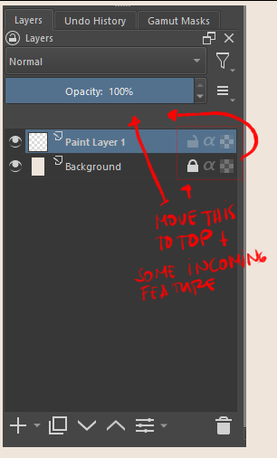
This tread was split out from the other one after it kinda clog at the same time get runover by other discussion there + it also starting to include other feature that is not clipping/ alpha mask - so its hard to follow the proposal to give opinion on a mockup proposal.
The other thread was all the discussion you are talking about going round and round until it just kinda went oh yeah we are going around and around. The mockup for this i think come after deiflou committed on doing the layer. Most agreed at the time that locking it at that point because its concluded and that this one can then proceed.
IDK about the other tread you mentioned, atleast the one I participated in - people just seem to agreed to proceed on making mockup and that even if not fully satisfactory to each side the compromise proposal was good enough.
This is just a recollection of what i remember when this split out from there.
love this, is the first button layer color? or color label?
love the alpha inheritance switcher icon too.
What does the pin icon do? Is it for reference images?
It is the button for the color labels, I would also like a button to change the fill color, but I think that for that it would be better to implement a separate docker.
No, it was really just an idea to reference a layer when filling or selecting, currently the tools have 3 options to reference layers, the current layer, all layers and color labels, I assumed having an option extra could make things faster, maybe just an idea.
If the number of buttons in the layers docker is really an issue, it could also be solved by showing the icon upon a brief hover like this (from Affinity Designer V2):
Just thought I might throw this into the discussion.
We went through many variations originally when we changed the layers UI to what it is now. The main reason a lot of people wanted to see all the icons on each layer was to “quickly see the state of all of their layers without having to click through each one”. Only showing one at a time was effectively hiding them.
The other reason was related to support. Sometimes people have issues with their paintings. They share a screenshot with the forum asking for help. It can be a lot more difficult to see the state of their layers if only the active layer shows what properties it currently has.
We can certainly change it if most people don’t like it, but this will not be universally accepted if we move them to the top.
@scottyp as you point out, some of the developers were hesitant to have so many icons up top. At the same time, there are lots of icons in the layers docker. As part of the context to this idea is that you could opt to show only the exceptions, meaning you only have to show locked layers in this case. That would also offer the quick glance opportunity, but, with layers unlocked, you end up not cluttering the interface with icons as much.
And, as part of the proposal, I would want it so that if you have on object/ layer/ group selected, it locks the one you clicked to lock. But if you were to have a bunch of them selected, it would lock all of them at once. This was part of the discussion earlier, if my memory serves me right. So, since Affinity just incorporated this idea I proposed earlier, I showed it here for the discussion. 
↑ This is a very important point in my eyes. ↑
The other point for me is, that I personally dislike the Affinity-Solution, it felt like I’m not “at home” in that layer-stack.
Michelist
@Hologram @scottyp I think when we move the lock alpha alpha lock icons on the top of the layer docker we can only show icons of active properties. for example if the layer is alpha locked there will be a lock icon besides it and other icons will not be shown. This will make it easy to grasp which layer has which property active, this may be more easier to gasp than what what we have now. It will also make the layer docker more spacious and clean.
I do not personally like showing icons only when hovering as that would make it slow operation and less discoverable. Having the icons at the layer docker top bar below opacity and blend mode would have them available all the time.
Exactly my point @raghukamath. And this lock icon thing could potentially reduce one more icon, if necessary. That’s all I’m pointing at here.