I am a digital artist exploring the wonders of Krita and I have been working on improving my line art. However, I sometimes struggle with getting smooth, confident strokes that look professional.
I would love to hear your tips and tricks! Specifically:
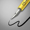
Do you prefer using a stabilizer like “Basic Smoothing” or “Stabilizer” in Krita: ??
Are there particular brush settings you swear by for clean, sharp lines: ??
Any exercises or techniques to improve hand control and precision: ??
I have also been experimenting with vector layers for line art does anyone find those useful: ??
Let’s share ideas and make this thread a resource for anyone trying to level up their line art game in Krita. Looking forward to hearing your insights and learning from the community !!
I don’t use stabilizer at all because I find it messes with my muscle memory too much and makes me inconsistent. Sometimes for very long lines I set brush smoothing to Stabilizer for lines I would use my bendable ruler in real life.
My tips are: zoom in enough that the line takes the whole screen but can be taken in one stroke. Use the whole arm, not the wrist. Take some extra time and set up your tablet correctly so that it feels comfortable for you. This can take some time but at least you only have to do it once.
Practice, practice, practice. It took me at least two years until I felt comfortable doing line art in digital like I can do them in traditional. Make your own line art brushes. I use more soft and brush like pens in real live so I like softer feels in digital too (although it makes it harder to control too). Krita has some good line art default brushes already but they weren’t for me, personally. Taking some extra time to make your own brush presets can save you a headache or two later.
Ironically I currently try to unlearn this because digital lines can look too perfect for my taste so I currently try to emulate more traditional looking lines.
Vector lines can be a solution but the vector tools in Krita are too limited and clunky to use, in my opinion (and again, also look too perfect for me). I only use vector when I need to make a reusable and scalable image like a Cutie Mark for My little Pony characters.
I use stabilizer here. It’s mostly visible when I do clean line-art with a non pressure sensitive to opacity and/or flow brush, like for this quick artwork of Carrot, the cat of my comic. I made a video about how to use it. But it takes time to find the right combo of:
You can get away with making any textured lines crispier by adding a Enhance > Sharpen filter mask without having to fuss with brush settings. It takes grayscale like transparency masks do, making it possible to control where they’re sharper too.