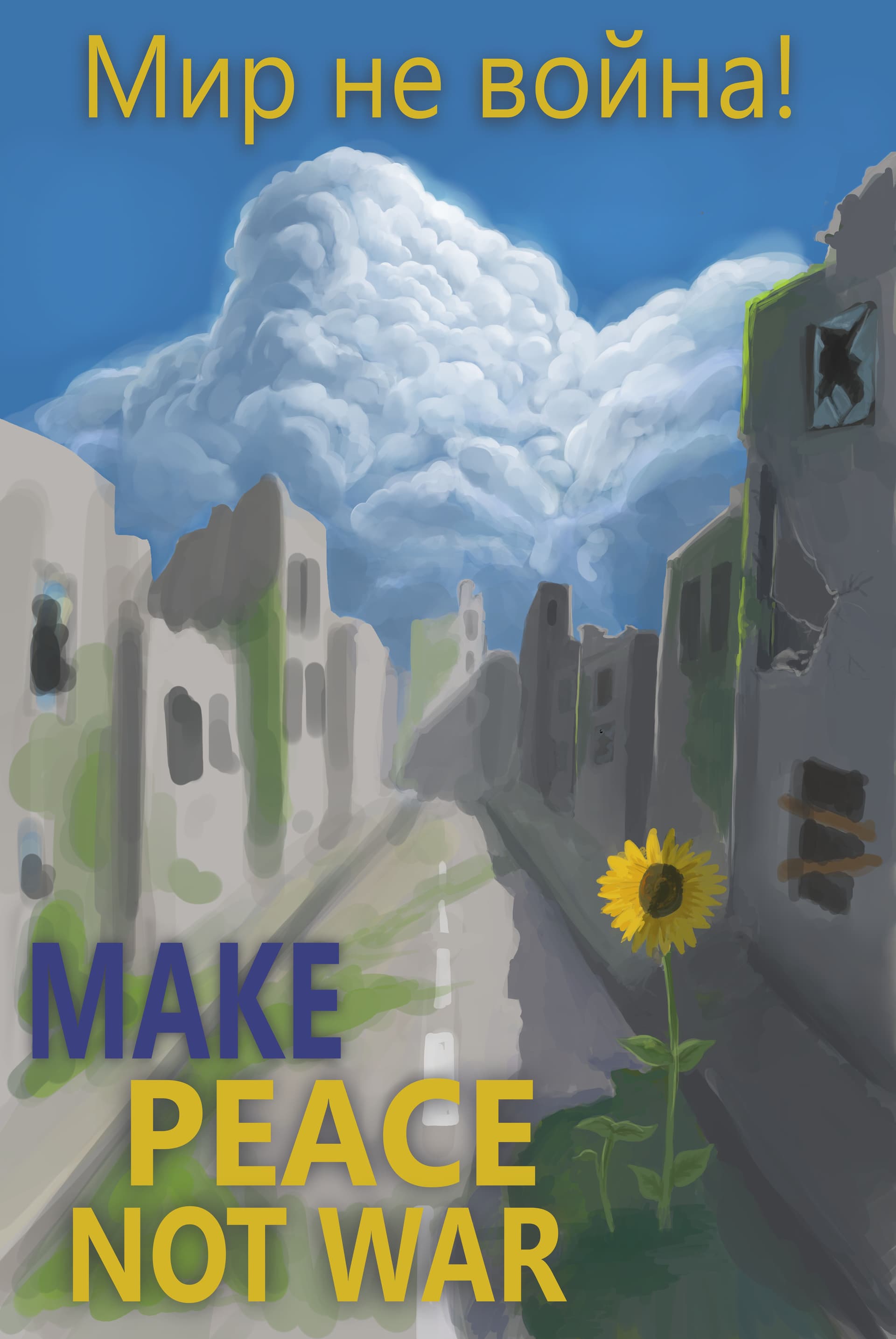
This is my work for the monthly art contest so far. I’m open to feedback.
09.06 2022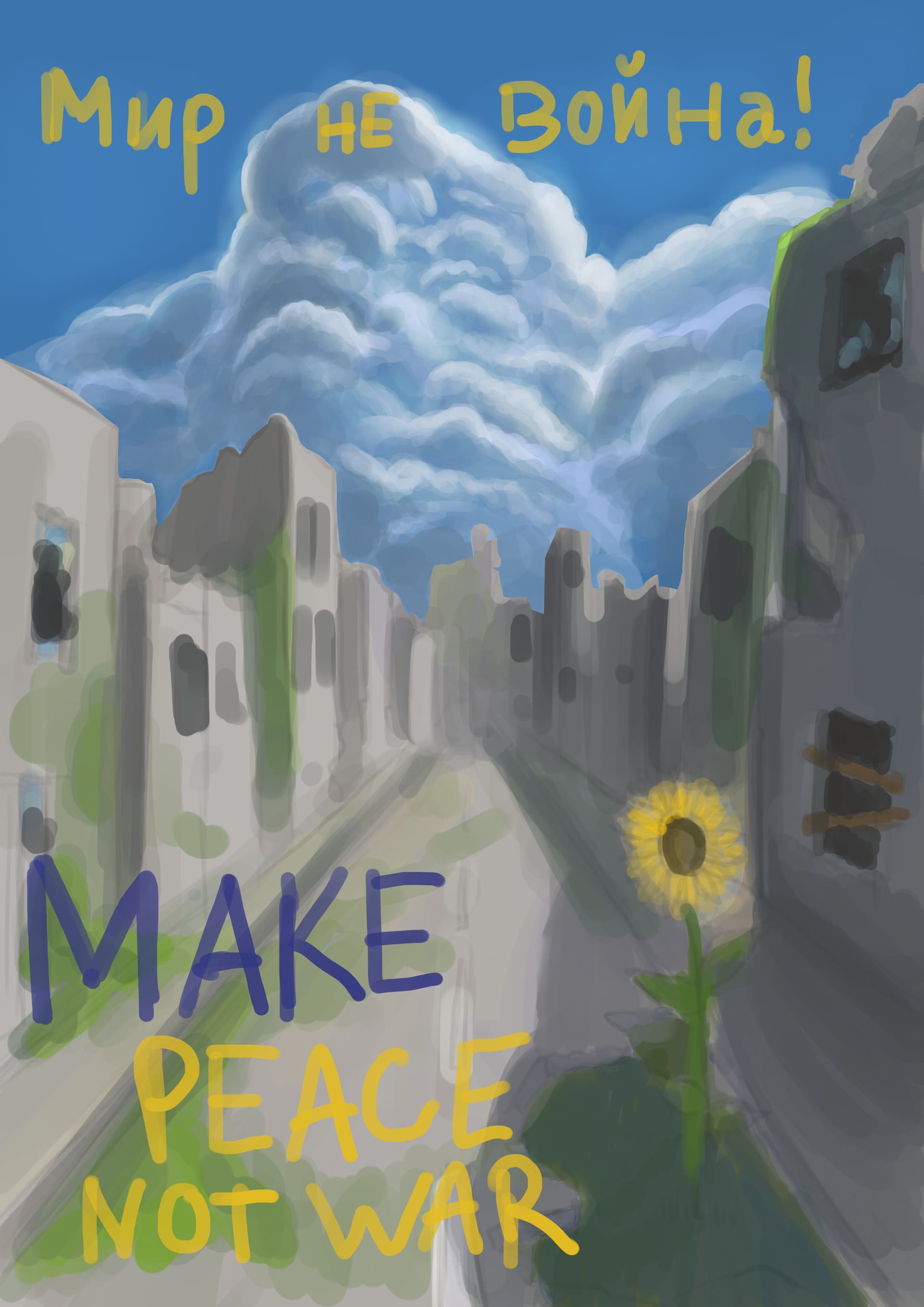
I worked more on the buildings, and finished the letters.
17.06 2022 17.06 2022

Finished the clouds.
21.06 2022
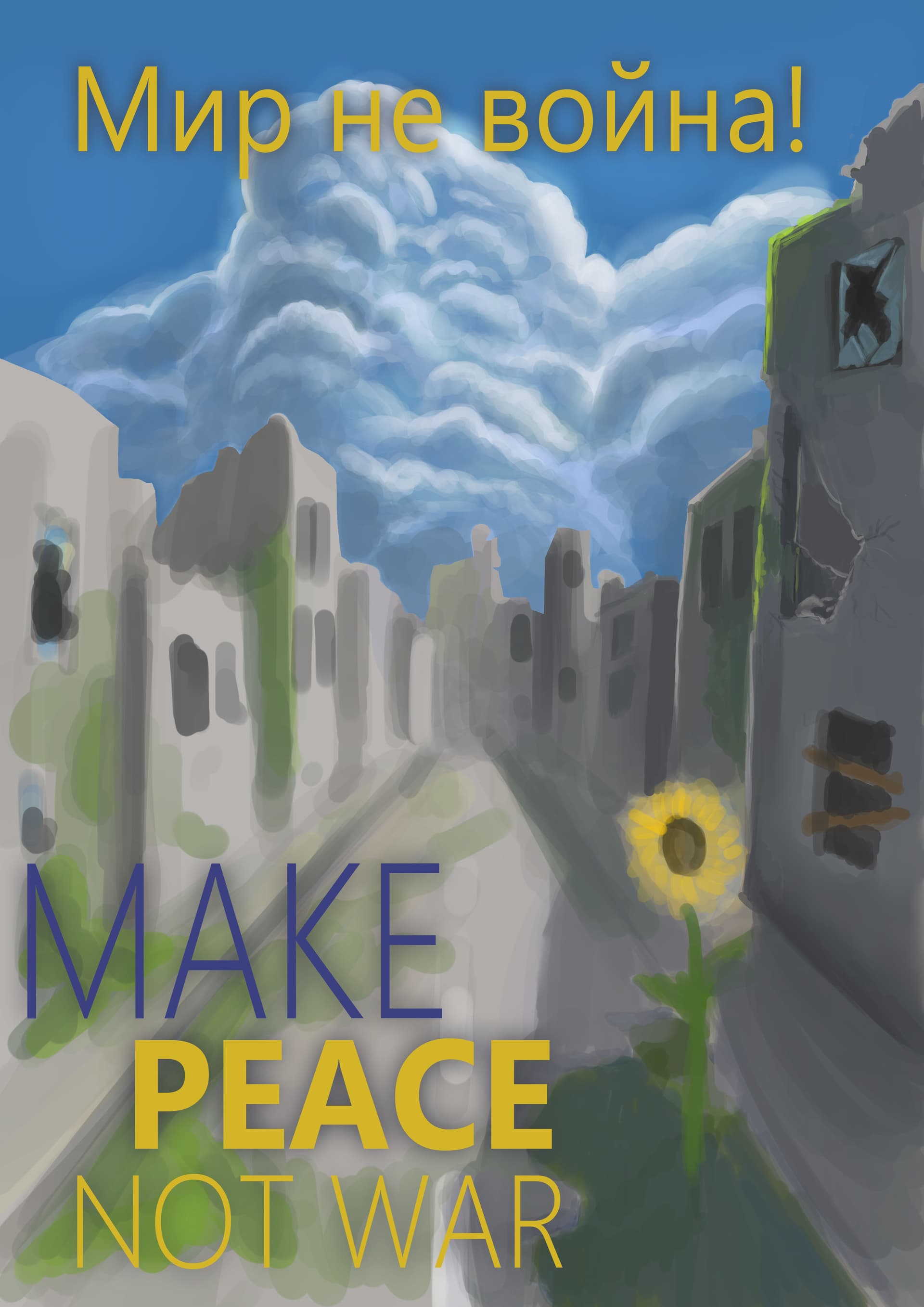
This is my work for the monthly art contest so far. I’m open to feedback.
09.06 2022I think you should make more space at the top (just the sky) and put the top text higher so it’s at least nearly entirely on the sky (that would make it more readable, now the contrast in the cloud fights the contrast between text and the background; try Filter → Adjust → Desaturate → Luminosity (it’s more human-like than Lightness) and you’ll see some parts are fighting quite a lot). Alternatively, the second version could use the trick from the first one that “He” (sorry, I don’t have the cirillic keyboard here) is enrtirely on top of the cloud, and other words are entirely on top of the sky.
The bottom text could be thicker so it would be more visible as well.