Hello Krita Artists! ![]()
This is a discussion thread and WIP thread for our Monthly Art Challenge for December 2023. Ask any questions about the challenge or share your works in progress.
The December Art Challenge was designed by @Mythmaker.
Hello Krita Artists! ![]()
This is a discussion thread and WIP thread for our Monthly Art Challenge for December 2023. Ask any questions about the challenge or share your works in progress.
The December Art Challenge was designed by @Mythmaker.
That’s something I haven’t even touched yet in Krita. I am proficient in CorelDraw vector program… I wonder if Krita’s vector tools are similar in function? ![]()
I think it’s more or less the same, but it feels very different because many of the tools in vector-based applications (that I’ve tried such as corel draw, inkscape, adobe illustrator) are not yet in krita. so I can still create lines, shapes, change their shape and color, but not as fast and not as effective as in other applications. ![]()
So even now, I still rely on Inkscape to create vectors, and vectors in krita are only for practice and experimenting. ![]()
![]()
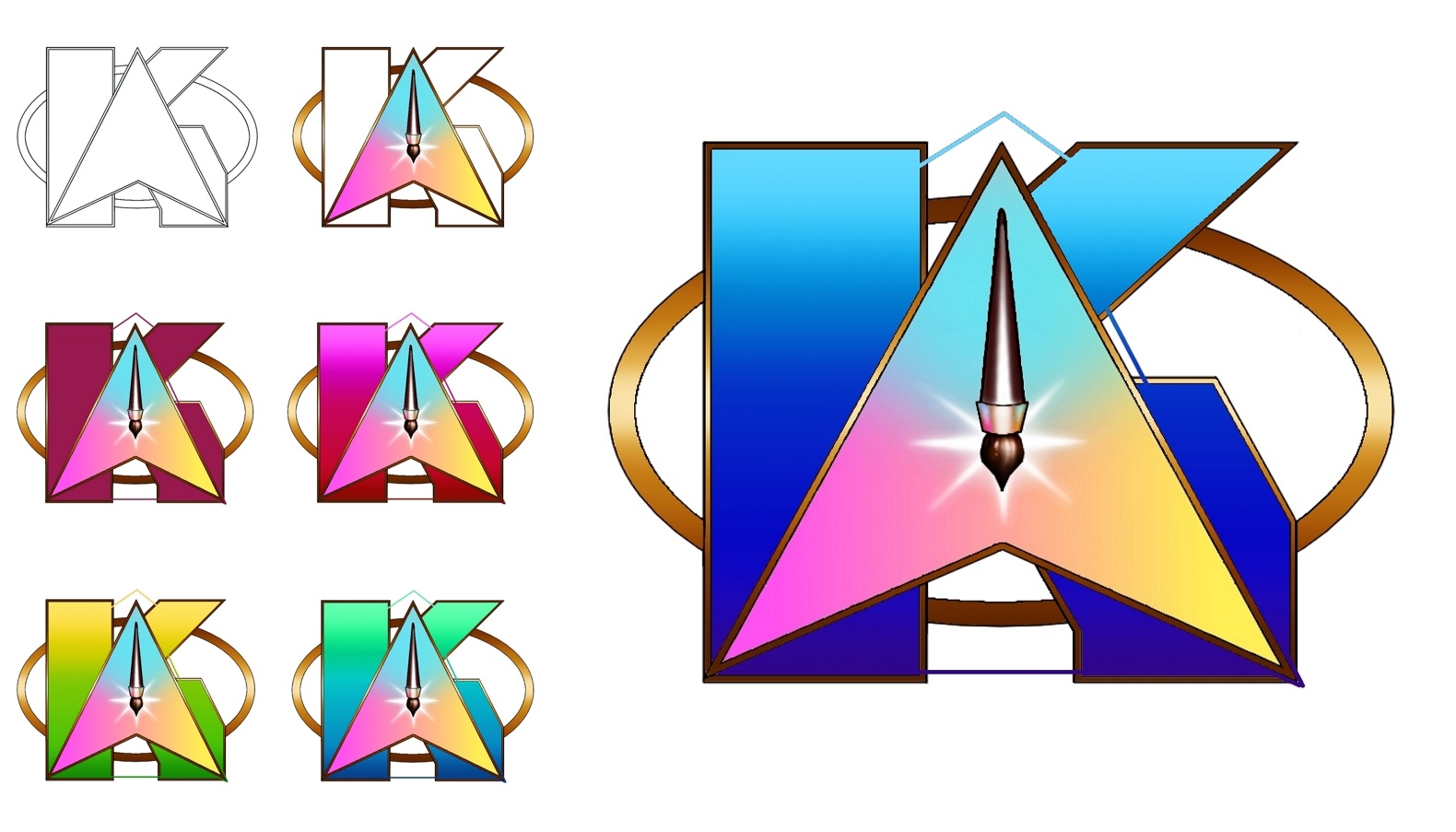
Okay…so, first of all, I LOVED this challenge! Always been fond of fonts and logo design! Secondly, I am sharing my WIP just moments before I post my finished piece! ![]() Hope y’all enjoy this challenge as much as I did!
Hope y’all enjoy this challenge as much as I did! ![]()
That is very clear and the result is very good ![]()
Thanks so much @AhabGreybeard ! I’m still kinda old school digital, so you see the lines connecting the parts of the K? That’s how I made them into one selection and altered the color scheme. ![]()
I’m not really inspired by the theme unfortunately (sorry), but let me throw an idea out for people who are: if it’s gonna be a logo, maybe we should add the special rule to export the final result in a format that allows its effective use as a logo, a format that keeps the background transparency like PNG instead of the usual JPG? Just saying… ![]()
Very nice work indeed. Star Krita! To the infinite and beyond! ![]()
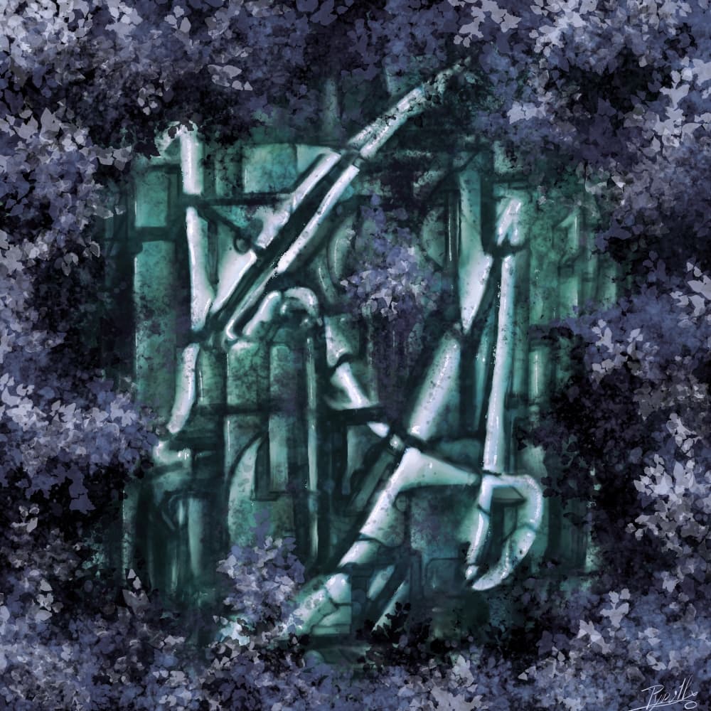
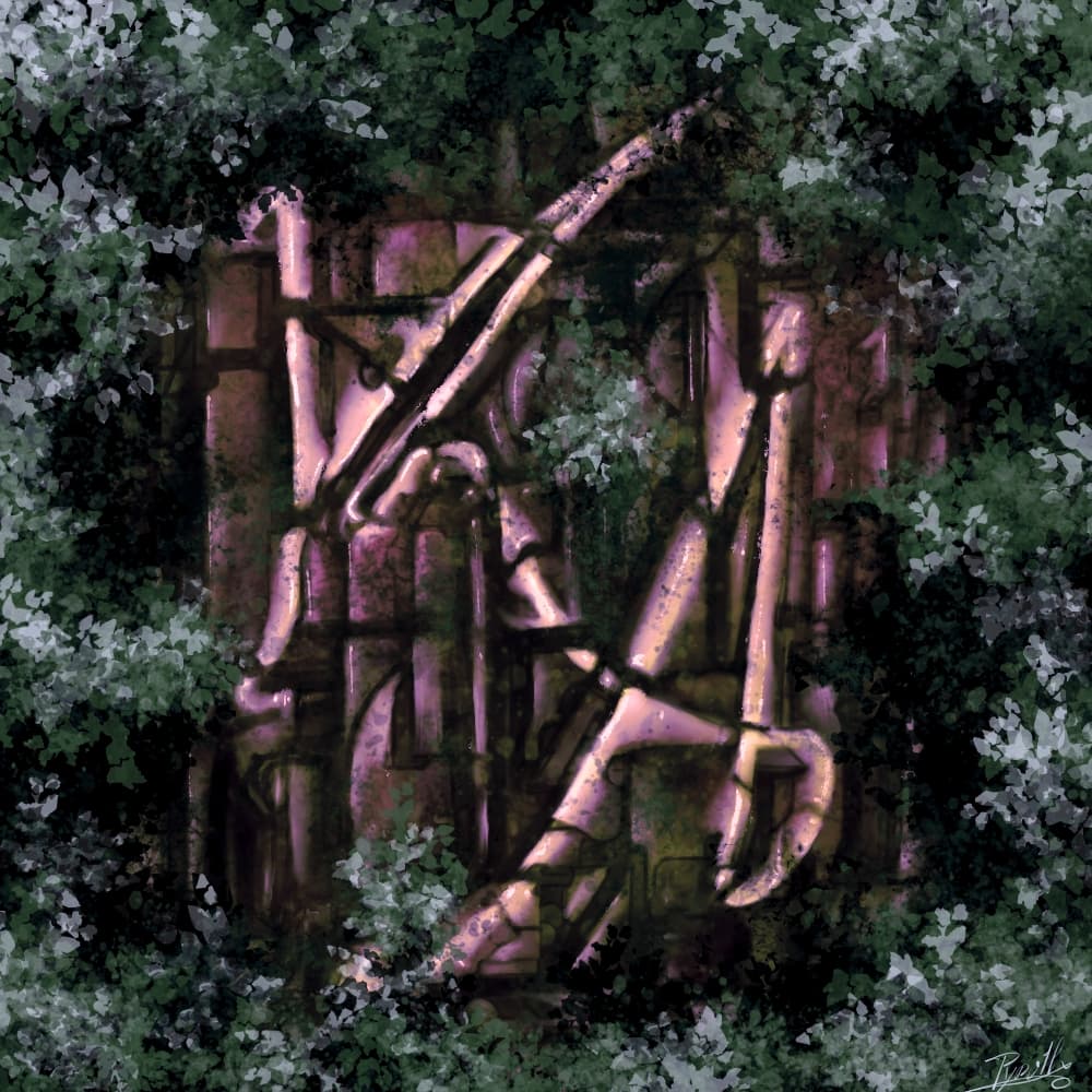
For now here is the result =). many more finitions to add, and still struggling on what color to choose for the final render. And I’m not sure If the letters have a good enough shape. (would like something that include most of them, so even if I like the teal one, it will probably be discarded)
Thank you! That was always a conundrum for me. How does anything go beyond infinity? ![]()
![]()
I like this concept! Very organic! The emphasis on any logo is legibility, so I agree that your letters may not be quite shapened enough. ![]()
Thanks for your comment! you’re right about legibility. So i’ll try to enlarge them. but I’d like to keep this quite thin and curvic style
I don’t know… We need to ask Buzz Lightyear! ![]()
It wasn’t intended to be a logo design challenge. It’s meant to be more illustration focused - that’s why for the title I went with ‘paint’ rather than ‘design’ the logo. I did consider ‘Illuminated Letters’ as a title, but thought ‘Paint the Logo!’ was simpler to grasp at a glance.
I thought I’d been pretty clear with the brief but maybe it needs clarification? ![]()
What I had in mind was decorative lettering - like old medieval manuscripts, maybe using imagery as part of the design.
I didn’t have scalable vector-based designs in mind at all - I only mentioned the letters being legible. It’s a long while since I tested Krita’s vector tools, but based on previous experience I wouldn’t consider using them for vector art/design.
I already included this video in the brief for inspiration:

Here’s some similar ones for clarification:


If some people are more inspired by graphic design style that’s okay, but it is kind of missing the point. ![]()
Whenever I see a picture of beautiful writing, it makes me think of an episode in Spongebob Squarepants
![]()
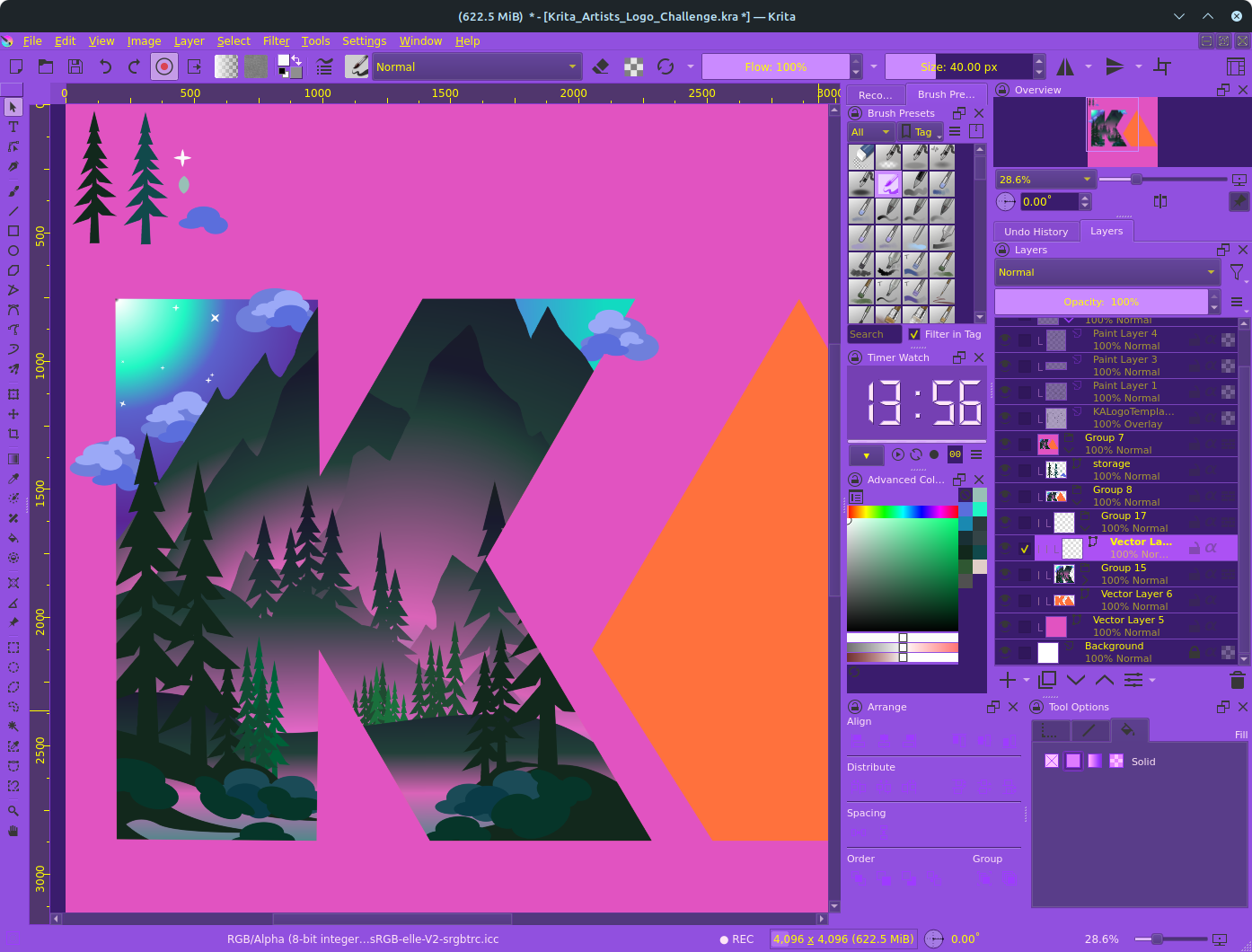
Progress: 30-40%
What I have in mind at the moment is that I am depicting 2 different conditions, such as mountain and beach, day and night. In the future, I will probably add a lot of things outside the silhouette but balance them so as not to disturb the clarity of the writing.
I tried to organize the shapes and group them as neatly as possible. ![]()

OK, my bad! ![]() Maybe I’ll try it then.
Maybe I’ll try it then.
But even if it’s not a rule and we don’t work with vectors, I maintain that a transparent background is better than a white one for this type of art. ![]()

Unfortunately, when you give an idea to a bunch of creative folks, it’s bound to happen. But in a good way?
This is how I do Vector in Krita:
I do it similar to how I use Infinite Design.