I stand corrected. Happy TEXTING everyone ![]()
4 Likes
It’s close to done…
I thought about learning how to wrap the text around the globe, but I’m gonna wimp out on downloading the nightly and playing with the new text editor. I have to try hard just to keep everything stable and running on my laptop! Maybe that will be a cool Optional Challenge once it’s released in the future!
Fonts Used:
https://www.behance.net/gallery/40157073/Smoothie-Shoppe-Free-Script-Font?locale=en_US
11 Likes
@edgarej Very cool Mars theme! I saw your post on the main page… I just wanted to point out that using text is optional for this challenge so you can submit whichever version you feel best about (or both)! ![]()
3 Likes
I will submit both ![]()
1 Like
Love the idea of using a vintage style for this month @steve.improvthis!![]()
A couple of ideas have popped up from my travel bucket list.
Attempting to use perspective and the text editor. Detailing is going to be a nightmare ![]() ! As usual!!!
! As usual!!!
And then there’s this idea in a similar concept to @steve.improvthis.
And then something warmer.
Not sure which I’ll post yet….?
7 Likes
The month is young, why not try all?
Michelist
3 Likes
Ahh…you guys are so ecourageable…don’t ever stop! ![]()
3 Likes
@edgarej beat me to Mars, so I’ll have to look a bit further out.
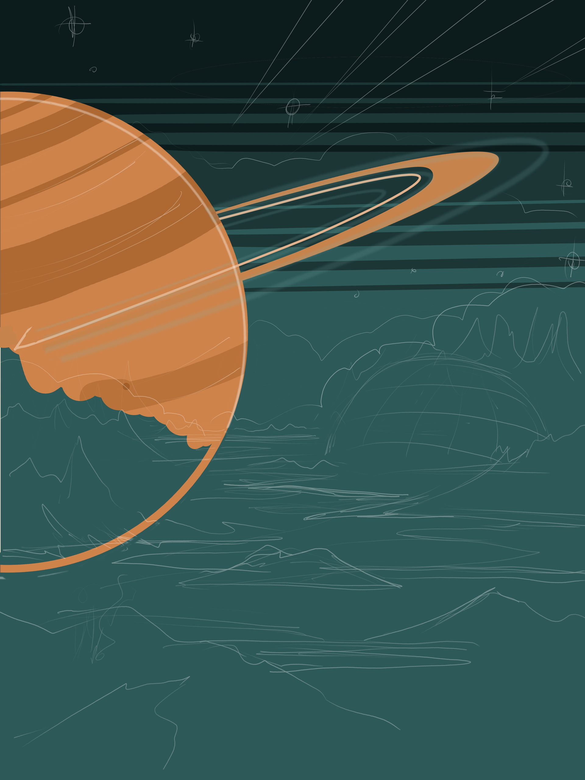
Here is a concept for Uranus Cruises, the inspiration was from The Fifth Element’s cruise to Floston’s Paradise:
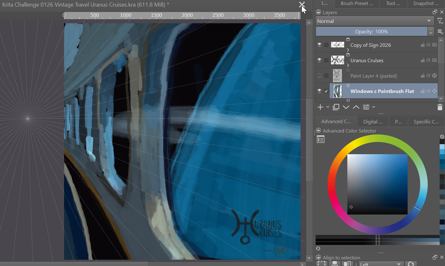
Lots of blending to do here, we’ll see if I decide to do more work on this to get it submission ready or just leave it as a doodle.
Fonts are hand drawn… for now.
UPDATE:
There seem to be a bunch of space themed posters, so I’m going to pause my work on this one. ![]()
10 Likes

4 Likes
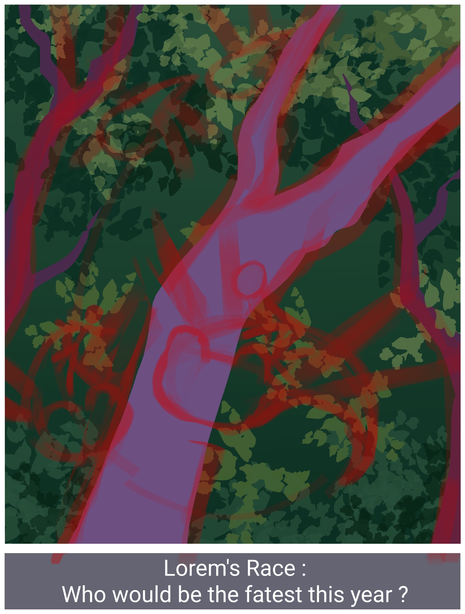
I need to adapt the leaves and the font… maybe just the whole promotionnal poster part in fact. Well, creature race is the idea anyway.
6 Likes
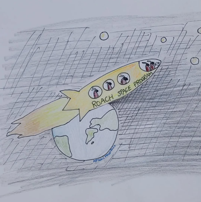
Just if anyone was curious, I got inspired by an old drawing I made in 2022, on paper, for a drawing challenge that existed in Instagram at that point. I thought it was fun to make a little remake of it for this theme.
9 Likes
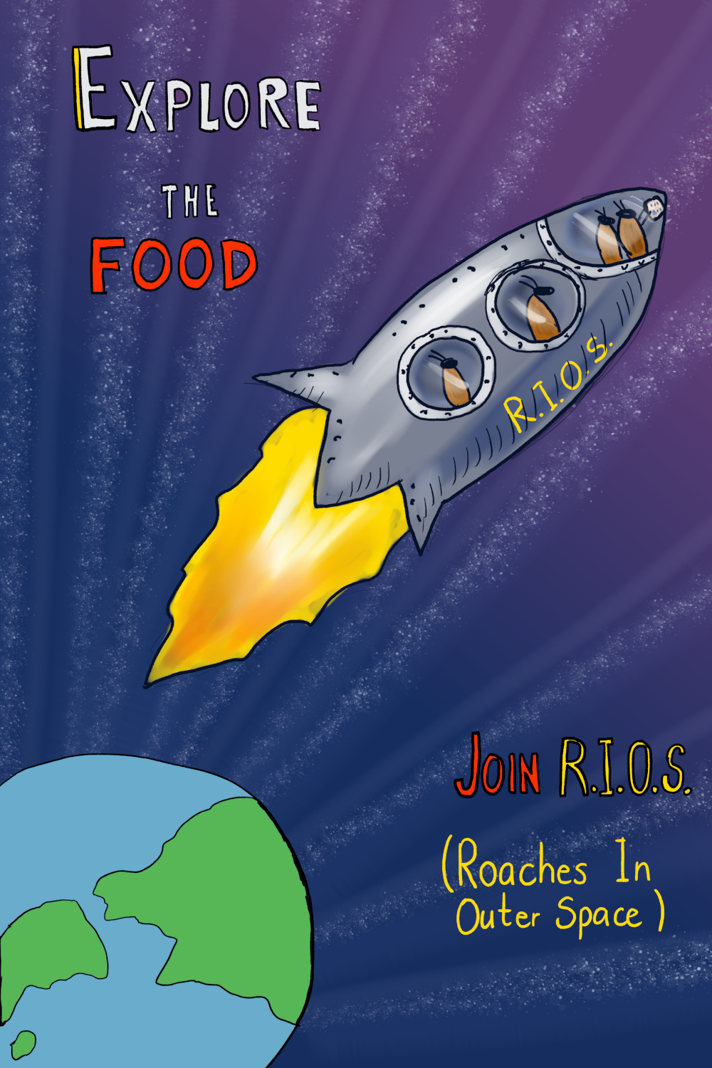
R.I.O.S.! How fun @Gaillycool ! ![]()
I also like how the stars are all going to the Earth vanishing point!
2 Likes
thank you! I was a bit in a doubt about the stars, but thought that it looked funny, so I kept it.
1 Like
Still a WIP, but here’s something with a bit more warmth. I’m not set on the text location or the fonts yet and there’s still a bit more detail work to go, for now here’s my thoughts on a poster for the USVI National Park
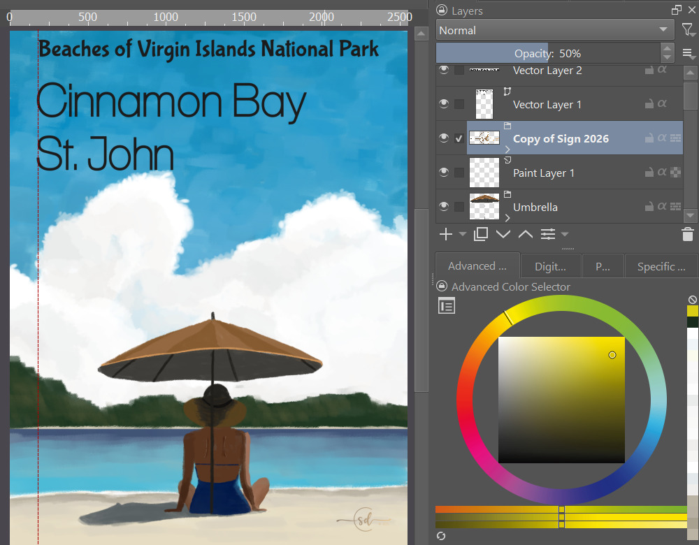
Updated bay to better match the view from Cinnamon beach, muted the colors for a more retro vibe, changed the fonts, and moved the umbrella to a bit off center using the vanishing point tool.
9 Likes
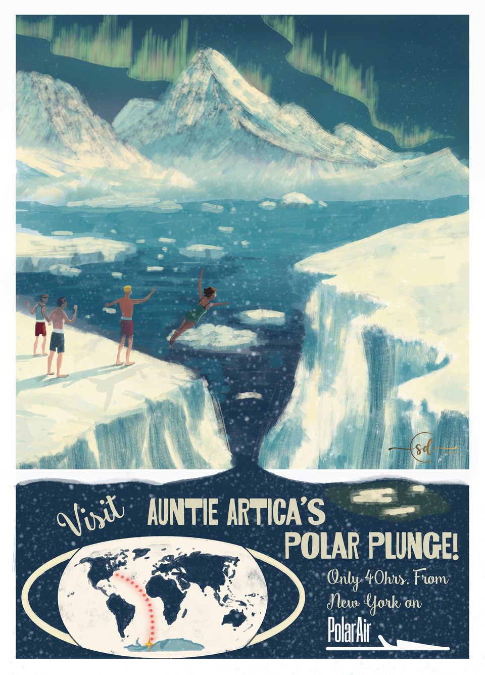
I’m going with an interplanetary theme. After browsing through a bunch of old poster photos for ideas on colors and elements, I put together an interplanetary theme with a aged yellowish tint and limited palette, like old prints frequently have. I haven’t decided on wording or fonts yet. ![]()
10 Likes
Another quick doodle idea having fun with the polygonal selection lasso. Not sure if I’ll keep going or not yet…
11 Likes
@steve.improvthis You are so good at putting simple shapes together to make a balanced composition! Something I struggle with. My detail oriented brain fights me the whole time. Beautiful as is, or you could go on with it. Keep up the good work! ![]()
3 Likes
Thanks @Elixiah ! I totally feel the same way about how awesome you are at putting all those amazing details into your works! ![]() It’s so much fun to come here every month and see how a simple prompt can deliver so many different interpretations and styles… and they are all so amazing!
It’s so much fun to come here every month and see how a simple prompt can deliver so many different interpretations and styles… and they are all so amazing!
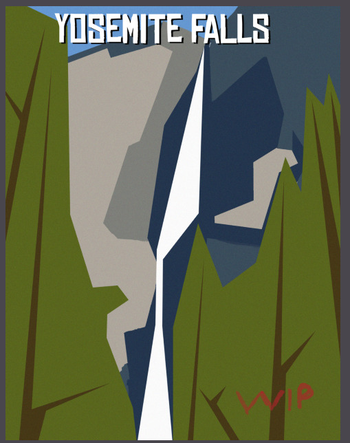
I think this is close to finished. As I look at it posted here I see that centering things in Krita is still… challenging. I’ll clean that up. Ya ya, it really is all in the details. ![]()

And with your encouragement, here is a close to finished vintage travel poster for the Yosemite Falls.
8 Likes
When I see how productive some users are here, and with just under ⅔ of the challenge time elapsed, I wonder whether the restriction of only being allowed to submit three images is a painful limitation for some.
![]()
Michelist
4 Likes