Text Tool Thread

Hey everyone,

The text layout rewrite branch finally got merged! You should be able to test it in the next nightly build. Keep in mind that the text tool by itself has not changed just yet. Similarly, if you find bugs, please report them to bugs.kde.org under the product Krita, in the component Text.

State of Text

I’ve spend the last year completely rewriting the text layout code, with a technical blogpost here. This code handles things like taking a text with markup, selecting and loading fonts, getting the correct glyph from the fonts for the specific bit of text, and positioning it. We were previously using the text code that also draws our labels and help texts for this, but this couldn’t be modified easily, which is why we had to do our own version of it.

However it was really important to us that people would be able to write in their native language, as well as allow advanced features like OpenType. But that implies a much more complex setup, involving complex algorithms for bi-directional text ordering (that’s text that mixes right-to-left scripts like Arabic and Hebrew with left-to-right scripts like Latin, Greek and Cyrillic), line, word and grapheme breaking algorithms (a grapheme is when a single glyph is represented by multiple characters in the text, stuff like diacritics on characters, like “g̈”, Hangul Syllables like “각” or even skin color on emoji), and then correctly implementing OpenType glyph selection (also called ‘shaping’).

Even when we depend on other people’s code libraries, which solves 90%~ of the work, integrating all the components is very intimidating, especially because we didn’t want to introduce a situation where we’d have a period where Krita’s text tool got much worse. Which is exactly why there hadn’t been any real work done on the text tool for a very long time.

For our vector tools, we follow the W3C’s CSS and SVG specifications. At their core, these are a way to store text and vectors, but the specifications also have a lot of information on how to solve problems, which in the case of text is very useful, because otherwise I’d have to be a specialist in every language in the world. My rewrite followed the SVG 2.0 text specification, so right now, we have a text layout that can handle most of what the SVG 2.0 text and css-styling chapters expect of us, plus some extra features from CSS-text-3, CSS-text-decor-3 and CSS-fonts-4 where it made sense (OpenType variable fonts are an example)

Some of the new features include:

  • Vertical text (support for both writing-mode: vertical-rl and vertical-lr)

  • All the SVG 1.1 specific features like textPath and textLength.

  • Basic support for automatic text wrapping with inline-size, as well as related features from CSS-Text-3 like text-indent, overflow-wrap and hanging-punctuation.

  • OpenType features via font-variant and font-feature-settings, as well as support for variable fonts with font-variation-settings.

  • Some really basic support for color fonts.

  • We can now have texts that are filled with any of the typical fills like gradients and patterns, as well as stroked with the special path-types like dashes.

The missing items are shape-inside/shape-subtract/shape-padding/shape-margin, text-orientation, ::first-letter and ::first-line and @font-face.

Roadmap (Sorta)

So, the next two items I’ll be working on are:

  • New Text Tool with on-canvas text editing. This is something that’s both necessary because the current text editor pop-up is kinda painful to use, as well as it just not being able to preview the new features properly. Might as well solve both at once. This will be most of my 2023 as there’s a lot of small details to get right here. This will likely be post-5.2.
    • Phase 1 – This will consist of on-canvas interaction, so cursor navigation, typing on canvas, editing the wrapping size, support for Input methods/Virtual keyboards, copy, paste, undo, etc.
    • Phase 2 – This one is all about editing the text properties. A separate part from Phase 1 because it will require reworking the properties code. We’ll work on the widgets, as well as a preset system. After this we should have a reasonably functional on canvas text tool.
    • Phase 3 – This will be about extending the functionality with the lower priority but useful features, such as a separate typesetting mode to do fancy oncanvas adjustments, display for formatting marks, and other things.

After that there’s a number of smaller items, some of which will require a lot of waiting time as I need to communicate with people who know a lot about text, so I might begin working on some smaller features while I wait.

Big projects:

  • More East Asian text layout features.

  • The aforementioned text-orientation is one of these, it allows for configuring whether text from horizontal scripts (like Latin and Arabic) is rotated when vertical text is enabled. This is often much easier to read and takes up less space.

  • Similar is the text-combine-upright feature, which is typically used to make sure that numbers in vertical text are typeset horizontally and taking up one single vertical place if possible.

  • text-emphasis-marks, which is a way to emphasize text that’s common in East-Asia not unlike underlining a text.

  • Ruby annotationsThis is an example of a ruby annotation. These are often used to indicate how advanced characters are pronounced, and very common in childrens’ media, like comics. This is a very ambitious feature as CSS-ruby-1 is a complicated specification and no one has implemented it for SVG before, but it’s an accessibility feature, so I’d really like to give it a go.

  • I’d like to be able to get most of these features into one of the libraries we use, Raqm, so that other projects may be able to use them too. Text-emphasis-marks are the exception here because they are somewhat similar to underlines, which we handle inside Krita’s own code.

  • Color Fonts (SVG and ColrV1). We have support for bitmap based color fonts, and we have support for the relatively simple ColrV0, and the latter even works properly if you do convert-to-path. SVG and ColrV1 are a bit more complex, rendering by itself is not that hard, but allowing configuration of the color palette and allowing for convert-to-path is a bit trickier. I will first need to extent our vector drawing code to support blending modes as well as supporting css variables so we can actually adjust colors. This’ll be quite a bit of work.

Smaller projects:

  • SVG 2.0 paint-order property, so you can choose whether to draw the stroke on top or below the fill. This is necessary for joined scripts, because we don’t have a good vector combining algorithm, and it’s also useful for regular text.

  • PSD text-saving and loading support. You’d think this be in the big projects list, but I’ve got it working mostly already. It needs some thinking regarding vector objects as well as actually loading the wrapping shapes properly.

In-Limbo:

  • @font-face. I’m not sure how much we can support this, but it feels disingenuous to say we support all of SVG 2.0 text if we don’t even try to parse this.

  • Hyphenation. This will require using hyphenation dictionaries as well as have ramifications for line-breaking. At the moment I know too little to even begin to implement this.

  • ::first-letter and ::first-line. These require our CSS parser to be much better, after which implementing will be tricky for first-line.

DONE

  • I am currently going to work on getting shape-inside/shape-subtract/shape-padding/shape-margin to work, which together form the text in shape feature. I am also working on allowing new lines to work inside the text, and making sure that the CSS-text-3 white-space feature works correctly. I had delayed this because half a year ago I wasn’t sure how to go about implementing this, I have since looked for solutions, and have a plan now. I would like to have this in 5.2 if possible.
  • Font-synthesis. Not all fonts have bold and italic, and computers usually handle this by modifying the glyphs. We’re currently not doing any of that. One of the code libraries we use, Freetype has basic support for it, so I’d like to give it a try. (Tackled by Alvin)
  • Better missing glyph indicator, right now, if a font doesn’t have support for a script, Krita will instead select a font on your computer that does. However, if there’s no such font, it will show a .notdef glyph, which is a little rectangle that kinda resembles a block of tofu. These .notdef glyphs are kind of annoying if you don’t know which script is missing, so Firefox for example will make a custom glyph that represents the code point that it couldn’t find a font for. It’d be good to have something like that in Krita too. (Tackled by Alvin)

This roadmap will fluctuate and move around as I learn more about text, so this is just a general gist of stuff I’d like to do.

Old

How you can help

I am already trying to plan how to approach the on-canvas text tool, studying how to handle cursors and undo, as well as input methods and the many different ways markup is handled. I have however seen one text tool too many by now, and can’t see the forest for the trees anymore. So my question to you all is, what are you expecting out of this tool?

Some examples:

SVG has both text-in-shape and text-on-path (but not at the same time :wink: ). Furthermore, a text can have multiple associated paths for this.

  • This means that we have three things that can be adjusted that is not the text itself: The total text shape, the associated path(s), and the nodes of the associated path(s). Which tool should allow adjusting which thing?

  • How do you want to create a text-on-path or a text-in-shape? Like, we can make sure the text tool can make a simple rectangle, but what if you want to flow text into two circles and have one rectangle subtracted from both (this will be possible, Inkscape already allows it, if you coax the document SVG to enable this).

There’s now about 50+ properties that can be configured. I’m going to make sure these will be put into a preset system, like character and paragraph styles (integrated into the resource system).

  • How do you imagine yourself using these properties? A separate docker, or a drop-down in the tool options or on right click? Or maybe a hanging overlay with buttons?

  • How are you expecting to adjust single properties (without using a preset).

  • How do you imagine editing a gradient you assigned to a single word in a text?

And overall…

  • What kind of hotkeys and gestures are you expecting? Like, zooming, panning, setting text bold, etc. Because of course, if you press space to pan while a text is being edited, you’re not going to pan, you’re going to type a space into the text. :stuck_out_tongue:

… And anything else that comes to mind.

So my plan is to start working on text-in-shape and the final white space fixes. After that I’ll discuss with the other developers how to tackle the tool architecture and then I’ll give an update on that with a more precise roadmap than ‘text tool’. Likely we won’t be able to get everything in this thread, but at the very least it’ll ground the project a little.

In addition to all this, you can ask me anything about text in Krita.
45 Likes

Woah! this was really a mammoth task wolthera. Congrats to the team on sorting out the dependencies and getting this merged. The roadmap is also really detailed and huge undertaking. I am sure users will really appreciate this and will help in testing and providing feedback.

1 Like

Oh yes, thanks and congratulations to @wolthera and everybody involved in getting this done and merged.
It’s going to be a lot of work to test it all :slight_smile:

1 Like

Phew, that was, and still is, a huge piece of work. Thank you very much!

As for my expectations, I guess my response will be more of a disappointment. As always, I try to approach things as an opportunist, if I need the text tool, I use what’s available and if I need something not available I work out a workaround, which in case of doubt does not exclude the use of other software, even if that is always the last option.

Michelist

2 Likes

I think in the meantime most of us uses alternative [I do inkscape and copy paste vector] .

@wolthera I think also envision krita to be able to do the full on comic creation process which includes alot of text work in word bubbles. :sweat_smile: And would complement well her other works [the comic manager for one]

@wolthera congratulations and thank you for the work you’ve done so far. I really love that you have this vision of what you want to achieve. Reading your write up and my occasional attendance in weekly meeting , just doesn’t show much how hard this whole process well. I say for myself - i really appreciate the work who’ve done and doing for the text tool.

Comic manager + bubble generator + bubble set + the multiple speedlines/ screentone set + and a workable text tool that is easy to adjust :kikiexcited:

3 Likes

My thoughts on text tool features, hope you like novels!

My background and workflows

I make comics and pixel art, and I’ve been using Photoshop’s text tool for many years, so my expectations are formed largely by that.

I write comics in multiple languages, Japanese among them, and the lack of East Asian typography support outside of Adobe’s software has been a recurring problem for me. I’m very happy to see it’s on the to-do list, even if only as a distant goal.

I draw most of my sound effects by hand, so I don’t really care about features like text on arbitrary paths. I use them when they’re available (mostly for in-comic logos), and make do when they’re not. Most of my text just consists of multiple lines of text on straight lines (usually horizontal, but I do work in Japanese sometimes and need vertical type for that).

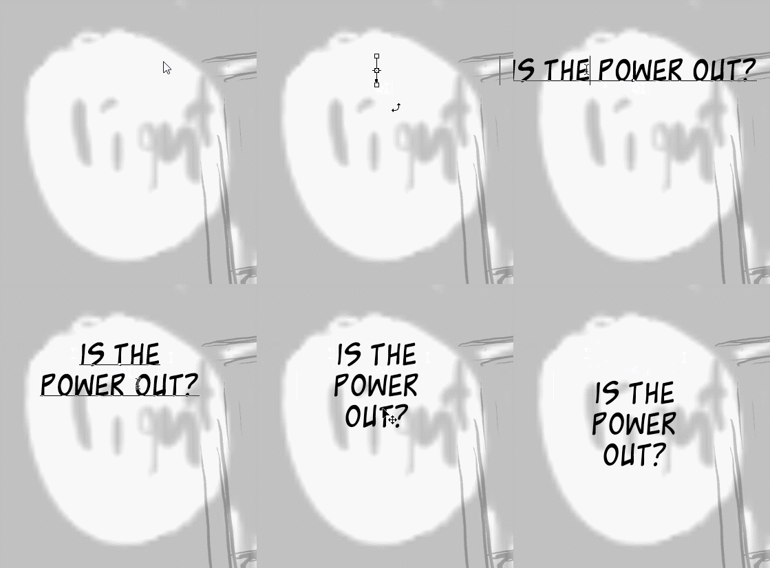
For comics, I click in roughly the middle top of where my my speech bubble will eventually be drawn and then copy+paste my text from the script. Then I manually add line breaks. I often iterate on where exactly the line breaks will be to ensure the speech bubble both looks pleasing and reads clearly.
text02
I do not need hyphenation features, the layout of the text is far too important to leave such things to automation. In comics, I generally avoid hyphenation. When hyphenation is inevitable, such as when a word is simply too large to fit on one line, I hyphenate by hand by typing a hyphen and a line break.

For layout out limited numbers of text-heavy book pages (e.g. bonus material in a printed comic) and text in game mock-ups, I do use automatic line-breaks and (sometimes) hyphenation. I don’t expect advanced text flow features in a drawing program, so I’m quite satisfied with being able to define a rectangle for the text to fit into. If I need text to flow around a complex shape, I’ll add spaces manually. This means whitespace should not merge (unless the font says it should via kerning and such).

I make my own fonts for most of my comics (but not the one in the gif above), and these fonts often employ variant characters via dlig, so I need to be able to enable/disable that. I also make conlang fonts that are typed as Latin characters but display unusual glyphs, usually via dlig or liga.

After I’ve made all my texts, I often move them around a bit before I finally draw the speech bubbles around them. With traditional pages, the bubbles are drawn first, but I still often need to move the text around a little to make sure it looks nice. So, it is important for me to quickly go between modifying a text and moving it. Switching tools between Text and Move is fine for this, but a modifier on the Text Tool would be even better.

Expected Inputs

Single click on an area unoccupied by any Text with the Text Tool to start a new unbounded text input. The origin and baseline will be at the clicked point. Because the text is unbounded, there is no automatic line-breaking or hyphenation.
Single click on an area occupied by Text will activate that Text for editing and place the cursor as close to the clicked area as possible.
Click+drag on an unoccupied area with the Text Tool will define a bounding box for text. Bound text will have line breaks and (optionally) hyphenation added automatically to make it fit within this box. If the text ends up with too many lines to fit in the box, I want those overflowing lines to still be displayed so that it’s easy to spot the overflow - so really, it’s just the width (for horizontal type; height for vertical type) of the box that matters.
Click+drag on an occupied area with the Text Tool should select the text, and then select some characters. It is beyond me to describe how the logic for selecting multi-line text, but most programs seem consistent about it.

When I say “occupied by text”, I mean any visible text anywhere in the image, in any layer. Selecting a particular bit of (visible) text should require a single click, I should not need to select the layer first.

While a text is active (i.e. a cursor or a text selection is present), Enter should add a line break. If some text is selected, the line break should replace the selected text.
While a text is active, any text entry should be inserted at the cursor. If text is selected, the first text entry should replace the selected text place the cursor after the new text.

Ctrl+Text Tool with no text selected should act as a Move Tool for texts, moving the clicked text. In Photoshop, Ctrl+Text Tool with an active text enables the free transform mode - seems useful, but I never actually use it and instead habitually trigger transform mode in the same way as I would for other layers.

Selecting multiple texts (e.g. via the layers list) should de-activate any active text. Having multiple texts selected should let you modify their properties en masse. Activating a text (i.e. placing a cursor or selecting some characters) should deselect any other texts.

Setting properties

Text has a lot of properties, but most of them don’t need to be changed often, so I expect them to be in a docker that I can bring up and hide with a button from the toolbar. There are too many interrelated options to work well as a drop-down menu, and overlays get in the way.

The following settings do need to be changed often, and I expect them in the toolbar in addition to the docker:

  • Text colour
  • Font family, weight, and size
  • Basic alignment (left/centre/right)
  • Anti-aliasing options (at a minimum, on/off)

If some characters are selected in an active text, any option changes should apply only to the selection. Otherwise, they should apply to all the selected text objects. I should be able to select my text layers and then change the colour for all of them, for example.

Bold, italics, etc are font styles that are not present for all fonts. I expect these to be selected as part of the font, e.g.
image
Or, in the toolbar:
image
When changing font families, if the new one doesn’t have the style that was previously selected, then it should pick Regular (or whatever is available that is the closest to not italic and having 400-ish font weight).

Underline, strikethrough, subtext supertext, all caps, small caps are not frequently useful so I’d be happiest with them being only in the docker rather than wasting space in the toolbar.

If Krita is to offer automatic Italics and Bold options, these should be clearly separated from the ones offered by the font family. In Photoshop, they are called “Faux Bold” and “Faux Italic”, which I think communicates their nature well. They should be available only via the docker.

Photoshop offers buttons for OpenType features like ligatures and dlig, but I usually use the drop-down menu to add them because I find the text clearer than the icons - but that might just be because I often use these features in strange ways, so the icons don’t represent my use cases.

Japanese typography

As I mentioned, I do some comics in Japanese, and as such, I need Japanese layout features.

The major one is vertical text. I’d be quite happy with a “Orientation: Horizontal/Vertical” selector buried in a menu in a docker somewhere.

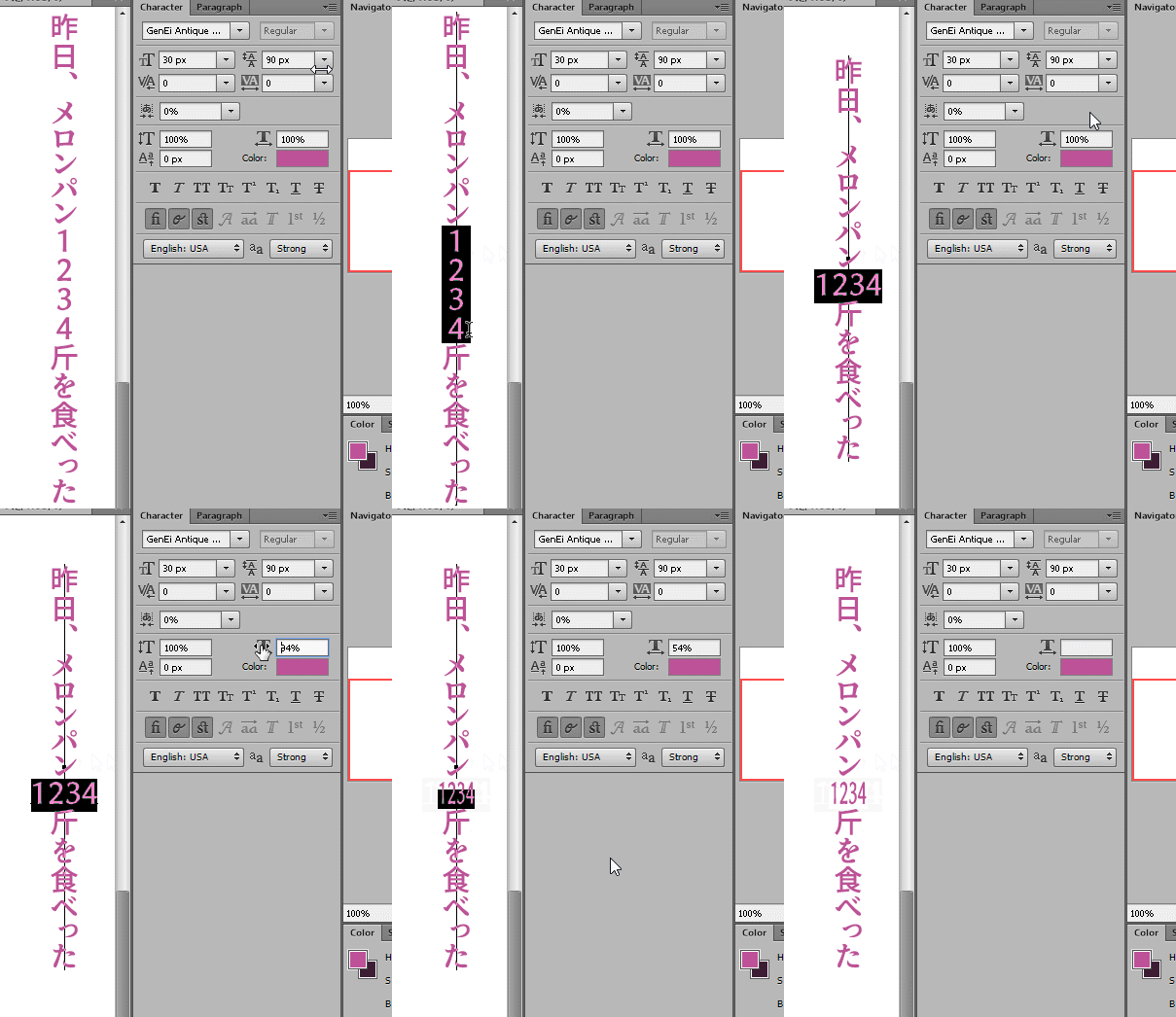
Less frequently, I need tate-chuu-yoko, short runs of horizontal text within a vertical line of text. I expect to be able to select some characters, click a tate-chuu-yoko checkbox somewhere, and then possibly set the character Tsume or width scale to make them fit, like so:
text03

Mojikumi, per-character spacing, is also useful. For example, in the gif above, I used “Mojikumi set 2” to make the 、character have the same size as a full-width kanji. Without that, it would be narrower, which saves space but will misalign lines.

Ruby text

I have not used any software that directly supports ruby text, so I don’t have any expectations for how that should work, only desires :]
I would like something where I can select text with a tool (perhaps a dedicated “Ruby Text Tool”, or a modifier on the Text Tool), and then just start typing my text, and that will be added as ruby text until I commit by clicking away or pressing Enter (ruby text doesn’t usually have line breaks). The ruby text is automatically spaced to centre and fit alongside the selected text. If I select more text for ruby editing and it contains already placed ruby text, then I want all the already placed ruby texts to be concatenated into a new starting text for the new selection. I would also expect to be able to click existing ruby text with this ruby tool/modifier, which would select the text the ruby is assigned to and let me edit the ruby text.
I would like to set the options for ruby text similarly to other text options: based on the selected text, not selected ruby text. In other words, I should be able to set ruby options before I’ve even started adding any ruby text. These options should include:

  • font family, style (“inherit”/“not set” should be the default, most ruby text is in the same font as the main text)
  • size
  • distance from source text (this is horizontal distance for vertical text, and vertical distance for horizontal text)
  • colour (“inherit”/“not set” should be the default, it’s rare to need to set ruby colour separately)

When adding furigana (ruby text with the pronunciation of characters), it is usual to set the furigana for each character independently rather than for the whole multi-character word, which means there will be a lot of [select single character] → [add ruby] cycles. A button or shortcut to commit the current character’s ruby and select the next one for ruby editing would be a nice time-saver. It would be extra useful if this skipped to the next kanji and skipped any non-kanji/hanzi characters (I think this can be done via Unicode ranges) but it would be a good feature even without that.

Gradients

I’ve never needed anything I can’t achieve with a Gradient layer overlay that applies to the displayed pixels, so I don’t have a useful opinion on this.

Text and paths/shapes

Since I mostly do comics and hand-draw my sound effects, I hardly ever need these, and am willing to adapt to tools designed around people who use these features more often.

  • Paths: I expect to click a Path on the canvas with the Text tool (it should display a different cursor to show that it’ll be on a path), and then the text will follow that path. If the text is longer than the path, it should continue off in the same direction it left off on. I’ve never tried to have multi-line text on a path, so I don’t know how that should work.
  • Shapes: When I click a Shape with the text tool, I again expect a different cursor. I expect the text to be positioned within the shape. So, if I click to put text on a star shape, I expect the text’s characters/words to be spaced such that the text fills that star shape. The way the text is broken up to create this shape should depend on the line break and hyphenation settings.
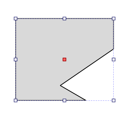
    I’m not very familiar with Krita’s shape tools, but it looks like complex shapes created via boolean operations result in a single shape object you can manipulate, so I would expect to be able to click on this object with the Text tool to fill it with text. For example, I created this object by making a rectangle and subtracting a polygon from it, and I would expect the text to fill the grey area:

In either case, if I click and then drag with the Text Tool, I expect to just make a regular text rectangle box (see above), ignoring any Path/Shape I may have touched.
In both cases, if the underlying path/shape is changed, I expect the text to re-flow. Not sure about deleting the path/shape.

CSS

As you can probably guess from all of the above, I do not expect or want to be editing the SVG and CSS when using the text tool. I mainly see it as an implementation detail in this case, and as such, I would be fine if the CSS parsing was somewhat strict and didn’t support every single way that CSS has to specify some of these different text properties.

17 Likes

@wolthera Thank you for your perseverance and hard work and also for educating us on how much work and research this project entailed. Congrats on this milestone!

2 Likes

Krita doesn’t have a concept of a toolbar that changes with the tool. :slight_smile: It has a tool options docker (which can be hidden in the toolbar). That said, it makes sense that the most used options are the most accessible, and I will need to play with ordering how far away the options are from the ‘main’ area of the docker. For other folks: I would love to hear which properties are the most important to you.

The CSS spec says that I should automatically squish the tate-chu-yoko into an em’s width, so you don’t (and won’t, CSS spec doesn’t allow customization there), have to squish it yourself.

The emphasis marks are actually mentioned in the big-projects list, they’re a slightly different thing than ruby.

The Ruby stuff has some interesting quirks that I am not going to go into until I’m ready to start implementing it. Let’s say that it’s the complete opposite of tate-chu-yoko in how configurable it’ll be.

Yeah, this was probably not clear when I tried to explain it on mastodon (because of the character limit), but I’m going to try and make sure all the relevant options have a widget. I will keep around the svg source edit (the rich text editor will go), but the expectation is that people won’t have to use it unless they’re being very nerdy.

Anyway, thanks a lot! I’ll be compiling a list of stuff from this and what other people find important and see what I can and cannot make work. Just wanted to comment on some places where I wanted to clarify my limitations and possibilities :smiley:

4 Likes

The lack of per-tool toolbars has been an annoyance for me for a while, it puts so many frequently-needed features behind extra clicks, while putting options I can’t use right in front of me xP

That is a very reasonable default, but sometimes one needs to have wider tate-chuu-yoko text because squishing it to 1em makes it illegible, but where vertical text is also hard-to-read. I’ve seen numerous print examples that were a fair bit wider than the column, fitting four-letter initialisms or five-digit numbers in - almost always headings, not multi-line text. I’m surprised CSS imposes such a harsh limitation! If possible, I’d love some sort of custom Krita property that allows us to override this.

Whoops, I totally missed the text emphasis marks bit! Glad to see that’s planned as its own thing. I’ll remove that section from the post.
I don’t expect Ruby to be available any time soon, but I hope my thoughts will be of some use in the future. As I mentioned though, I’ve not used any software that supports it, I think consistency with tools people are used to is more important than my preferences.

3 Likes

It looks like there’s a proposal on the CSSWG to change that, so it might be that this was an initial implementation detail. I’ll have to monitor how that develops.

1 Like

Great work @wolthera . I didn’t realize the scope of everything that was done. This is a very scary area of the code base, so it is really amazing you are diving into this.

I see some people are having a large list of features they want. The UI might have to grow organically as things get added.

The text tool hasn’t really had too many options compared to applications that have more text-heavy use cases. We might want to slowly add tabs with sections to start…then potentially break things out into multiple dockers as time goes on. I think the best course would be to incrementally change the UI as we slowly add functionality. We don’t have a large team working on this.

I am not sure if any of these ideas will be useful since it was done in 2016, but here were some wireframes from around that time when we were originally thinking of redoing the text tool…
https://phabricator.kde.org/M77

6 Likes

I’ll look forward to using this :slight_smile:

2 Likes

Hey, Bravo again for the huge work! :tada:

Here are my answers to your questions:

  • Quality of life
  • Oddly specific to my needs: exporting SVG text from Krita, and being able to edit them in Inkscape.
  • Easier to size text (not limited by a list of size presets, eg. 36pt then 48pt, I wish I could go 37pt, 38.5pt, etc… )
  • Quick prototyping of speechbubble (wrapping, line-break) while in focus on changing for the 10th time the line of a character. xD

Just using vector selection tools (or node selection). The Text objects could expose all these controls (+ a control to edit the text).

  • If I already have a shape: With vector selection tool, select text, (hold shift for multi-selection), select shape (both selected), right click menu → an option for that. (If the shape is two circle minus a rectangle, I would expect the user to manage the bolean operation prior to do the text-on-shape.)
  • If I went ahead with a simple ‘text-box’ rectangular frame (in case the text tool allows prototyping a shape like that with drag’n’drop at creation), I would like to be able to edit the box with the vector node tools. Adding nodes manually and moving them, for eg, transforming the box into a polygon. That’s a workflow I often did with Scribus.

Not on a docker, that’s sure for me because displaying them on demand is a pain: they change the current layout or appear on the smallest part of my screen. (I had to workaround that with workspaces only to display Recorder, Grid, or Alignments tools)

I like the idea of a hanging overlay with buttons.

Selecting the characters or words, then on a hanging overlay tray find the good tab with the buttons or sliders I need to adjust the properties. I like sliders (or widget I can “scroll” with mouse wheel), I dislike numerical entries only; because I like experimenting visually with “a bit bigger” or “a bit smaller” (for a size, a spacing, etc) and doing that with entering a number is longer and less intuitive. But keeping the numerical entry is also important, when I have good settings I need to match a new time.

Selecting the word in question, access a ‘advanced’ tab/page of an hanging overlay menu, and selecting the gradient from here. Basic mapping like angle, size, position could be managed via sliders (no need a WYSIWYG widget overlay with nodes appering over the word, IMO).

As soon as a blinking cursor invites you to enter a text; I would expect the Space/Navigation and shortcuts to be inhibited to help typing. A very modal mode. Ctrl+B for Bold, Ctrl+I for Italic, could work… Having possibility to get Ctrl+Z would be great.

7 Likes

FIrst of all huge thanks @wolthera for working on this! This is probably one of the aspects of Krita that need most catching up! I’m impressed with everythign you are planning to add!

I’ll try to keep my inputs and feedbacks to your questions short. But I may fail :slight_smile:

I mainly use Krita for illustration and sometimes for graphic novels. Text is generally used either as “artistic text”, i.e. big type, as a placeholder for text that I intend to to add later in a layouting software, or text in balloons. I generally work with latin type.

First of all let me say that these two things you are working on already do like 90% of what I was wishing Krita would do:

  • being able to edit text directly WYSIWYG on the canvas, as opposed to having a separate editor.
  • Being able to draw a bounding box for longer text and having text automatically flow in there.

Further things I would love to see implemented:

  • Having some control over kerning/letter spacing on a glyph basis. I.e. being able to change the kerning of a single glyph. This is most necessary on bigger text, since not all fonts are properly designed, and even the really well designed ones often need manual adjustment.
  • Paragraph spacing options, especially bottom margins. This is one of the things I use most when layouting text.
  • I would be ok with not having hyphenation, but it would be great if adding a hyphen would automatically add a new line break as well, that greatly speeds up the process.

Lastly – and this might sound a bit strange – I have to say that I would also probably rather have a text tool that doesn’t have too many features. Less but better.

I think having text-on-path or text-in-shape would be wonderful, although for me it’s more a “nice to have” feature, not an essential one.

I sometimes use text-on-path to put text around a circle, very rarely using other paths. text-in-shape can be useful for odd-shaped ballons in comics.
Ideally the workflow could be that one first creates the shape/path with the existing tools and then uses a dedicated text-on-path or text-in-shape tool to add text to it.

Not really sure in which way the three things you list differ, but here’s how I would love this to work:

  • case 1: If you click on the canvas (without dragging), a cursor appears and you can type in text. There’s no bounding box that you can change, this is for big, short text, where you don’t want to mess with a bounding box. For me this is more than 50% of the use cases.
  • case 2: you click and drag to create a bounding box. Once you lift the mouse the cursor appears inside the bounding box and you can start to type. Text automatically flows inside this bounding box.

For case 2, if you want to change the size of the bounding box we have two options:

  1. you use the text tool, hovering over the bounding box makes handles appear and you can resize it. Click and drag on the text to move it, simple click to edit the text.
    The transform tool would be used for transformation
  2. You use the vector editing tools. Both would work for me.

A bunch of dockers actually:

  • character: to edit all character properties
  • paragraph: to edit anything that is related to the paragraphs
  • styles: since you are planning that as well, character and paragraph styles would be amazing!

Using the dockers.
Creating a text would use the last used font + last used settings, or a default font + default setting in case of a new document. With the text or the text box selected you change the settings in the docker and see them reflected in real time on the canvas. Ideally you should be able to also just change the settings for a single glyph or word.

Good question!
It might be an idea do have a vector gradient tool that also works with the text? So that when you have it selected handles appear on the canvas? I’ll have to think about this one a bit more though. Not sure this would even be a priority for me. I’m fine with using text as a mask for a paint layer, or using layer styles.

4 Likes

I like this suggestion. How about having sub tabs in one single text docker? Like we have tabs in the grids and guides docker.

1 Like

To be clear, you’re suggesting that nodes and such can be edited inside the text tool?

So, while text-in-shape will have margin-options, padding between paragraphs is a bit awkward as each text-object is considered a single paragraph from the perspective of text-layout. Just wanted to clarify that.

Is the vibe here closer to…

  • Intimidating – So, ‘AAAH too many options, this is petrifying!’?
  • Annoying – So, ‘All these options are nice but I can’t find anything’?
  • Something else?

Do you need to be able to see all of these at the same time, or is one visible at a time fine?

Thanks for the feedback everyone, I’m continuing to note down everything!

1 Like

My expectations on how to use the text tool? I don’t use it too much but I have some thoughts considering what I read here

Interface with text tool

  • 1 click select text
  • 1 click drag moves the text
  • 2 clicks opens a canvas text input mode, hitting esc or changing layer would exit this mode
  • click on the corners to resize or rotate the text block

Interface with options

  • a text docker considering there are so many options this would help having space to expand if changes were done or moved around.
  • having a text block on the docker that in the end would mimic what was written on the canvas. Because the canvas display might have a weird formatting. Writing on one or the other would be essentially the same but the text on the docker would not be affected by size, colour or font type.
  • options to give spacing between letters, between lines, text size and colour. I think these would be the most essential options to be on top if possible.
  • option to transform text into vector paths or pixels
  • a section on the docker where you could select a target vector shape and also select an operation. These operations could be text inside a shape or text on its path and such. I feel this would work but would require you to know what is the name of the shape and that would be easier if vector layers could display the list of shapes they contain like some sublayer. I think here using copy paste to connect objects like inkscape does is the worst option possible. Maybe when using one of the operations you could see a canvas handle to adjust were something starts or ends on the path.
  • I think on canvas UI for extra options should be avoided as much as possible if they are not a point. Because there will always be the question were do you place it to not to be in the way and how much is too much and there will always be a case where it is in the way because it essentially is.
  • my thoughts on by passing on screen uis is to simply remember last used settings when creating a new text block making it only needed when wanting to make a change.

Well those are kinda my imaginary expectations for it but I have no idea how this will come out, the project just seems so big I think my ideas will fall short of this project real needs and ableness.

3 Likes

Sorry for using the word ‘node’. I was referring to the handle little squares that appear when the “Edit Shape Tool” is selected. I was thinking more decorative handles could appear to play with the line height or spacing between characters.

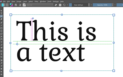
Here is a mockup I made that will be probably self-explanatory:

5 Likes

On second thought (I have been thinking about this a bit), I think this would be absolutely fine to me. Krita is not supposed to be a layouting tool and for text bubbles in comics this would work fine.

Well, maybe a bit of intimidating and just having a tool that is more focused. And I guess I just wanted to say that while I might have a lot of ideas, just having a text tool that works in the canvas and gives me the most important text-formatting tools, is already an amazing thing!

Good question. But maybe let me define some use cases.

Use case 1, artistic type
This could for example be the main typography on an album cover, probably the type would go a bit beyond just plain type. I might use gradients, masks, shadows. Maybe use the type as a mask for a paint layer. This would not be a lot of text, maybe even a few words. Likely I would not use a box, since each line of text would probably be a separate element, maybe even a separate layer.

Use case 2, quick placeholder text
This would probably involve bigger type (headlines) and body text. I often do this when creating an illustration that will have to partially serve as a background for text. Since the text here is just a placeholder, I generally don’t spent much time styling it. I just define the font size, colour and place the text roughly where it should be.

Use case 3: text in speech bubbles
In this case the font is fixed, most of the time even the font size. Each paragraph would be a separate element. Some words would need to be bold of emphasized. I generally keep type very simple and readable. If I do all-caps text (something I don’t do as often anymore) I am grateful for a feature that quickly lets me transform a sentence-case text in an uppercase one.

Use case 4: onomatopoeia in comics.
I just realized that could be another nice use case. Here colour, size, rotation and potentially warp effects would be really great.

There’s probably more use cases, but these are the ones I can think of from the top of my head.
One thing that emerges here is that it’s mostly about short text, even single words. The settings I would probably use most are size, colour, spacing (kerning) and generally what is found under “character” in other software packages. Paragraph settings would be of secondary importance. Although text alignment and line spacing are probably the ones I would use most.

The ones I would love to have easily reachable are probably: font, font style (italic, bold, black), size, kerning, colour, text alignment and line spacing.
For big text I would probably use Open Type features a lot.
I think styles would get used only rarely, now that I really go through what I usually did with text in Photoshop.

And to actually answer your question, I would be ok with having separate tabs for character, paragraph and styles.

I think this would work for me yes.

1 Like

I have to second this.
Oh and btw. one of the most annoying things in Photoshop is that when you select a bunch of glyphs and slighly move the mouse, a little pop-up shows up where you can change the glyph’s OT variants. In theory that’s useful, but most of the time it just gets in the way, because once this pop up shows up you can’t type anything anymore.

1 Like