I… don’t believe you understood.
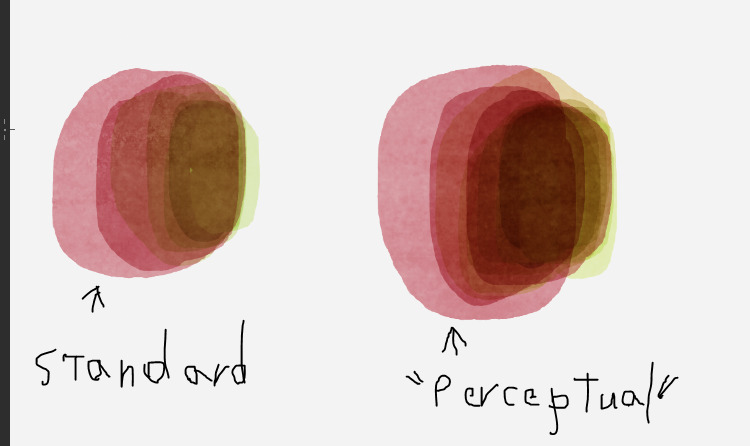
CLIP STUDIO PAINT has a brush option for color blending that allows for colors to blend “more naturally”, supposedly in a way that emulates closer to how the human eye perceives color blending.
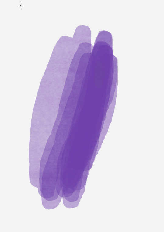
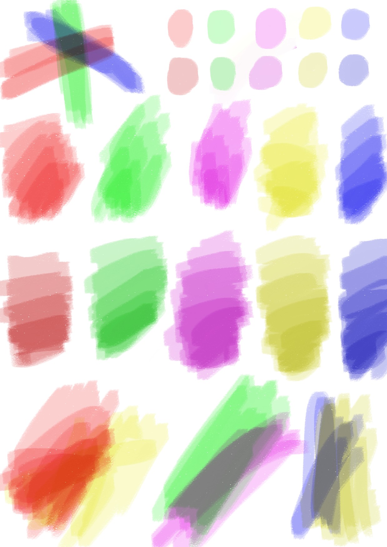
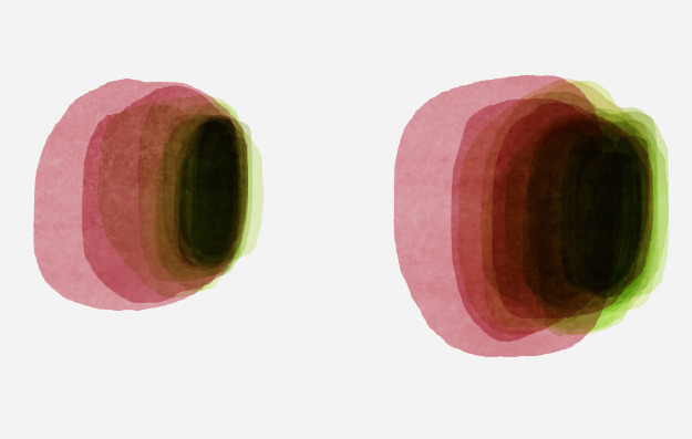
I have here a demo of what I am talking about. Other than changing between “Standard” color blending and “Perceptual” color blending with maximum brightness correct, the settings for the brush were unchanged. Which uses a Multiply mode for layering the colors to ensure it darkens.
The problem here is if you keep going you will eventually reach black regardless, as demonstrated here.
The desired feature is to make it so it cannot do that.
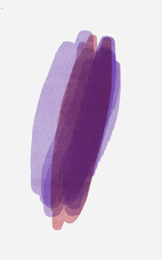
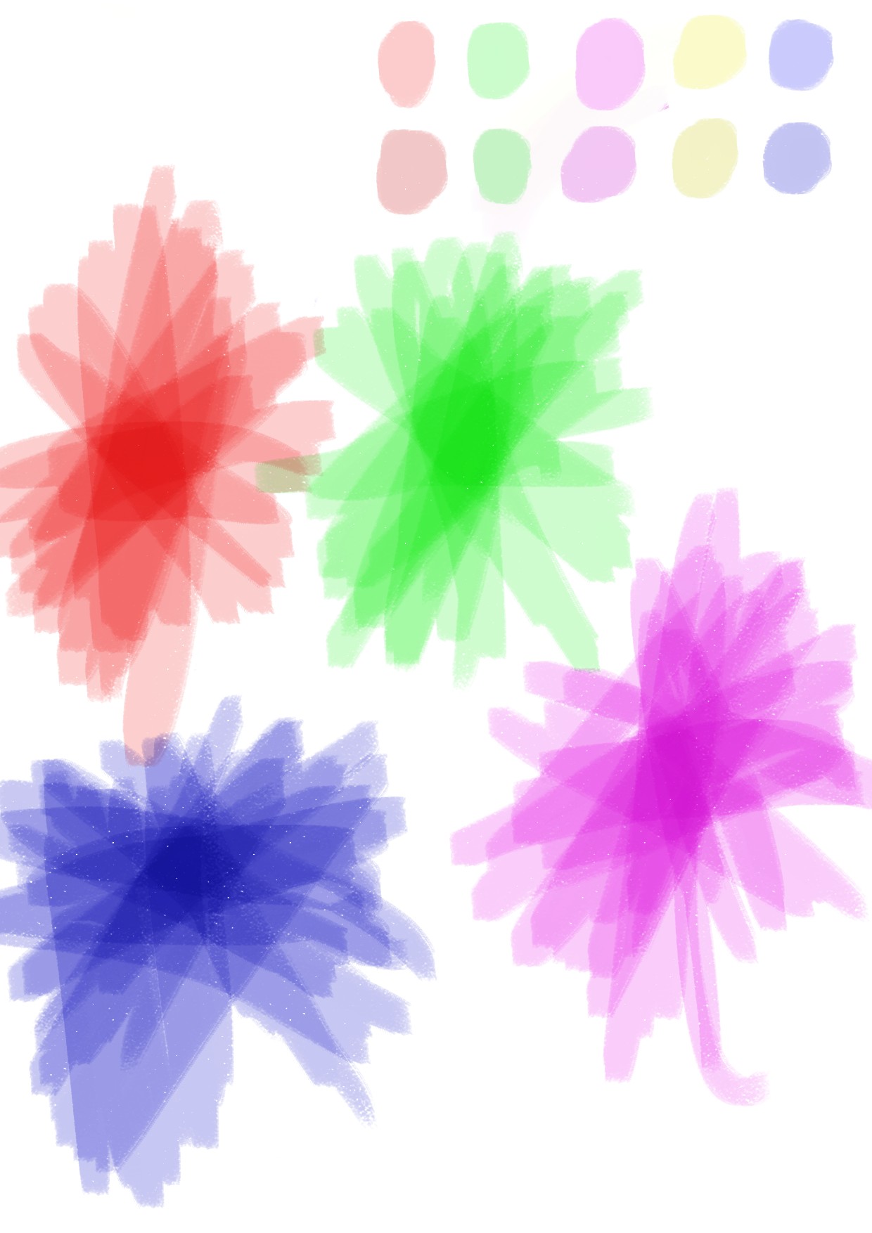
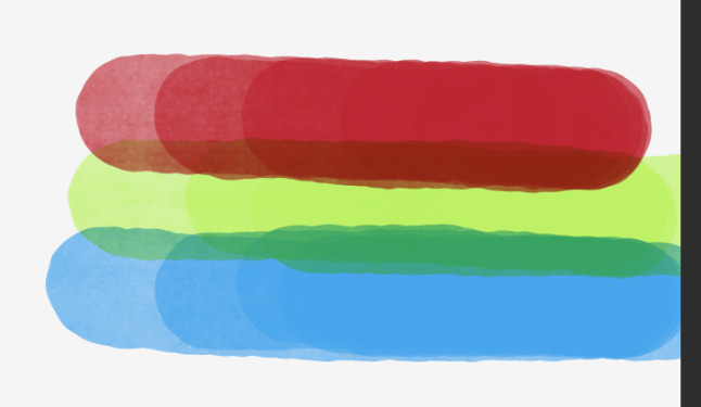
To make it so it will blend and darken, but only up until the color layered on top reaches maximum opacity/saturation, at which point it will not darken any further. To demonstrate the idea, I have here 3 colors that I chose (a Red, a Green, and a Blue) that I put the brush at 75% Opacity so that it reaches max opacity/color saturation for those colors in a bout 4 strokes.
All those layers on are the Multiply layer blending mode for the purpose of demonstration. While this is not the “Perceptual” color blending mode, this does demonstrate an idea of what the desired result is. I then layer them over the top of each other, and you get, of course, the expected result of a really muddy, dark color.
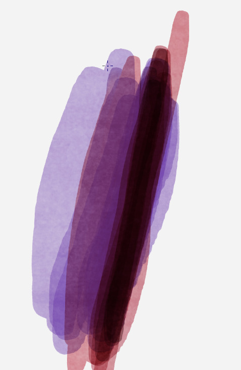
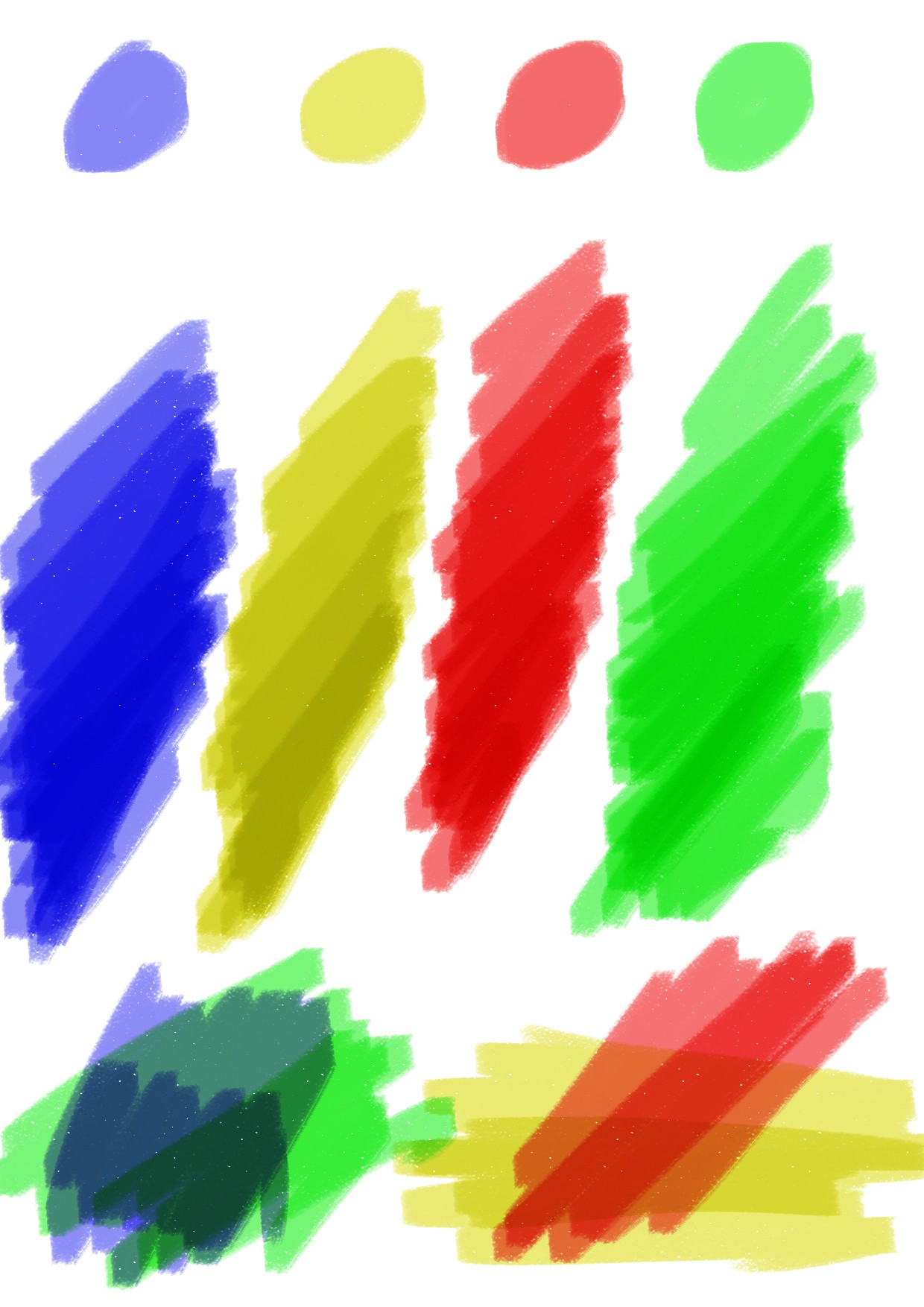
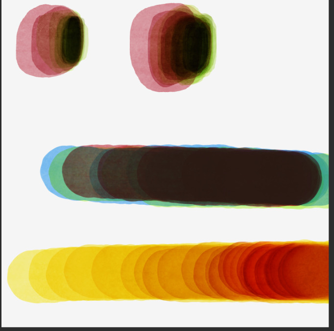
Contrast that with the previous ones shown above, where that was all done with just two colors, with the brush blending mode set to multiply, with perceptual color blending. In either case, if you keep going, even with a singular color, you will progressively reach black. I don’t show it going to black in the image below with the yellow but it does demonstrate the problem. The yellow below was done using the perceptual color blending mode, with the brush blending mode set to multiply.
If you are to emulate real markers, the color/ink/pigment cannot just continuously darken after reaching full ink saturation with a single color. The only way it should be able to darken any further, is to use a darker pigmented color of the same or similar color family, or a color that contrasts it such as blue, green, or red. But with current methods, the same problem as stated above, still applies. If you keep going, it will eventually reach black.
Am… I making any sense here, about why I think there needs to be a feature that limits this kind of thing? It would make the practice of trying to emulate this style of coloring a heck of a lot easier, and I’m sure it would be handy for emulating other mediums too whose colors work similarly.