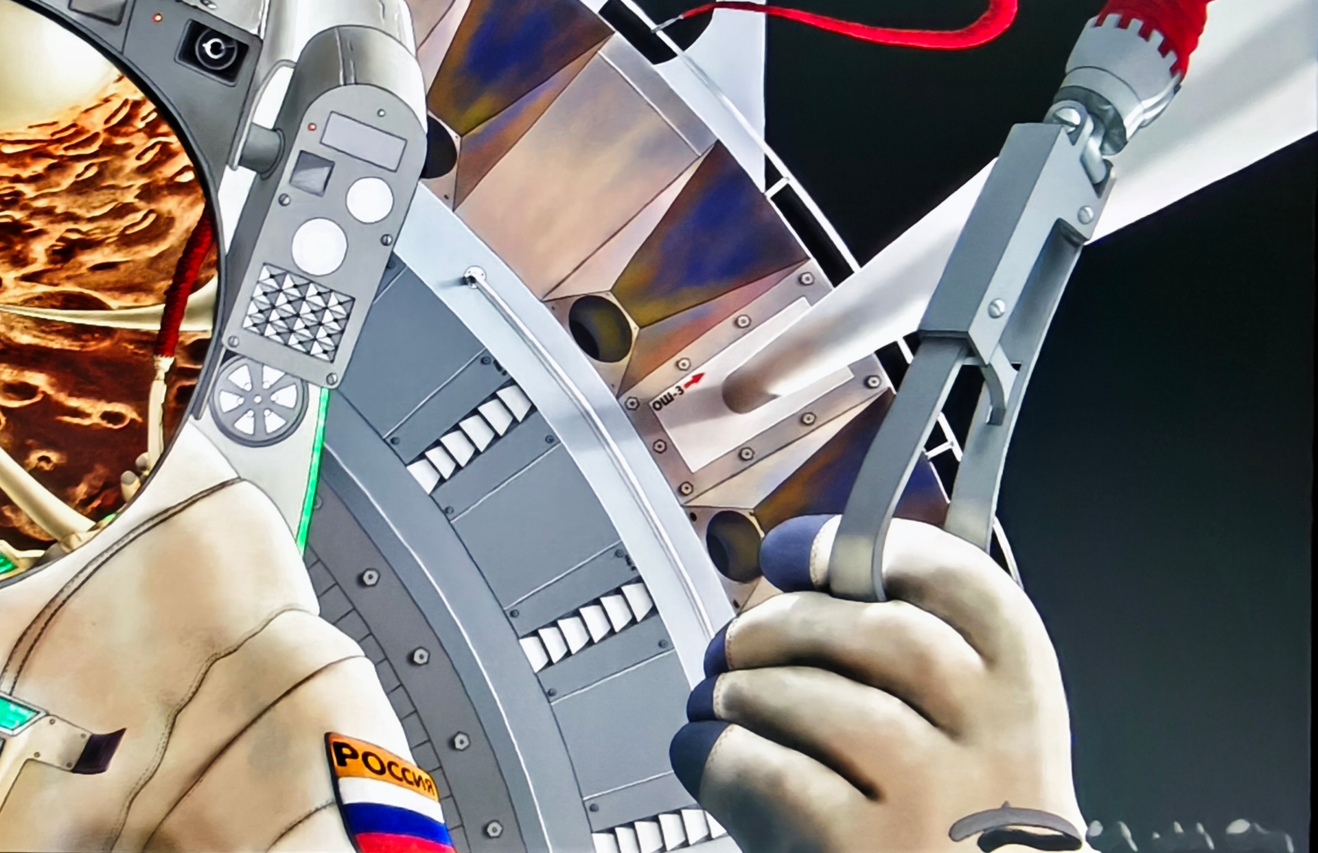
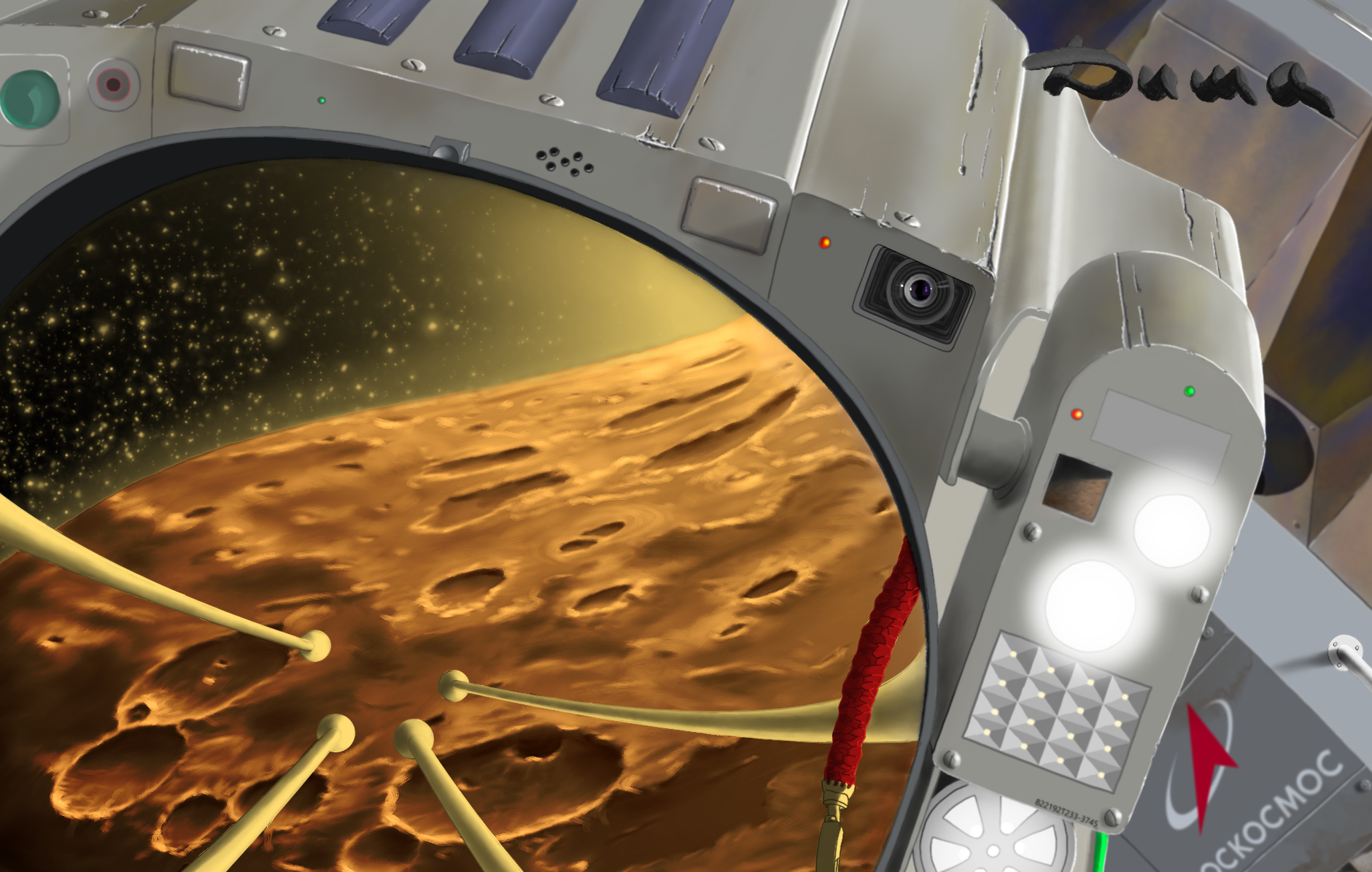
Hello everyone. Due to my main work, I’m progressing slowly, but there are some advantages to this, as it allows me to rethink the details of the drawing that I’m redesigning. Let me give you an example. In the story of my book, the technical staff is responsible for maintaining the functionality of the entire station. Most of the drawing is already complete. After taking a break for over a week, I opened the project, looked at my drawing, and realized… This astronaut is a technician. He has traveled such a great distance, and according to the plot, he has gone through a series of emergencies and breakdowns that he has had to fix, and in one of these emergencies, he almost lost his life. And yet, he has not shown any signs of the trauma he has experienced. NO, THIS IS NOT MY SPACE PILOT! I need to bring his character to a state that is consistent with the plot. His spacesuit should be worn and dirty from the repairs he has made, and his equipment should have signs of wear and tear from the challenges he has faced. The ship itself can’t look like a museum exhibit either, as this giant has undergone the harsh trials of space. Perhaps I went a bit overboard, but I personally like it because it reflects the storyline. All that’s left is to clean up a few things, correct any mistakes, sort out the necessary and unnecessary layers, which now number almost three hundred, play with color correction, and I hope I can stop there.
Всем привет. Из-за основной работы я медленно продвигаюсь, но в этом есть свои плюсы т.к. происходит переосмысление деталей рисунка которые я переделываю. Приведу пример. По сюжету моей книги, технический состав занимается подержанием работоспособности всей станции. Большая часть рисунка уже готова. Вынужденный перерыв больше недели, я открыл проект, посмотрел на свой рисунок и понимаю … Да как же так, этот Космонавт техник. Он преодолел такое колоссальное расстояние, по сюжету прошел через аварийные ситуации поломок которые устранял, а в одном из ч.п. даже чуть было не погиб. И всё это не оставило на нем отпечатков пережитого? НЕТ, ЭТО НЕ МОЙ КОСМОНАВТ! Нужно довести его образ до сюжетного состояния. Скафандр должен быть потрепан и испачкан в ходе ремонтов, на оборудовании должны быть следы сколов и повреждений от ударов судьбы. Сам корабль тоже не может выглядеть как музейный экспонат, этот исполин прошел суровые испытания космоса. Возможно я немного и перестарался, но лично мне нравится, потому что отражает задумку сюжета. Осталось совсем немного подчистить, подправить ляпы, разобраться в нужных и ненужных слоях которых сейчас почти триста, немного поиграюсь с коррекцией цвета и надеюсь на этом я смогу остановиться.
4 Likes
The drawing is in 4K, so I made two cuts out of the image so you can see the level of detail.
Рисунок выполнен в 4К, поэтому я сделал два выреза из картинки чтобы вы могли увидеть масштаб детализации.
I’ve finished the astronaut project, and it was very difficult for me. But I overcame myself, and you can see the result in the finished projects section. Mars 2 total, it took me about three months, but that doesn’t mean I spent all three months sitting in front of my tablet. It was like this. I spent an average of three hours a day for those three months. Remember, it’s up to you to achieve the desired result. Let’s say we’re working for the same publishing house, and I don’t need your results. You’re my competition, and your weakness is my victory, because my drawings will be included in the book’s print run. What? Did I hit a nerve? Ha Ha Ha… That’s how things work in life. So, even though it’s a long way to go and it’s difficult to climb a mountain, you still need to keep going. Or are you unsure of your abilities as an artist, afraid of your creative ambitions, too shy to be yourself, succumbing to your weaknesses, and giving up on your goals? No? Well, then what are we sitting here for? Who are we waiting for? Let’s go! Let’s draw, draw, draw. And to avoid getting mentally exhausted, burning out psychologically, and losing motivation, draw until you feel that the decision is taking too long, your hand is no longer laying it down the right way, and you’re pressing Ctrl+Z more often. Save your work with Ctrl+S and immediately do something completely different, like cooking meat, making a salad, cleaning your room, visiting friends, or coming up with new ideas. The main thing is a sharp change in the way of thinking and action. Don’t think about the drawing, leave it for tomorrow, everything will be, but tomorrow. Remember, your goal is to complete what you started. Please ask yourself a question. Do I want to draw? And now the most difficult thing is to answer this question honestly…
Проект космонавт я закончил, для меня он оказался очень трудным. Но я победил себя, можете посмотреть на результат в разделе готовых работ. Mars 2 В общей сложности у меня ушло на это около трёх месяцев, но это вовсе не значит что я сидел за планшетом все три месяца, не вставая. Значит было так. В день я тратил плюс минус по три часа, в течении этих трёх месяцев. Запомните одно, вам и только вам, нужен результат, так идите к нему. Допустим мы работаем на одно издательство, мне ваш результат не нужен, вы для меня соперники, ваша слабость это моя победа, потому что мои рисунки пойдут в тираж книги. Что! Задело за живое? Ха Ха Ха… В жизни именно так и происходит. Поэтому, да далеко идти, да идти в горку трудно, но идти то нужно. Или вы не уверенны в себе как художник, испугались своих творческих амбиций, струсите быть собой, поддались своим слабостям, сдались откладывая всё на потом? Нет? Ну тогда чего сидим? Кого ждём? Вперёд! Рисуем, рисуем, рисуем. А вот чтоб не надорваться морально, не выгореть психологически , не потерять стимул, рисуйте до момента пока вы не почувствуете что решение даётся с задержкой, рука уже не так кладёт, стали чаще жать Ctrl+Z, всё, стоп. Сохраняйтесь Ctrl+S и бегом делать что то совершенно другое, например мясо пожарьте, салатик нарежьте, наведите в комнате порядок, сходите к знакомым, придумайте что то. Главное это резкая смена образа мышления, и действий. Не думайте о рисунке, оставьте на завтра, всё будет, но завтра. Помните, ваша цель завершить начатое. Прошу вас, задайте себе вопрос. Хочу ли я рисовать? А теперь самое трудное, это ответить себе на этот вопрос честно…
4 Likes
Like poetry ![]()
Well said and nice painting.
1 Like
@TBs_thename Thank you ![]() , it’s very nice when someone enjoys watching your work. I tried to put some motivation into my message, as I’ve encountered a lack of motivation among some artists on the forum. They may be doing a great job, but they’re not pushing their limits to their full potential.
, it’s very nice when someone enjoys watching your work. I tried to put some motivation into my message, as I’ve encountered a lack of motivation among some artists on the forum. They may be doing a great job, but they’re not pushing their limits to their full potential.
Спасибо, очень приятно когда работа доставляет кому то удовольствие от просмотра. В своё обращение я постарался вложить мотивацию, общаясь на форуме я неоднократно сталкивался с её отсутствием у некоторых художников. Вреде бы как всё у них здорово получается но не дожимают свои возможности хотя могут.
1 Like
Try to understand me as accurately as possible (if the translation is confusing, translate my original Russian text yourself in your own translators; it’s possible that much of the meaning will change).
##Mirror
How to make our brain believe that there is a Mirror? Very simple, you need to deceive it! Let’s learn together to lie to our head!? Yes, I know, this is very bad, but in this case, as we say, this is a lie for the good. ![]() I warn you, I will not try to bring the pictures to the ideal, they will be slanted and crooked. My goal is to do everything quickly and as simple as possible. I recommend that if you decide to practice, do it easily and naturally. You should feel like you’ve done it before. We’ve agreed to lie.
I warn you, I will not try to bring the pictures to the ideal, they will be slanted and crooked. My goal is to do everything quickly and as simple as possible. I recommend that if you decide to practice, do it easily and naturally. You should feel like you’ve done it before. We’ve agreed to lie. ![]() Get in the right mindset, like, “I already knew it was easy, and it only took five minutes.” From what I’m showing you, it’s very important to understand the essence of how and why it worked, and to learn how to understand your own brain, at what stage it started to believe in the mirror, and why and what exactly made it believe. And as soon as it starts to realize that you’re lying to it again, it means that something went wrong with the drawing. Stop! Put the drawing aside for a day or two, but no more than that, because after three days, you’ll lose touch with both the drawing and your brain. I’ve been through this before, and I’ll have to start from the beginning again, and it’s not guaranteed to work. But before that, flip the canvas horizontally or vertically, and now save the project and distract yourself as much as possible for a couple of days. After a day or two, when you open the project, it will appear upside down. Pay attention, this is very, very important, step back from the screen a distance of 1.5 to 2 meters, recline on your throne, relax, and simply observe the image. The secret lies in the fact that this is something new for your brain, and it begins to process information in its own way. You won’t be able to understand it, so don’t even try. Let it live its own life for five minutes. In five minutes, all your mistakes will be on full display. Think about how and what needs to be corrected and get to work. At the end, flip the drawing back and save it. Tomorrow, when you open it, you won’t believe that you drew it. No need to thank
Get in the right mindset, like, “I already knew it was easy, and it only took five minutes.” From what I’m showing you, it’s very important to understand the essence of how and why it worked, and to learn how to understand your own brain, at what stage it started to believe in the mirror, and why and what exactly made it believe. And as soon as it starts to realize that you’re lying to it again, it means that something went wrong with the drawing. Stop! Put the drawing aside for a day or two, but no more than that, because after three days, you’ll lose touch with both the drawing and your brain. I’ve been through this before, and I’ll have to start from the beginning again, and it’s not guaranteed to work. But before that, flip the canvas horizontally or vertically, and now save the project and distract yourself as much as possible for a couple of days. After a day or two, when you open the project, it will appear upside down. Pay attention, this is very, very important, step back from the screen a distance of 1.5 to 2 meters, recline on your throne, relax, and simply observe the image. The secret lies in the fact that this is something new for your brain, and it begins to process information in its own way. You won’t be able to understand it, so don’t even try. Let it live its own life for five minutes. In five minutes, all your mistakes will be on full display. Think about how and what needs to be corrected and get to work. At the end, flip the drawing back and save it. Tomorrow, when you open it, you won’t believe that you drew it. No need to thank ![]() . I’ll be genuinely happy if you post the result of your trial here. Don’t hesitate, no one will vote, but I guarantee that we’ll discuss your strengths and weaknesses. I usually respond within two to three days. Well, how else can you figure yourself out, only through communication, practice, mistakes, and fair criticism. This is how any skill develops. My dear creative souls, do you want to create miracles, to create miracles on your tablets? Why are we sitting here? Who are we waiting for? Let’s get started…
. I’ll be genuinely happy if you post the result of your trial here. Don’t hesitate, no one will vote, but I guarantee that we’ll discuss your strengths and weaknesses. I usually respond within two to three days. Well, how else can you figure yourself out, only through communication, practice, mistakes, and fair criticism. This is how any skill develops. My dear creative souls, do you want to create miracles, to create miracles on your tablets? Why are we sitting here? Who are we waiting for? Let’s get started…
First, in any drawing, we need to understand what we want to achieve. Therefore, the size and ratio are crucial. For example, if you want to show the scale of what is happening, I recommend using a wide-format canvas. A person has a broad perspective on the world. We see everything except what’s under our feet, so we sometimes stumble, and we see everything except what’s above our heads, so we get bruises. It is very good to use this format in landscapes, @malee is very good at doing this with one of his drawings of nature. Fisherman or, for example, the magnificent scale of a city street was demonstrated to us by @holdrmb in his work My Second Hometown It is very advantageous to use a wide format in fantastic landscapes, as @valquer did in his apocalyptic story. The Last City on Earth - Valquer Jose A vivid example of a successful application the inverted wide format was used by @lukoart in his work Hai Shen - Murena - Artwork A wide format is also beneficial for mass battles, as it is important to show a large number of events in them. A vivid example is @canedo’s work, which is stunning with its numerous mini-scenes on a single canvas. You can spend more than an hour and still miss something (I only noticed the cat after the third viewing). King-under-Leaves Final Illustration
Let’s take a moment to summarize the above. If you need to maximize the scale of what’s happening, or if you need to fit in as much as possible, the most popular wide format today is 4K Digital Cinema Initiatives 1.9:1 4096x2160 300ppi, which allows for any scale. Not everyone’s computer can handle this, so you can reduce the load a bit and use 4K UHD 16:9 3840x2160 or even easier UW 4K 2.4:1 3840x1600 ppi 300 If you don’t plan to print your work, you can further reduce the load on your computer. Choose the ppi based on your monitor’s capabilities, as specified in the settings. It’s not a big deal for me, as I still set all my projects to 300 ppi, and my PC’s power is sufficient. On average, my projects are 4-6 GB in size, with around 200 layers.
I’ve strayed from the topic a bit, and I’ve probably confused you, but if you’re interested, I’ll talk about other formats next time, specifically where and which ones are more advantageous or convenient to use. For now, let’s return to the reflection in the mirror.
![]()
Зеркало
Как заставить наш мозг поверить в то, что на рисунке оно есть? Очень просто, его нужно обмануть! Давайте вместе учиться врать нашей голове!? Да я знаю, это очень нехорошо, но в этом случае как у нас говорят, эта ложь во благо. ![]() Предупреждаю, я не буду стараться выводить картинки до идеала, они будут косые и кривые. Моя цель сделать всё быстро и максимально просто. Рекомендую, если вы решите потренироваться, делайте это легко и непринуждённо. У вас должно быть чувство что вы это уже делали. Мы ведь договорились врать.
Предупреждаю, я не буду стараться выводить картинки до идеала, они будут косые и кривые. Моя цель сделать всё быстро и максимально просто. Рекомендую, если вы решите потренироваться, делайте это легко и непринуждённо. У вас должно быть чувство что вы это уже делали. Мы ведь договорились врать. ![]() Настройтесь именно на такую волну, да я уже знал, да легко, и это всего то, дайте пять минут и всё готово, для меня это уже не впервой… Из того что я вам показываю, очень важно понять суть, как и почему это сработало, научитесь понимать свой мозг, на каком этапе он начал верить в зеркало, почему и что именно заставило его верить. И как только он начинает понимать что вы опять врёте ему, значит что то пошло в рисунке не так. Стоп! Срочно отложите рисунок на день, два, но не более, за три дня потеряете связь и с рисунком и вашим мозгом. Я это уже проходил не раз, придётся начинать с самого начала и не факт что получится. Но перед этим отразите холст горизонтально или вертикально, а теперь сохраните проект и отвлеките себя максимально на пару дней. Через день, два, открыв проект он возникнет перед вами перевёрнутым. Внимание, это очень, очень важно, отодвинтесь от экрана на полтора два метра, откиньтесь на своём троне поудобней, расслабтесь и просто рассмотрите этот рисунок. Секрет в том что для мозга, это что то новое, и у него начинаются свои процессы, вам их не понять, даже не пытайтесь, пусть он пять минут поживёт своей жизнью. Через пять минут все ваши ошибки всплывут как на ладонях. Подумайте как и что нужно исправить и работайте. В конце переверните рисунок обратно и сохранитесь. Завтра открыв его, вы не поверите что это рисовали вы. Не надо не благодарите
Настройтесь именно на такую волну, да я уже знал, да легко, и это всего то, дайте пять минут и всё готово, для меня это уже не впервой… Из того что я вам показываю, очень важно понять суть, как и почему это сработало, научитесь понимать свой мозг, на каком этапе он начал верить в зеркало, почему и что именно заставило его верить. И как только он начинает понимать что вы опять врёте ему, значит что то пошло в рисунке не так. Стоп! Срочно отложите рисунок на день, два, но не более, за три дня потеряете связь и с рисунком и вашим мозгом. Я это уже проходил не раз, придётся начинать с самого начала и не факт что получится. Но перед этим отразите холст горизонтально или вертикально, а теперь сохраните проект и отвлеките себя максимально на пару дней. Через день, два, открыв проект он возникнет перед вами перевёрнутым. Внимание, это очень, очень важно, отодвинтесь от экрана на полтора два метра, откиньтесь на своём троне поудобней, расслабтесь и просто рассмотрите этот рисунок. Секрет в том что для мозга, это что то новое, и у него начинаются свои процессы, вам их не понять, даже не пытайтесь, пусть он пять минут поживёт своей жизнью. Через пять минут все ваши ошибки всплывут как на ладонях. Подумайте как и что нужно исправить и работайте. В конце переверните рисунок обратно и сохранитесь. Завтра открыв его, вы не поверите что это рисовали вы. Не надо не благодарите ![]() . Буду искренне рад если выложите сюда результат вашей пробы. Не стесняйтесь, никто здесь голосовать не будет, а вот обсуждение сильных и слабых сторон, я вам гарантирую. Обычно я реагирую в течении двух трёх дней. Ну, а как еще разобраться в себе, только благодаря общению, практике, ошибкам, и справедливой критике. Так происходит развитие любых навыков. Милые мои творческие души, вы хотите творить чудеса, именно творить чудеса на своих планшетах? Чего сидим? Кого ждём? Поехали…
. Буду искренне рад если выложите сюда результат вашей пробы. Не стесняйтесь, никто здесь голосовать не будет, а вот обсуждение сильных и слабых сторон, я вам гарантирую. Обычно я реагирую в течении двух трёх дней. Ну, а как еще разобраться в себе, только благодаря общению, практике, ошибкам, и справедливой критике. Так происходит развитие любых навыков. Милые мои творческие души, вы хотите творить чудеса, именно творить чудеса на своих планшетах? Чего сидим? Кого ждём? Поехали…
Для начала в любом рисунке нужно понять, что мы хотим в итоге получить. Поэтому размер и соотношение играет значение. Например, если хотите показать масштаб происходящего, советую делать холст широкоформатным. У человека широкое видение мира. Мы видим всё кроме того что у нас под ногами, поэтому иногда спотыкаемся и кроме того что над головой, поэтому набиваем шишки. Очень хорошо этот формат применять в пейзажах, это очень хорошо умеет делать @malee один из его рисунков природы Fisherman или например шикарный масштаб городской улицы нам продемонстрировал @holdrmb в своей работе My Second Hometown Очень выгодно использовать широкий формат и в фантастических пейзажах, как например это сделал @valquer в своей апокалипсической истории The Last City on Earth - Valquer Jose Яркий пример удачного применения перевёрнутого широкого формата использовал @lukoart в своём произведении Hai Shen - Murena - Artwork Также широкий формат выгоден для массовых баталий, так как в них важно показать большое количество событий. Яркий пример работа @canedo она потрясает количеством мини сцен на одном холсте, можно потратить больше часа и всё равно что то пропустить (я например кота разглядел только после третьего просмотра) King-under-Leaves Final Illustration)
Итак подведём промежуточный итог выше сказанного. Если вам нужно максимально раскрыть масштаб происходящего, или нужно впихнуть столько что оно не впихивается, то на сегодня самый популярный широкий формат 4K Digital Cinema Initiatives 1,9:1 4096x2160 300ppi позволит реализовать любой размах. Не у всех компьютер выдержит такое издевательство, поэтому можно немного сбавить нагрузку и использовать 4K UHD 16:9 3840x2160 или ещё полегче UW 4K 2,4:1 3840х1600 ppi 300 Если вы не планируете печатать свою работу, то можно ещё облегчить загрузку компьютера. Выбирайте ppi по возможностям своего монитора, смотрите в настройках. Для меня это не критично, я всё равно ставлю все проекты на 300 ppi, мощности моего пк хватает. В среднем мои проекты 4-6 гигабайта, около 200 слоёв.
Я немного отошел от темы, и вероятно заморочил вам голову, но если вам это интересно, то в следующий раз расскажу о других форматах, а точней о том где и какие из них выгодней или удобней использовать. Давайте вернёмся к отражению в зеркале.
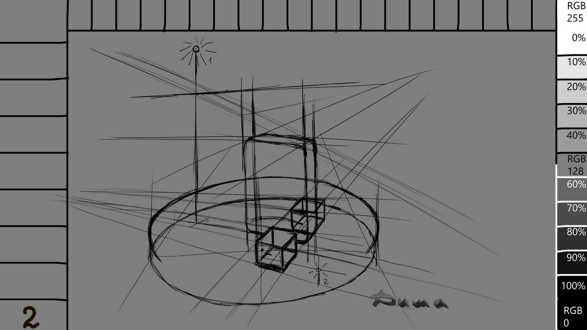
1 I have an idea how to show you, and I’m making a stroke. Krita has tools for working with perspective, and they are unique and very, very convenient and diverse, and most importantly, easy to learn. I admit that I rarely use them, as I’m afraid of becoming addicted to them. ![]() Therefore, I’m looking for the right angle on my own, the old-fashioned way. Of course, I had several options, but this one was the most suitable because it was more visual.
Therefore, I’m looking for the right angle on my own, the old-fashioned way. Of course, I had several options, but this one was the most suitable because it was more visual.
![]()
1 У меня появилась идея как вам показать и я делаю штрих. В Krita есть инструменты для работы с перспективой, они уникальны и очень, очень удобные и разнообразны, а главное просты в освоении. Признаюсь, я редко ими пользуюсь, боюсь впасть в их зависимость ![]() . Поэтому ищу подходящий ракурс самостоятельно, по старинке. Конечно у меня было несколько вариантов но устроил именно этот, так как более нагляден.
. Поэтому ищу подходящий ракурс самостоятельно, по старинке. Конечно у меня было несколько вариантов но устроил именно этот, так как более нагляден.
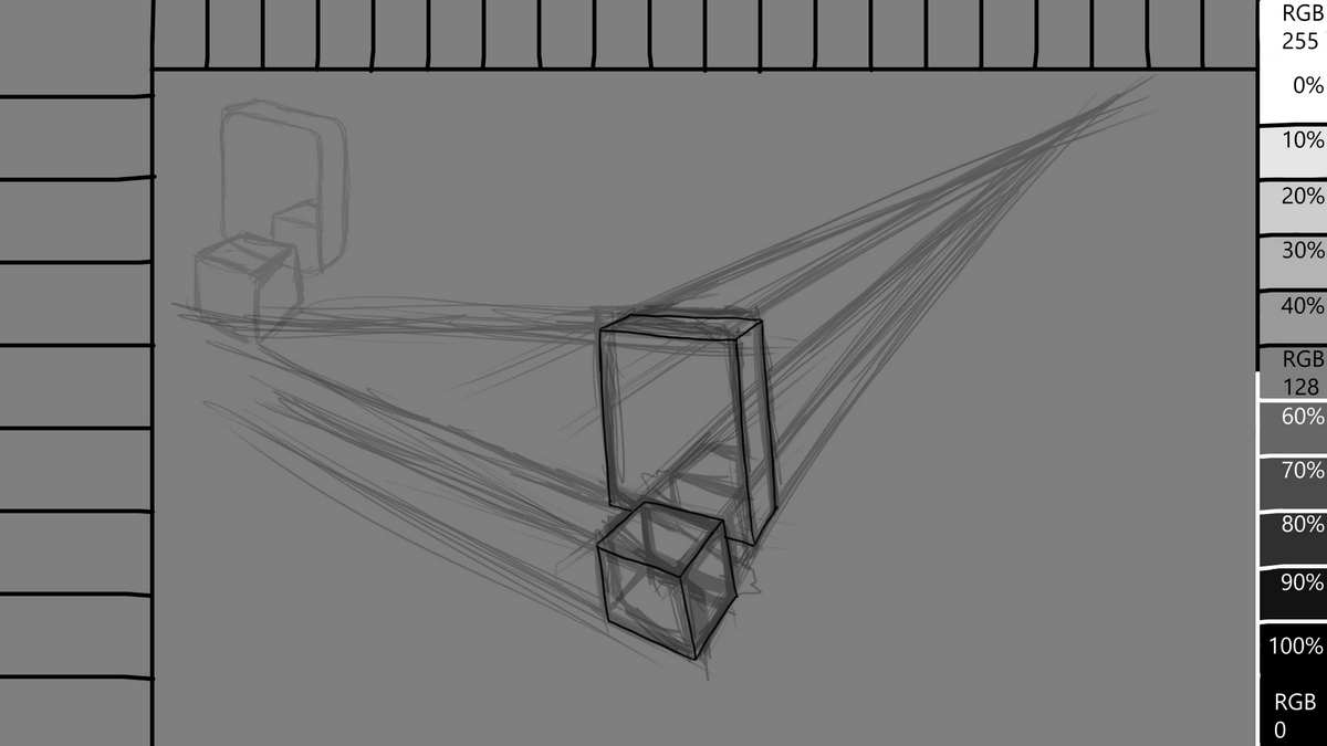
2 I want to reassure you, in drawing, all perspective directions should be on the verge of reality and fiction, our task is to draw, not to draw. Yes, it is necessary to adhere to the laws of perspective and this is important, but only adhere and no more. Although sometimes the conditions of the plot may require you to be extra accurate with the lines, then and the perspective tool Krita will help you. Therefore, train your abilities by eye. By the way, did you know that in art, rulers are not prohibited. I didn’t know either, until this moment.
2 Хочу вас успокоить, в рисовании все перспективные направления должны быть на гранях реальности и вымысла, наша задача рисовать, а не чертить. Да придерживаться законам перспективы нужно и это важно, но только придерживаться и не более. Хотя иногда условия сюжета могут и потребовать от вас сверх точности линий, вот тогда и перспективный инструмент Krita вам в помощь. Поэтому тренеруйте свои способности на глазок. К стати вы знали что в искусстве, линейки не запрещены. Я тоже не знал, до этого момента.
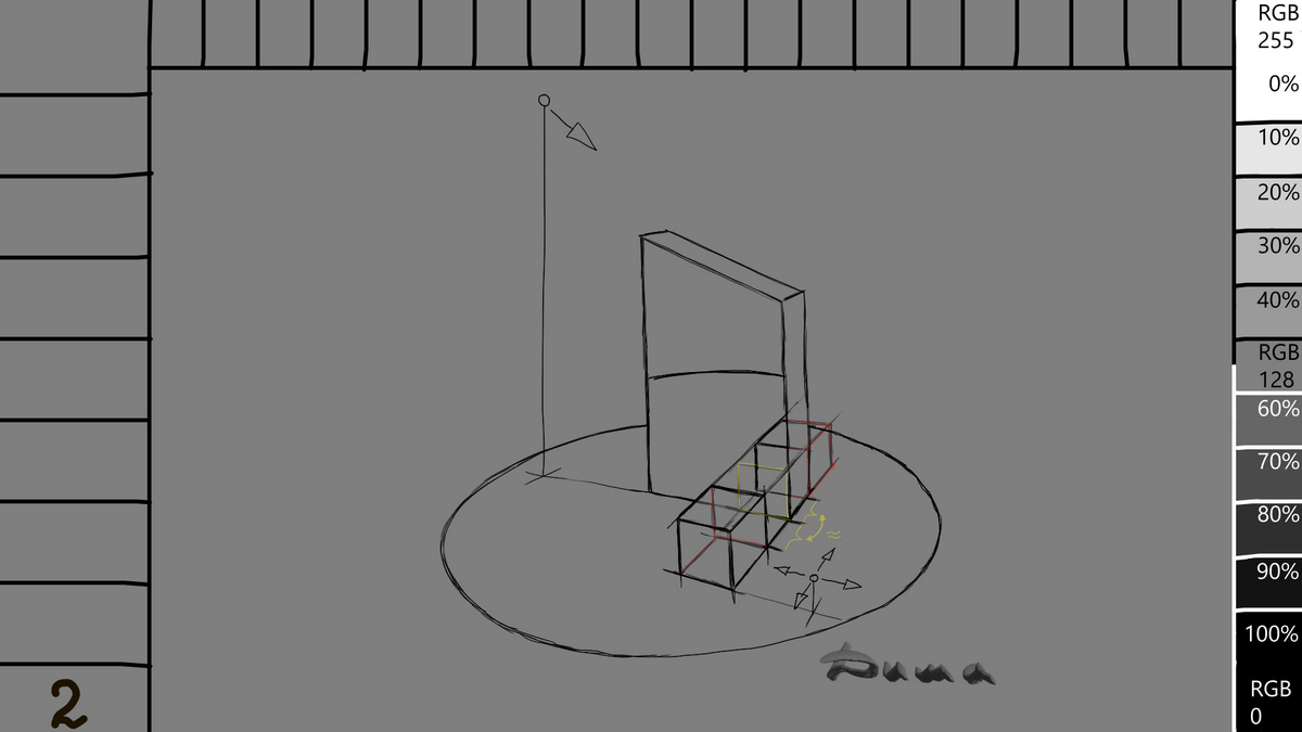
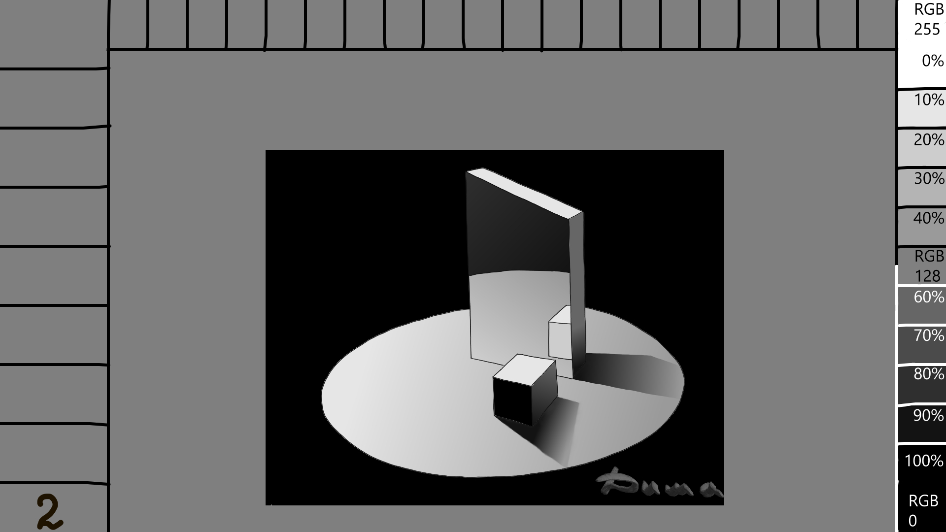
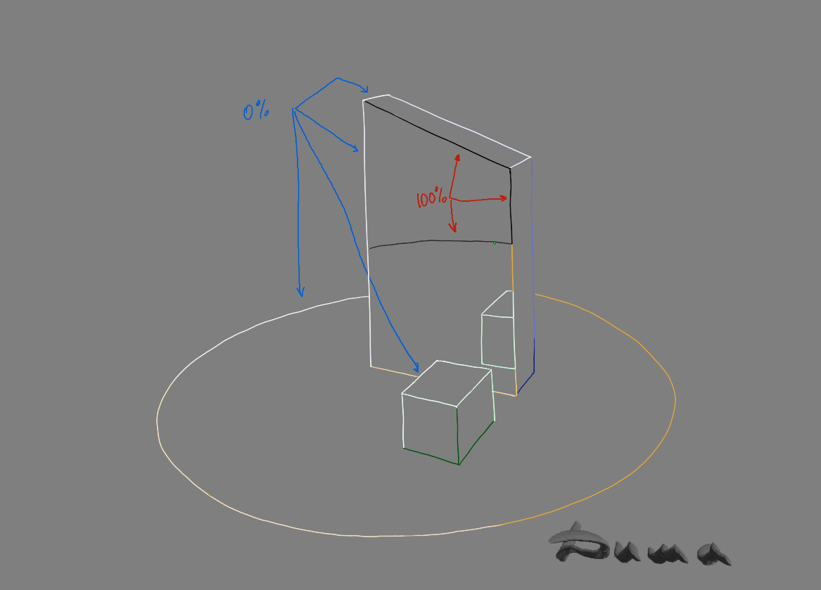
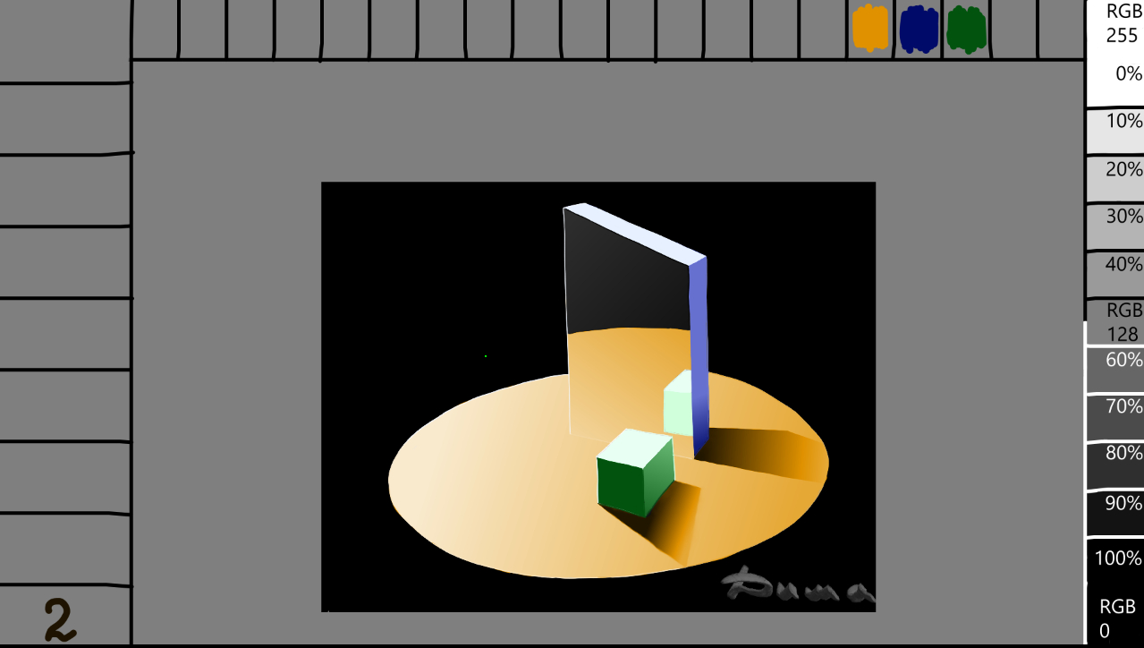
3 In my opinion, the reflection of the cubes in the glass should be like this. I outline one directional light at the top, and place the second light behind the cube.
The first light can be anything, such as the sun, a lamp, or a candle. In my case, it’s a lantern that’s slightly above the mirror and aligned with it. The second light can also be anything, but it’s usually weaker than the main light. Otherwise, the image will be flat and overexposed. There’s a great way to make your work even more interesting by using a third color that’s different from the others. But it will take a lot of practice, because it’s a challenging level. In my drawing, there is light from the Sun, light from the astronaut’s headlamp, a reflection from Mars, and a reflection on the module from the side light. I’m not boasting, I’m just giving you an example. https://krita-artists.org/uploads/default/original/3X/4/f/4fa44d2d417a3fe9ac1ab436f1df055ee80fb5c1.jpeg You can use very strong and sharp contrast if it’s necessary for your story. Here is a vivid example of such a trick by @asknarin in the drawing DnD Elf Sorcerer. You will agree, an amazing effect. In my case, the second, this is diffuse light, just to highlight the volume of forms, this is the light that bounced back from the bright surface behind the cubes, this is Reflex. Ideally, you need to add a little color to the surface on the cube. But today we are talking about reflection in a mirror, and reflex is a separate topic if you want.
3 На мой взгляд отражение кубиков в стекле должно быть таким. Намечаю в верху одно направленное освещение, а второе ставлю за кубиком.
Первое может быть чем угодно, солнцем, лампой, свечой… В моём случае это фонарь, он чуть выше зеркала и находится на одной линии с ним. Второе освещение тоже может быть чем угодно, но как правило слабее основного. В противном случае, рисунок будет плоским, засвеченным. Есть хороший способ сделать вашу работу еще интересней, применив третий оттенок цвета отличный от остальных. Но для этого потребуется много тренироваться, потому что это достаточно сложный уровень. В моём рисунке есть свет от Солнца, свет от налобного фонаря у космонавта, рефлекс от Марса, и отражение на модуле от габаритного огня. Я не хвалюсь, просто привожу пример https://krita-artists.org/uploads/default/original/3X/4/f/4fa44d2d417a3fe9ac1ab436f1df055ee80fb5c1.jpeg Можно применять очень сильный и резкий контраст, если это вам нужно по сюжету. Вот яркий пример такой хитрости у @asknarin в рисунке DnD Elf Sorcerer Согласитесь, потрясающий эффект. В моём случае второй, это рассеянный свет, просто для подсветки объема форм, это свет который отскочил в обратном направлении от яркой поверхности за кубиками, это Рефлекс. В идеале нужно немного добавить цвет поверхности на кубик. Но сегодня мы говорим об отражении в зеркале, а рефлекс это отдельная тема если захотите.
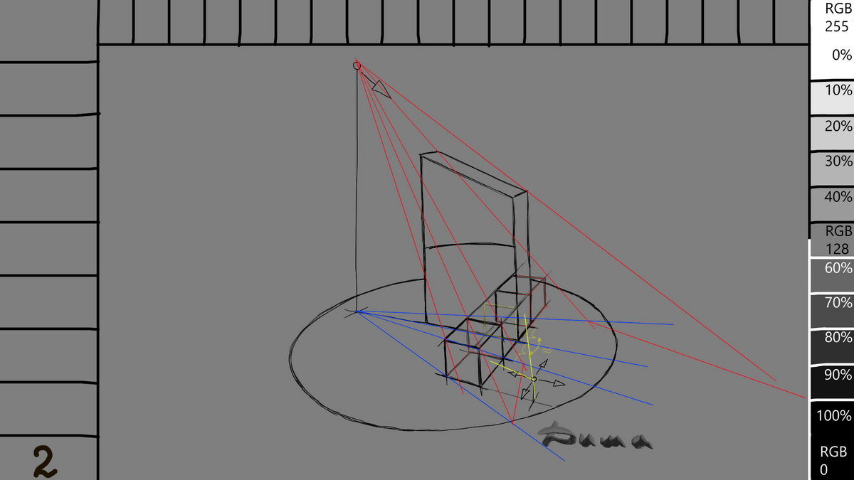
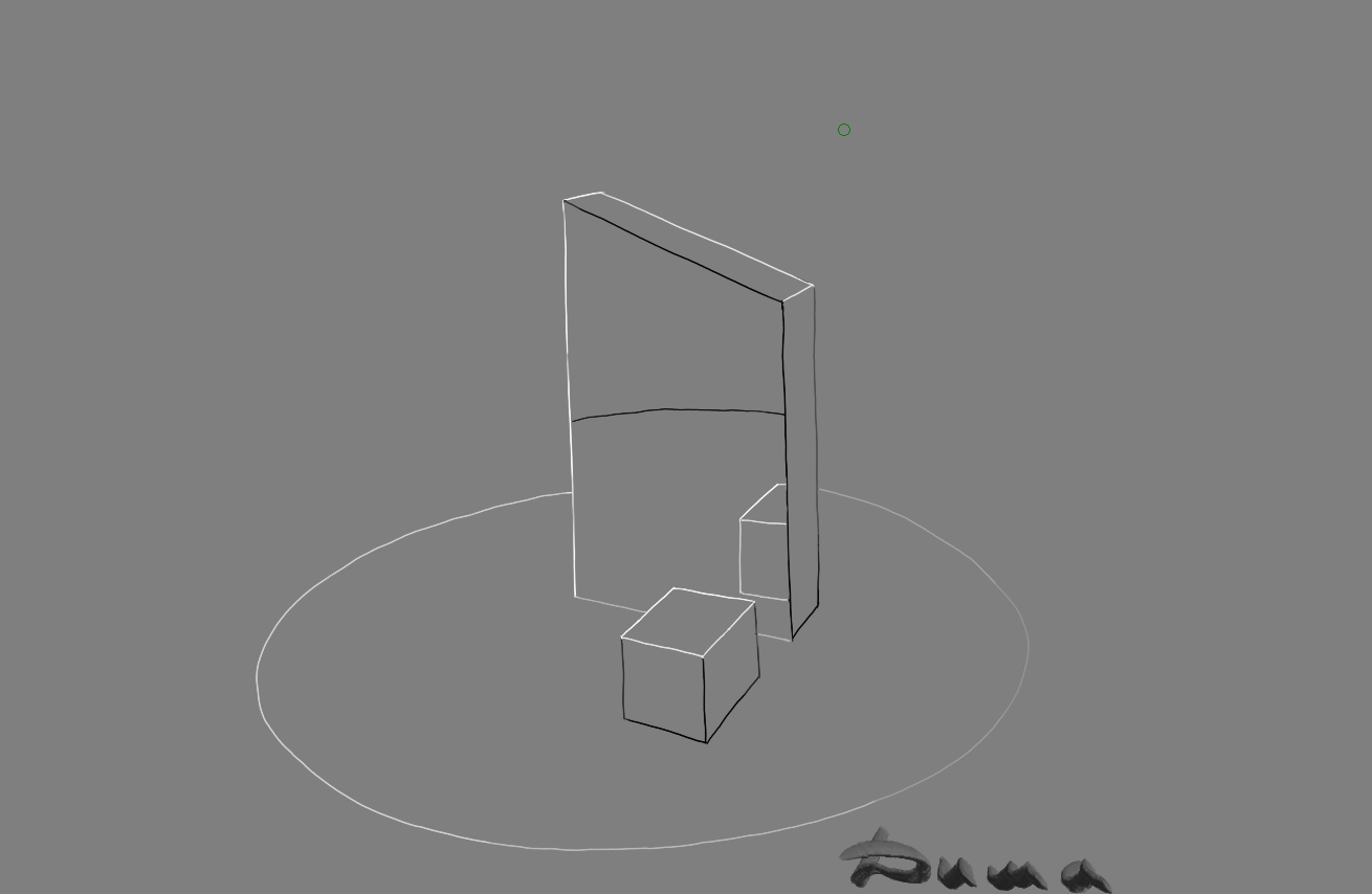
4 We draw a clean outline. I thought it was necessary to change it a little, simplifying its contours. This will make it easier to draw shadows and make the mirror outline with sharp edges and straight corners. The sharper the boundaries of objects, the easier it is to draw shadows. Semi-circular edges and bizarre shapes of faces greatly change and complicate the boundaries of shadows, their contours and shapes. Let’s draw shadows. I’m sure you’ve known this method of determining their boundaries. If not, look carefully. Red is the definition of the boundaries of the directional light from the lantern. The blue is the direction of these boundaries. That’s why it’s crucial to decide where, what, at what height, and how many light sources you have, as well as their shades and where they can blend. Take a closer look at the image and imagine moving the main light source, which will cause all the red and blue lines to follow. The shadows will shift, completely changing the direction and lighting of all surfaces. I’ve indicated the surfaces where the diffused light falls in yellow. Moving this light will result in fewer changes, but its presence and positioning are equally important. I recommend that if you have drawn something and your brain doesn’t believe it, don’t rush to delete it. Instead, play with the lighting, create two or three layers, and quickly use an airbrush to experiment with the placement of shadows and lights. You can also adjust the brightness of the lights, dilute and stretch the shadows, and move the main light away. Try making the shadows short and contrasting by moving the light closer. Remember that we perceive objects through the light, which highlights their contours in the darkness, while the shades of gray create the main volume. Understanding this is crucial for creating a well-drawn image. To reiterate, you paint white where the light hit the surface, and black on the opposite side. The rest is shades of gray.
4 Вырисовываем чистовой контур. Мне показалось что нужно немного его изменить, упростив его контуры. Это облегчит рисование теней и делаю контур зеркала с резкими гранями, и прямыми углами. Чем резче границы объектов тем проще рисовать тени. Полукруглые края и причудливые формы граней сильно меняют и усложняют границы теней, их контуры и формы. Давайте рисовать тени. Уверен, вы знали этот метод определения их границ. Если нет, смотрите внимательно. Красные это определение границ направленного света от фонаря. Синие это направление этих границ. Именно поэтому, очень важно решить где, какое, на какой высоте и сколько у вас будет источников света, их оттенки, где они могут смешаться. Посмотрите ещё раз на рисунок и мысленно подвигайте основное освещение и оно потянет все красные и синие прямые за собой. Тени начнут перемещаться, полностью меняя направление и освещение всех поверхностей станет другим. Жёлтым я указал на какие поверхности попадает рассеянный свет. Двигая его будет меньше перемен, но тем не менее его присутствие и расположение не менее важны. Рекомендую, если вы что то нарисовали и вам не верит ваш мозг, не спешите удалять, поиграйте освещением, создайте два три слоя и быстренько аэрографом поиграйте с расположением тени и света, или добавьте или уберите его яркость, разбавьте и растяните тени отдалив основной свет. Попробуйте сделать тени короткими и контрастными, придвигая свет. Помните, мы видим благодаря свету, он выхватывает из темноты контуры предмета, а вот основной объем создают оттенки серого. Понимание этого, основа для хорошего рисунка. Повторюсь, закрасили белым там где свет ударился в поверхность, чёрным закрашиваете противоположную сторону. Остальное всё оттенки серого.
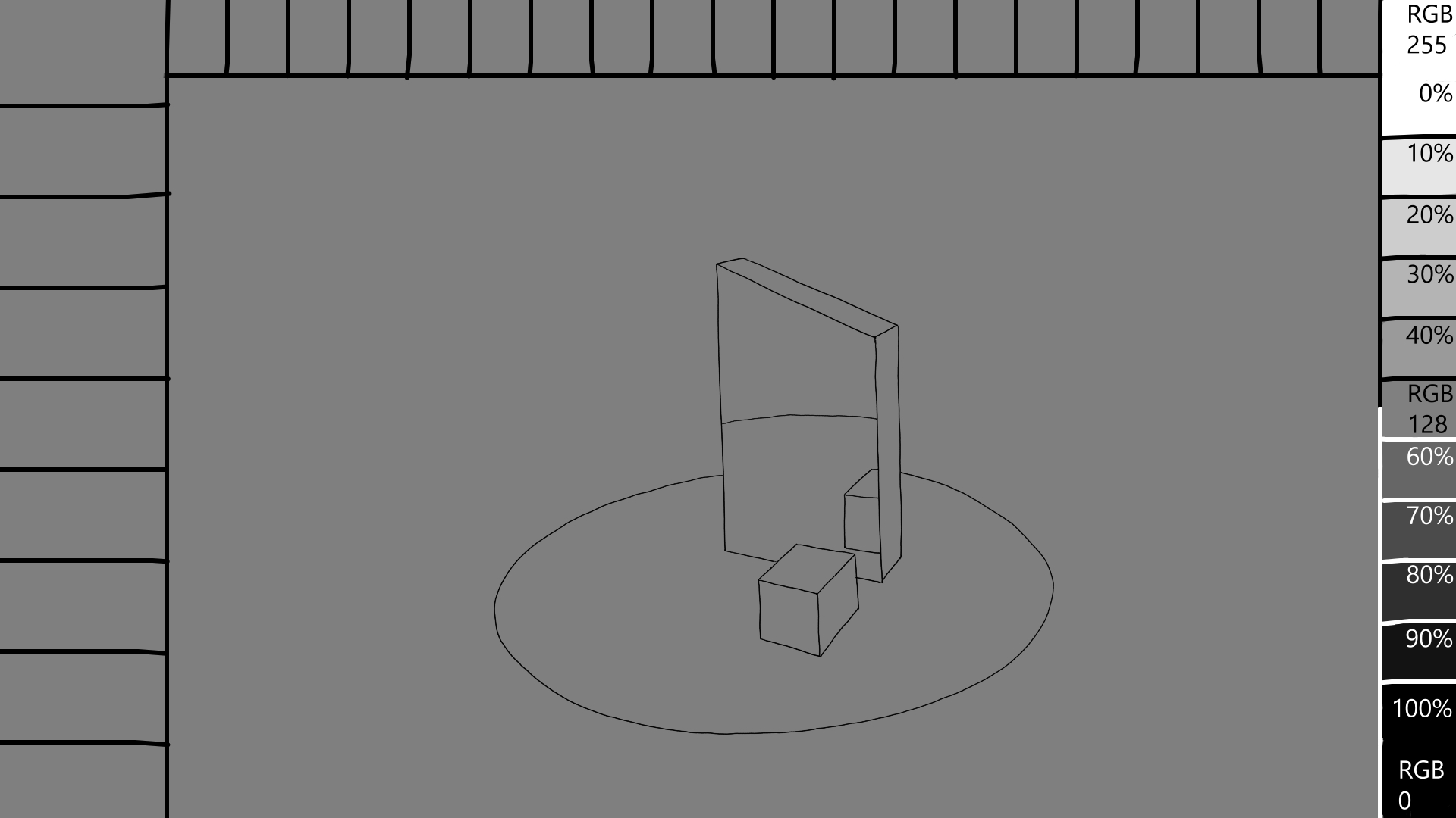
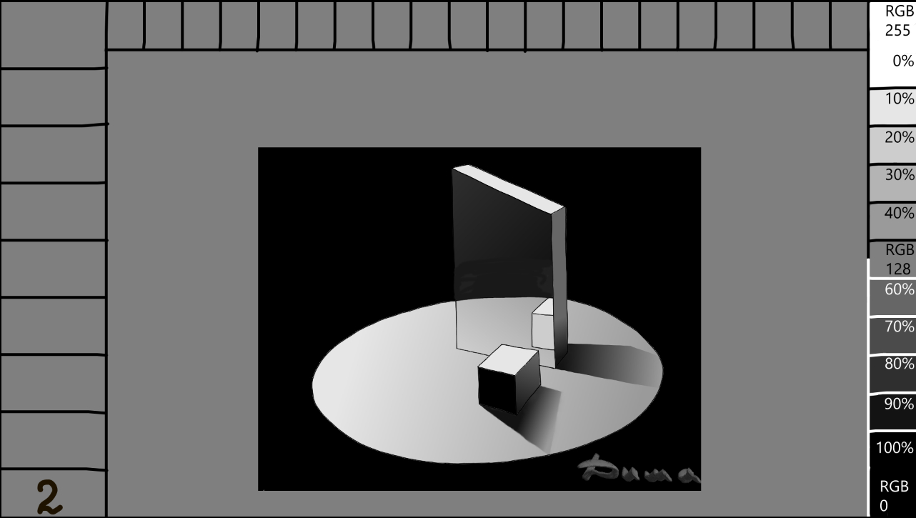
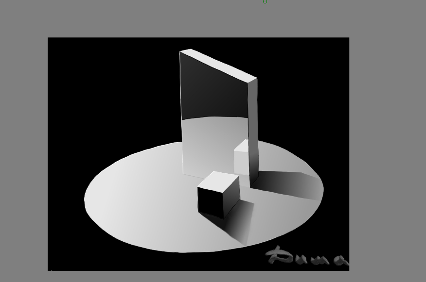
5 This is a clean outline. If you want, save this drawing and open it in your Krita as a template. There are all the necessary shades of gray in the right part, distribute them according to the lighting. But! Don’t touch the white and black color, then I’ll show you a trick. We only make the background 100% black. You should get something like the following picture.
5 Это чистый контур. Если хотите, сохраните этот рисунок, откройте его у себя в Krita как шаблон. В правой части есть все нужные оттенки серого, распределите их согласно освещению. Но! Белый и чёрный цвет не трогайте, потом покажу вам одну хитрость.100% черным делаем только фон. У вас должно получиться примерно как на следующем рисунке.
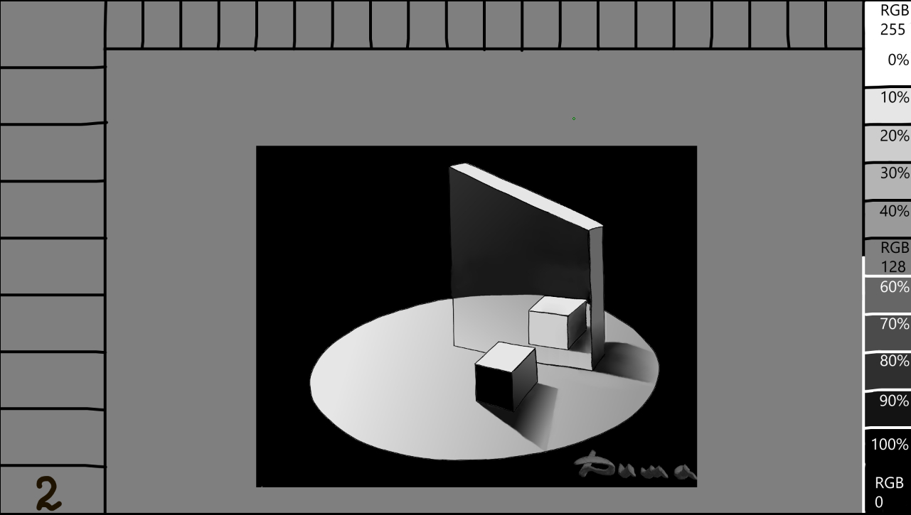
The surface on which all the shapes are standing, the reflection in the mirror, and the shadows were created using the gradient tool G. Select it and click on its icon in the toolbar. Choose the foreground and background, and then click on the edit button. This will open the gradient tool’s settings window. You will see two droplets, one black and one white. Double-click on one of them. Here, you can change the shade or color. Select the eyedropper and choose the desired shade of gray from my template, or customize it according to your preferences. Now change the parameters of the second drop. Well, now you have the desired shade transition. Select the part of the image you want, pull the gradient, and… Change the shades and do the same with the shadows and reflections. Then, either use the selection tool or fill in all the edges of the shapes directly. Everything is fine except for the two edges that receive the Reflex. Select the gradient and pull it up by one-third, then release it. Remember to select these edges beforehand. But only one at a time, otherwise the gradient will fall on both of them at once. Well, did you manage to trick your brain? You’ll agree that it wasn’t too difficult to do.
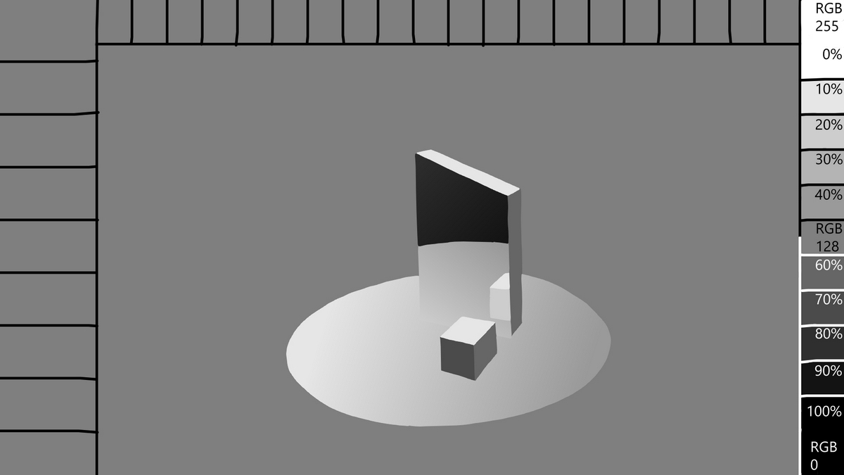
Поверхность на которой стоят все фигуры, отражение в зеркале и тени я делал инструментом градиент G. Выберите его и на панельке кликните на его пиктограмму. Выбираем передний план и фон и ниже кликаем на правка. Перед вами открылось окно параметров инструмента градиент. Видите две капельки, чёрная и белая? Кликните дважды по одной из них. Видите здесь можно поменять оттенок или цвет. Выбираем пипетку и берём нужный вам оттенок серого с моего шаблона например, или меняйте его самостоятельно. Теперь меняйте параметры второй капли. Ну вот, теперь у вас есть нужный переход оттенка. Делаем выделение от руки нужной нам части рисунка, оттягиваем градиент и… Меняйте оттенки и проделайте всё это с тенями и отражением. Далее, хотите работайте выделением от руки, или закрашивайте напрямую все грани фигур. Всё хорошо кроме двух граней на которые падает Рефлекс. Выбираем градиент и с низу в верх на одну треть оттянув отпускаем его, незабудте предварительно выделить эти грани. Но только по очереди, иначе градиент ляжет сразу на обе. Ну что, получилось обмануть свой мозг? Согласитесь не так уж и сложно было это сделать.
I’m probably already boring you
Вероятно я вам уже надоел
3 Likes
Hello, Dima, my great artist! It is always a privilege to receive your guidance and see how you dedicate your time to helping the community. Your reflections on how to “deceive” the brain to bring truth to what we paint are fascinating; after all, perception is one of the complex gifts we’ve received to appreciate the order of things.
I was very honored and grateful that you mentioned my work, The Last City on Earth, as an example of using wide formats. Indeed, that breadth helps convey the scale and depth necessary for stories in vast settings.
I truly appreciated the technical points you covered, especially:
The Practice of Perspective: The idea of training the “eye” before resorting to Krita’s automated tools. It is an exercise in discipline and honesty with one’s own perception.
The Distance from the Work: The advice to mirror the canvas and physically step back from the monitor (those two meters you suggested) is essential. We must have the humility to see our mistakes in a new light and not let fatigue blind us.
Light Management: Understanding the role of “Reflex” and the hierarchy of light sources. I will follow your advice and avoid using absolute white and black (0% and 100%) at this stage, leaving them only for the final touches, according to your technique.
I’ll download your cube template and try to apply the grayscale following the logic of the shadows you drew. It’s a work of patience, but as you said, it is through practice and fair criticism that we develop our talents.
Thank you so much for sharing this knowledge, great artist. I look forward to the continuation regarding screen formats!
Best regards,
Valquer
Versão em Russo (Cyrillic)
Привет, Дима, мой великий мастер! Всегда большая честь получать твои наставления и видеть, как ты посвящаешь своё время помощи сообществу. Твои размышления о том, как «обмануть» мозг, чтобы придать правдивость тому, что мы рисуем, просто захватывают; в конце концов, восприятие — это один из тех сложных даров, которыми мы наделены, чтобы ценить порядок вещей.
Я был очень польщен и благодарен за то, что ты упомянул мою работу The Last City on Earth как пример использования широкоформатных холстов. Действительно, такой размах помогает передать масштаб и глубину, необходимые для историй в огромных мирах.
Я очень оценил технические моменты, которые ты затронул, особенно:
Практика перспективы: Идея тренировать «глаз» перед тем, как прибегать к автоматическим инструментам Krita. Это упражнение на дисциплину и честность перед собственным восприятием.
Дистанция от работы: Совет отражать холст и физически отходить от монитора (те два метра, что ты предложил) — это важно. Нужно иметь смирение, чтобы увидеть свои ошибки в новом свете и не давать усталости ослепить нас.
Управление светом: Понимание роли «рефлекса» и иерархии источников света. Я последую твоему совету и буду избегать использования абсолютного белого и чёрного (0% и 100%) на этом этапе, оставив их только для финальных штрихов, согласно твоей технике.
Я скачаю твой шаблон с кубами и попробую применить оттенки серого, следуя логике теней, которые ты нарисовал. Это работа, требующая терпения, но, как ты сказал, именно через практику и справедливую критику мы развиваем свои таланты.
Огромное спасибо за то, что делишься знаниями, великий художник. Жду продолжения темы о форматах экрана!
Всего доброго,
Валкер
2 Likes
@Valquer Hi, friend. You don’t have to thank me, I mentioned the artists whose work caught my attention in my text. I don’t have any specific criteria for evaluating someone’s work; it’s all interesting in its own way. It’s just that some pieces are inexplicably beautiful to me, with stunning narratives, beautifully chosen colors, breathtaking scale, perfection, unique character, or meaningful content. Sometimes, I find myself drawn to certain designs. I can spend an hour looking at it, and then I come back again, and again, and again. I go to the artist’s profile and look at all of their works, as if I’m getting to know their hands. I’m trying to feel them. This means that I’m hooked. So, I’m grateful to you for your artwork and for hooking me. It’s an honor for me to be able to reference your drawings. Thank you for taking the time to visit, and I know you have a lot of work to do. I wish you success in your creative endeavors and new ideas.
@Valquer Oi amigo. Não me agradeça, mencionei em meu texto aqueles artistas cujo trabalho me fisgou. Não tenho nenhum modelo pelo qual avalie o trabalho de alguém, todos são interessantes à sua maneira. Eles são simplesmente inexplicavelmente bonitos para mim, eles vêm com um enredo incrível, ou com tons agradavelmente escolhidos, incrivelmente grandes, ideais, com um caráter especial ou significativo… Às vezes entro em obras acabadas e se vejo um desenho parecido. então eu posso ficar uma hora olhando para ele, depois de um tempo eu volto de novo, e de novo, e depois de novo. Entro no perfil e olho todas as obras desse artista, como se conhecesse suas mãos. Estou tentando sentir. Significa que estou viciado. Portanto, sou grato a você por seus trabalhos, pelo fato de terem me fisgado. É uma honra para mim ter a oportunidade de me referir aos seus desenhos. Obrigada pela visita, sei que tem muito trabalho a fazer. Boa sorte com sua criatividade e novas ideias.
2 Likes
I mistakenly uploaded a low-quality template, so I reloaded it in a larger format and removed my signature.
Por engano, carreguei o modelo em baixa qualidade, então o recarreguei em um formato maior e removi minha assinatura.
My dear Dima,
Your words touched me in a way that is difficult to express through technique alone. I deeply thank you for your sincerity and for the time you spend observing my work; knowing that my “hands” and my stories stay with you is a valuable encouragement to me.
But I would like to tell you something about your own work. You see, while looking at your piece featuring the cosmonaut, I found myself suddenly drawn into the reflection on the visor. There was a moment of true transport there; something in that captured light carried me away, into the silence and the vastness that all of us, each in our own way, try to understand and reach.
This is the true strength of our communication: when words fail, what we paint manages to say “I am here too, I feel this too.” If my work has hooked you, know that your cosmonaut’s visor offered me a reflection of something very deep and personal.
Thank you for sharing your worldview with me. I wish you much peace, health, and that inspiration continues to be your refuge and your strength.
Warmest regards,
Valquer
Versão em Russo (Cyrillic)
Дорогой Дима,
Твои слова тронули меня так, как трудно выразить только техническими терминами. Я глубоко благодарен тебе за твою искренность и за то время, которое ты уделяешь изучению моих работ. Знать, что мои «руки» и мои сюжеты находят в тебе отклик — это огромная поддержка для меня.
Но я хотел бы сказать кое-что и о твоей работе. Знаешь, рассматривая твоего космонавта, я вдруг почувствовал, как меня буквально затянуло в отражение на визоре. В этот момент произошло настоящее преображение; что-то в этом пойманном свете унесло меня далеко, в ту тишину и необъятность, которую каждый из нас, по-своему, пытается понять и постичь.
В этом и заключается истинная сила нашего общения: когда слова бессильны, то, что мы рисуем, говорит: «Я тоже здесь, я чувствую то же самое». Если мои работы «зацепили» тебя, то знай, что твой визор космонавта подарил мне отражение чего-то очень глубокого и личного.
Спасибо, что делишься со мной своим видением мира. Желаю тебе мира, здоровья и чтобы вдохновение всегда оставалось твоим убежищем и твоей силой.
С братским теплом,
Валкер
2 Likes
Let’s continue with the topic of the Mirror.
What do you think we tricked our brain into believing in a reflection like in a mirror? Unfortunately, there is no feedback from you, and I am unable to know your answers. Some may argue that it is a repetition of the cube as a reflection, or that the repetition of a portion of the surface created an illusion. Yes, you are correct. However, there is a part of it. The redrawn figures themselves won’t fool you, but here are a few drawings that seem to have everything, including the reflection of the surface and the cube, but something is off. You’ve already sensed that you’re being fooled.
![]()
Продолжим тему Зеркало. Как вы думаете, чем именно мы обманули свой мозг, заставив его поверить в отражение как в зеркале? К сожалению от вас нет обратной связи и я лишен возможности узнать ваши варианты ответов. Кто то скажет что это повтор кубика как отражение, или повтор части поверхности создало иллюзию? Да вы правы. Но от части. Сами по себе перерисованные фигуры не обманут, вот несколько рисунков на которых вроде бы всё есть, и отражение поверхности и кубика, но что то не так, вы уже сами почувствовали что вас дурят.
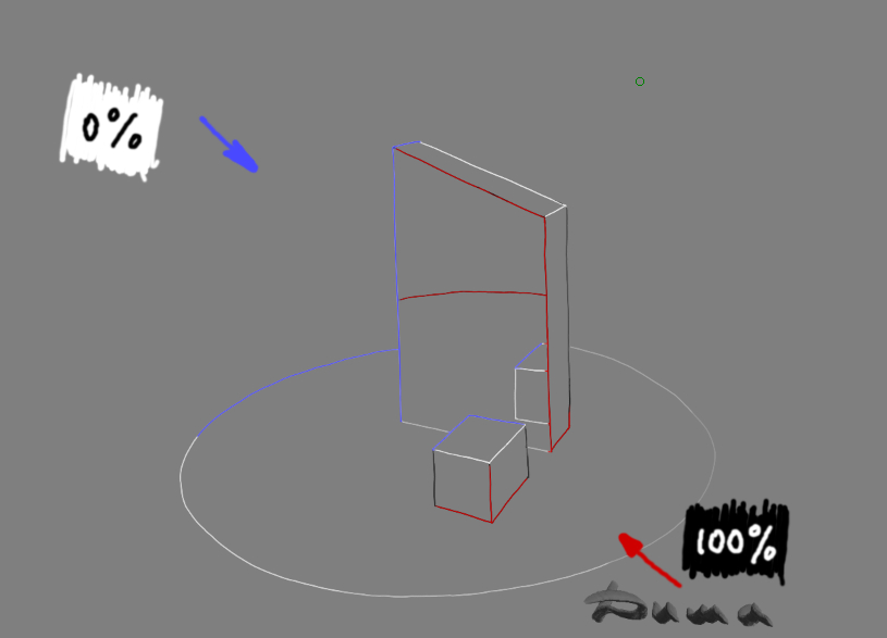
6 The first trap is that the edge of the surface in the reflection is raised higher, that is, for our brain, this is a distortion of reality, something here is not right for the brain, why is it separated from the real location of the boundaries of the surface itself, we are used to get on everything its explanation. And then he notices our second trap, the absence of half of the cube, there behind this thing. Aaaa! so this thing is a mirror, everything else he imagines from what he has already seen something similar somewhere, yes, yes, this is a mirror. The brain has no more questions about the drawing! Or is there?
6 Первая ловушка в том что край поверхности в отражении приподнят выше, то есть, для нашего мозга это искажение действительности, что то здесь для мозга не так, почему она оторвалась от реального расположения границ самой поверхности, мы привыкли получать на всё своё объяснение. И тут он замечает второй нашу ловушку, отсутствие половины куба, там за этой штукой. Аааа! так эта штука зеркало, всё остальное он домысливает из того что где то уже видел подобное, да точно, точно это зеркало. У мозга больше нет вопросов к рисунку! Или есть?

7 Tell me, how often do you meet objects that surround you with a clear, black outline? And what about gray, green, and red? You haven’t seen them, and your brain wants to believe it, but these outlines are preventing it.
Click on the layer where these outlines are located and activate the alpha channel lock in the layer’s menu. Lock all the transparent pixels in this layer. Now, use the brush and eyedropper to color the outline. We take a sample of the right shade with a pipette from the main drawing, but as close to the outline as possible, change the pipette to a brush and paint the outline until the shade changes, then use the pipette and brush again, walk around a little, then use the pipette and brush again… Have you painted the entire outline? Do you like it? No, it’s not you, it’s clear to your brain, it believes in the mirror!? Yes, congratulations! No, then you did something wrong or misunderstood something. Try starting over. If you don’t want to figure it out and understand the reason, then drawing is not for you, find yourself another hobby, sell the tablet, buy a bike and ride in the park. You got it?! Very good, just great! Then stop looking at the monitor, draw, draw, draw… Forget about the bike, your goal is a car, an apartment, a new house, a new life. Work on yourself, and remember, no one but you can help you. So everything is in your hands.
Back to the outline. Remember I promised you to show the trick with white and black colors? To create an emphasis on some parts in the drawing, to give it depth and artistic, you can use this method. For clarity, I marked these places, blue bright edges white, red black. All other shades we have already made gray from the near zones.
7 Скажите, насколько часто вы встречаете предметы которые вас окружают с чётким, чёрным контуром? А с серым, зелёным, красным? Не видели, вот и ваш мозг хочет поверить но ему мешают эти контуры.
Кликните слой на котором находятся эти контуры и активируйте в меню этого слоя блокировка альфа-канала. Запираем на замок все прозрачные пиксели этого слоя. Теперь работаем по очереди кистью и пипеткой, и начинаем красить этот контур. Берём пипеткой пробу нужного оттенка с основного рисунка, но как можно поближе к контуру, меняем пипетку на кисть и окрашиваем контур до момента где оттенок изменяется, опять пипетка и кисть, прошлись немного, опять пипетка и кисть… Перекрасили весь контур? Нравится? Да не вам, с вами всё ясно, вашему мозгу зашло, он поверил в зеркало!? Да, поздравляю! Нет, значит вы где то что то сделали или поняли не так. Попробуйте всё с начала. Если не хотите разобраться и понять причину, тогда рисование это не ваше, найдите себе другое хобби, продайте планшет, купите велосипед и катайтесь в парке. Вас это задело?! Очень хорошо, просто отлично! Тогда хватит смотреть на монитор, рисуйте, рисуйте, рисуйте… Забудьте про велосипед, ваша цель машина, квартира, новый дом, новая жизнь. Работайте над собой, и помните, никто кроме вас самих не в силах вам помочь. Так что всё в ваших руках.
Вернёмся к контуру. Помните я обещал вам показать хитрость с белым и чёрными цветами? Для создания акцента на некоторых частях в рисунке, придания ему глубины и художественности можно использовать этот метод. Для наглядности я пометил эти места, синим яркие грани белым, красным чёрным. Все остальные оттенки мы уже сделали серыми с ближних зон.
8 You should have a contour like this.
8 У вас в принципе должен получиться такой контур.
9 Here is how, in the framework of this article, the drawing of the mirror looks complete, in my opinion. Agree, it is more realistic than with a black outline. Yes, we have returned the white and black outline, but a little and in places that are beneficial to us. The drawing has become more realistic and at the same moment did not lose the style of a regular drawing. This is the very edge, of reality and fiction in your works.
9 Вот как в рамках этой статьи выглядит законченный на мой взгляд рисунок зеркала. Согласитесь он более реалистичен чем с чёрным контуром. Да мы вернули белый и чёрный контур, но немного и в выгодных нам местах. Рисунок стал более реалистичным и в тот же миг не потерял стиля обычного рисунка. Вот это и есть та самая грань, реальности и вымысла в ваших работах.
10 Someone will say that it is possible to draw without a contour. Yes, it is possible, but it is long and difficult. And it is not certain that it will be more realistic and beautiful. Here is an example in the lower image.
10 Кто то скажет что и без контура можно рисовать. Да можно но это долго и сложно. И не факт что более реалистично и красиво получится. Вот пример на нижнем рисунке.
1 This is where you can stop. As I said at the beginning, there are many ways and methods that are faster, easier, or more correct. I won’t argue with that. Share your experience, and I’m sure it will be interesting.
Finally, I’ll share one of the painting methods. Create a new layer at the top and select the blending mode, multiplication mode, or color mode in its properties. It depends on your preferences, and you can simply paint different colors on this layer. Don’t be afraid to experiment. However, for a multicolored image, you’ll need a colored outline. And here white and black already need to be applied based on what you want to highlight or on the contrary to drown.
I give my example again how I emphasized the outline in black and white for the color option. I will explain why. It is necessary to show the mirror glare from the lantern, thereby I highlight and snatch from the general, and with black I strengthen the depth of black in the reflection. In the shadows, I replace black with the darkest shades of chvet on these surfaces. Black is no longer needed there.
Thank you for your attention. Good luck with your creative work. And remember, your goal is to teach your hands to deceive other people’s heads. This is the secret to success…
1 На этом можно и остановиться. Как я уже говорил в начале, есть множество способов и методов других и возможно более быстрых правильных или простых. Не спорю. Поделитесь своим опытом, уверен будет интересно.
Напоследок поделюсь одним из способов покраски. Создаём на самом верху новый слой и выбираем в его свойствах наложение, умножение, цвет. Зависит от ваших задумок и начинаем просто раскрашивать этот слой в разные цвета. Не бойтесь экспериментировать. Но для разноцветного рисунка нужен и контур в цвете. И здесь белый и чёрный уже нужно применять исходя из того что вы хотите выделить или наоборот утопить.
Я привожу опять свой пример как я подчеркнул контур чёрным и белым для цветного варианта. Объясню почему. Нужно показать блик зеркала от фонаря, тем самым я выделяю и выхватываю из общего, а чёрным я усиливаю глубину чёрного в отражении. В тенях чёрный заменяю на самые тёмные оттенки по цветам на этих поверхностях. Чёрный там больше не нужен.
Спасибо вам за внимание. Удачи вам в творчестве. И помните, ваша задача научить свои руки искусно обманывать чужие головы. В этом и есть секрет успеха…
3 Likes
Just a workout for the arms and head ![]()
Просто тренировка для рук и головы.
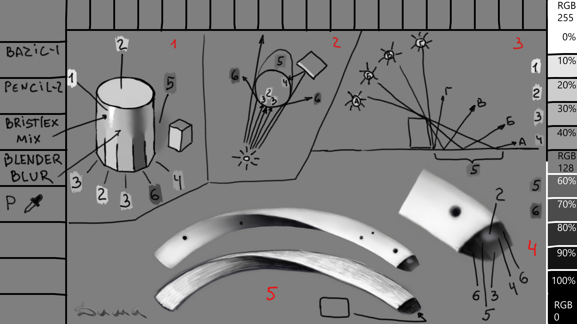
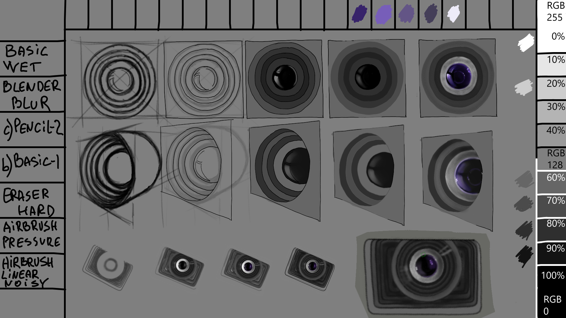
1-Glare (in cases with a glossy surface) 2-Light 3-Half-shadow 4-Reflex (this can also be a second light source) 5-Falling shadow 6-Self-shadow
After making a sketch, you can use six shades of gray to create a base layer. Distribute the shades according to the light sources. Then, use Blender blur to blend the shades evenly. Create a layer on top of the entire project in the overlay mode and apply the colors. The trick is that the shades will adjust to the intended lighting. Use filters to adjust the brightness or dimness of the colors.
1-Блик ( в случаях с глянцевой поверхностью) 2-Свет 3-Полутень 4-Рефлекс ( это также может быть вторым источником света) 5-Падующая тень 6-Тень собственная
Сделав набросок, можно придерживаясь шести оттенкам серого создать подмалёвок. Правильно распределите оттенки согласно источникам света. Потом использовав Blender blur равномерно смешайте их между собой. Далее создав поверх всего проекта слой в режиме перекрытие, нанесите краски. Фокус в том что оттенки сами подстроятся под задуманное освещение. Далее фильтрами можно придать яркость или приглушить.
2 Likes
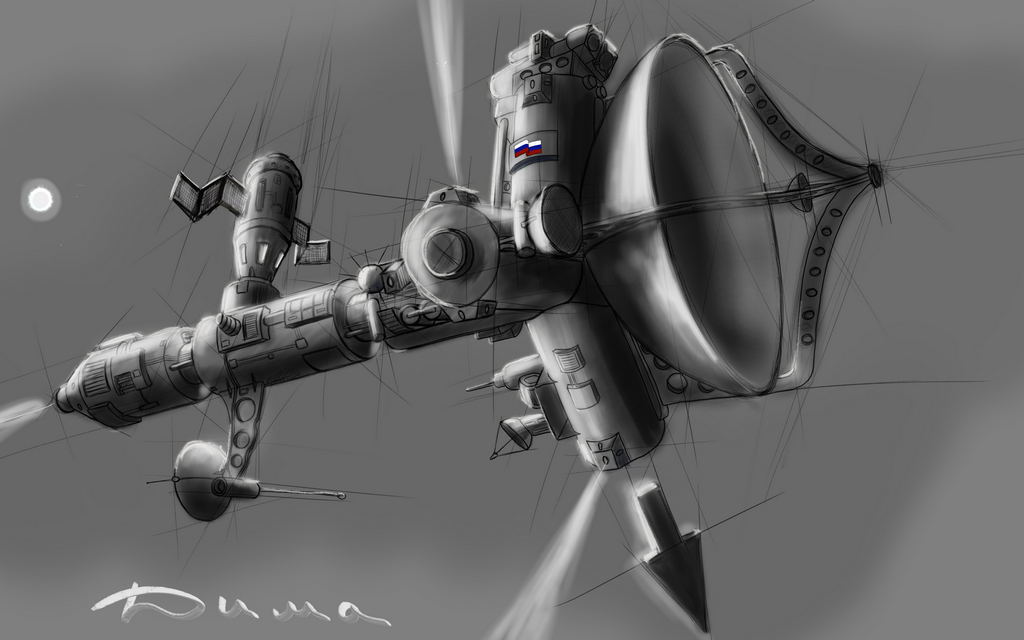
I took a short break after the cosmonaut, and with difficulty began the project of the largest in the history of mankind, the Russian space telescope Mikhail Vasilyevich Lomonosov. (our scientist who lived from 1711-1765 is considered the first Russian astrophysicist).
![]()
Я немного отдохнул после Космонавта, и с трудом приступил к проекту самого большого в истории человечества, Российского космического телескопа Михаил Васильевич Ломоносов. (наш учёный живший с 1711–1765 Считается первым русским астрофизиком).
I’m often asked which 3D software I use to create my sketches. To be honest, I use Krita from a blank sheet, and it usually takes me a dozen attempts to create a decent sketch. . Sometimes it doesn’t work out that way, so I recommend placing a similar-shaped object in front of you and illuminating it with a table lamp from the desired angle. Then, simply rotate the object and examine it from different perspectives. When you’re ready to draw, start from a blank sheet of paper, drawing from your imagination. Avoid using 3D templates, photos as the base layer, or drawing using tracing paper. Don’t argue with me; it’s pointless. This is my opinion, and it belongs solely to me. Do you want to know your real capabilities? Then put an A4 sheet and a ballpoint pen in front of you, and think about what you see on that sheet. Give yourself an hour and just draw what you want with a ballpoint pen. How are you doing? I’m sure not everyone has this ability. That’s why I’m against all these shortcuts, it’s a self-deception that takes away our ability to feel the line, see the light, understand the angles, and feel the shades. Draw from your own imagination, it’s a worthy endeavor…
Меня часто спрашивают в какой 3D проге я делаю заготовки. Отвечаю честно как есть, в Krita с чистого листа, обычно такой набросок у меня получается после десятка попыток. . Бывает не получается так, советую положить перед собой близкий по форме предмет, помогите себе ещё подсветив его настольной лампой, с нужной вам стороны. Дальше вам нужно его просто повращать и внимательно рассмотреть со всех ракурсов. И когда вы будете готовы рисовать, то рисуйте с чистого листа, из головы, от руки. Все эти 3D шаблоны, фотографии нижним слоем, шарлатанство и самообман, как и рисование под кальку… Не спорте со мной, бесполезно, это моё мнение и оно принадлежит только мне. Хотите узнать свои реальные возможности?! Тогда положите лист А4 и шариковую ручку перед сбой, подумайте что вы видите на этом листе!? Дайте себе час и просто нарисуйте шариковой ручкой задуманное. Как успехи? Уверен что не у всех. Именно поэтому я против всех этих облегчающих процесс уловок, это самообман, который лишает нас способности ощущать штрих, видеть свет, понимать углы и чувствовать оттенки. Рисуйте сами, из головы, это достойно уважения…
3 Likes
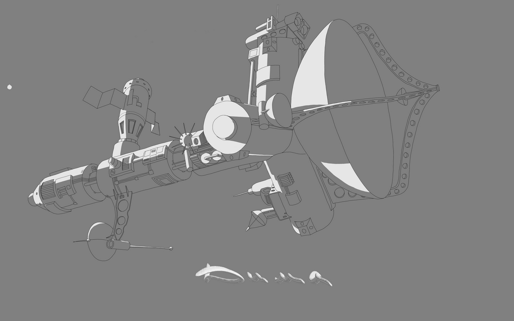
I’ve completed the final outline. Now I’ll start adding lighting.
Выполнил чистовой обвод. Сейчас начну обозначать освещение.
3 Likes
Great values here
1 Like
Well, if you dig around, you can find something.![]()
Ну да, если покопаться можно что то найти.
1 Like
I don’t think I quite understand? ![]()
1 Like
All these misunderstandings are due to translation. So I write a text in my own language, then I translate it into English, and then the first corrections to the text appear. I copy and paste it into the forum’s dialogue box, and then there’s another correction, and the text becomes more verbose or the phrases are rearranged. If you’re fluent in English, you can translate the text into your own language for a third time. This can sometimes lead to a complete distortion of the original text. Additionally, it’s important to consider that we all have different senses of humor. That’s why I’m duplicating all my texts with my own, so that I can translate them directly. Look, you’re saying that I have something valuable here, and I’m telling you that if you dig through my notes, you might find something valuable for yourself.
![]()
Все эти недопонимания из за перевода. Получается я написал текст на своём языке, потом перевожу его на английский и тут появляются первые поправки текста. Я его копирую и вставляю в диалоговое окно форума и тут ещё одна корректировка, текст обрастает фразами или они меняются местами. Тебе английский близок, а тем у кого другой язык переводят текст в третий раз уже на свой язык. Всё это приводит порой к полному искажению исходного текста. Ещё нужно учесть что у каждого из нас разный юмор. Именно по этому я дублирую все мои тексты своим, для возможности перевода напрямую. Смотри сам, ты пишешь что у меня здесь есть что то ценное, я ответил тебе что если покопаться в моих записях то да, каждый может что то найти ценное для себя.
1 Like
![]() here again he turned everything upside down. I write that you know English, those who do not are forced to translate the text for the third time, it will be far from the truth.
here again he turned everything upside down. I write that you know English, those who do not are forced to translate the text for the third time, it will be far from the truth.![]()
![]()
вот опять он всё перевернул. Я пишу что ты владеешь английским, те кто нет вынуждены в третий раз перевести текст, там будет всё далеко от истины.
2 Likes
Haha! It’s ok, we just try out best to understand and I think we get the gist most of the time ![]()
1 Like