My method

Try to understand me as accurately as possible (if the translation is confused, translate my original Russian text yourself, in your translators, it is possible that a lot will change in the sense of what you have read).

For me, any drawing at the beginning of its path is a germ, no one sees it, and you already feel it, see its features, lose peace because it beats in your head, think how, think what and here, having matured, it turns into an idea. And it does not give you peace, so you decide to show it to the world. You make the first stroke, this is the birth, the second, the third is already development. Day by day your idea grows, taking on contours, details, shades, color, character. Time works wonders with your hand, the idea grows, becomes a personality on the canvas, you put everything you could into it, you showed it to the world, you put a piece of your soul into this drawing. All, it’s time to let it go. We make the last farewell, final stroke of our signature, give it your name or creative nickname and … tremblingly let it go into the abyss of the world’s abyss. There he will be praised, scolded, loved, envied, respected and perhaps hated. But he is forever yours, he belongs to you, he has a piece of your time lived, he is your child, your name. Remember this when you decide to show something to the world.
I want to warn you right away that I have not studied drawing. All of my methods, techniques, views, and advice are purely advisory in nature, based on my conclusions drawn from forty years of practice, of which the last twenty have been spent drawing on a tablet. I am honest in stating that I am not a certified professional in the field of drawing. I was given the gift of drawing, and I’m developing it as a hobby. Soon, many things will change. Everything has its time…
:bear:
Постарайтесь понять меня максимально точно (если перевод напутан, переводите мой оригинальный Русский текст сами, в своих переводчиках, возможно многое изменится в смысле вами прочитанного).

Для меня, любой рисунок в начале своего пути это зародыш, его никто не видит, а вы его уже чувствуете, видите его черты, теряете покой потому что он бьётся у вас в голове, думаете как, думаете что и вот, он созрев превращается уже в идею. И она не даёт вам покоя, поэтому вы решаетесь явить её миру. Делаете первый штрих, это рождение, второй, третий это уже развитие. День за днём ваша идея растёт, обретая контуры, детали, оттенки, цвет, характер. Время творит чудеса вашей рукой, идея растёт, становится личностью на холсте, вы вложили в него всё что смогли, вы явили его миру, вы вложили в этот рисунок частичку своей души. Всё, пора его отпустить. Мы делаем последний прощальный, завершающий штрих своей подписи, дарим ему своё имя или творческий ник и… трепетно отпускаем в бездну всемирной пучины. Там его будут хвалить, ругать, любить, ему будут завидовать, его будут уважать и возможно ненавидеть. Но он навечно ваш, он принадлежит вам, в нем есть частичка прожитого вами времени, это ваше дитя, ваше имя. Помните это, когда решите что то явить миру.
Хочу сразу предупредить, я не учился рисованию. Все мои методы, способы, взгляды, советы носят сугубо рекомендательный характер, основанный на моих выводах, сделанных и отработанных в ходе сорокалетней практики, из которых последние двадцать, рисую на планшете. Я честно заявляю что не являюсь дипломированным профессионалом в области рисунка. Мне был дан дар рисовать и я прокачиваю его в хобби, скоро многое изменится. Всему своё время…

31 Likes

I love to draw on space themes. In my drawings, I try to adhere to the framework of reality as much as possible. These limits are determined by what humanity can do in the next century. I am trying to build on the promising discoveries and developments of the Russian space industry.
Here is an example of how it happens to me. Roscosmos begins the project of the most powerful orbital telescope. I ask myself the question, what can it be?…

Обожаю рисовать на космические темы. В своих рисунках стараюсь максимально придерживаться рамок реальности. Эти рамки обусловлены тем, что человечеству по силам в ближайшее столетие. Стараюсь оттолкнуться от перспективных открытий и разработок Российской космической индустрии.
Вот пример как это у меня происходит. Роскосмос начинает проект самого мощного орбитального телескопа. Я задаю себе вопрос, а каким он может быть…

Maybe it will look like this or like this? And what is the maximum size possible for its mirrored dome? And what will be the dimensions of its compartments? What are they like and how many should they be? What size and mass can be lifted into space by heavy or superheavy launch vehicles? For example, our Energia can launch over 50 tons of payload into orbit with a diameter of 8.8 meters and a length of 10-13 meters.…

Возможно он будет выглядеть так или вот так? А какой максимальный размер возможен для его зеркального купола? А какие будут размеры его отсеков? А какие они и сколько их должно быть? Какой размер и массу можно поднять в космос тяжелыми или сверхтяжелыми ракета-носителями. Например наша «Энергия» может вывести на орбиту свыше 50 тонн полезного груза диаметром 8.8 и длинной 10-13 метров…

Then the most difficult but interesting thing begins for me. How to present all this in the most interesting perspective, from where to give the light and what it should be, how many sources there should be in order not to miss the significance of the details. At the same time, it is necessary to reveal the scale, because this happens in space, and not in a room among the walls. It is very important for me not to lose volume.… I create a layer, draw a sketch, then make it 30% transparent, create a new one over it and draw with corrections. I hide the layer that is beginning to bother me, but I am not in a hurry to remove it. It can take more than one day, or even weeks. You say it’s crazy, and I’ll tell you YES. But yes, there is an explanation for this. Everyone who draws knows that the most difficult thing in the modern abundance of drawings is to come up with YOUR OWN plot, and if it has appeared, then I want to squeeze the drawing out of it to the maximum.

Потом начинается для меня самое сложное но интересное. Как это всё преподнести в максимально интересном ракурсе, от куда подать свет и каким он должен быть, сколько должно быть источников чтобы не упустить значимость деталей. При этом надо раскрыть масштабность, ведь это происходит в космосе, а не в комнате среди стен. Для меня очень важно не потерять объем… Создаю слой, рисую набросок, потом делаю его прозрачным на 30%, создаю над ним новый и рисую с поправками. Слой который мне начинает мешать, скрываю но не спешу удалять. Так может длится не один день, а то и недель. Вы скажите что это безумие, я вам отвечу, ДА. Но этому да есть объяснение. Все кто рисует знают, что самое трудное в современном изобилии рисунков это придумать СВОЙ сюжет и уж если он появился, то я хочу выжать из него рисунок по максимуму.

Now it looks like what I originally intended. I’ll take a break from it, collect my thoughts, and maybe bring this project to an end.

Вот теперь это похоже на то что я изначально задумывал . Немного отдохну от него, соберусь мыслями и возможно доведу этот проект до конца.

8 Likes

Neat! I love how thoughtful your approach is to creating a piece. (Also love the happy little star in the background!)

1 Like

@Smeep Hi, thanks for your support. If you see a smiley face in the sun, then you have carefully approached the viewing.

1 Like

In the meantime, so that you don’t get bored, I’ll show you what I’m doing right now.
Ну а пока что бы вам не было скучно я покажу чем сейчас занимаюсь.

2 Likes

The Cosmonaut project is bothering me right now, it’s still very difficult for me. I need to draw the cosmos in the reflection of the mask. To do this, you need to position the main character closely. The price for such an angle will be unrealistic detail, down to the lines on the spacesuit. I do not know how to do this, no, I know, but how not to drown in the details, how not to get stuck, not to miss and not to overdo it. That’s why I’m still sketching. One, two, five, thirty… but I am not happy with the result, although I subconsciously know that I will succeed.

Сейчас мне не даёт покоя проект Космонавт, для меня он пока очень сложен. Мне нужно нарисовать космос в отражении маски. Для этого нужно близко расположить главного персонажа. Расплатой за такой ракурс будет нереальная детализация, вплоть до строчек на скафандре. Я не знаю как это сделать, нет я знаю, но как не утонуть в деталях, как не застрять, не упустить и не переборщить. Поэтому я пока усердствую в набросках. Один, второй, пятый, тридцатый… но не доволен результатом, хотя подсознательно знаю, у меня всё получится.

3 Likes

Choosing the angle of the astronaut from one sketch and the brush holding the mounting cable from the other, roughly positioning the light source, I thought about what would be the background.

Выбрав ракурс космонавта с одного наброска и кисть держащую монтажный трос с другого, примерно расположив источник света, я задумался над тем, что будет являться фоном.

4 Likes

Оттенки великолепны!

1 Like

I drew a lot of sketches, then there is no volume, then there is not enough scale, then my hands do not obey, then I just don’t like the result. In the end, I settled on this. It is important for me to provide depth in the reflection of the mask, this is the essence of my idea. I decided to make the head module of the Gagarin Research Institute as a background. To put it another way, this is the head, the butt. According to my ideas, the station’s brake nozzles are located here. Imagine, the mass is more than a hundred tons, and to stop the inertia and acceleration of such a colossus, you need a very powerful and complex braking system. At this stage of the project, I used 93 layers and the project weighs almost 4 gigabytes. Next, I cleaned up the unnecessary ones, combined the test layers, rearranged them in the right order, created groups, and eventually there were about 30 layers left. Now you need to draw an almost clean outline and add the first detail. I am finally deciding on the point of the light and its direction. Now you can apply the first shades.

Рисовал множество набросков, то нет объема, то масштабности не хватает, то руки не слушаются, то просто не нравится результат. В конце концов остановился на этом. Мне важно подать глубину в отражении маски, это суть моей идеи. Задним фоном я решил сделать головной модуль НИС им. Гагарина. авий сказать, это головная часть, торец. Здесь по моим задумкам находятся тормозные сопла станции. Представьте, масса более сотни тонн, и чтобы остановить инерцию ижения такой махины, нужна очень мощная и сложная система торможения. На этом этапе варианта я использовал 93 слоя и весит проект почти 4 гигабайта. Далее я почистил от ненужного, объединил пробные слои переставив нужном порядке создал группы, в итоге осталось около 30 слоёв. Теперь нужно отрисовать почти чистый контур, добавить первую детализацию. Окончательно определяюсь с точкой света и его направления. Вот теперь можно наносить первые оттенки .

4 Likes

At this stage, I have completed the final preparation of the draft in shades of gray, I always try to stick to ten. (guess why) I usually don’t do it smoothly right away, on the contrary, sharp strokes allow me to see the light edges, it’s easier to replace them with a darker or lighter shade, blocking the alpha channel pixels on the layer. After making sure that the direction of the light is correct throughout the drawing (depending on my idea), and if I am satisfied with the result, I begin to smooth out the places where the shades touch. It’s a bit tedious and not fast, but the result is worth it. There are probably other methods and methods, but I haven’t discovered them yet. Having smoothed out all the joints, having cleaned up the blunders and surges, I will embody it in the color of paints. It’s fun and interesting because the drawing starts to come to life, I start to feel it.

На этом этапе я выполнил окончательную подготовку наброска в оттенках серого, всегда стараюсь придерживаться десяти. (догадайтесь почему) Обычно я не делаю сразу плавно, наоборот, резкие мазки позволяют мне увидеть световые грани, их проще заменить на более тёмный или светлый оттенок, блокируя на слое пиксели альфа канала. Убедившись в правильности направления света на всём рисунке (в зависимости от моей задумки), и если я доволен результатом то начинаю сглаживать места соприкосновения оттенков. Это нудновато и не быстро но результат того стоит. Вероятно есть и другие методы и способы, но я их ещё не открыл для себя. Сгладив все стыки, подчистив ляпы и наплывы я буду воплощать его в цвете красок. Это весело и интересно, потому что рисунок начинает оживать, я начинаю его чувствовать.

9 Likes

Exquisite attention to detail, with every rivet visible to the last. :+1:

极致的细节描绘,每一颗铆钉都清晰可见。:+1:

1 Like

@LSY Yes, I’ll have to try and tinker with the details here, because I chose this angle. Let’s see what happens…

Да, здесь придётся постараться и повозиться с детализацией, потому что я выбрал такой ракурс. Посмотрим что из этого получится…

2 Likes

Hello everyone, I adore you all, and in this forced separation I realized that I even miss this company. In a nutshell about what I had in mind. For obvious reasons, I haven’t been able to log in to the forum for over a month. I got bored and tried to find an alternative to this forum, but I couldn’t find it. I had to look for ways to break through. In short, I’m personally glad to be back with you. I think it will be interesting for you to see how I have progressed in my work on the Cosmonaut picture. In this work, the main idea for me was to create a feeling of colossal horror, delight, and the vastness of space, and it is in the glass of the helmet, behind which a mortal man is looking at this cosmos, just like you and me, what is in his head now, what feeling he is experiencing, what it feels like there. It is hanging at a point X around which there is infinity… Have you ever tried to swim into the sea so that people on the shore are like ants, and at this moment you tried to think how far the bottom of this sea is under your feet, whether you have the strength and life to touch it. It seems to me that Astronauts experience something similar, I don’t know why I’m writing you all this, whether you need it… But it seems to me personally that I almost succeeded. There is still a lot to do here, for example, to add a bunch of technical labels, and at the same time I will test the updates in the text tool. Previously, I was not very good at working with text in Krita, and I did it in Gimp, the results can be viewed in the NIS image.Gagarin. Judging by the latest announced fixes, this can now be done in Krita. Then you need to finish everything, emphasize and enhance the light touch, make the background a little secondary and do a series of manipulations until the moment when my brain says Stop, you’ve already started to spoil… From the moment of the previous version to this one, I spent about twenty hours, whether it’s a lot or a little I don’t know, the main thing for me is the result. I won’t draw this a second time, it will be boring, but for now I’m interested, so I’m probably ready to spend another few hours. If you are interested in something from this process, do not hesitate to ask, I will definitely tell you in detail or show you sketches.

Всем привет, я вас всех обожаю и в этой вынужденной разлуке понял что я даже скучаю по этому обществу. В двух словах о том что я имел в виду. По понятным причинам я больше месяца не мог зайти на форум. Мне стало скучно и я пытался найти альтернативу этому форуму и ура, не нашел. Пришлось искать способы как прорваться. Короче, лично я рад что снова с вами. Мне кажется вам будет интересно посмотреть на то как я продвинулся в работе над картинкой Космонавт. В этой работе для меня главной задумкой было создать ощущение колоссальной жути, восторга, бескрайности космоса и именно в стекле шлема, за которым на этот космос смотрит такойже как и мы с вами смертный человек, что у него в голове сейчас, какое чувство он переживает, каково ему там. Он висит в точке Х вокруг которой бесконечность… Вы когда нибудь пробовали заплыть в море так что люди на берегу как муравьи, а в этот момент пробовали подумать насколько далеко под вашими ногами дно этого моря, хватит ли у вас сил и жизни дотронуться до него. Мне кажется Космонавты испытывают что то подобное Не знаю зачем я вам всю эту хрень пишу, нужна ли она вам… Но мне лично кажется что у меня это почти получилось. Здесь ещё многое нужно сделать, ну например добавить кучу технических надписей, заодно потестирую обновления в инструменте текст. Раньше у меня в Krita не очень получалось работать с текстом и я делал это в Gimp, результаты можно посмотреть в рисунке НИС им.Гагарина. Судя по последним заявленным исправлениям, теперь это можно делать и в Krita. Потом нужно всё докрасить, подчеркнуть и усилить световое прикосновение, сделать фон немного второстепенным и ещё проделать ряд манипуляций до момента когда мой мозг скажет Стоп, ты уже начал портить… С момента предыдущей версии до этой я провёл около двадцати часов, много это или мало не знаю, мне главное результат. Второй раз я уже такое не нарисую, скучно будет, а пока мне интересно, поэтому пожалуй ещё столь коже часов я готов потратить. Если вас заинтересует что то из этого процесса, спрашивайте не стесняйтесь, я обязательно подробно расскажу или покажу зарисовками.

8 Likes

Hi @Valquer :handshake: are you interested in how I transferred the reflection to the Visor? (The visor is the name of the reflective glass on the spacesuit, which protects the astronaut’s eyes and skin from harmful solar radiation. To enhance the protective properties, the visor is often covered with a thin layer of gold.) I will try to prepare for the answer as soon as possible and I will definitely share my method.

Привет Валкьер Тебя заинтересовало как я передал отражение на Козырёк? (Козырёк — так называется отражающее стекло на скафандре, которое защищает глаза и кожу астронавта от вредного солнечного излучения. Для усиления защитных свойств козырёк часто покрывают тонким слоем золота.) Я постараюсь побыстрей подготовиться к ответу и обязательно поделюсь своим методом.

1 Like

Awesome work. Is specially interesting to see the whole process. Good job :+1:

1 Like

I’ve already tried to make a detailed description of one job once, I spent a lot of time, but the feeling that everything in the description was turned upside down by the translator does not leave me (if you’re interested in what I’m talking about, look in my portfolio how I drew the Krita logo Do you like Krita? Come in!). So I thought about it and decided to try the method, whoever wants to will understand, and whoever really wants to will ask. Seriously, when preparing the material, you don’t know at all if anyone needs it, if it’s enough and interesting for me to submit it, perhaps there is an easier way, in short, a lot of doubts take a lot of time, and the lack of feedback deprives the incentive to deal with it so deeply. I have quite a lot of similar sketches, a few corrections, a list of brushes, a simple version, a more complicated version, a couple of hours, and that’s it. If you liked it, if you want more details, I’ll do something wrong, write to me. I promise not immediately, but I promise I will not leave without an answer. And so, less words, more action, let’s go. This is one of my methods for getting acceptable quality in a short time, for example, Craters. Using only five preset brushes with standard parameters. (I don’t have any others, basically. You can also draw with a stick if you have an irresistible desire to do so) We only change the size of the brush tip.

Craters come in various shapes, types, sizes, etc. In this image, I’ve drawn a soft, let’s say young, and a more complicated old man, corroded by thousands of years. I initially draw all my drawings over a canvas that I have filled with neutral gray 127 by default. I’ll explain now. In the right corner is the same as in the left, only on white. Look at the white version for a minute and you will lose the feeling of illumination, you will be dragged into saturated, bright colors as a result, juicy and flat drawings. GRAY AND ONLY GRAY. After a month of practice, you will get used to it, and after seeing the difference in your work, you will no longer want to start life with a blank slate. We make the top layer with a palette, apply a maximum of ten shades of gray, memorize the hotkey of the pipette and assign the return key to the last tool and good luck to the exploration of planets and galaxies.

Я пробовал уже однажды делать подробное описание одной работы, потратил очень много времени но чувство что там в описании всё перевёрнуто переводчиком, меня не покидает (если интересно о чём я, посмотрите в моём портфолио, как я рисовал логотип Krita Do you like Krita? Come in!). Поэтому я подумал и решил попробовать метод, кто хочет тот поймёт,а кто очень хочет спроит. Если серьёзно то подготавливая материал совершенно не знаешь, нужен ли он кому, достаточно и интересно ли я его подал, возможно есть более простой способ, короче множество сомнений отнимают много времени, а отсутствие обратной связи лишает стимула этим так глубоко заниматься. У меня достаточно много подобных зарисовок, немного поправок, перечень кистей, вариант простой вариант посложней, пару часов и все дела. Понравилось, хотите подробней, что то я сделаю не так, пишите. Обещаю не сразу но обещаю без ответа не оставлю. И так, меньше слов , больше дела, поехали. Это один из моих методов как за небольшое время получить приемлемое качество например, Кратеров. Используя всего пять предустановленных кистей со стандартными параметрами. (у меня других нет, принципиально. Рисовать можно и палкой, если испытываешь в этом, непреодолимое желание) Меняем только размер кончика кисти.

Кратеры бывают разных форм, типов, размеров и т.д. На данном изображении я нарисовал мягкий, скажем так молодой и старика посложней, изъеденного коррозией тысячелетий. Все свои рисунки я изначально рисую над холстом который у меня по умолчанию залит нейтрально серым 127 Сейчас объясню. В правом углу тоже что и в левом, только на белом. Посмотрите на белый вариант в течении минуты и вы потеряете чувство освещённости, вас потащит в насыщенные, яркие тона в итоге, сочные и плоские рисунки. СЕРЫЙ И ТОЛЬКО СЕРЫЙ. Через месяц практики вы привыкните, а увидав разницу своих работ, больше не захотите начинать жизнь с белого листа. Верхний слой делаем палитрой, наносим максимум десять оттенков серого, запоминаем горячую клавишу пипетки и назначаем клавишу возврат к последнему инструменту и в добрый путь, к освоению планет и галактик.

2 Likes

Having finished with the grayscale drawing, having adjusted all our blunders and blunders, we create a palette under the layer (that is, the second one from above will be) a new layer, paint over any place with any color and change its properties from Normal to Color or Multiplication or Overlap. In short, I advise you to play with everyone and choose a suitable painting option for your needs. Good luck to you and see you later.

Закончив с прорисовкой в градации серого, подправив все свои ляпы и тяпы, мы создаём под слоем с палитрой (то есть второй сверху будет) новый слой, закрасьте любое место любым цветом и поменяйте его свойства с Обычный на Цвет или Умножение или Перекрытие. Короче советую вам поиграть со всеми и выбрать подходящий под ваши замыслы вариант покраски. Удачи вам и до встреч.

3 Likes

Hello, Dima, and sorry for the late reply. I spent the weekend working very hard and didn’t have time to check the forum. But, answering your question: ‘Yes, I would very much like to learn your technique’.

Russin (via Gemini)

«Привет, Дима, и извини за задержку с ответом. Я провёл выходные, очень много работая, и у меня не было времени зайти на форум. Но, отвечая на твой вопрос: „Да, я бы очень хотел научиться твоей технике“».

1 Like

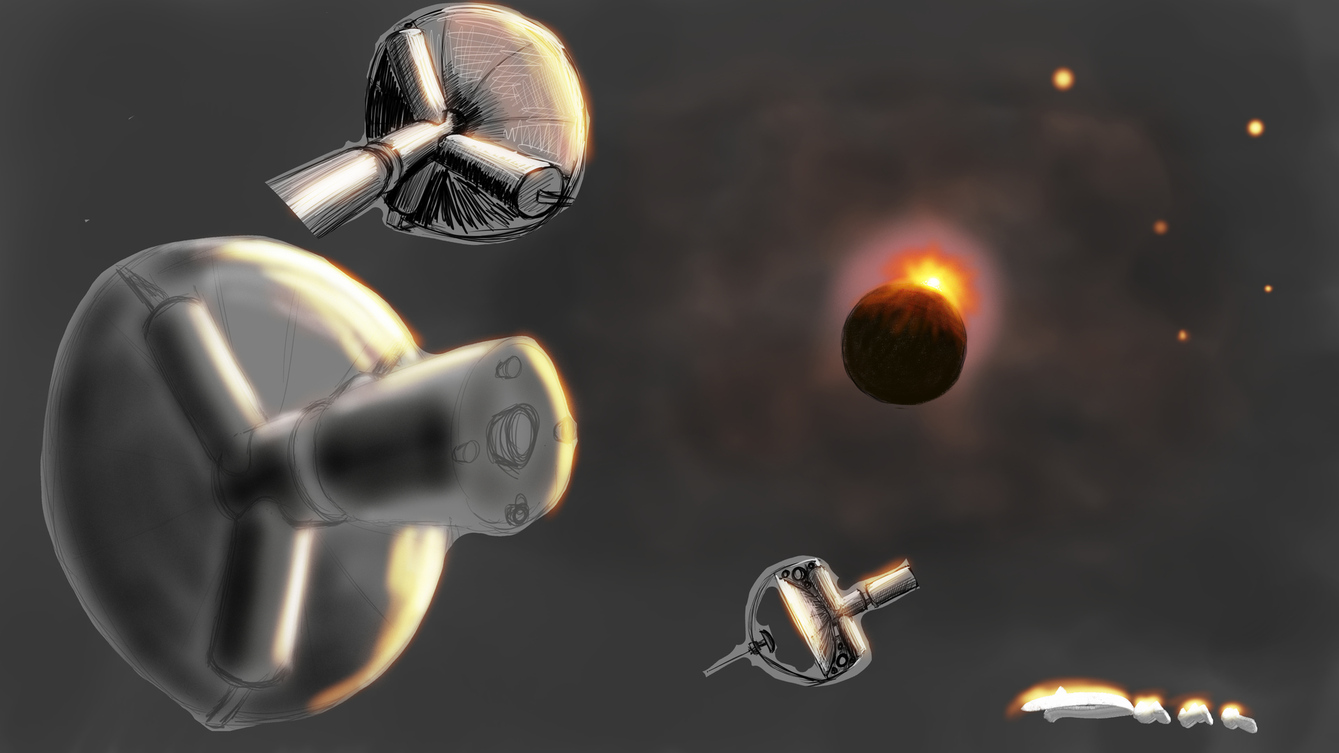
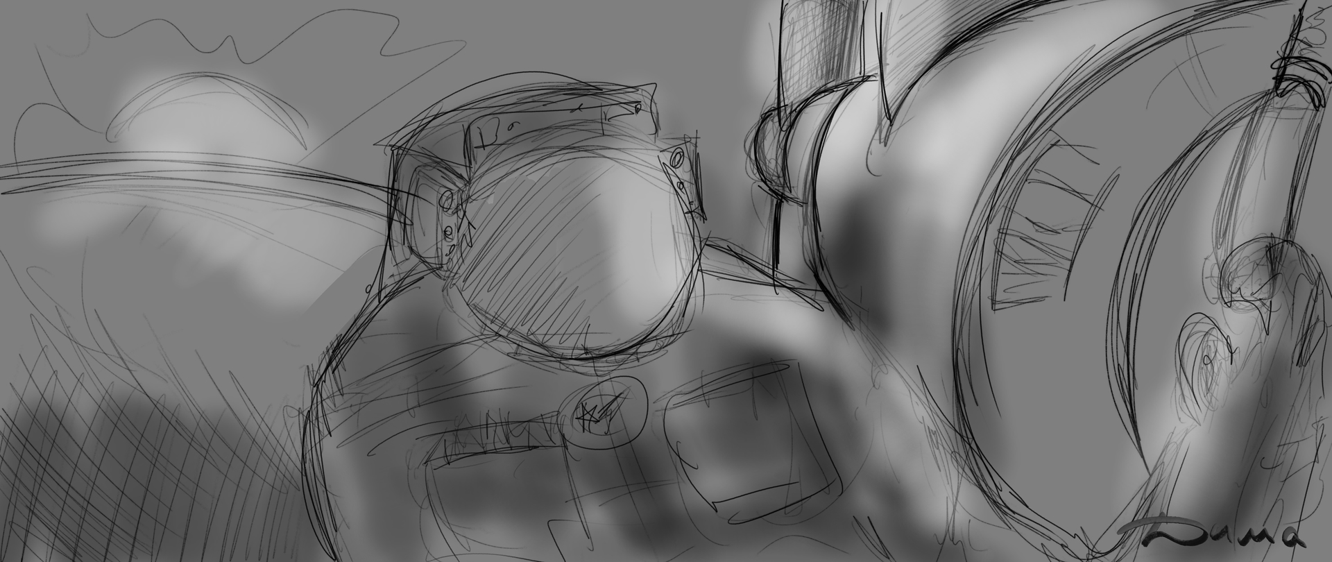
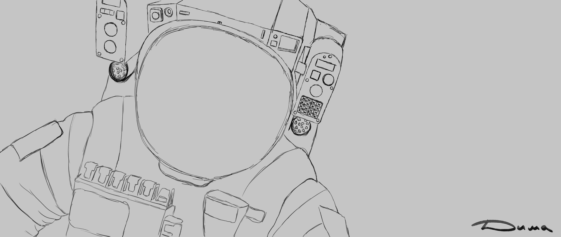
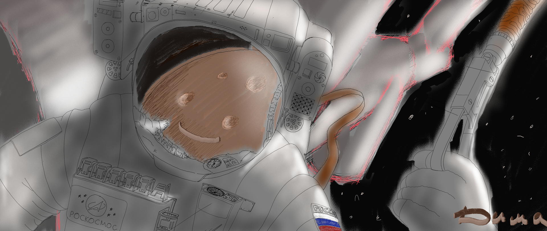
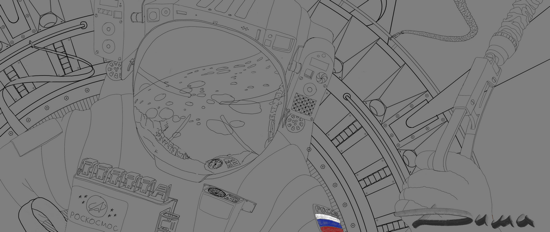
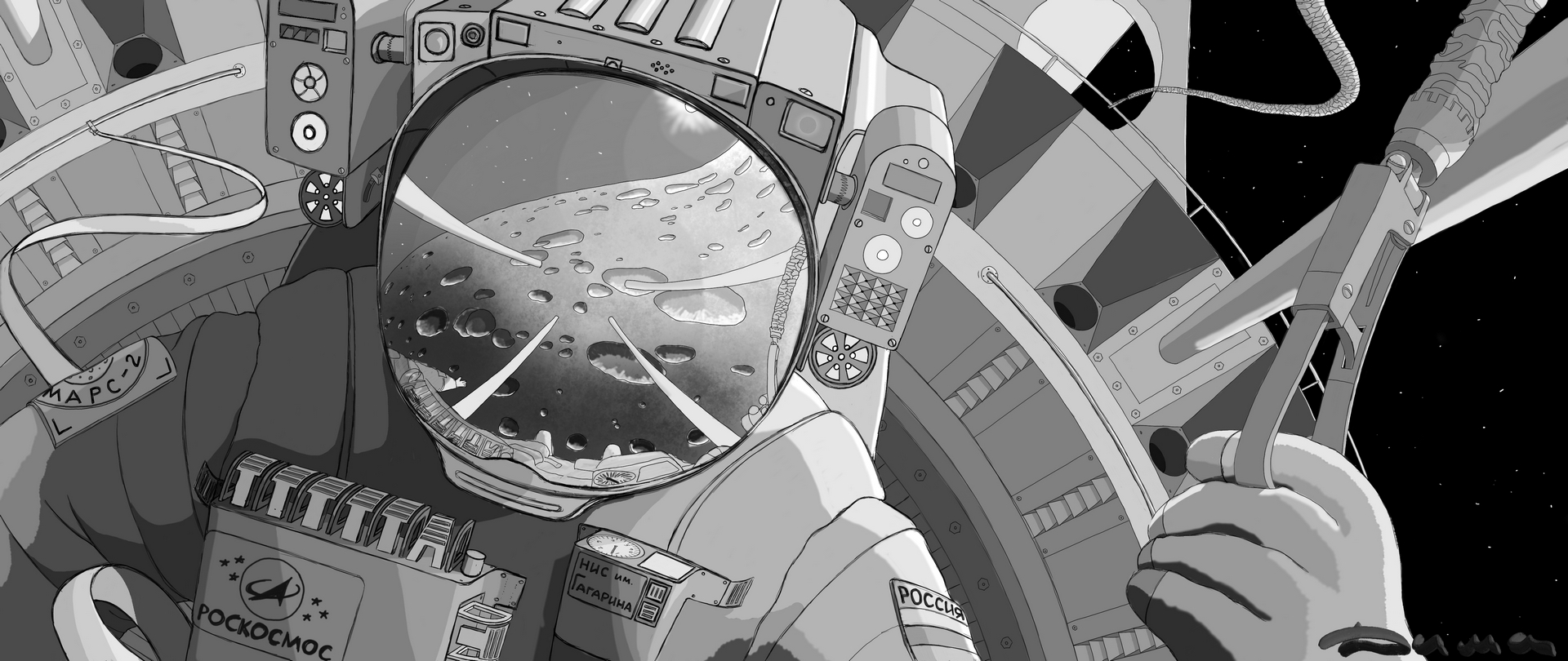
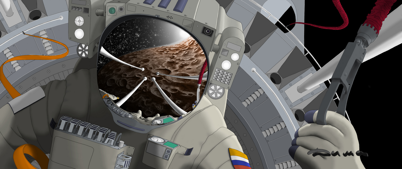
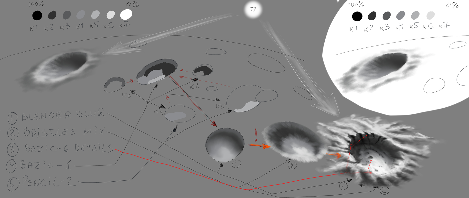
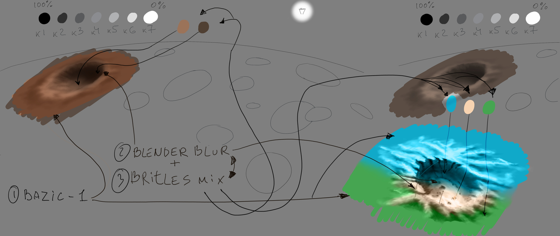
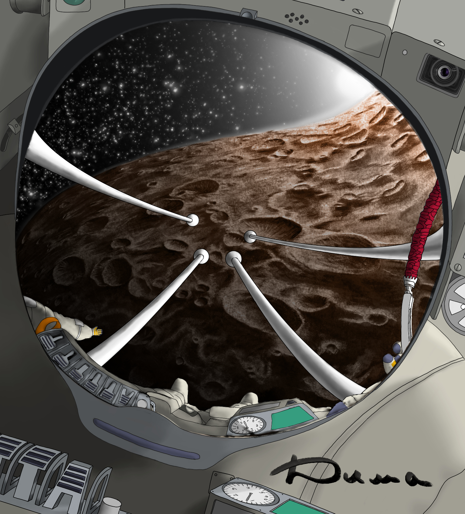
Draw the outline of the sphere of the future visor. For example, I had a reflection of the planet planned. Since the visor is convex (almost a sphere), therefore, I intentionally distort the outer contour of the planet, and also draw out the craters. At the edges, parallel to the contour, it is stronger, closer to the viewer, on the contrary, I take the edges away a little. I have a teapot in my kitchen, it’s perfectly round on legs and polished stainless steel, I think you also have polished utensils with which you can conduct research on various distortions in reflections. So, in practice, the result is actually a little different, not so spectacular. The task of any artist is to deceive the brain, to show him a plane with tricky combinations of shades in the right place, and he himself will complete the volume in this plane. Remember, WE SEE WITH OUR BRAIN, our eyes are just sensors that transmit information to it. You and I have not been there in the orbit of Mars and have not seen this reflection in the visor. Therefore, it is extremely difficult for our brain to understand whether we are lying to it or not. One thing he knows for sure from everyday life is that any reflection on a mirror surface is reflected in the opposite direction, and if this surface is not smooth, then the reflection will be skewed. Therefore, I tried to distort the reflection in the visor in different ways, but this option seemed to me more interesting and my brain personally believed that this reflection was voluminous. Get to the point. There are at least three ways to draw it. The first is to use a freehand selection and, having selected a space inside the visor, create a gradient fill on a separate layer. It is better to select the multiplication property for this layer right away. Then we create another layer, the usual one, and draw, for example, craters (I told you how to draw them before). Then we create a new multiplication layer on top, select the entire contour of the visor and do the gradient fill again. Next, we make a glow in the corner, in my case from the Sun. Basically, that’s it, then there’s the detail, and the stars. The second method is Figure 6. I drew a sketch, select the manual selection tool and outline the inside of the board with rivets. I create a layer and fill in the gray 60% on it. Now I select the reflection of this board in the visor, create a new one and fill in 60% gray. I repeat these steps inside the canopy, where there will be space, and on a separate screen, I paint this space 90% gray. We have three layers, turn on the protection of transparent pixels on them. Now you have a clear border control. We select the first layer (where we have a board with rivets). We select an Airbrush and make it a giant radius, and using a 30% gray pipette, we make a smear, as if the edge of this radius touches the upper right corner of this riveted board. Agree, it turned out to be more controlled than the gradient. We also repeat with the reflection of this board on the second layer. Now we have a third layer, this is the inner space of the visor, space. We reduce the diameter of the airbrush by half and make it glow gray by 10%. as if smearing the edge. Everything is ready, we detail it by drawing, for example, a letter on the first layer, the normal direction, and on the second by turning it away from ourselves. A few stars and the drawing is ready. The third method in Figure 7, I did everything inside the selected area, adding only new layers for each new shade of gray in the multiplication mode. I know that there is more than one way, perhaps faster or easier or more controlled. Share it if you don’t mind. Yes, I would be very pleased if you would post your results of sketches based on my examples here.

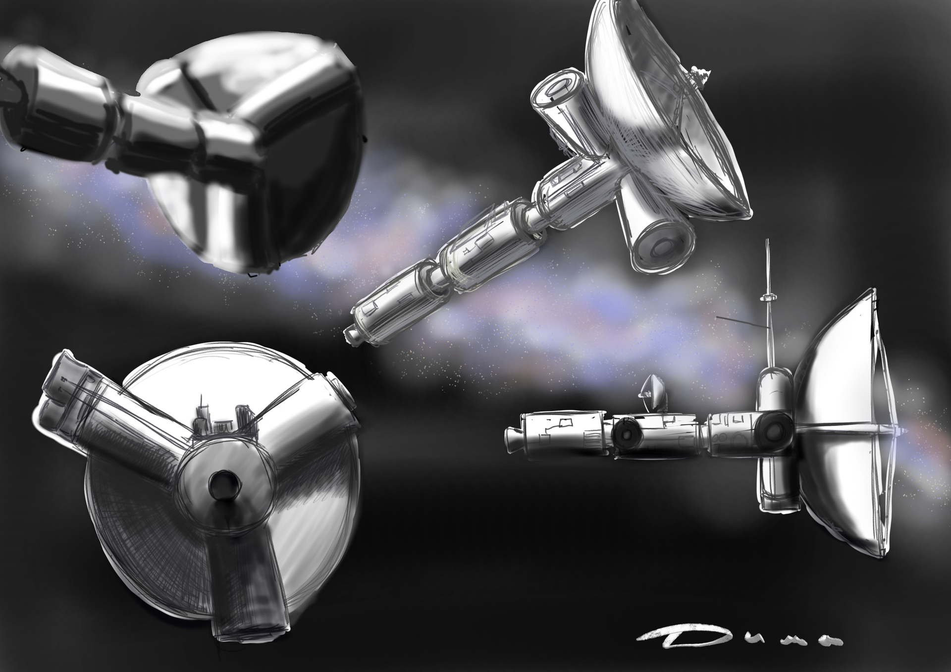
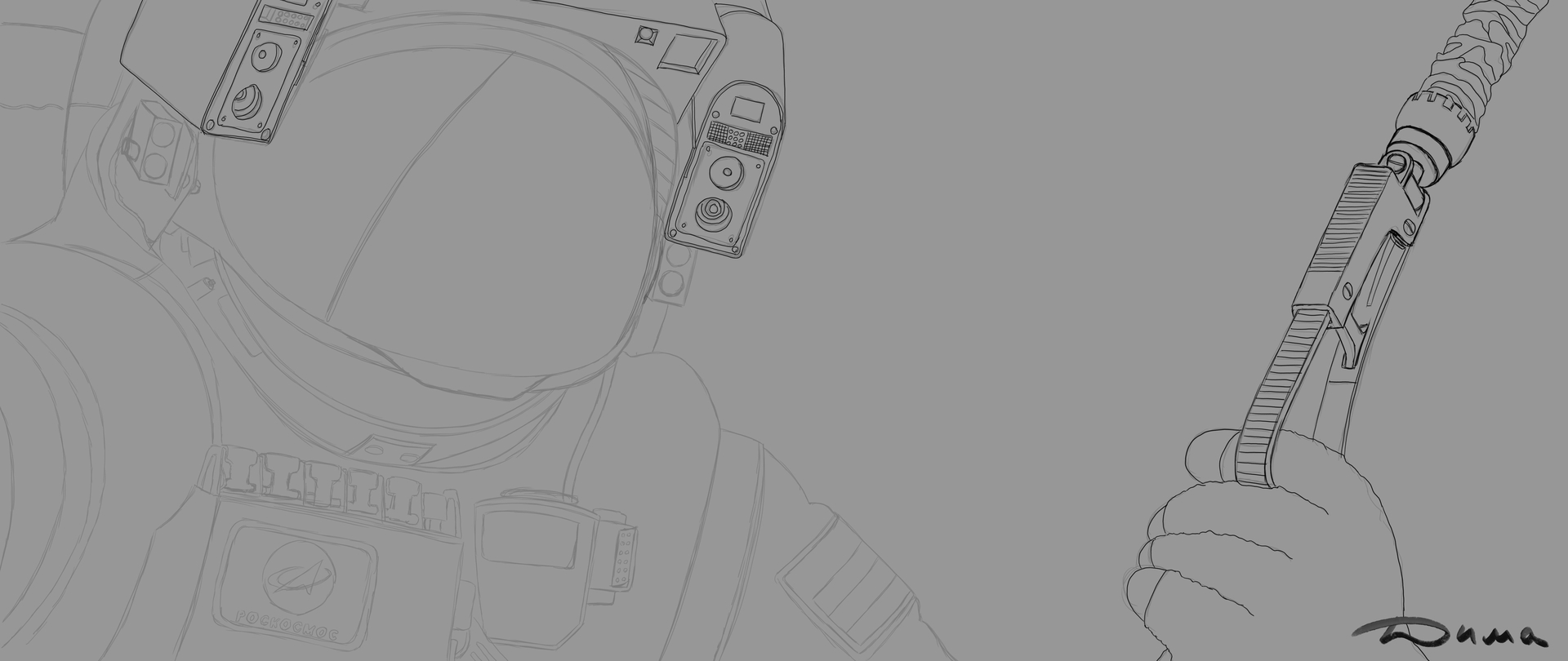
For clarity, I have cut this fragment from my drawing. I want to justify myself, there are a lot of mistakes here, the drawing is still in progress, and it’s not a fact that this is the final version.

Для наглядности я вырезал этот фрагмент из моего рисунка. хочу оправдаться, здесь видно множество ляпов, рисунок ещё в процессе, и не факт что это окончательный вариант.

Рисуем контур сферы будущего козырька. У меня например, было задумано отражение планеты. Так как козырёк выпуклый (почти сфера) поэтому я намеренно искажаю внешний контур планеты, также вытягиваю кратеры. По краям параллельно контуру сильней, ближе к зрителю наоборот, края немного отвожу. У меня на кухне есть чайник для заварки, он идеально круглый на ножках и полированный из нержавейки, думаю у вас тоже есть полированная утварь с которой можно проводить исследования различных искажений в отражениях. Т Так вот, на практике результат по факту немного другой, не столь эффектный. Задача любого художника обмануть мозг, показать ему плоскость с хитрыми комбинациями оттенков в нужном месте, а уж он сам достроит в этой плоскости объем. Запомните, МЫ ВИДИМ МОЗГОМ, глаза это лишь сенсоры которые передают ему информацию. Мы с вами небыли там на орбите Марса и не видели этого отражения в козырьке. Поэтому нашему мозгу крайне сложно понять, врём мы ему или нет. Одно он знает точно из повседневной жизни, любое отражение на зеркальной поверхности отражается в обратном направлении и если эта поверхность не ровная то и отражение будет перекошено. Поэтому я пробовал отражение в козырьке перекосить по разному но этот вариант мне показался более интересным и лично мой мозг поверил в то что это отражение и оно объемно. Ближе к делу. Нарисовать можно как минимум тремя способами. Первый это используем выделение от руки и выделив внутри козырька место под космос, создаём на отдельном слое градиентную заливку. Лучше сразу этому слою выбрать свойство умножение. Потом создаём ещё один слой обычный и рисуем например кратеры (как их изобразить я до этого рассказывал). Потом поверх создаём новый слой умножение, выделяем уже весь контур козырька и делаем опять градиентную заливку. Далее в уголочке делаем засвет, в моём случае от Солнца. В принципе всё, дальше уже детализация, и звёзды. Способ второй это рисунок 6. Нарисовал набросок, выбираю инструмент ручное выделение и обрисовываю внутреннею часть доски с клёпками. Создаю слой и закрашиваю на нём выделенное серым 60%. Теперь выделяю отражение этой доски в козырьке, создаю новый и закрашиваю серым 60%. Повторяю эти шаги внутри козырька где будет космос и на отдельном солее закрашиваю это пространство серый 90% . У нас получилось три слоя, включите на них защиту прозрачных пикселей. Теперь у вас есть чёткий контроль границ. Выбираем первый слой (где у нас доска с клёпками). Выбираем Аэрограф и делаем ему гигантский радиус и выбрав пипеткой серый 30% делаем мазок, как бы краешком этого радиуса задеваем верхний правый угол этой проклёпанной доски доски. Согласитесь это получилось более контролируемо чем градиентом. Повторяем тоже и с отражением этой доски на втором слое. Теперь у нас третий слой, это внутреннее пространство козырька, космос. Уменьшаем на половину диаметр аэрографа и делаем на нём засвет серый 10%., как бы мазнув краешком. Всё готово, детализируем рисуя например букву на первом слое, нормальное направление, а на втором перевернув её от себя. Немного звёзд и рисунок готов. Третий способ на 7 рисунке, я всё сделал в внутри выделенной области, добавляя для каждого нового оттенка серого лишь новые слои в режиме умножение . Я знаю что есть ещё и не один способ, возможно более быстрый или лёгкий или более контролируемый. Поделитесь если не жалко. Да, мне будет очень приятно если вы выложите здесь свои результаты набросков по моим примерам.

4 Likes

Thank you very much for the detailed tutorial on how to make reflections, and just so you know, I’ve already bought a stainless steel milk jug online to practice!

Большое спасибо за подробный урок о том, как делать отражения, и знай, что я уже купил в интернете стальной молочник из нержавейки, чтобы практиковаться!

1 Like