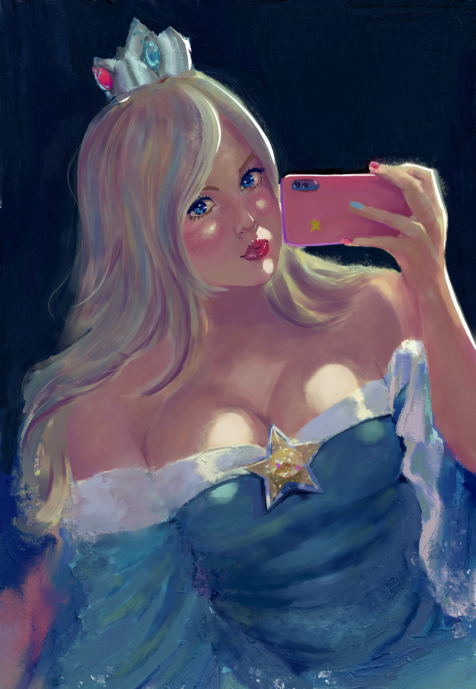
I’ve seen a lot of tutorials about color theory and the like. But I can’t be happy with my work thus far.
the colors always feels off and the frustration is noticeable in othe rareas.
My objective is to have rich colours that do feel like the colors you get from scanned or photographed traditional media, I know I’m not even close, but before I can achieve this goal I seriously need to improve my color choices and mixing.
I would really appreciate if someone who struggled like me but ended up improving could give me some advice.
It’s just really hard to actually use the color wheel effectively.
send help,
Best regards,
PD: I think I’m in the right place to ask for advice, I will remove if this is wrongly posted.
Your actual colour choices and placement. “Rich” colours are usually a lot less saturated than we tend to think! Pairing saturated colours with less-saturated complements makes the former pop a lot more. Using a family of hues for each “colour” within the image feels more natural and lively as well - you’re already employing that, but not enough.
For example, your blue dress has a blue base, shadows trending towards a more navy colour, and some greenish highlights, which looks much better than having the same hue at different values for everything, but you can go further by introducing even more variation. IRL this variation is usually the result of reflected light from different parts of the scene, but there can also be hue variation coming from the colouring of the object (for blue fabric, that might be be variation in the dye, deliberate patterns, iridescent bits, etc).
You can also make the colours more interesting by introducing different hues where lights and shadows meet. A common example is a reddish boundary on skin, representing subsurface scattering, but it’s also not uncommon to add such transitional hues even on objects that don’t exhibit subsurface scattering.
Colour blending in Krita. There are many different ways to blend any two RGB values, and it’s a lot easier to get good results if the blending works with how you think about hues. For example, you might expect saturated yellow blended with saturated blue to produce saturated green, and if that’s not how the colours actually blend, then you’re going to have to spend a bunch of time manually choosing intermediate hues to make your colours work well.
Depending on the colour profile you use, Krita will blend colours differently (more details in the docs), perhaps trying a different colour profile might give you results more to your taste. Changing colour profiles won’t change existing pixel values so it probably won’t make your painting better, but it can help with blending going forward (though it may help in the case of blending across layers, since that’ll be recalculated). I’m not aware of any colour profile that makes colours blend like pigments, though there are art programs out there that do a decent job, and perhaps one day we’ll see that in Krita (there are some threads about people attempting such things, but I haven’t tried any).
If none of the profiles feel better (for me, none make enough of a difference), you can still choose intermediates manually so that Krita doesn’t have to blend disparate colours as much, so the blends are less likely to get muddy. This is why you sometimes see artists, digital and traditional, block in a lot of the colours before they do any blending - it gives them more control over the colours. Some artists instead prefer to blend first and adjust the hues with additional washes after. Most do some mix of the two, depending on the situation and how confident they are about the colours.
Thank you for the detailed response, I think your first point is something I can immediately work on.
looking back at my process I see that my issue is knowing how the color wheel works, i’ll try to work from more desaturated colors so the accents look rich, its just that when a large portion of the canvas has to be made with some already rich colour I lose the control over my values.