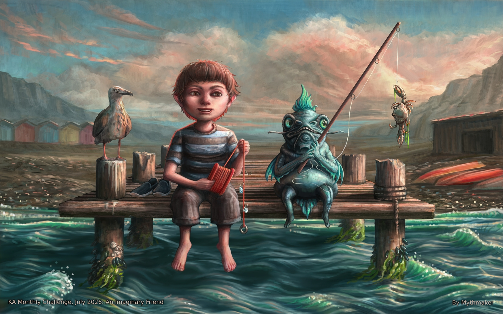
This was my piece for last month’s challenge. It’s actually the fifth one I’ve attempted this year, but I didn’t get far enough with any of the others - So I’m glad I managed to get this one far enough along to post it.
I should have posted it in here over a week ago to be featured, but as usual I couldn’t resist trying to improve it!
It’s taken a lot longer than I’d anticipated, and I’ve long since grown tired of messing with it. Please take it away from me!
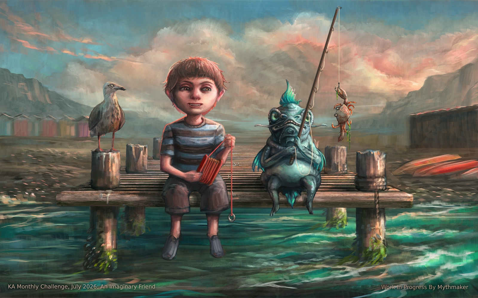
I think something is always lost when refining a piece, so hopefully I haven’t spoilt what people liked about the earlier version?
Congratulations on winning the monthly art challenge. Your winning artwork is now featured on the Krita-Artists artwork banner.
May I have your permission to post this image on Krita’s social accounts (Mastodon, reddit, X, and the new Facebook group) and on Krita.org? If yes, I will credit your user name (or another name if you specify one). You are free to specify which places (if any) you allow us to post your image.
Please write a brief description of the visual art that will allow unsighted people using a text reader to understand the image.
Good Alt Text Examples (click to read)
A herd of black and white cows graze in a distant field. There are yellow flowers in the foreground and the sun is shining.
–OR–
Full-length portrait of a knight in armor. The knight is standing next to a white horse. Behind them are a number of soldiers tending to their animals.
I did start writing a story inspired by the mouse illustrations I’ve posted on the site (I don’t think they’re all in the portfolio) - So I might end up doing that if I continue with it.
I did struggle with the composition because I rushed into it without doing any exploratory thumbnails first. Well, I did one thumbnail then built on it to make this!
I kept thinking it would have been better with more of a 3/4 view so I could more easily describe the perspective. Creating depth with what’s essentially a 1-point perspective proved quite difficult!
The imaginary friend is meant to be some kind of aquatic creature - I was thinking along the lines of something Studio Ghibli might create, but the end result is somewhat different to what I imagined. I think I was looking at images of catfish when I was sketching the head.
I came back to enjoy this gorgeous image again. I’m drawn to it because of the colors. I especially like the way the imaginary friend is the same color as the water, as if it just jumped right out of the water to sit on the dock.
That is a terrible fear! I can’t stand it when more work is put in an image only to feel like you lost the initial integrity/feel. But, I don’t think it happened in this case. I think all of your changes were enhancements.
Only thing that seemed just a style choice was the rendering of the water. Seemed simply a different look in your original. Which, didn’t really get lost in your final, just more stylized to me. I’m not sure which one I liked ‘more’. They honestly both look nice. Just different.
I’ll admit being a little disappointed at first, as I thought the boy’s feet had been dangling in the water and I liked that. But, closer look, I saw he was actually wearing shoes (which was a sweet detail you chose to include them on the pier!). So, since that was what you were aiming for, it was good you clarified that by defining his bare feet. (And, on closer inspection, I saw his feet were way too high to be in the water anyways! )
While I may not really connect with having a catfish-like friend myself you really rendered it well, and your image has a very pleasing style! Has an immersive feel to it. Glad you were able to post!
Part of the difficulty for me is I hardly ever start with a resolved drawing - I tend to work more iteratively, so I usually end up having to fix things as I go. All that reworking and refining can risk destroying the spontaneity in a painting.
I actually repainted the water twice. I kind of liked the original too, but it was painted entirely from imagination and I wanted something more realistic. I ended up watching videos I’d taken using an action camera in the sea, to help me understand how waves behave in reality.
I think I found a decent balance with this iteration, but (as above) did lose the more impressionistic feel in the process.
The feet were actually meant to be like that - I only added the shoes as an experiment, then left them as an interim solution because I didn’t have time to spend refining the feet!
I did experiment with adding other items - such as a bucket and a bag, but I felt it was cluttering up the composition so only included the shoes in the end.
Oh my goodness @Mythmaker , wow. Watching a video to study how waves work - good for you. I’m very impressed. I had subconsciously noticed how much the second version had well defined swirls and rhythms. I think you got it.
You know, I’m sure you’ve heard it before of thumbnailing and all. I only mention it since between the shoes, bucket and bag, it struck me how much you seem to be bursting with ideas. Might help with streamlining & lessening your overall pain! (Esp of refining and spontaneity)
I would not have guessed those first shoes were temp, btw. I think that was a good call on the items on the pier. It’s a nice composition that hones the focus on your characters with enough to create the setting. (And I don’t know why, but the set of shoes next to the kid really hits me as cozy.)
I do thumbnails when I’m being thorough and not rushing, but as I mentioned in my reply to Ramon:
So - I started to make thumbnails, but was impatient and decided I already knew what I wanted. I took that one very loose thumbnail and used it as a base to build the image on. I did a base sketch in greyscale (in values rather than lines), then once I’d had enough of that I started to colourise it and continued in colour from that point (the majority of the work time).
As for resolving those details in my thumbnails - I never take them that far. Mine are a combination of ideation, basic composition and value study. You can see some examples in the sketchbook I haven’t updated in ages: Myth's Tome of Inane Scrawlings 📖
I’ve long wished I was better at doing lineart so I could solve all the composition and drawing problems before painting. But I struggle to draw with only line - I’m more comfortable working with values and never made enough of an effort to change that.
Come to think of it - I did have some success experimenting with adding lines as a layer over my early values, but I seem to keep forgetting about it!




 Would that be an art book or an illustrated story book?


 you really rendered it well, and your image has a very pleasing style! Has an immersive feel to it. Glad you were able to post!

 Might help with streamlining & lessening your overall pain!