Oh, I just saw it! And nice of you to make it bold I think that does it cleanly enough!
In the meantime, I’ll keep working on the advanced color selector. I know that @Kapyia is doing some cool work on the plugin front, so let’s hope that we have some more things to share in the near future!
I honestly don’t like currently the additional line at the top of every docker with the name and max/min and cancel button (the name redundancy as mentioned at the beginning).
Would it be possible to remove this line all together, keep only the tab name in the tab and if the mouse hovers over the tab name it would expand (width not height) and the icons would appear (it would cover or pushed to the side the other tab names)?
While moving it around (holding the mouse button) it would display only the names - same as the image on the left, or how it is done right now in Krita.
I tried to tinker a bit but I don’t think I can do this on my own to try in the the scripter unfortunately, at least I don’t know how and haven’t been able to figure it out so far.
I borrowed an image from above to show something, not saying it has to look like this but it keeps the functionality, it kills that unnecessary name double and saves space as was suggested with that one line of name removal.
At least I don’t see a reason to keep the functionality visible all the time as I don’t think it has a frequent use during work but it’s still nice to have it there especially considering GUI is a bit clunky to customize.
It’s a neat idea, but right now I think that’s a challenge given how the title bar and the tab bar are separated. I’m not saying it’s impossible, far from it, but from what I understand there’s a lot of funk to be had from messing with the tab and title bars of dockers, especially when you’re targeting multiple OSes.
I see what you’re saying. Those posting etiquette messages probably could have been discussed through private message. But considering how post etiquettes in these topics affects everyone reading, I think it’s reasonable to include them in the main thread.
I think I might have made a mistake when creating this topic then . Initially, this topic was mainly focused on how Dockers could look together, in terms of tab width, visibility, icons etc.
Obviously given such a broad topic and title, there is bound to be focus on details of specific Dockers, like the Colour Selector Docker. But what I’m thinking of in future is for specific Dockers being mentioned in here first, gaining an audience, and then moving into dedicated topics.
I wouldn’t feel like individual topics for Dockers mentioned here would be excessive. There is already a dedicated topic for Animation Dockers for example, and that could easily be discussed here!
While I say this, I’m assuming that not every Docker in Krita will be discussed here, and then need a dedicated topic. A large portion of them work fine as they are, only needing a style change, which was mostly why this topic was created initially.
In any case, I’m not outlawing specific Docker recommendations from this topic. All I suggest is that discussion on how one Docker operates be kept to a reasonable length, and if there is clear desire to pursue the Docker further, then perhaps move that discussion to a dedicated place, where readers don’t have to sift through various unrelated replies to talk about one thing.
The tab title and the tab itself are because how Qt has it by default. if you see any Qt opensource app like kdenlive scribus etc. they all have these duplicate title and grab area for tabs. the tab area is for arranging the tab and the title area is for grabbing the docker out of the docked group. In other applications these tabs are placed at the bottom of the docker while here we keep it at top thus making the duplicating titles more obvious.
If we want to remove title underneath the tab
marked with red here. Then you would have to make the tab also the grab area for the docker.
@halla had already linked a different implementation in the earlier Ui design thread perhaps that will be interesting to look at.
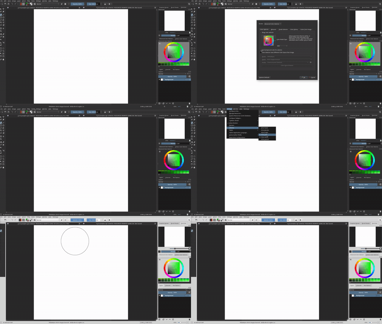
Just submitted the merge request for the advanced color selector using the background color. It now correctly deals with theming, as well as the shade selector. Thank you to everyone that assisted in this!
If it gets merged, I’ll let people know. Tomorrow I’ll pass onto the next things to improve the UI!
Can there be a border around the wheel and the center square/triangle, just to differentiate certain greys and other colors from the background? This is just a wish.
Yeah, the problem with that suggestion is that I don’t think that should be another option for such a small feature. I think that it should either be left as is, or add the suggestion you gave, not both… From a UX perspective it feels too much customizability for so little.
I had a chat with @scottyp in the IRC the other night and I think he made a good point that it’d be great if the Python API could be extended to allow for more and easier UI customization. This would allow the community to experiment with new UI/UX design and distribute it for users to test without immediately having to push it on the core software.
If this was done Krita could theoretically have a great “default and simplified” core UI experience, but allow finer details to be tweaked with Python instead of messy configuration dialogs.
Still, I could test out to see the difference it would make, but I can’t do that at the moment, focusing on other parts of the redesign, namely the overall theme and tabs. Hope I have something to show in a few days!
Yes the code “only” gets built once every 24h, time of the day depends on branch and platform.
Try again in roughly 10h for the windows master build, some more for the appimages.
 I think that does it cleanly enough!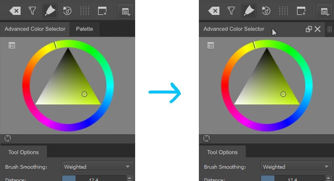
 . Initially, this topic was mainly focused on how Dockers could look together, in terms of tab width, visibility, icons etc.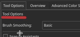
 .
. Will we be able to download and try this in the “Krita Next” builds if/when it is merged into master?

