Thank you so much for this amazing change! I also love that people can choose whatever background colour they want for it, and the UI for that was done super well!
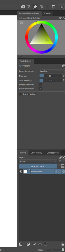
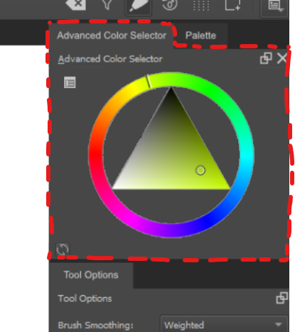
I noticed that the Timeline looks different when undocked compared to the others. Since this thread is about dockers overall, I want to ask if anybody knows: Is this coming to the rest of the dockers? It looks and acts fantastic!! I love how it looks like it’s more a part of the program, and not just another Windows window! It’s just so beautiful! If all the dockers looked like this undocked, I would probably undock more than I do now haha. In Krita 4.2 - 4.3 the biggest reason I don’t undock dockers is because I don’t like the look of the large white window header
@Rakurri - that docker was recently changed by emmet and eoin. It has a custom title header. I am not sure if there are any plans right now to use that custom header type on all the dockers right now. Maybe that would be an easy change…but I don’t know. There were some concerns that the custom title header might create issues on certain OSs. Maybe if that is out there for a bit and we aren’t getting any issues we could make that new custom type the default which would get rid of the white headers for all the other dockers.
Thank you so much for the kind words! Also, a thank you to @Deevad since it was him that suggested the ability to use a custom color for the background Had to rework some things, but it was worth it, gives a lot more flexibility!
Just to let people know, there is still work being done, only that the plugin is being refactored to allow for some good levels of customization. It’s being tricky tho, but it is being done!
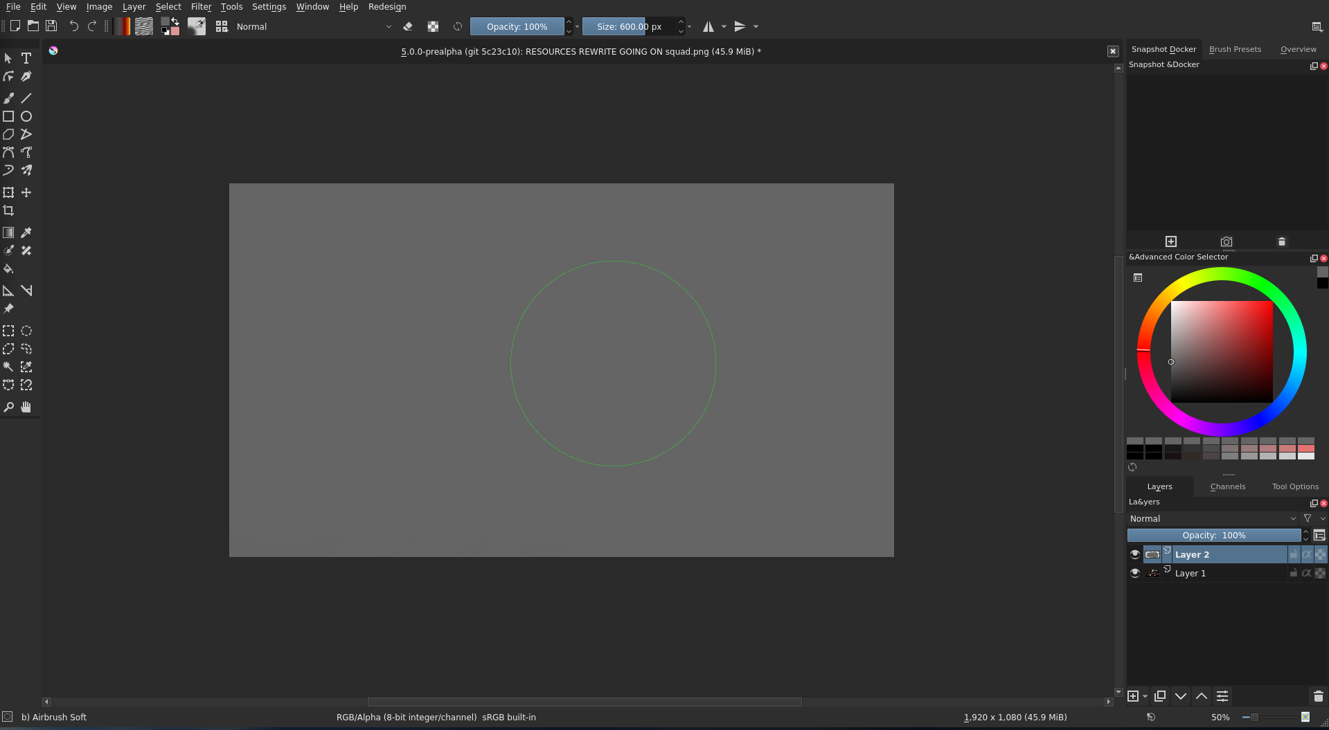
Okay, so here’s the current version of the theme. This is done after a massive refactor to increase modularity, and the plugin now stores the settings persistenly.
This is using a new flat theme, which can be disabled. What are the most standout things you can say that are wrong? It’s still a work in progress, so please take this with a grain of salt. Still, progress is evolving rapidly!
I would probably second @fullerhill_art to use a more subtle close icon for the dockers if possible. I usually think of red as errors, or some very “destructive” operation where you might lose data. I would probably just make the icon a similar style to the float icon.
@raghukamath@scottyp I chose it because it was more readable than the default one and because it would work with both light and dark themes. It was the best option I found among Krita’s icons. I found it a bit strange that there isn’t a plain ‘X’ icon with a a light and dark variant anywhere in Krita’s icon library, or at least that I could find.
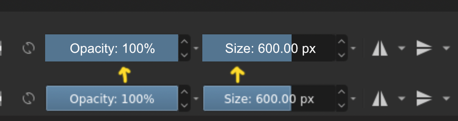
The icon is nice, It is just that the color stands out. Also one more thing I noticed is that the docker close icon and the tab close icon don’t match.
Looks nice! I love the clean look, though I feel the shades of colours are a bit disorienting.
Some feedback:
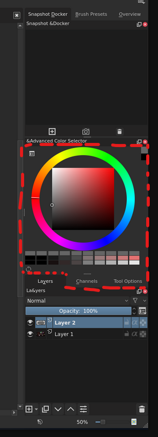
I think the colour of the docker should follow in its tab, for instance with the advanced colour selection, the unused tabs under the docker looks like it belongs to the colour selector, like illustrated here.

 This is fantastic! So pleasing to the eyes!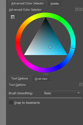
 I also love that people can choose whatever background colour they want for it, and the UI for that was done super well!
 I love how it looks like it’s more a part of the program, and not just another Windows window! It’s just so beautiful! If all the dockers looked like this undocked, I would probably undock more than I do now haha. In Krita 4.2 - 4.3 the biggest reason I don’t undock dockers is because I don’t like the look of the large white window header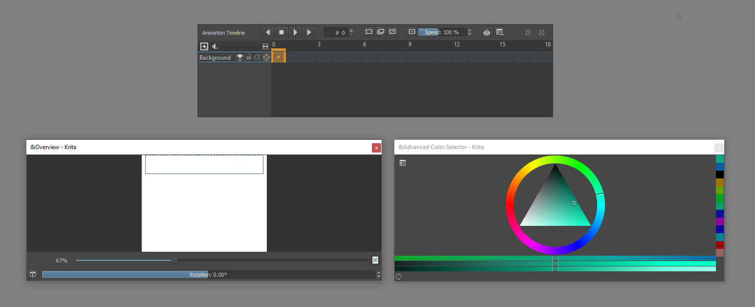

 Had to rework some things, but it was worth it, gives a lot more flexibility!
 congrats on getting this merged
 ”
”
 .
.