Yesss, love these suggestions! I love the cleaner look and better readability on the bars! And I would love to have a grey/white/black selection! It makes sense especially when you can chose colours for the layers!
Well, right now it’s extracting the colors from the theme itself, so there won’t be hard-coded values for any colors in the end result. Right now, I’m doing a new custom theme that will also be in the repository, but I’ll get back to it tomorrow, hopefully I’ll have something more to show by then!
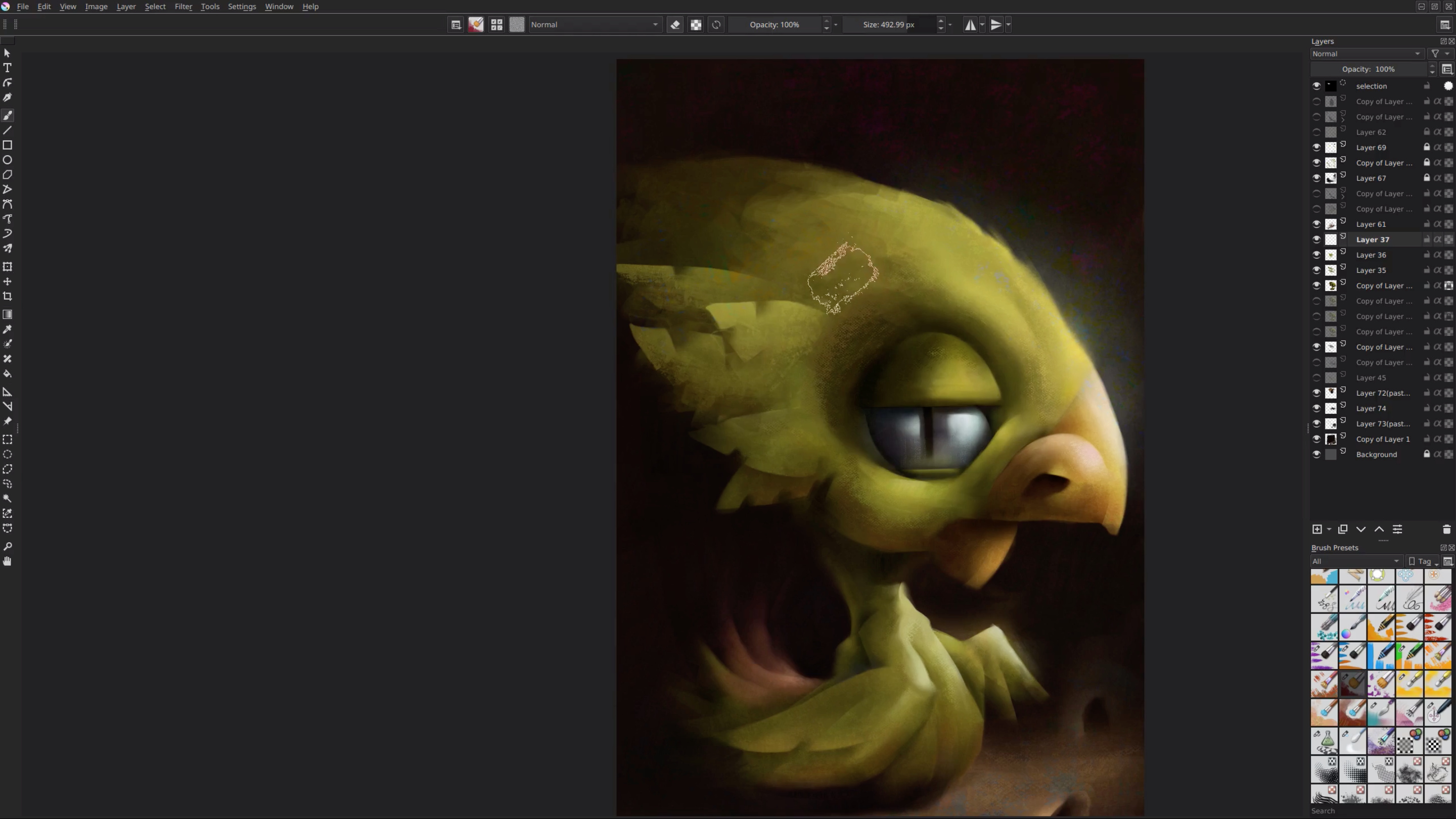
Would also like to share custom @wojtryb UI, that I recently discovered in his video tips. I think it is very minimalistic and a great example of how the canvas can be the centrepiece of the UI. Many of the things that are being discussed can be found in his custom template.
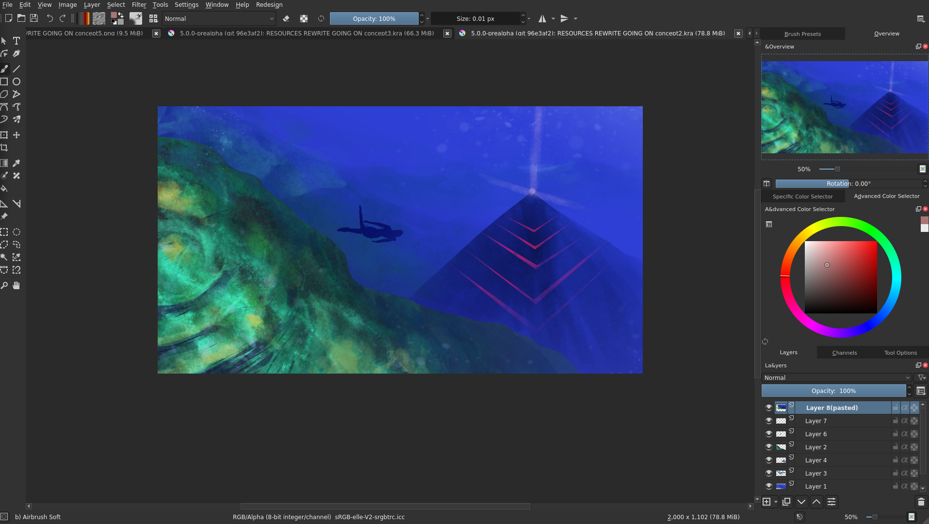
I know there are a lot of improvements to be made, namely not existing any separations between dockers on the side, the document tab on the top, the close button wasn’t changed, and the sliders still have that border that I can’t seem to get rid of.
Looks nice! I’m wondering if the scroll bars can possibly be reformed, so that they’re more in style with Docker tabs? Even though I disable scrollbars, that might look good too .
I only see it every 4 to 6 months so it might be old news for you guys.
but I was there a couple of weeks ago when I was tweaking my script for linux.
I remember thinking Linux was more pretty the first times I went there but now it is kinda a sheet of paper with angular edges, didn’t like much.
btw I will not be working on the UI thing anymore I did a bunch of work and I got their stance pretty well. it is a big “no” for various reasons. kinda pisses me off but things are how they are, and their reasonning. So I am busting my head on blender python now, but if you guys need help at all just send me a shout-out I will come around and help. I still keep an eye open because of my scripts threads here to give support.
I think you misunderstood the feedback for the icon work. I regret that the communication felt that way. Please don’t be discouraged. I request you to open the Merge request for the icons. some of them are good and might be up-streamed. Contributing takes time but it must go through with proper steps, we must gather feedback from all users otherwise it won’t be a community project would it?
This raises a conflict with what I said (in the toolbox thread) about canvas space being a priority. I can see and appreciate where this is heading - but the lack of padding around the interface in this latest iteration makes it feel cramped and harder to read.
That’s one reason why the other more dramatic redesign looked visually appealing - because of the spacing. I’m sure there’s a happy middle-ground; So the UI can breath without eating too far into the canvas space.
I think I agree about the separator line - As now there’s no indication where to grab to re-size (I do that quite frequently). Maybe that’s not an issue in practice - as the cursor changes in the right place.
 .

 .

