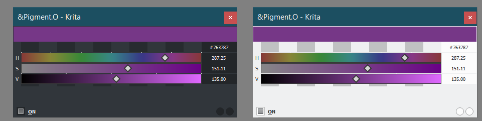
Ok, I got around testing this. I find that the font are too small for me to bother with. Can they be bigger? How do I make the fonts overall bigger?
EDIT: I’m using QTCreator UI Toolkit to do this.
Ok, I got around testing this. I find that the font are too small for me to bother with. Can they be bigger? How do I make the fonts overall bigger?
EDIT: I’m using QTCreator UI Toolkit to do this.
too small? but they are the same size as Krita’s fonts.
and yeah changing that will messup the entire UI I dont recomend that at all.
As you may have seen I have been working on a luminosity lock.
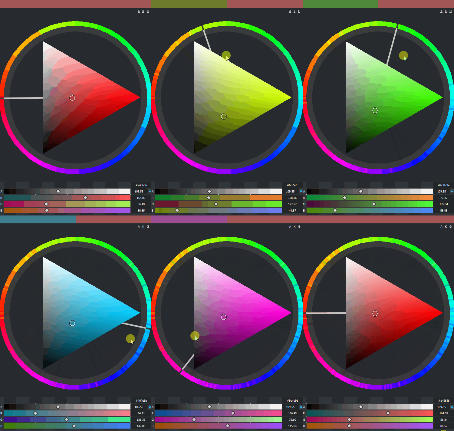
After making the luminosity lock work properly I have been divided over the behavior when it goes out of bounds. I have 2 versions to treat this out of bounds values.
Maintains fixed the amount black of the color but by doing so creates Hue breaks at certain points.
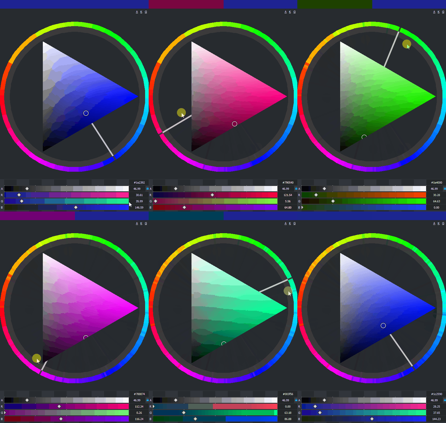
Maintains fixed the amount of hue of the color but by doing so creates Black breaks at certain points.
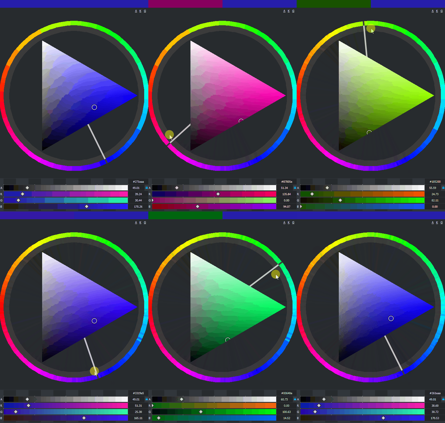
In your opinion what seems to be the best behavior to uphold or you have another thought?
I went for a shower after posting the question and I was thinking about it and when I came back I did this.
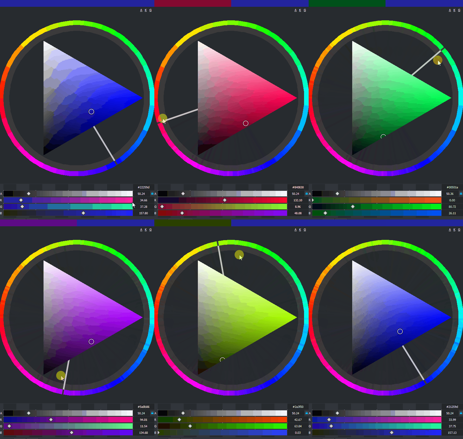
wow i need to test it as soon as i can. And read also a lot of previous comments, This is getting serious ! 
Coolorus and MagicPicker plugins for Photoshop have the same feature, and each of them cost 15$ (the second one need +$ after major version update)  . I love Krita. In that way a couple years and PS will nothing have that Krita don’t for painters.
Btw when are you planning to publish the update?
I don’t really know. my initial prediction was to end about mid to end of January for this one. but I imagine about 2 more weeks or so. it kinda depends though if I want to do something and i don’t know how to yet and i have to find info, learn and use it. I am very prone to just follow in a tangent suddenly.
But I found a bug with my implementation of QPainter about the beginning of the year and I have been remaking things. While i was bored fixing stuff I made the luminosity lock that you saw there and some other little things here and there.
I just finished fixing the obj panel and that was really time consuming but I think I managed to do it more right this time. it is looking really fast and light now. Next is the new feature that has been on hold for a while now.
Mini Skin Tutorial
Skin has various issues considering color variation and lighting.
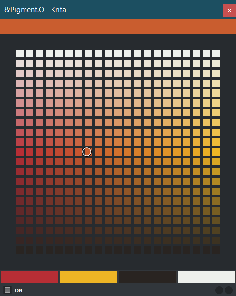
Thinking about it I thought about something that could helped me create tone variation inside a limited gamut of colors in a variable and easy to use fashion. Inspired by Andrs Zorn limited color palette I created the DOT panel which is incomplete to reflect all the variations that his mixtures creates in paint however it focuses on the main mixtures paths it creates.
Andrs Zorn Example
As homage to Zorn, this is the default color set, and the one that appears if you delete all entries and restart Krita again. The mixtures it ignores is the black to white ones, you can add the mixer to do these on the side under it. Instead it focuses on the red to yellow and how they go to white and black instead. Also black and whites are much easier to mix in the canvas too and you can also swap the colors around if you like if that is you main focus.
The DOT panel is a auto generated swatch set of colors but when painting skin it is more akin to a makeup case of a limited set. Andrs Zorn palette is very ample but you can choose colors for more specific cases. Since it does RGB interpolation you don’t get weird variations of colors going from one to another as it favors greys instead keeping the hues cleaner.
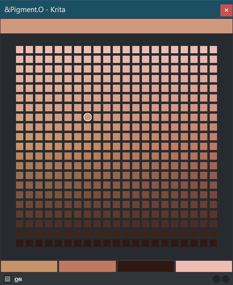
I will show some more specific cases for skin taken from photos:
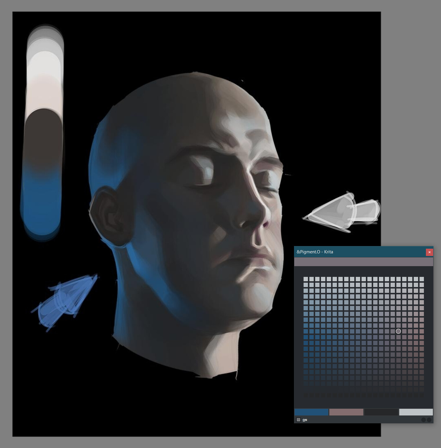
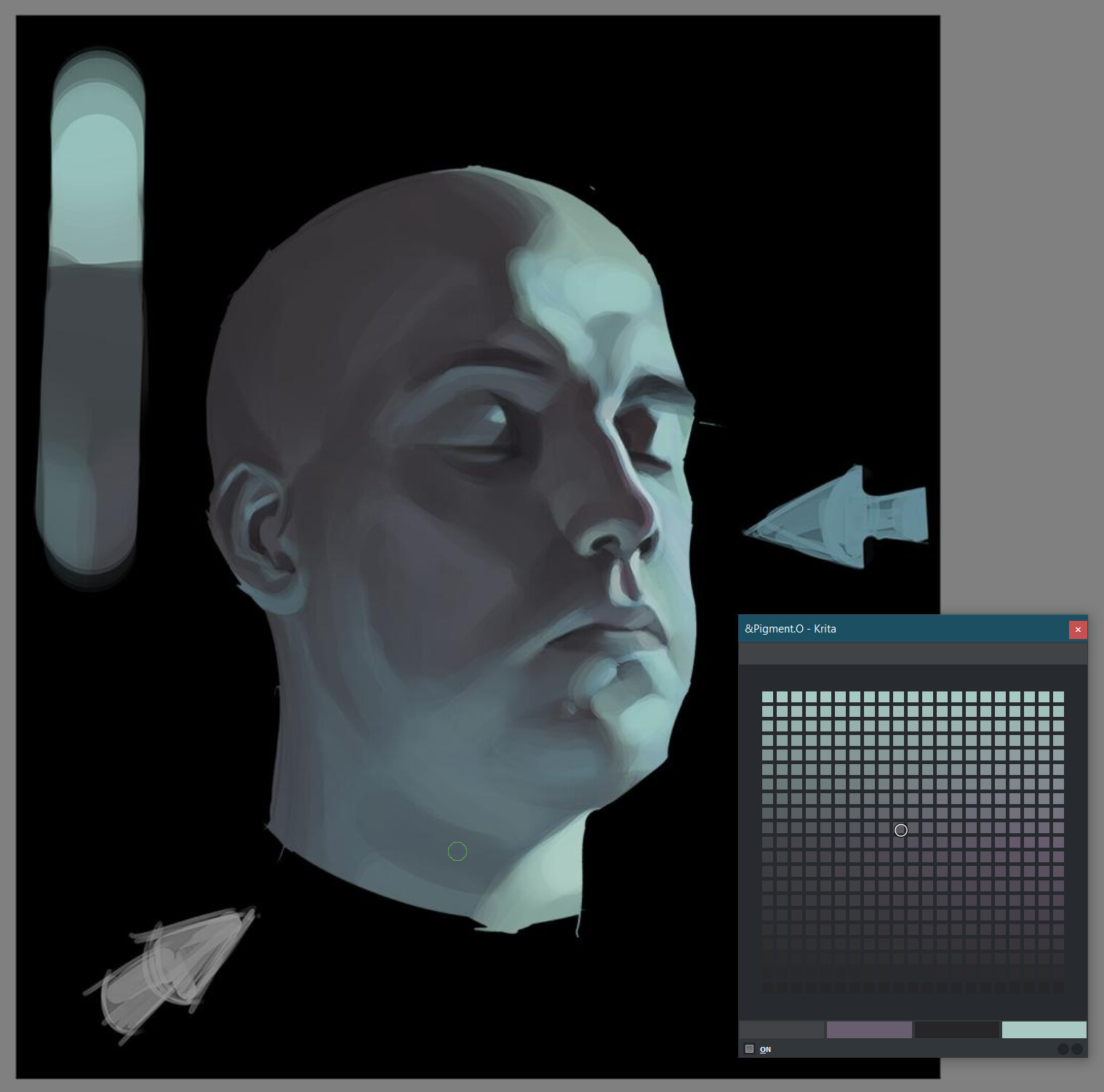
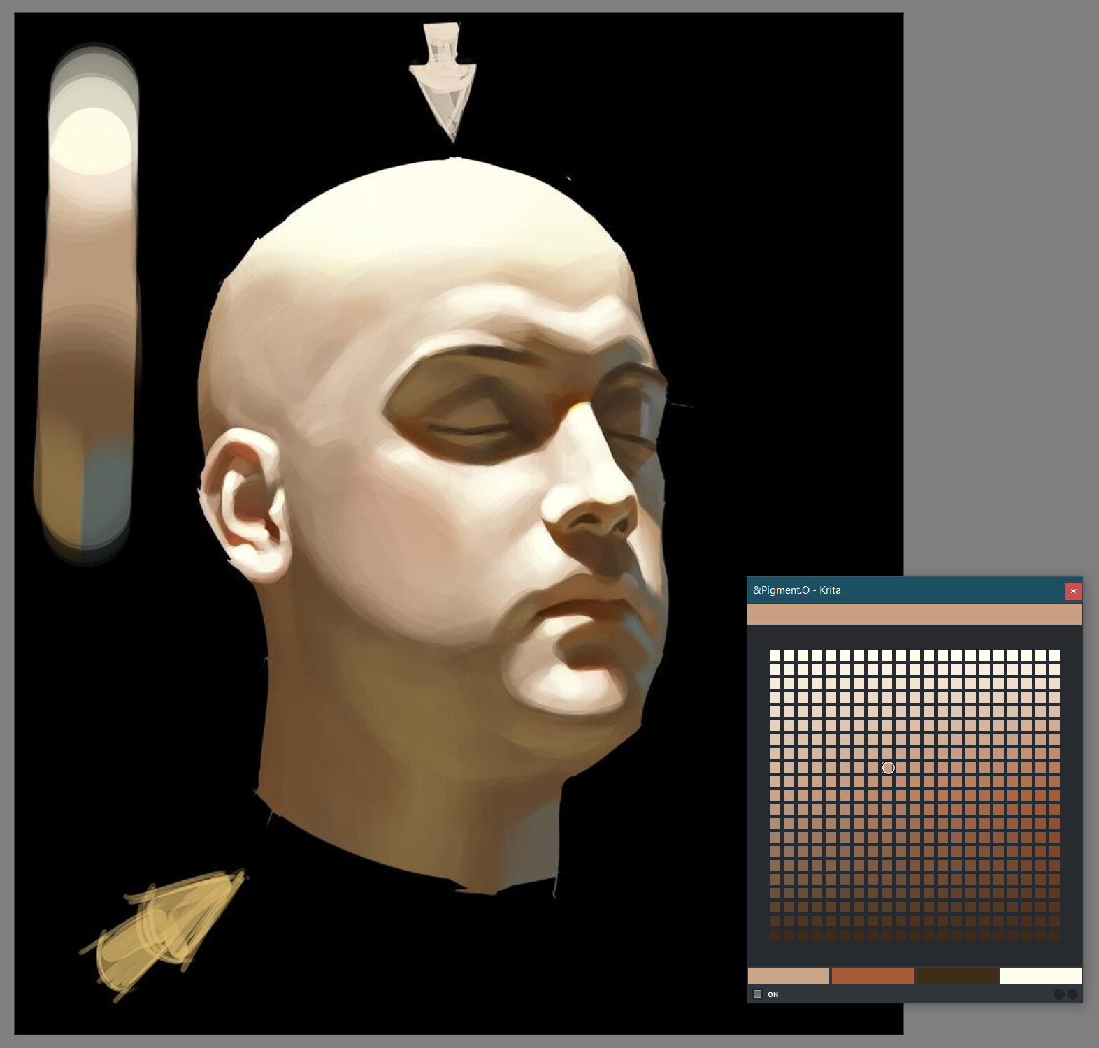
Light Skin Example Dark Skin ExampleAs you can see despite the dark skin being darker is reflects light more intensely on steep highlights while the lighter skin here does not have much variation overall in either direction. But it all essentially depends on the material state and lighting set. Picking the colors below will transfer the palette to your own pigmento.
Skin is the biggest issue to solve due to stuff like Sub Surf Scattering but it is not very illustrative with the amplitude of variation it generates without more harsh lights on it to showoff. I found a study from an artist that I do not know the name where he displays his method for lighting and I compare with matching intermediate colors inside pigmento.
but what does this even mean?
Also the colors are not set in stone you can simple adjust and change anytime you want.
I hope it helps for it’s usage.
P.S. - Artist : Jinwu (Jinwudraw)
very very cool
Your work is incredible, thank you so much. Haven’t checked in for a while but will use the current version from now on.
It seems artists name/nickname is Jinwu (Jinwudraw)
I so often meet this reference-guy (actually is 3d) in various light-situations and even mems that sometimes I think he is the chosen one.
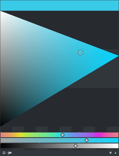
I really like your add-on a lot, but it has a big usability problem, if you slide your value to black the hue bar to select a hue becomes well… black or near total black if you are shifting dark hues, the whole bar I mean, so then you can’t see the colors in it, that works really well programmatically and logicality, but say you are painting a really dark scene and you want to be shifting dark hues, but because both the saturation and hue bars are so dark or gray you can really pin point where on the hue scale you want you new color to be, so my suggestion is as follows:
Add a lock mechanism that locks the color of the hue and saturation bars at full brightness, the value bar already works fine, as all if it does not become a full dark bar, or a full white bar as you approach either side of the value spectrum.
I can be a lock toggle so if some users like the current usability they can still use it, and if some user have the same problem I’m having they can also make the add-on work for them
Thank you for creating this addon, Cheers!
Basically this is problem Im having, I’m painting several colors in dark areas, but I can no longer see the hues while I’m doing it.
I can see the feedback on the big HSV overall square on the top, so if the H and S gradient bars become super dark, then I cant find the hue I want fast, naturally I can still slide the bar and the big square will change to the selected hue, but I’m doing it blindly, I rather have a constant visual cue of how saturated my color it is and where on the hue scale I’m at, I can then corroborate the color I want is indeed the one I want by looking at the big square that encompass HSV and then do a test on my actual canvas, rinse and repeat and keep painting.
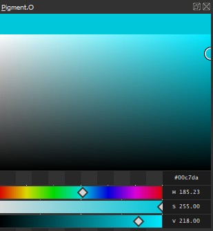
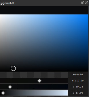
Uhmm no.
The long answer is if you want a reasoning for it it is simply because that editing any slider reflects the influence of the other sliders on that color space. So you can have an prediction on what your getting yourself into when editing it and not blinded by an imaginary color your no where near too. As hue variation changes from color space to color space. For example in hcy near black you have everyone black except blue that will be alone there.
It is not what you would expect or want unless you only think in a single color space. Because depending on it the hue variation is never ideal as you might imagine it would. You would only be tricking yourself.
The “work around” here is you use the numbers it is why they are there in the first place. Hue values all have the same amplitude and equal internal variation. If you don’t like that use the ticks over the slider it indicates the locations of the pure colors within the slider.
Also I should add the more near to pure black you are the less colors you have available it is not like it would even do anything for you. You can have 100% saturation but if your at value=1 per example your just 1 chroma point away from zero. Despite the GUI geometry your still in the corner of the RGB cube.
Also you can just use the hue panel with the square and have a angle indicator to a non variable color wheel.
I more less understand your point of view, tho I lean more towards an intuitive color managing with some technical sprinkled in, wich is why I would favor a way to see in which color I’m playing with from the get go, rather than use number inputs or the ticks, I thought of the idea as a freeze toggle because I was pretty sure some people are very comfortable with the setup you have, so that way both types of workflows would work.
Its funny that to you having the representation being so dark makes you not guess, while for my brain that keeps me guessing, (I mean I understand that its being true to the math) but its not very comfortable for my brain, hence I consider it an usability issue not a programmatic or strict color theory one, I do know that when you lower the value too much you have less saturation and as a result less color variation, but after I find a place in value that is sort of dark, maybe not as dark as what I showed but quite dark I just want to slid to the next hue I feel would look alright on given place, not having to go over numbers or ticks, I just want to see blue red, kind of orange, blueish green, and move there, by sight.
The hue circle on the right click menu of Krita was designed as such too so the user could jump to the color he wanted fast as well, if that circle was to turn black or gray as you move the triangle that holds the colors in the center, the action of just going to the color you want would slow down, or at least it would to people that works the way I do.
I also understand coding something is not easy, so I completely understand that this is not something you would like to implement, or that is easy to do so, still I wanted to let you know because I like the plug-in a lot on other regards, and I wanted to use it, but it adds fog to my brain process so I cant really.
Again thanks for taking the time to reply and for making this add-on available to the community, cheers!
What your asking is much easier to code that what you have now, I think I could implement that in just a couple of minutes really but I really see no boon in taking that path at all for the sliders.
The objective is to show the color your selecting and a sense of meeting the user expectation in slider behavior all through out. I have been working to keep display and commands consistent all throughout despite having original commands on it.
The grey mode thing was made due to inability to solve a problem at the time and I only recently got rid of it recently and things have been smoother, however this would be the grey thing again but instead of performance issues it would be a usability issue? I really have a hard time getting the why of this even being a thing if your choosing blacks you should see the difference of the blacks at that level you want no? because not all hues are created equal and selecting blind seems worse overall.
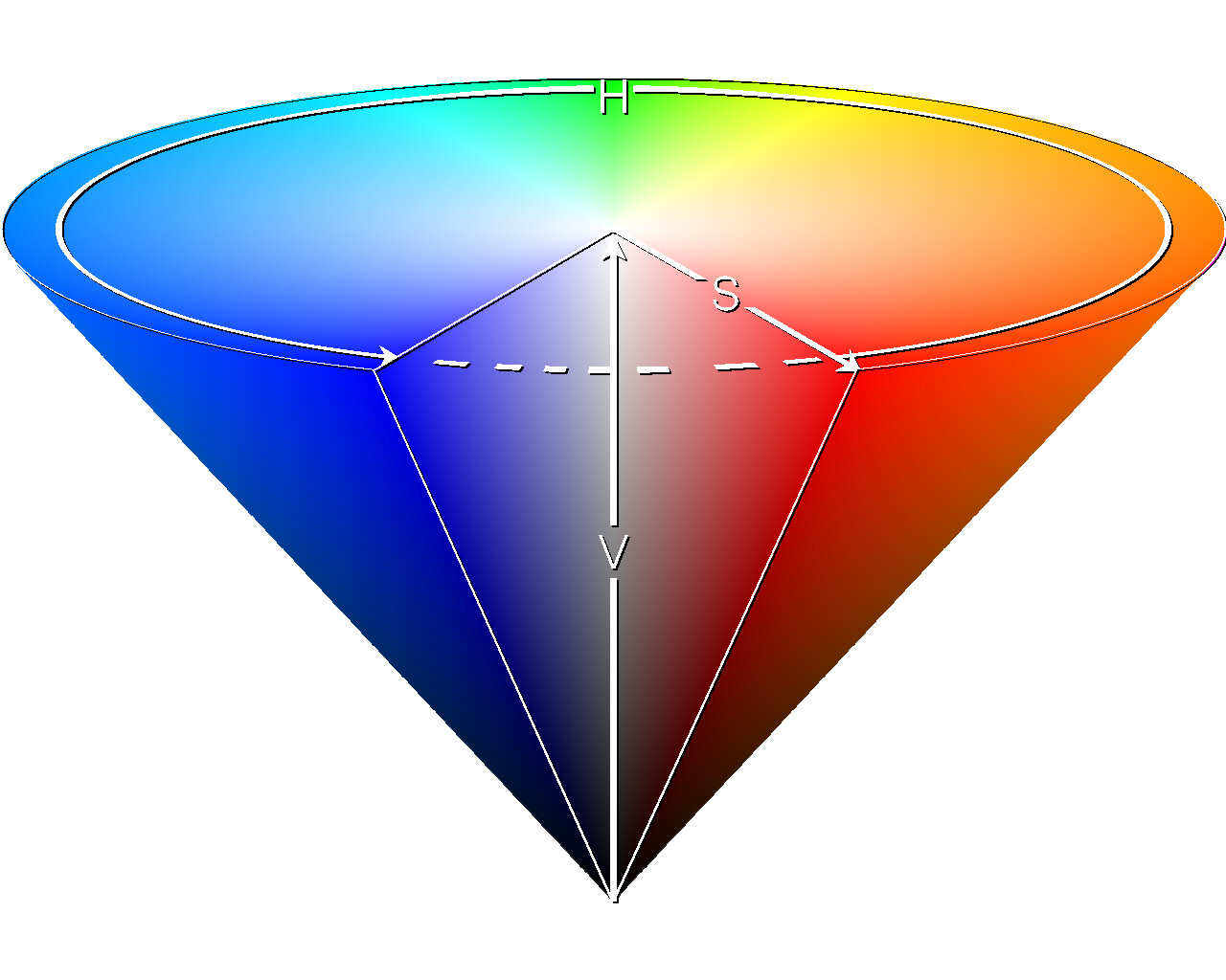
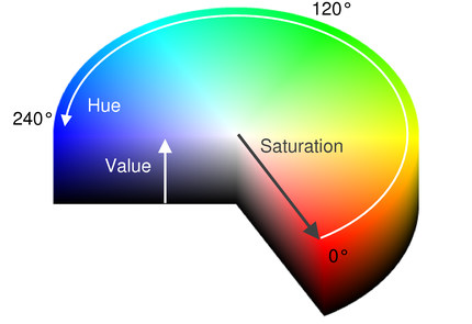
Some HSV color space information.
my ARD panel displays the RGB cube much better overall in terms of where you are in space. it even has a more whitish band where it tells about the cube geometry variation limits here you can see how HSV is all wonky math wise when going from hue to hue.
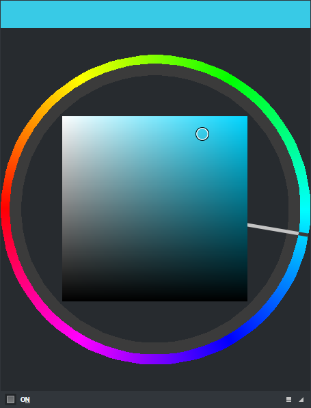
However does not the HUE panel with Square not satisfy your need of a constant display of what hue your selecting much better than the slider though?
Regarding inputs to access things with any kind of shortcuts I have my hands mostly tied up and limited by the framework. i need to ask for developer help once i am free to work on that again because i am a very peculiar use case. But considering all my attempts I don’t see a way out without them making me a patch for just me to do that. I don’t even know if there are more use cases beyond me for me to justify any request of the sort to them.
Thank you for the detailed reply this has been very interesting to me 
A quick reply for one of your key questions for now:
Yes and no.
I was going to reply with longer idea, but I’m testing your last suggestion to use that square HSV with the constant hue circle around it, that might be a workflow that I can make work with how I pick colors, thank you for suggesting it.
I also thought of a simple way to explain what I need, and your post gave me the idea.
Why does that circular constant hue ring why does not change the same
as the hue gradient on the sliders section?
The reason as far as I can see, is usability, this is to say is easier to just find that yellow with a tinge of red you need by just locking at a constant hue gradient, after you find that, one can check the color appearing on the top swatch final feedback, then you test that on your canvas and keep using the color or increase decrease the sat, value or change the hue again (as often times the color you selected will react different once it starts vibrating with the rest of your colors in the actual canvas) so you need to change it a few times to find something you can use.
Your suggestion on this last post mostly gives me what I need, so I to will try to use it, and I will let you know how it worked out for my workflow
About the last thing you wrote about the addon using shortcuts.
I did not mentioned anything about that, (so you are probably replying to another user on that one)
still my opinion on that matter is that I would like to be able to invoke the color picker with a shortcut where my brush is at, ideally I would like this implemented into the right click menu of Krita, but an independent shortcut would be nice to have as well.
I had these requirements:
My main reason is a Pyqt5 limitation, when you create a masked region or any ellipse there is no antialiasing so I can’t place a pixel perfect limit around the edge of a circle like I did with the sliders to create contrast from the background. I had to make colors that would never mix with the theme and respect my design choices so to ensure krita integration as much as possible.
I added a band inside the wheel to fake the inability to make a perfect edge and this would give more contrast to the handle which by the same line of thought with the anti alias problem would never be aligned with edges of the curved limits as it rotated. The step then to make it look like a clock handle did not take too long as going past it’s limits would fill all the pixels on the gap that vary as you resize everything.
so no color shifting for the hue circle.
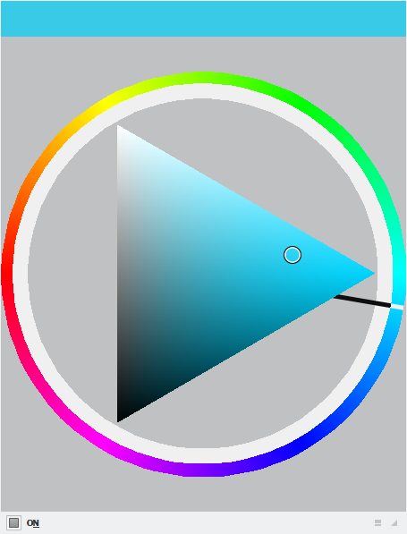
sliders contrast against diferent themes with static colors
hue circle against diferent themes and theme compensation