I am not at the computer right now to check but did you notice if the output colour from pigmento was the same or it was just a display thing?
1 Like
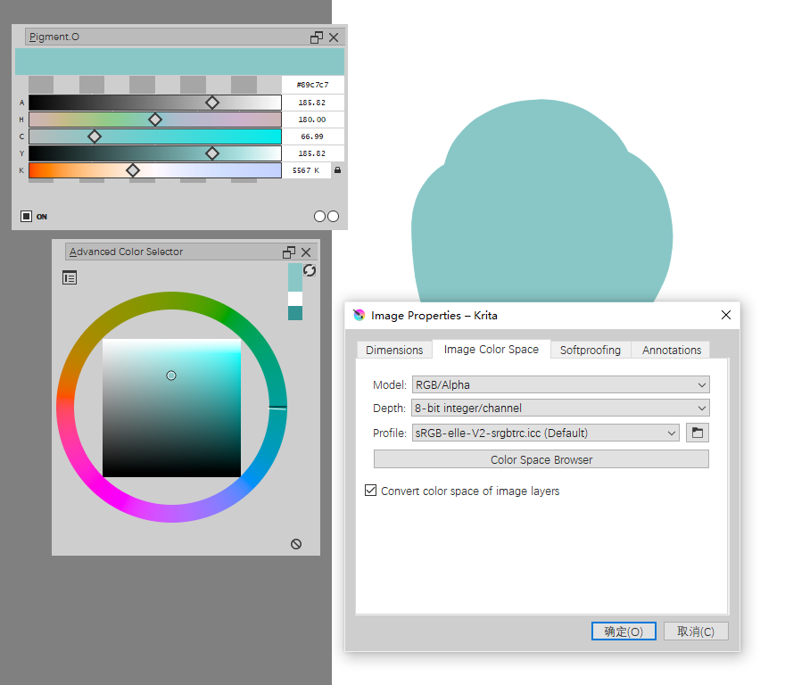
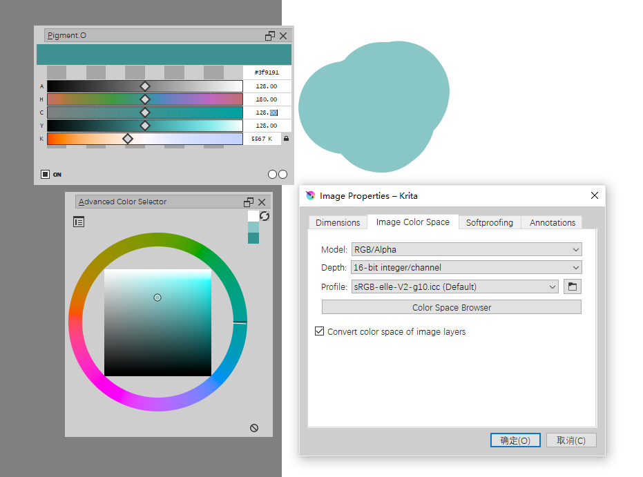
As shown in the figure, the two pictures use the same color. Taking krita’s color picker as a reference, the value of Y is correct at 8 bits, and the value of C is correct at 16 bits.
2 Likes
This can’t be a Pigmento bug. Pigmento simply does not behave like this. What I think is that you found a Krita bug instead.
The thing is that Pigmento does not own any right over the colors what it does is a periodical check to see if there is color changes. if a color change of any kind (regardless of color depth) is done Pigmento will change color or it will remain inactive this makes Pigmento lighter and I will not change this for no reason what so ever. I should add this check is done every second or by moving your mouse in or out of Pigmento interface area for a forced update.
When you change bit depth for the new document the color inside Krita changes not inside Pigmento. However Pigmento is not able to detect a change. This means somehow the old color is still active for Pigmento check it still exists or else it would change as it does after you pick any other color.
if I apply the color that was used on the previous document it is not Pigmento that changes but Krita. For some reason the color is lost when you change bit depth I am sorry to say I don’t know what is the cause of this issue. Krita has many color pickers and something might have happen between them. Pigmento can’t ever own the color just read what they have.
However if you color pick any color after the creation of the new document with a different color depth all works as intended so this is only valid right after a change of bit depth in document creation. Because if you have 2 documents with different bit depths have a color selected and swap between then the color is held constant between them inside Krita and Pigmento does not react.
I have disabled Pigmento entirely and done the same procedure and verified the same color change is made when a new document is made with a different color depth. Pigmento can’t do any changes if it does not exist. You should probably do a bug report.

1 Like

Oh, thanks!
Besides, is there any way to get the HSY 'value of krita in Pigment.O and control it through the slider?
I thought HCY was HSY , but now it doesn’t. I really like krita’s HSY color picker, but there is no slider to control it precisely.
3 Likes
if I had access to the conversions formulas at the time I would have done HSY but I ended up opting for HCY because chroma does not exist any where else.
1 Like
Ok,thanks!
1 Like
I know this sounds weird but I am not against placing HSY on the list I did a lot of work to be able and add new colour spaces easily.
But currently I have a issue where I am low on UI space. To make another line would mean reorganizing tons of code so the code reflects the presented organisation. I kinda grew much bigger than I ever expected too. And after almost a year on this now I just switched gears on this. I am working on my painting now I will do more but probably later I am more worried with it not breaking.
I was interested also in placing stuff like XYZ, LAB and HLC also and real temperature. And how to represent colours that don’t really exist in RGB form. Also HSY and all the hues with chroma HCV, HCL. I also have a weird stance with HSI and in consequence with HCI because of UVD and ARD that I created but it already exists it seems. Donno how I would do that. I will need to reorganize to fit everything in and also solve a issue I don’t know how to solve yet with all XYZ variants. And God knows about the YCbCr, I did YUV but there are so many variants of it.
I want to grow the UI space but making sense to all this confusion.
For now pigmento is RGB based and to do this all will become XYZ based after but the idea to make it all happen is already there just needs more paths to consider it will become a spider instead of a straight path.
Initially this was just to be the HSV that was missing and too be super compact. There are simply too many colour pickers doing different stuff in Krita, pigmento tries to unify everything up, but I know there are some I just can’t replace, they are just way too advanced. But now I need a settings menu window in order to choose how it will consider the luma calculations and others, being compact is out the window.
And I have considered so many times just doing it in C++. I know if I add too many colour spaces I won’t be able to reduce the lag of so many colour spaces working at the same time but I would also have access to more things inside Krita that would make my life easier and also harder.
…
In alternative:
I can do just HSY and HCY after as is but it will be more cramped but for just that I would prefer to wait for krita 5 to do a test because of the new version of the python plugin installer online and offline that will come out with it and how will my pigmento versioning system will react with it. I gave the suggestion for it and it would be bad if I did not get ready for it lol. Pigmento as it was on the previous version would crash on the first run after an online update, my other plugins would not though.
Sorry for the wall of text.
2 Likes
Thank you! But maybe HCY is better than HSY? Because I feel that the S of HSY is not as good as the C of HCY. Now I hope krita can use HCY instead of HSY. And the Pigment.O you developed is very powerful, more importantly, it is free, which is a very cool thing, thank you again!
1 Like
HCY in krita I doubt a bit it will happen.
if it is better I am not sure the only thing I notice is that Saturation looks a bit more diluted.
I must say that paying just to select color is bonkers to me. And I cant wrap my head around it.
I am just glad you like it.
I have done some experiments, and I found that the saturation described by HCY is the absolute saturation which does not change with the luminosity, and the saturation described by HSY is the relative saturation which changes with the luminosity. Maybe the saturation of HSY is more in line with the psychological feeling of saturation. HSY dilutes part of the saturation of medium gray, maybe because the human eye is more sensitive to the color of medium gray, a slight change in saturation will give people a strong feeling? I don’t know if my guess is right.
1 Like
@ EyeOdin: You seem to have done a lot of work on color and color pickers here. Did you see this thread I created some time ago:
The big hurdle for this actually seems to be the color picker krita uses - it’s not suitable for HDR workflows and a new one like shown in the thread would be needed. I get the impression you might already have something very close here, am I right?
@hulmanen
Yes I did see that feature request. I should say I did like the idea but I donno.
First of all I should say the grade node does not work like a color picker directly, you usually have pickers inside each channel it so can edit so your affect on the white or black or multiply or for another color and for a certain amount if I recall. The grade node color transforms the input into a new output. So it would act like an adjustment here.
I think the grade node would be more similar to a filter/mask filter inside Krita, it would make more sense to me like that in the Krita environment. Like selecting a group folder put a filter on it and adjust everything inside your tiny “comp” and then apply it merging or have it there. If it was a docker it would be on the LUT Management docker for sure. Also I do not see the UI as a issue and I think alot of people can make that happen but making the functions work that might be hard for several reasons.
On my side I need to work on my painting work now because I really suck. I stopped programming for the time being. I am just doing some brushes for my personal bundle and I am gonna help with the 3D mannequin now as a side quest that should be hard enough for now . Also I must say I would probably gravitate a bit more on another type of projects, probably something concerning vectors in some way. Also I think there are other stuff that needs more attention.
Despite not being free and all I feel this needs to be done in C++ for sure or you will be waiting forever for a image update. There are also many limitations on me on a project like this because of that, like not knowing C++ yet. I don’t know if learning it is worth for me still.
I fully understand having priorities!
Regarding the base functionality, we already have the ASC-CDL filter which actually does provide the rudiments of what’s needed - lift, gamma and gain. It’s just very difficult to use due to the color pickers, and doesn’t let you do e.g. blackpoint/whitepoint adjustments. But yea, I was just kind of opportunistically fishing here to see if maybe you had a trick up your sleeve for this. Not intending to pressure you into doing something you don’t have time or inclination for!
I will have to check that filter out later then I am not seeing which it is by memory now.
But the color picker should be the least troublesome part of the whole thing. I am kinda surprised with you saying that.
I do agree that the organisation of the nuke node for it to be on the nose. Black and white point adjustment needs the code behind it though, but it should not be too hard to make that.
But GUI wise there should be some other alternatives for that. I do like those in davinchi resolve too. I kinda made 2 GUIs inspired on it. The HUE and GAM panels.
The whitepoint/ blackpoint operation is just:
(Color - Blackpoint)/(Whitepoint - Blackpoint)
The actual math here is all pretty simple, and there’s a proof of concept filter already, so that’s why I said the color picker is the biggest missing piece.
I took a look at the filter and it seems good, kinda like what blender has. The picker even has a nice look the only thing I noticed was the black on the top but that only makes sense for the computer I think. Beyond that I don’t see much of a issue with the picker itself. HSY also seems the best choice for the picker there too.
When you compare Nuke to Krita. Yeah it does look like a proof of concept but it’s Nuke your comparing it too…
Regardless my hands are tied to help you on this now. My suggestion is to propose a picker redesign on another thread with some graphical representation.
Hi there ! Thanks for the great plugin !
The luminosity lock is awesome, and I managed to tweak the UI as I like, pretty quickly with your tips from december.
my question was about LAB colors, but I just realised you already mentioned working on it, so : good luck with it !
I m trying out the “specific color selector” from krita at the moment for this, but the color is not updating in pigment.o (might be a bug ,? - krita 4.4.3)
@maclud glad you like it.
The LAB thing will be a very long shot I don’t even know if I will be able to do it.
When you activate a Luminosity lock you stop receiving colors from the canvas but the color is still on the brush tip this happens to all locks when active, this because I don’t know if your new colour is a locked or unlocked one.
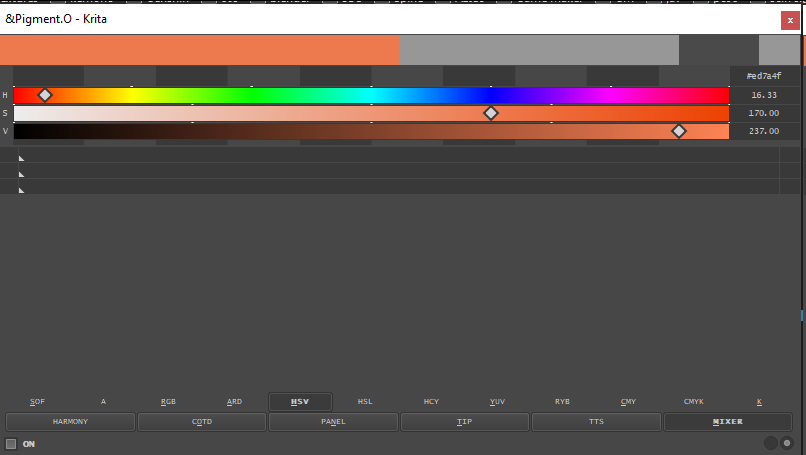
How do you use the mixer?
I can’t seen to add colors to it, and clicking on the gray bar just gives me black.
And is there a way of getting rid of the bar on the top? I just want the mixer and prefer it to be as compact as possible.
The mixer is open there. You then need to go to the settings and select the color space you want by default it is HSV.
Then you use the modifier keys to (shift+click or double-click)=apply, (ctrl+click)=save and (alt+click)=clean. These operations work on the currently active colour when clicking on the little boxes on the side, all boxes in pigmento work like that or similar.
After that you just move the slider to select the mixed colour and pressing ctrl there will clamp the values to multiples of 10%.
The grey bar is the luminosity lock that works on multiple panels and no you can’t get rid of it because it is your currently selected colour.
All behaviour is in the manual too if something is missing just tell me and I will add to it.