It depends, I was myself used to Photoshop and Illustrator, but when I saw Affinity did it the other way around, I was immediately convinced that the approach of showing clipped layers below their mask is more intuitive to me.
So not all software do it the same way. I do think, Affinity did this, because you can put raster content inside a vector layer (mask) this way. Whereas in Photoshop, vectors always seemed to be bolted on and were rather limited compared to even the basic Illustrator toolset.
Clip studio too shows it like photoshop and krita. Also I think this will make it problematic when we have legacy inherit alpha and also when we want to use blend modes on the layer which is going to be clipped. krita’s layer compositing is done from bottom to top and even if it is technically masking a clipping layer. The layer which is going to be used as the mask for clipping is not a mask in traditional sense. Apart from affinity I have not heard anyone do it this way. And our user base will be coming more from clip and photoshop than affinity.
Yeah I agree it needs to be consistent. I didn’t catch on to what was meant by the others, I guess. Nor would it be a good idea to hack the layer calculation to only change the display order in the UI. That’s why @Deif_Lou called my proposal a second system as well.
There can be a modifier override to make sliders more granular when the modifier key is pressed. Also, there is the option to type 0-10 to get 10% increments for opacity if you hover over the slider with the mouse/ pen.
Note: This should then be treated as a different context than keyboard shortcuts, because it would invoke the keyboard shortcut assigned to the numeric keys otherwise.
In addition, it may be possible to double click on the sliders and input a precise value. Currently, this doesn’t seem to be supported, neither for opacity nor for any of the sliders in the tool options docker.
In Krita this is just a normal group with the ‘knock-out layer’ being a layer with the erase blend mode. I didn’t bother recreating his specific example but some quick test on my part confirm this.
Unless there is some quirk to knock-out layer that he didn’t show in the video.
I recommend you try his example using the first method he showed, putting the ‘masks’ inside a group. The assuming a mask layer is just a layer with Erase Blend. After this you should be able to follow his video almost 1:1
So even after i told you about some people who were literally trying to find alternatives to use the software without needing to hold down the mouse button for long cause it caused them pain you say they should expect that they need to press buttons? wow…dont even know what to say.
That being said i will move on.
this mockup seems good if we disconsider the way the inherit/clip is shown inverted. from what i understood on a post after this one you seem to have dropped this idea too so thats ok.
Though I also agree with Deif_Lou on the organization of things
I would also put the color label on the left of the blending mode combo box.
But focusing on the inherit/clip I guess we are starting to converge on a common point. At least from the recent messages seems like most of us are more in tune with a button outside the layer stack to choose the mode and possibly to also set it on/off (having a drop down arrow to choose the mode). Though now i am a bit confused if we should discuss it here or the other thread cause these two topics are very tied together cause we are now discussing how the interface for this new feature would show.
As @raghukamath said, just focus on giving this feature its final push. Given that the redesign is being considered, I don’t think it matters were to put the buttons, just make them functional and kind of good ux wise. That way people can start testing the feature as soon as possible. For the “perfect” ux we can discuss in the other thread.
Let’s make a list. I would say that the main candidates are:
tri-state button that rotates as you click (substitutes the current one)
two buttons: one to activate/deactivate alpha inheritance (current one); another to set the method (one below vs. all below), maybe placed on the bottom toolbar.
3 state in where instead of cycle you just toggle on and off/last_used.
And another action to choose mode (to be defined as some people have problem holding click and or modifier keys).
So you are worried about that but the other inclusivity issue i said can be brushed off? That’s very weird.
To answer you having 2 buttons or having both functions of turning it on and off and and changing the mode separate in my view solves this issue.
Cause you just need clicks and doesn’t require 2 hands.
@LunarKreatures@Yuri_B Let’s not start arguments like that - presenting some option as being more inclusive to some disabled people, and some other option being less inclusive to them, is fine, but arguing who cares for whom - that’s not a constructive discussion at all.
Though, I’d like to point out here that there are people using only a pen with no, or just one button, and no keyboard. Currently Krita is quite difficult for them to use. It’s something that might be good to keep in mind sometimes, considering that we want Krita to be used on Android tablets.
Probably been suggested already but-
What if the inherit alpha button was a toggle between off and single layer (what peeps from other programs are used to)
If you wanted to do multi-layer, you double click.
While it can be used for more general stuff, it currently isn’t used for anything when clicking layer buttons. It just toggles them on then off.
And even if double clicking did open a context menu on the layer, I’d argue it shouldn’t if you’re actively clicking a button.
Either way it’s another suggestion, I personally prefer the 3-way toggle so new peeps get the functionality they expect, but also accidentally stumble on a new function they may like.
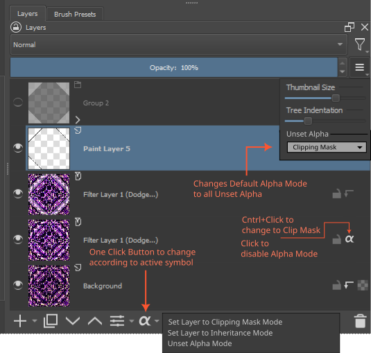
Arrow = Clipping Mask
Old Icon = Alpha Inheritance
What happens if I change the default unset alpha mode? As soon as I click any inactive icon, it would use this mode. It still remains disabled. If I wanted to switch it, I simply go with Cntrl+Click. If I want to disable it back, I click it.
As for the bottom, this enables applying multiple alpha modes on multiple layers.
For those with one arm or so, I guess there could be more option under right click, or use the below part of the layer docker to do that.
As someone who is hard of hearing, I rather have softwares accessible to every people. Imagine you watching youtube videos with no subcaption.
why is it written “Unset Alpha” in the Layers Docker configuration popup menu?
why do you prefer arrow + alpha instead of the icons I suggested?
I know that maybe arrow itself is more known out there are a clipping mask, but if you have two similar icons that communicate their meaning (one shows that the action is related to one layer, and the other that it’s related to multiple layers), it’s more consistent and easier to newcommers and even to typical users to look at the icon and instantly know which one it is.
What about having two icons like I suggested but instead of alpha on top of layers, there would be a clipping-mask-style arrow?
Cause it only changes the icon of inactive alpha modes within layers. It doesn’t change any layers with active alpha mode. So, as soon as you click one of the inactive icon, it will use that mode. This makes it easier to shift preference depending on your need which is why I thought of this and keep the one-click paradigm in the long run.
Arrow itself is more known is precisely why. As for multiple layers clipping mask, good idea. I guess a shift modifier + click would convert to multiple layer clipping mask. And the icon should show multiple bars in case of multiple layers clip mask.
For me, to switch the two modes, I would like the variant with the three clicks on the (previous) icon, but I am ready to change to one of the other suggestions if necessary. If something else should be favored.
Otherwise, this topic overwhelms me in the meantime, too much text for me, who likes to describe in detail himself.
I’m worried that we’ve misunderstood each other but I’m not sure. By “multiple layer clipping mask”, do you mean the current Krita’s inherit alpha, or a base layer + multiple layers with clipping mask mode on?
If you meant inherit alpha, please just ignore my explanations below.
The old “inherit alpha” is basically clipping mask but, well, clipping to everything below instead of just that one base layer. Which means having similar icons for both functionality would be easily understandable for users. That’s why I would prefer icons for “inherit alpha” and “clipping mask” to be similar and pointing out that “clipping mask” works for one base layer while “inherit alpha” works for any layers below (so, potentially multiple layers).
I don’t intend to change the icon based on how many masks/layers inheriting alpha a specific base layer has (so if you have hair and a layer with shadow, it will show the same icon as if you have a hair and a layer with shadows and a layer with highlights).
I do want to have a quick way to create a clipping mask from multiple layers (the end result would be: base layer, layer with clip mask mode on, layer with clip mask mode on, etc. And there could be another action that does the same thing but with a group and inherit alpha instead). But that’s kind of future quality-of-life improvements.
What I thought was that multiple layer clipping mask would bypass the group layer boundary, and clip to whatever below. Yes, Inherit Alpha works on multiple layer, but doesn’t bypass the group layer.
That would be very difficult to implement in Krita. If it works kind of like a blending mode, as in, it composites with the layer below, then there should be a way to make it work, but the “crossing group boundary” is very scary to me as a developer. I’m not sure if Krita will be ever able to do something like that without a huge buggy mess of the codebase, unless the whole layer stack is nearly completely rewritten.