Greetings guys. Hope you’re doing well.
So this year, I plan to hone my digital inking skills. But there’s this thing which I’m still
curious about.
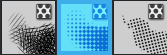
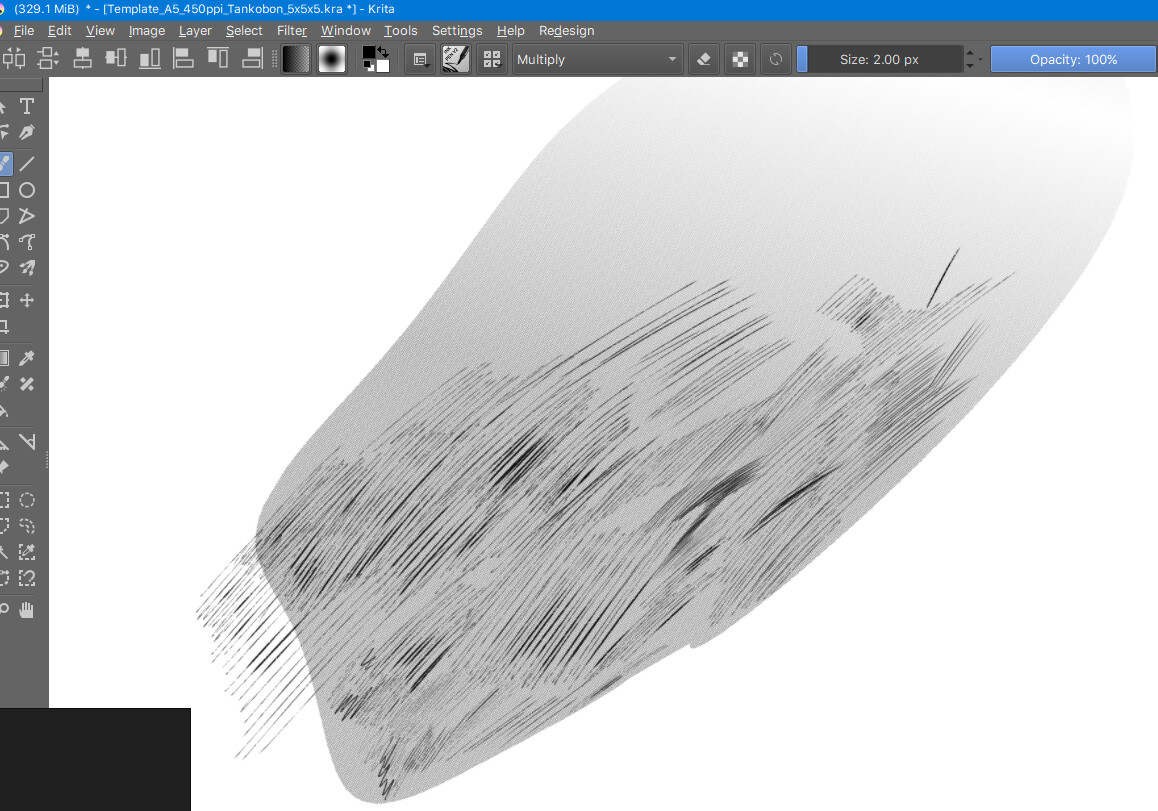
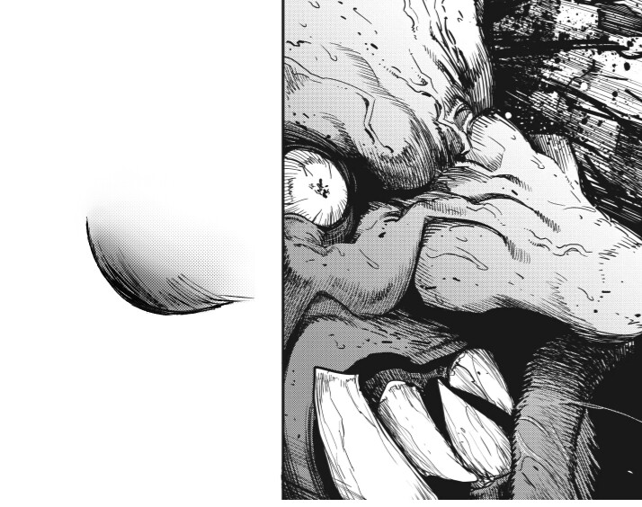
See the speed lines in the background in the following picture ?
See how the lines display a kind of texture when they go thin or fade away ?
It also appears a bit upon the helmet, under the left brace, and on some parts on the goblin head.
How do I achieve that in Krita ?
If also you could tell how to make the gradient blended with the screentone, I don’t mind.
Thanks for helping me @Grum999.
I’ve found useful resources thanks to the forwarded links to the brush kits.
They look good.
However, not all my problem are fixed :
I’m very aware of the drawing assistant tool and use it most of the time for my comic.
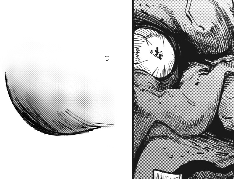
However, the feel from the speed lines you see in the background, I’m curious about
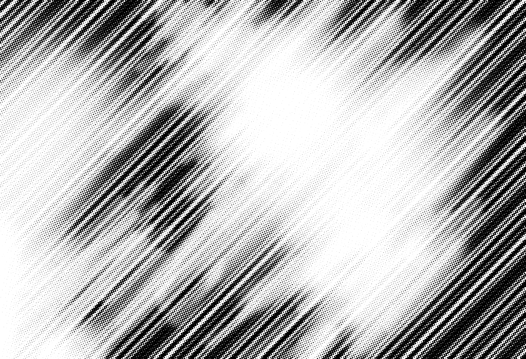
how to replicate that. The thing is, they’re not totally smooth. On the contrary they’re
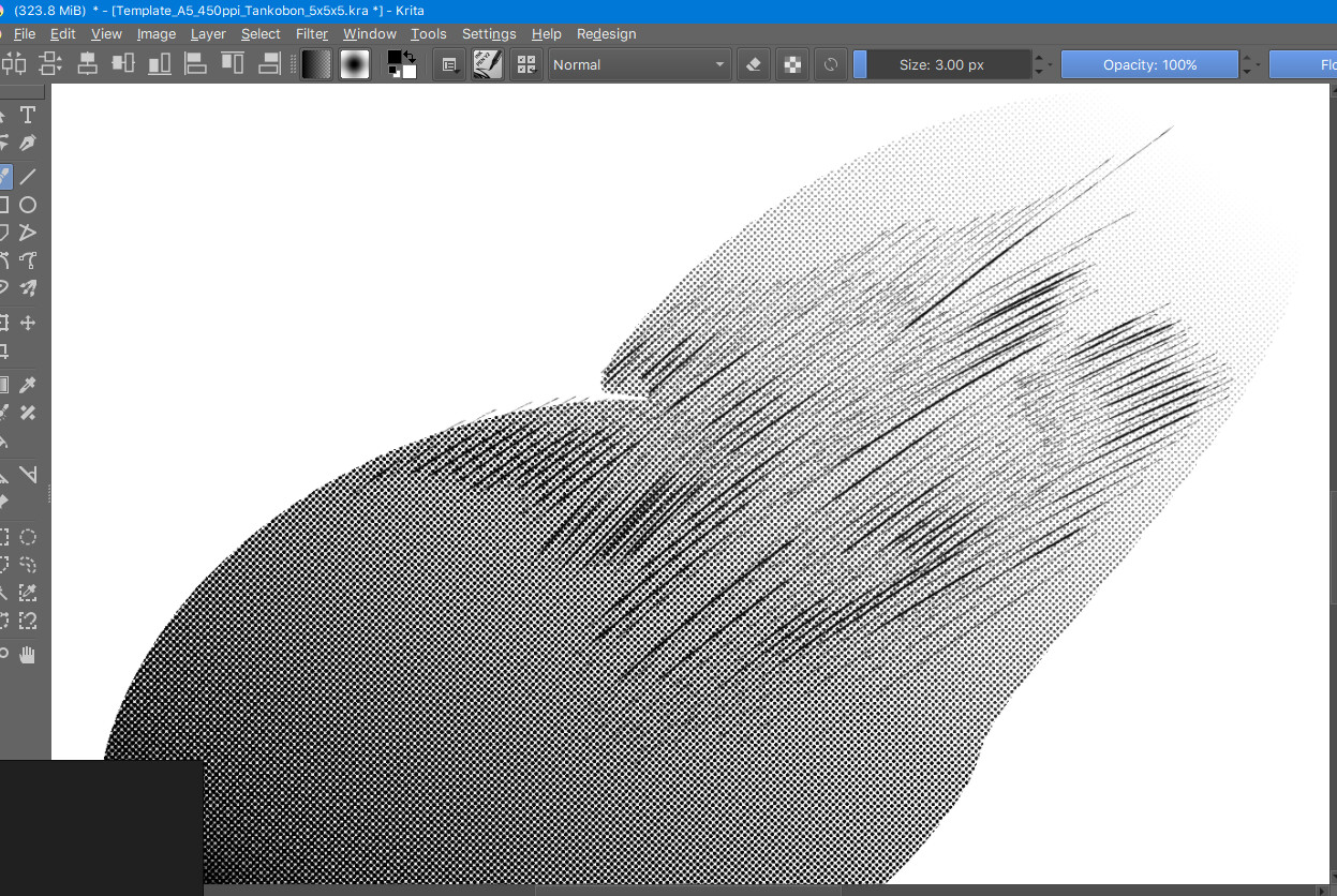
textured. Textured as textured line strokes. Watch closer, observe the picture zoomed in.
there’s like a consistent gap that repeats itself around the speed lines. But We can’t call this a gap. It’s a typical visual effect. And I so so want to know how to trace lines like that.
One way for me to achieve that was to lower almost completely the brush size.
But I’m not sure this is how it’s done.
For me, it looks like a screen tone applied ti speed lines.
Maybe, playing with halftone filter (screentone or pattern option) it’s possible to reproduce this effect
Those lines are a superposition of normal lines with screentone patterns. And the low resolution also helps creating those kind of moire patterns in some places.
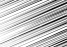
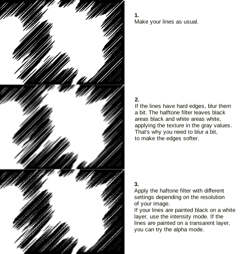
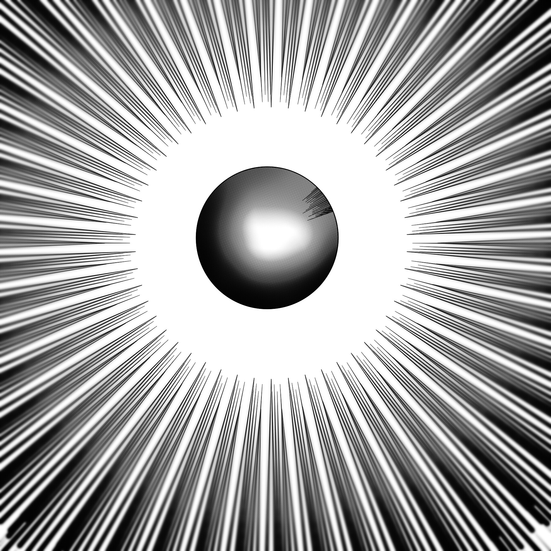
As Grum999 said you can achieve the effect with the halftone filter. Just ink the lines as usual and then apply the halftone filter with the screentone generator. if the lines have hard edges you can apply some blur to them before you apply the halftone filter.
What about something like this?
Awesomeness @Deif_Lou !
It seems screentones really help create this effect.
Would you mind giving a step by step guide on how to superpose screetones with these line strokes ?
But the gap in brush size, is it caused by the fact that it’s traced in low resolution ?
I really like that effect as well. But I’m wondering, do you think it’s the low resolution or
the brush itself.
If you can manage to trace a few lines replicating this effect, just tell me and how you did that. It’s my last question.
Thanks for your opinion on this.
My own hypothesis is that this effect is caused by the screentones in the background.
The grayish parts would cause this effect if you trace thin lines ontop.
To replicate the effect as close as possible you should based it on a high resolution reference image, because one can’t really say what the screentone used looks like actually from the image you posted.
I think it need more test/tuning to get the same effect than in your example, but it’s late here and I have to go to the office tomorrow then, now, go to to sleep
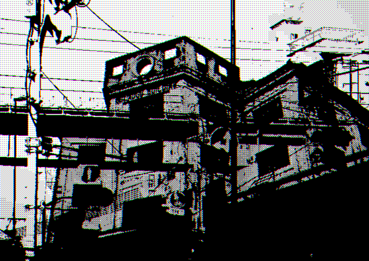
Hello, I have done manga-style things, many things can be achieved with Krita although sometimes it is complicated, but if you use Linux you could use Krita in conjunction with Azpainter, it is another open source program, it brings several tools to make lines of action and other things that are used in the manga, which saves you a lot of time.
Here are some examples of the things that can be achieved by combining both programs:
I don’t know if this is close to what you are looking for, but I remembered that many mangakas use certain types of pixelated brushes to give their drawings a certain touch