Medibang’s brush engine is way more basic than Krita’s but it has a feature where you can control how much the old color on the canvas is extended to the new color on the brush when the brush paints over the canvas. CSP and Sai has something like this too. It’s controlled by the “complement” parameter where the lower it is set the more the old color extends to the new color.
This allows it to mix colors together even when the brush’s opacity and “color rate” is at 100%. I think if Krita had a feature like this blending colors would feel more “realistic”. Even without pigment blending that simulate physical colors (still would be very cool! )
This is something that Krita definitely needs, although the current mixing engine is very good, the truth is that this feature is the one that the program needs the most and I have tried to recreate it but without good results
I don’t know for certain, but I have a hunch this might have been achieved by developing an entirely new color profile all together. If you could take a color space like RGB and modify the math of the transformation in the profile, in theory I think you should be able to have colors travel in curves as seen here or in traditional pigment mixing rather than in completely linear lines from point A to point B. That might explain the lack of performance hit due to the colors not having to be converted between multiple spaces per mixture.
Yes,compared to Krita’s brush engine,Medibang is quite limited.
It lacks also in the deparment of a proper basic blender , texture based brush options and dedicated 3d perspective rulers.
Even Firalpaca has these three options !
but as you have pointed out,these two free softwares provides this simple option to control the color mixing level and complement.
I have tried these options in Firealpaca,with it’s predefined small texture sets.
The result is obviously not in any way comparable with Krita’s RGBA brush output.
But if you can achieve such organic colour mixing effect with texture brushes , without making too much technical adjustment,it surely can help to add something extra in the artwork .
As far the knowledge of math,coding,advanced technical understanding goes…I am a pure idiot !
So I always try to find my answers from a creative person’s point of view .
I am still trying to find a way to achieve something like this in Krita,obviously the trick will be different from other softwares…but need to find how !
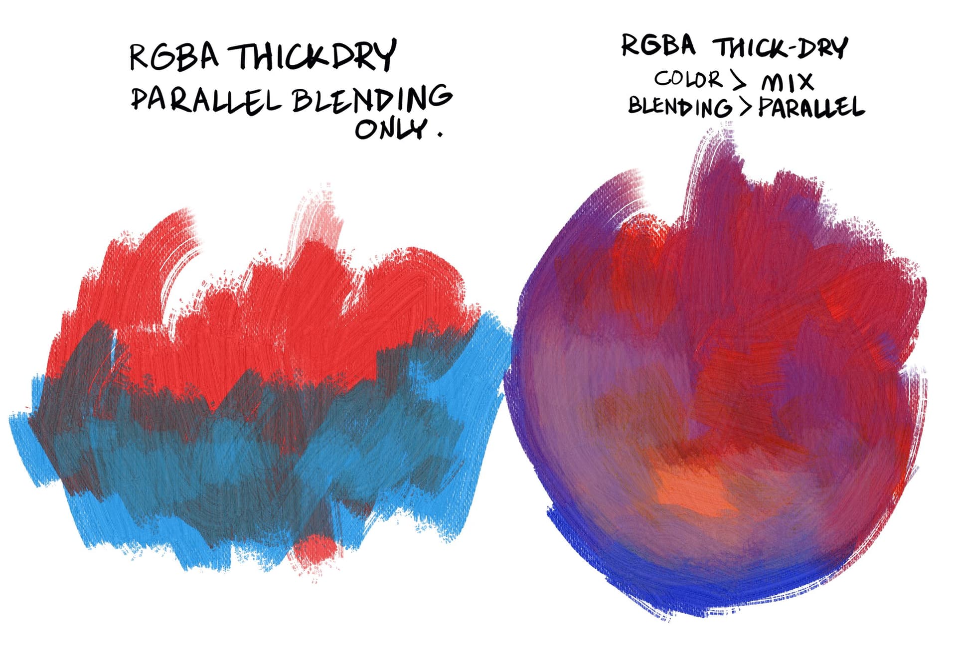
With parallel blending mode , the pressure is key to get the effect. If you pressure too much you override the effect and the selected color appears without problem, not the blended color. so keep the pressure mid-low. And also you have to notice that Parallel makes everything slower. Maybe is a complex blending mode. But at least you can use it for specific areas as i do in some experimental paintings.
Thanks a lot for these useful tips !
I will try to get the hang of the mid-low pressure control part.
Initially I was not even able to handle pressure trick with your watercolour brush set also.
But after I watched your video , understood how pressure is controlling the flow and opacity of the colour .
I hope I will be able to get a better understanding here also .
The video’s color mixing looks almost believable, I can’t really pinpoint what it is making it less real for me though - since on the right we can see an IRL comparison it’s easier to perceive a colour differences. For now I’ve noticed that when mixing red with white the video’s digital screen seems to create a lighter red when IRL the mix seems to create a lighter pink instead of a lighter red. Perhaps Krita could improve this in the distant future? I don’t know much about coding…
I see what you mean, but at the same time I view this system as a tool to further enhance the digital painting experience rather than perfectly imitate physical media. Being able to deliberately change the rules of how light and color interact is exciting to me as an artist. Being able to inherit some of the best parts of digital media and traditional media into one work flow where you have control is one of the greatest things about digital art. Researching systems like this allow for more happy accidents in the creative process, giving you the opportunity to make decisions you might never had considered when manually selecting each color.
I don’t know if you’re replying to me or not, I’m sorry if you weren’t.
I get where you come from, that’s another way of seeing things, but at the same time, if we wanted to “enhance the digital painting experience” then why would we want to simulate the real-life pigments and brushes in the first place? Moreover, why would we want to actively improve it just to make it look more “realistic” ?
I liked the idea you mentioned of “allow for more happy accidents in the creative process”, but wouldn’t the thing I mentioned contribute to that ? I feel like if Krita’s system had a percentage of “randomness” in colours (in a way, I don’t know how to call it) just like in real-life, the colours of the piece would turn out even prettier, furthermore, the colours would blend so much better together because of its painter-y look.
Both of our opinions are valid, but I couldn’t help but to have these questions.
Copyright (c) 2021, Secret Weapons. All rights reserved.
This code is for non-commercial use only. It is provided for research and evaluation purposes.
If you wish to obtain commercial license, please contact: mixbox@scrtwpns.com
So useless to Krita as is. I don’t even know if writing an original code, but using their approach or ‘formulas’ would be legal.
Not forgetting we would need a enthusiast coder to do this, as the main team don’t consider Real Pigments an urgent need.
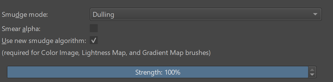
I was able to copy the color extending feature on Krita by turning off the “smear alpha” checkbox in smudge length and editing the graph in color rate. In this brush as long as you use low pressure the old color will extend over the new color. It’s not perfect but close enough
Yes, when I tested before, I found that checking it is equivalent to an extreme case of CSP parameters
E1:
I think it is better to make “smear alpha” a separate parameter, such as “alpha rate”? If it is 0, the alpha of the background color is used; if it is 100, the alpha of the brush is used.
Then convert the “smear alpha” (maybe 50?)

 !
!


 I feel like if Krita’s system had a percentage of “randomness” in colours (in a way, I don’t know how to call it) just like in real-life, the colours of the piece would turn out even prettier, furthermore, the colours would blend so much better together because of its painter-y look.