Personally, I don’t like how the popup palette has a rotating color wheel, but I got to know that there is no setting that lets me turn it off, so I’ll put that aside for now.
The Advanced Color Selector does have a stationary palette, but… why on earth is black at the top and white on the bottom left??? My brain is hard wired into thinking “slide up for brighter color and down for darker”. It just makes more sense. Here are the available options I found in the settings.
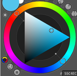
The next best alternative is the second option. It’s fine since I’m used to the square from my old days of using CSP, but after checking out a bunch of color theory videos, the triangular version makes more intuitive sense. I’m talking about the one where top-left is white, bottom-left is black and mid-right is color. Here’s a random image from google.
Intuitively, the mid-right would just represents the color (a mid-ish value). Slide up (and left) for a brighter version of that color, and slide down (and left) for a darker version. Here’s a video that explains it using x-axis (saturation) and y-axis (value).
So yeah, is there any way to rearrange the triangle selector that’s given by default? I’m guessing no, but is there any community addon that allows this?
IIRC, it has been exposed in UI since krita 5.0 in Configure Krita > Popup-palette > Color Selector and choose Wide Gamut Selector, which follows the selector shape in Advanced Color Selector setting.
Then you might have interest in this thread : User feedback for a new color selector which will replace the current Advanced color selector in the future.
The current state of it is still WIP but should appears in 5.2.0, though not complete enough to replace current Advanced Color Selector yet.