I understood one thing from what you explained.
The halftone filter you created was made with the purpose to look good only with anti-aliasing enabled. But not the other way around.
Well, thank you for explaining that.
I may tell my fellow artists, that they’d better avoid maximum hardness for the best results.
It is simply, the way Krita handles this currently.
Yes, might just have to print a sample again with this.
By trying to conform myself to the anti-alias, everything just seem fine with the screentones(no moirés, even at low scale).
Have you checked my screenshots? I don’t see why you can’t use hardness and get good results by tweaking some options. So ask your fellow artists to keep an open and scientific mind, use it and make an opinion based on results, from my experience they should be fine, unless they really want exact copy of results that photoshop and CSP give.
P.S.
Please don’t get me wrong. But in all your threads so far you seem to ignore the workaround / alternative feature provided and seem to be adamant in wanting the features that are present in others software as is. No matter what the suggestion you don’t change your view. It is as if the implementation done in other software is set in stone and is only solution. I would urge you to change the viewpoint and participate with more flexibility. Maybe I am reading in to the threads too much. Even when someone says “hey check this feature it may help you” you say “hmm, it’s not bad, but it is better if it is exactly like this software”.
It was created to be accurate. Unfortunately that means that with aliased edges it may look “bad”, because it is not fine tuned. That’s something that can also happen for examplre if you rotate an image with nearest neighbor filtering. It is normal.
I’m going to say it again: For me, if Ps and CSP generate a 25 degrees pattern when you choose 27 degrees or if it generates 12 lpi when you choose 14, then it is not correct and does not look right, regardless of some people finding the result pleasant. So I made the decision, in 2020, to make the screentones precise and look right with antialiasing over having them always aliased and having to use tricks to make them look good at the expense of correctness.
I’m not saying this screentone generator is perfect but for me to take time to make changes, some evident and well thought reason must be provided.
If you have too close tiny aliased shapes, moire patterns are unavoidable in one way or another.
Thank you for the notice.
I’m not using hard edges for they are bad with low scale dots. Sorry.
Unless I use an even bigger canvas, hardness is not an option for me.
The result you achieved, I already made a similar test days ago.
Looks good, but requires a bigger canvas, and with my specs, I can’t even imagine myself working on B4 size at 600 ppi. This size would be fine with the screentones tuned in your suggestions, but I work on A4, not even at 600 ppi, but 500ppi.
Now, just allow me to make a print or two to see if things will be fine nevertheless.
I have not printed my sample yet.
So Photoshop has moiré patterns you say ?
Well, look here.
It’s a page made by the mangaka Akihito Yoshitomi, and in his process, he shows himself the tools he uses, at which dpi he scans his work, and what settings he uses for his B4 manga manuscripts.
This the downscaled resolution of a 600ppi B4 manga page.
By default, he uses a frequency of 60 dot lines per inch tilted at 45°, with the inch covered by 600 pixels.
At this point, I feel like there’s nothing more to do about the implemented halftone filter aside from making the dot sizes matches the gray values by default, and giving the option to set a number of dot lines per inch. I won’t bother again about this.
I mean, you clearly analyzed the post, explained the choices behind your implementation with an overview of the problems if you copied other softwares as is.
Yep, I retire what I said then.
I could take a picture to show you a preview of the original screentone size as the artist works(he recorded himself doing so and I got the videos).
But, anyway.
Um… Maybe I understood this thread wrong, but yes it’s slightly different in Krita actually.
I agree with @Deif_Lou that Krita is better in term of having antialising options and more, but I think what novames is reffering to is something different.
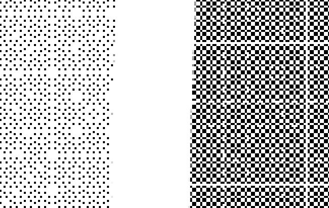
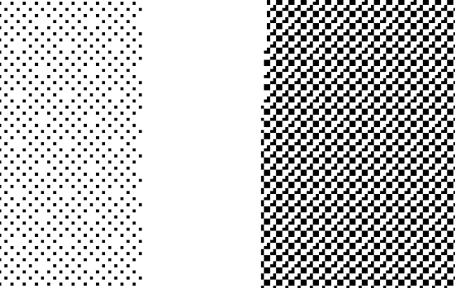
If you paint on canvas with full flat 100% opacity and try to convert it into tone scales in both CSP and Krita, you will see that CSP (generally) generates more consistant dot patterns. Especially in small dot sizes.
Although this effect itself is inevitable when converting preexisting values into tone scales(as you can also observe in CSP), I can’t say Kritas’ output looks more pleasant. Antialising can cover this to some extent, but the fundamental problem is stil there. In my opinion.
I don’t think this is a huge priority but I too hope this to be addressed by devs in the future.
EDIT : Reading through the thread again I noticed you actually covered this point in the thread lol. Sorry. But I just wanted to say it ain’t nothing.
@Deif_Lou
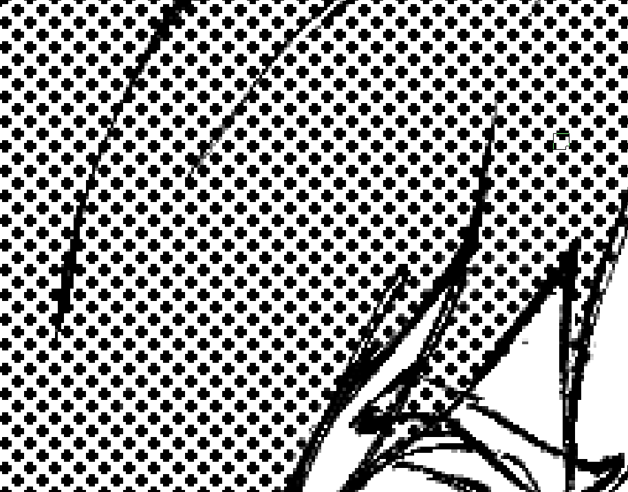
So I finally printed a page.
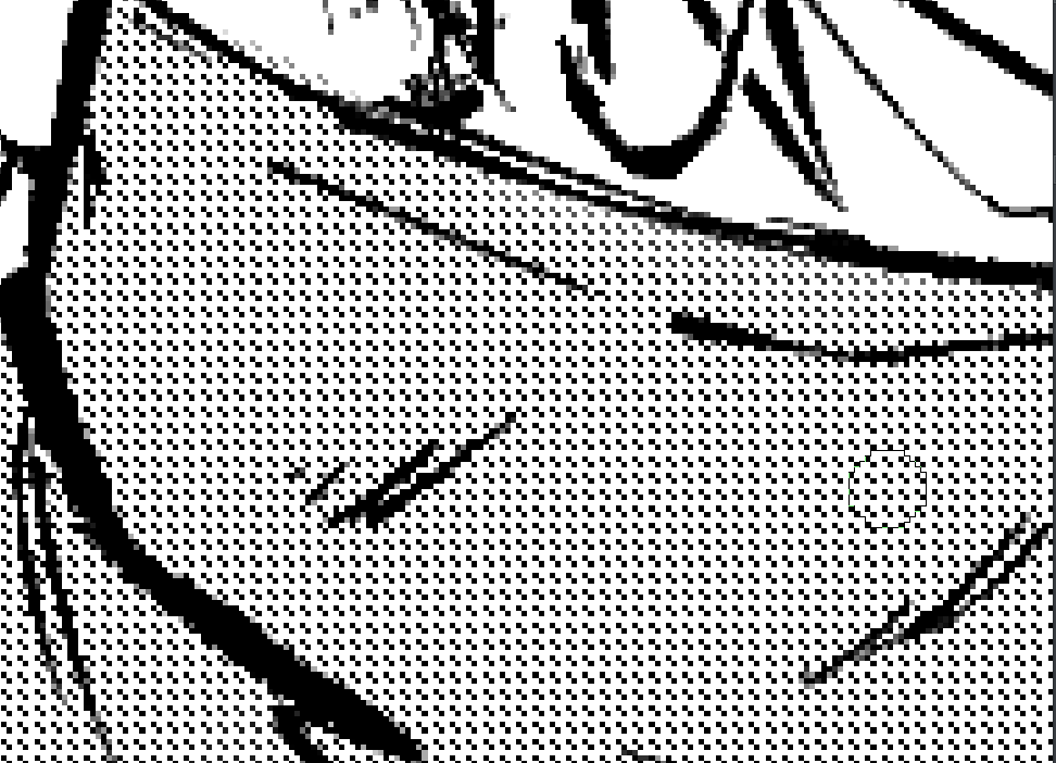
However the result wasn’t good at all with the screentones.
I had blurry directional lines all over the areas where it was applied.
Now, I suspect that it was either because the printer wasn’t a good one, or
the setting I used for my screentone was bad…
I thought all the details would appear fine, but, only with the screentones it was bad.
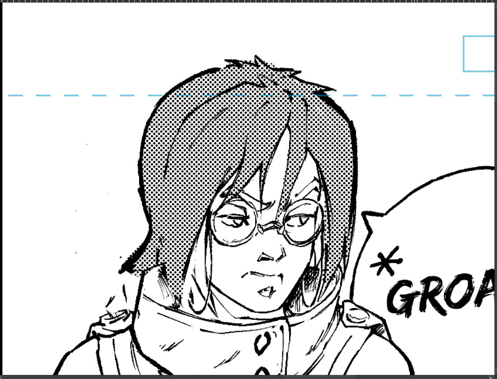
For the screentones, I used 4 pixels dot size with hardness at 50%. Angle for the screentones is 30°.
The file resolution is A4 @500ppi(about 4134 x 5846 pixels). I neither did the printing myself nor have asked questions about what settings where used and if it was an offset printing type.
All I’ve seen is a dialog and there was ppi somewhere. The correct value was entererd, then “OK”, and the print came shortly after.
@Deif_Lou
I noticed that the default halftone brushes from Krita’s default bundle also give an extraordinary consistency regarding the rendering of the halftone when you combine them
with the sharpness brush option.
Now there’s no angle set, but the scaling is possible. Though, by playing with the scale, I’ve noticed that it tends to behave like Photoshop/CSP style of halftone rendering…
Anyway, experiment still goes.
I haven’t printed something new yet because I realized that there’s lot of knowledge to have before choosing the right printing material and also the best printing technique.
For instance I’ve heard that PostScript printers would be best to use if you need to print
in high quality an image which contains halftones. I’ve also read that anti-aliased halftones increase the chance to the appearance of moirés effects…
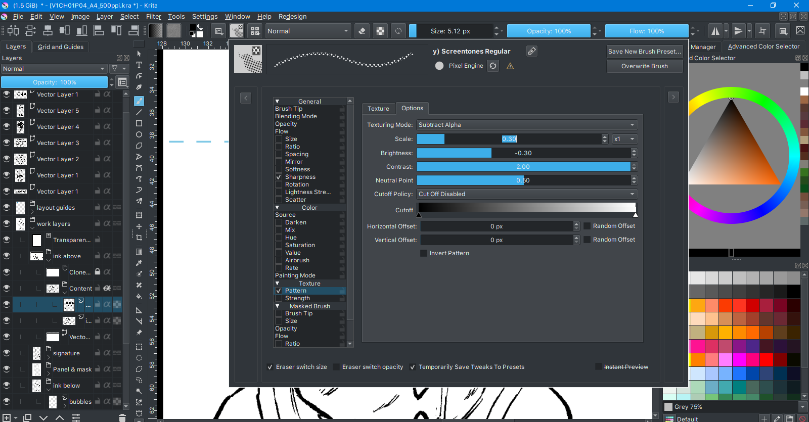
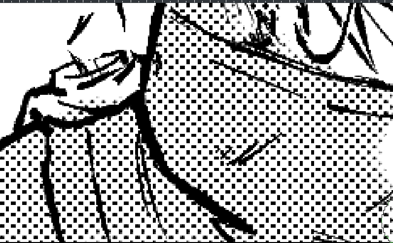
Photo 1 : texture blending mode and pattern settings :
Photo 5 : when the scale is very low (moiré zone) I’m impressed by how persistent the algorithm is regarding consistency…
Part of the painted area has slight stroke pressure rendered in it.
If I don’t dab over and over again, we can see some grays appear in the
tone grids. However, they display a black square with full value/pen pressure.
I say that it tends to behave like Photoshop/CSP way of halftoning because slight changes in
the parameters barely affect the result when you paint. If the value of the scale is too low,
you get nothing and not even moirés. Just nothing. Like if the tone was gone completely,
too small to even appear in a pixel square.
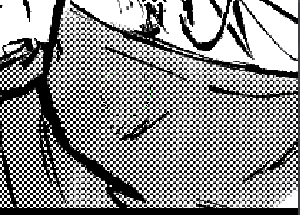
Photo : Smallest possible value for the halftone to appear( moiré zone, but still consistent ?
now that is insane ! ) :
Brightness of the texture : -0.36; scale : 0.10, blending mode : subtract; contrast : 2.00
The brush uses a pattern. That pattern is already made so that the dots look as if they where rotated 45 degrees and it is align to the pixel grid. I think you can have similar results using the halftone filter with that same pattern (that’s one cool thing about the halftone filter: you can make your custom patterns) .
I think the ps look can be achieved if you align the screentone grid corners to integer coordinates. For example, if you use 45 degrees, use a size multiple of square root of 2 (the length of the diagonal of a 1x1 square).
Now, I know it is cumbersome to make all those calculations by hand (specially if you would have to tweak the shear parameters). But in theory it should be possible to align the screentone grid to integer coordinates now. The only thing that would get in the way is that the transformation parameters only have 2 decimals of precision. @novames00 I understand this has its utility, as well as the lines per inch and accurate gray tone representation, so I’ll try to implement it when I have time, embedded in the current system, if possible.
If I can change the scale, angle of the pattern and its offset, while maintaining its consistency, sharp feel and also a good value transition from white to black, then I don’t mind…
Could it be that there are techniques capable of achieving the result without the halftone filter ?
The halftone filter is very simple, it just takes the output of the selected generator and mixes it with the image with a custom blending mode similar to overlay. Then it applies a contrast adjustment based on the hardness parameter. So if you use the pattern generator with it and choose that dotted pattern you should achieve similar results as with the brush.
The problem appears when you choose some transformation (scale, rotation and so on) that makes the dot grid not align to the pixel grid. That would render each dot differently and could create moire patterns. That’s a known issue that happens when sampling. The solution is to align the dot grid to the pixel grid which I think is what ps does, but that can make the grid cells become parallelograms, although I think it can work and look nice.
All those issues will appear also if with you would transform that dot pattern.