I haven’t gotten to the fill and stroke stuff, no.
What I have being doing however is work on…
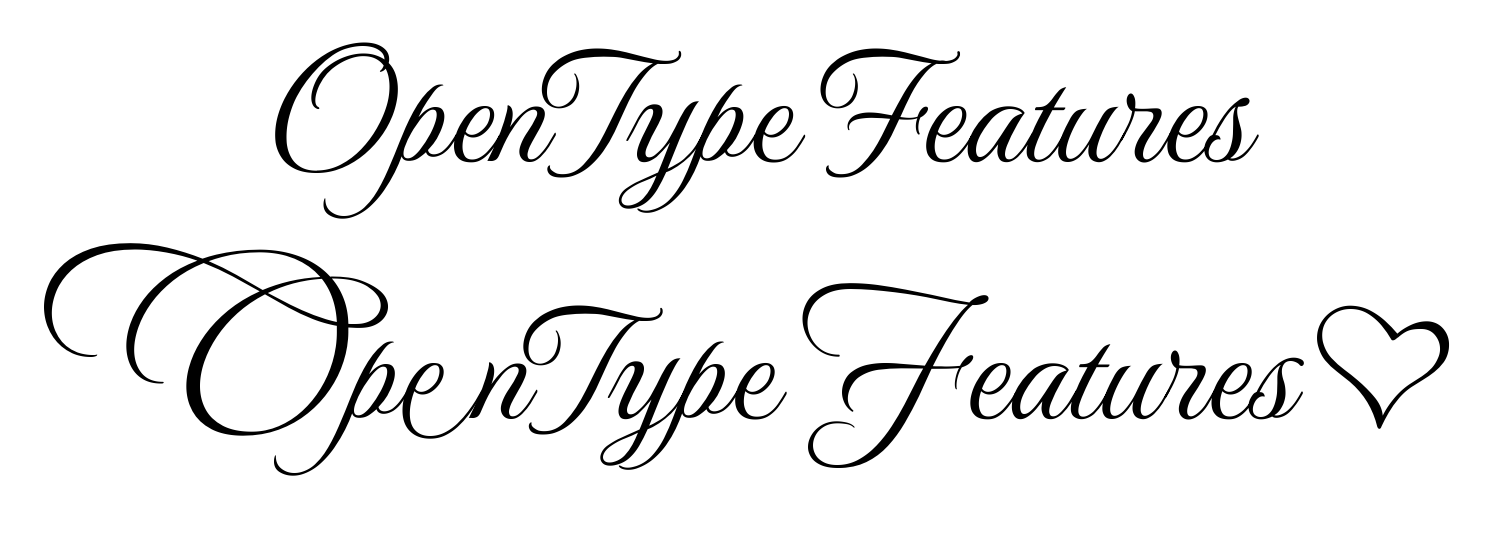
The UI for OpenType features, meaning I can now do my feature introduction.
As per usual, I wrote a technical blogpost too.
OpenType deals with making the font look good for the given script and script requirements, but a lot of it can be configured by typesetters. The most well known features are things like kerning and ligatures, but there’s over 120 officially registered features.
There’s two levels of OpenType feature in CSS. The first type is about generic OpenType features, while the second is about enabling and disabling specific features and glyph alternates, which means we have 5~ extra properties in the docker now:
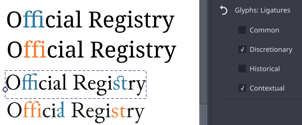
Glyphs: Ligatures controls whether or not you want to enable certain ligature types for the text. By default “common” and “contextual” are enabled, but “historical” and “discretionary” are also very common. The latter two are usually used in decorative or specific historic contexts.
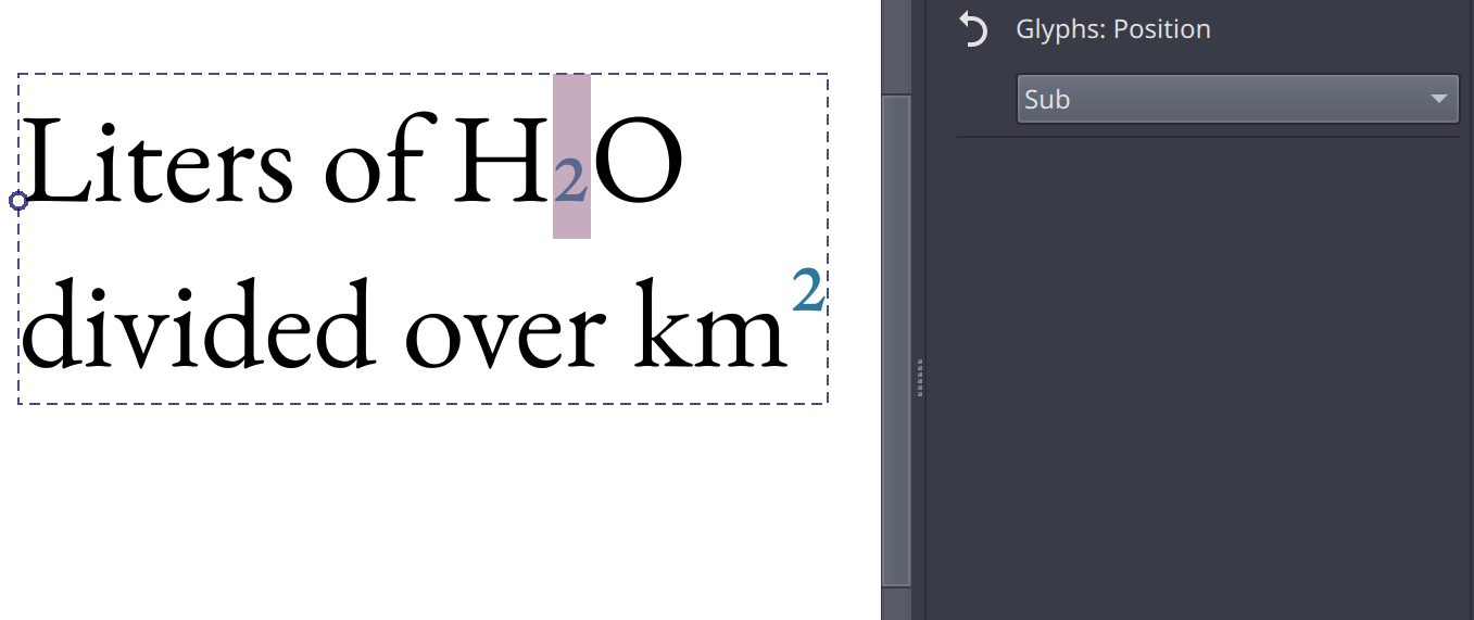
Glyphs: Position controls wether to use subscripts or superscripts inside the font. I am supossed to offer font-synthesis (with toggle) for this, where we manually resize and position a stretch of text if there’s no sub or super-scripts in the font, but I haven’t figured out how to do that yet. The alternative is to manually resize and position the stretch of text with baseline-shift.
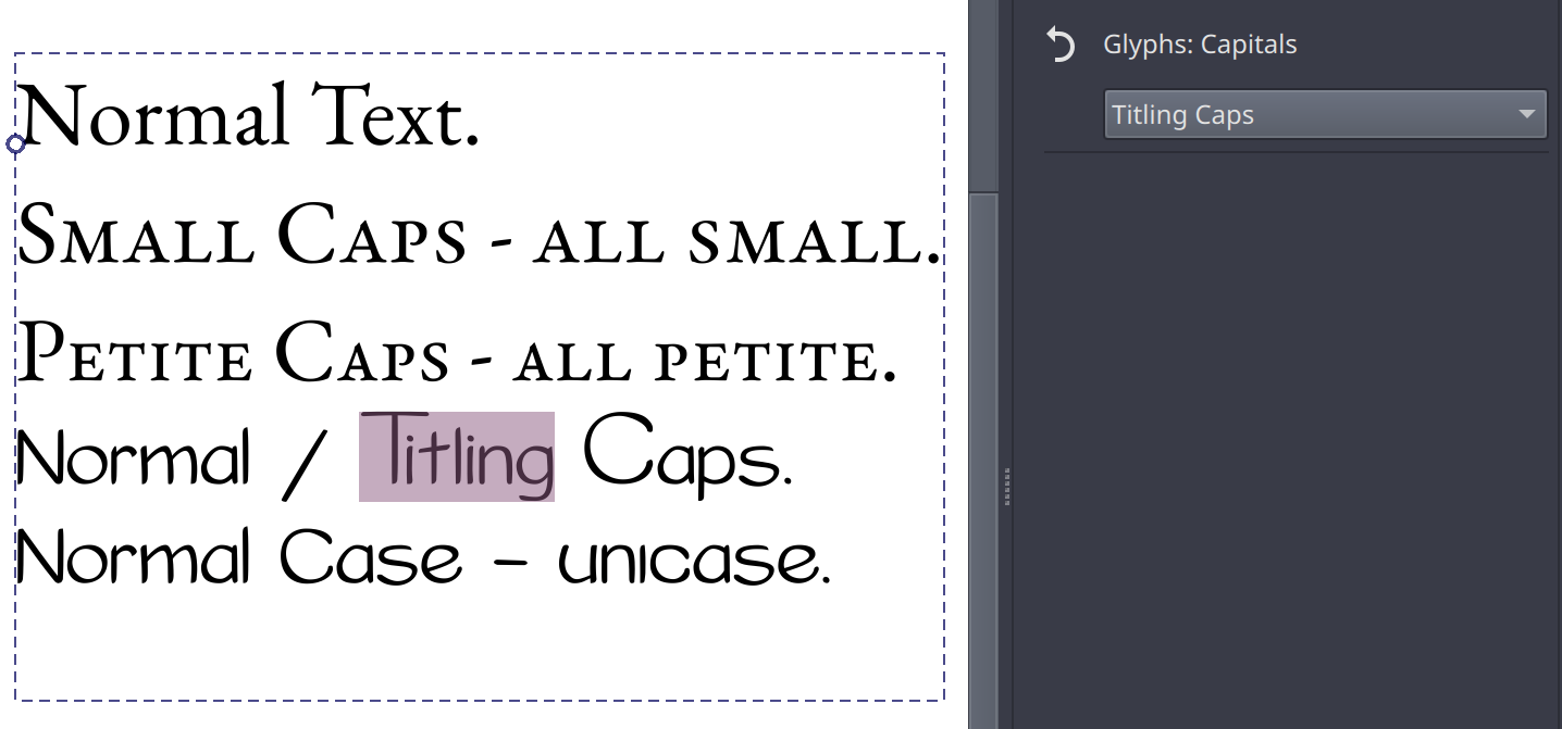
Glyphs: Capitals controls which capital-related feature you want to enable. Typically used for Small Caps, it also has options to select Petite caps (smaller than small caps), titling caps (Note the bigger more dramatic proportions, and Unicase (I now notice I selected a bad example for this, but Unicase makes bicarmel scripts use same-height glyphs, usually picking out the most dramatic glyph for a given situation). Here too I am supossed to offer font-synthesis for small and petite caps, but same as with Glyphs: Position, I haven’t figured out how to do that.
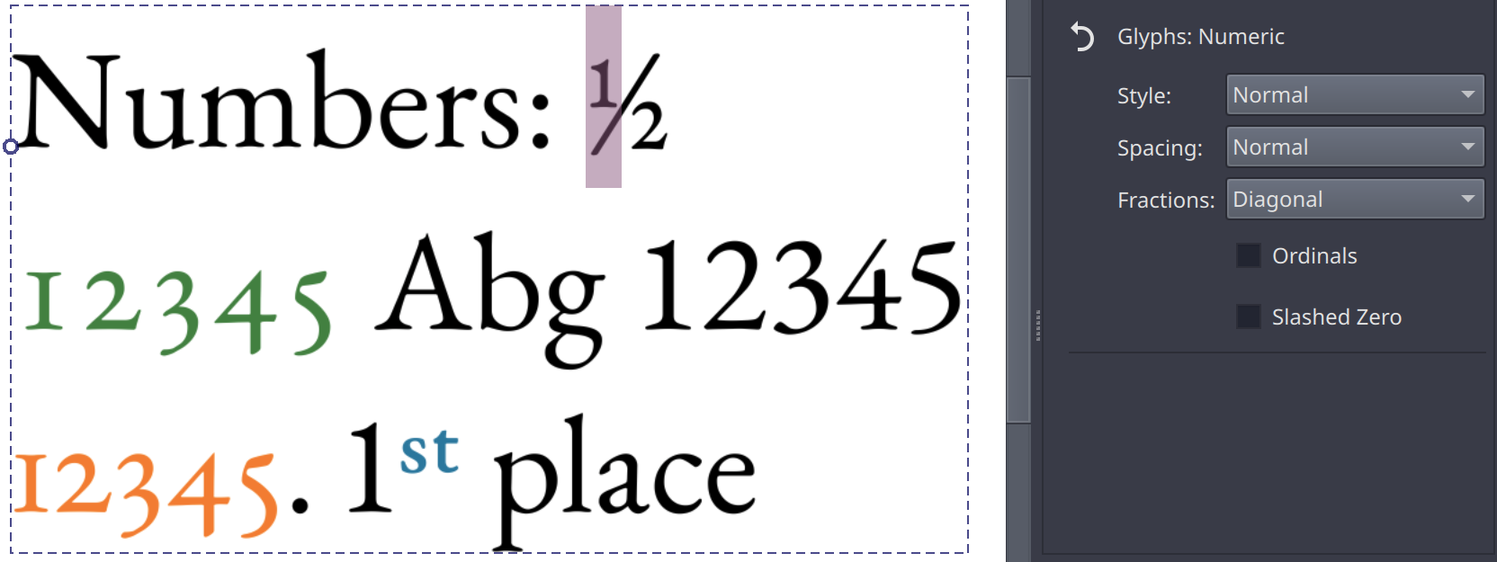
Glyphs: Numeric controls the number-related opentype features, such as fractions, whether to use old style or lining figures (old style is typically the height of the small letters, while lining lines up with the capitals), and whether to make the spacing tabular (that each number takes up the same space so they line up nicely, ) or proportional (each number takes up only as much space as it needs). The latter here is shown in the screenshot above as green (tabular) vs orange (proportional).
There’s also a toggle for ordinals (that’s a kind of superscript you use after numbers that count something, like 1st, 2nd, 3rd, blue in the screen above), as well as slashed zero, which can help to make the font less ambiguous. I didn’t have any font on my system that supported that one though…
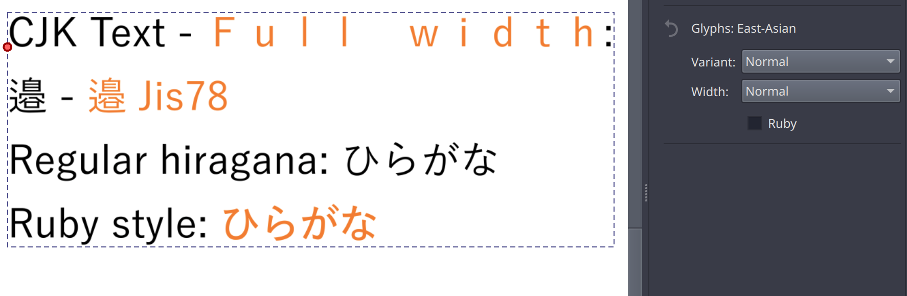
Finally, Glyphs: East-Asian controls features related to CJK typography. Primarily the glyph alternates associated with the different JIS standards, but it also allows toggling proportional or full-width glyphs and the slightly thicker glyphs that are better suited for ruby-annotations. (Note: these are not ruby annotations themselves, that is out of scope for 5.3).
Then, the second type of CSS feature is encompassed in OpenType features:
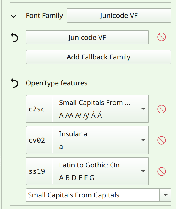
For this, I am scanning the font for available features in the text shape language. You can use the dropdown to add any feature found inside the font, or add any officially registered font feature by typing into the box. Some features, like character variants and stylistic sets, have extra data inside the font to annotate what exactly they do. This data is also retrieved, and in addition to that I spend some time making sure each official feature has a proper title and a small descriptionary tool tip, which can also by localized by the translators.
For this reason, the features are prepended with their OpenType tag, so it is unambiguous what features are enabled, regardless of language. The sample tag is enabled for a handful of features (mostly for speed reasons), and in the future I want to make it so that it actually renders the feature in the given font. Right now, I’m waiting for halla to figure out some code stuff before I can do that.
Now, this OpenType feature control is pretty rough to use, furthermore, CSS does have extra controls for handling character alternates and stylistic sets, but those require better handling of CSS stylesheets, and are therefore out of scope for 5.3.
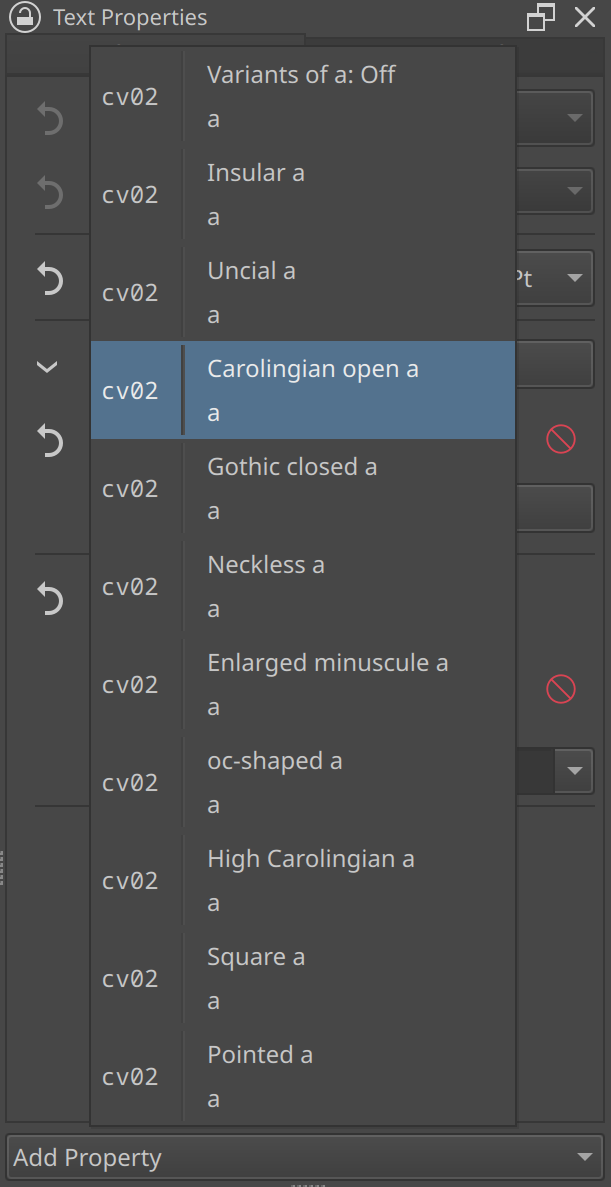
Instead, I spend some time writing a glyph palette:
This was what I was hinting at last year when I meant OpenType experiments.
This palette is a dialog in the text tool that functions as both a character map, as well as a character-alternate selector, and it can show both Unicode Variation Selectors (These are used in CJK fonts to give very specific glyph alternates, often required for people and place names), as well as a variety of OpenType glyph alternates. The character map can be searched for both typed letters, hex codes and filtered on Unicode blocks.
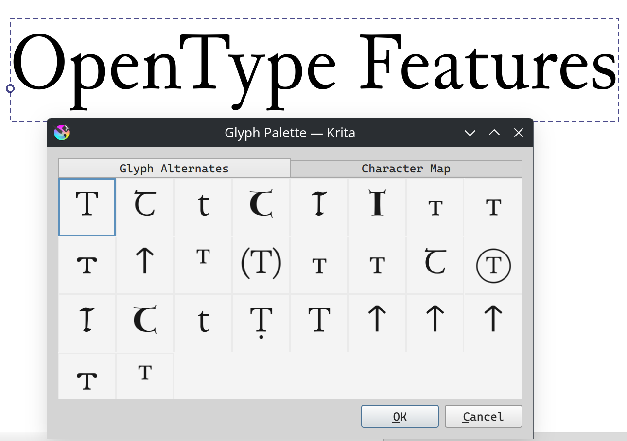
The medievalist font Junicode has been my main tester for this as it has many, many, many glyph alternates.
Now, the glyph palette isn’t perfect: I for one cannot get enough information for Ligatures and the “ccmp” (Also known as Composition/Decomposition) OpenType feature, so it right now isn’t able to show all glyphs a font really has. However, I do think this is a far more friendly way to interact with OpenType glyph alternates, and am very happy I managed to get it to work.
If you want to test this code, I recommend waiting for the next nightly: I found and fixed some crashes today while finalizing the blogpost and writing this introduction.
Beyond that I’ve been doing a bunch of UI tweaks, and I hope to be able to do more when halla figures out the plugin stuff I need. Otherwise I’ll be either working on unit handling for line height or actually getting that language selector in…