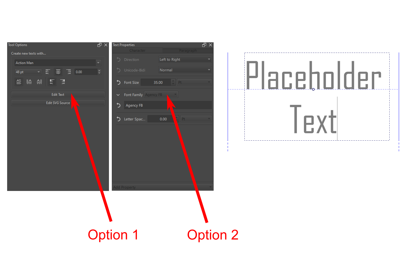
Is there a way to change the font in 5.3.0 pre-alpha? I can’t seem to get it to work.
The old method is still there, where you click on the Edit Text button, located on the Tool Options panel, but you can also change it via the menu on the new Text Properties Docker (which you’ll need to open with the dockers panel if you haven’t already).
Ok, the Fonts MR has just been merged. There’s still some UI quibles, and we hope to speed up the searching for fonts on windows still, but the major fixes (being able to select previously unselectable fonts, localized family names, better preview, tagging fonts, and variation axes support) are there.
Next up, this took me like, 6 months, so I’m going to try and get some small wins first before digging into the issues surrounding line height and baseline metrics.
Agree, thanks a lot Wolthera. It’s been absolutely awesome using the new editor. Super quick too btw and amazingly non-buggy.
Well done! “:D”
Can we have a plain text editor tab next to the rich text and SVG tabs?
I frequently work with smaller font sizes and in the rich text editor the text is so small that I can not see what I am doing. A zooming option like the SVG tab has could also work.
And if possible, could you make the background of the text editor mid gray? Now it is dark gray, making it hard to see black text. – edit: found the bg color settings –
Thanks, there’s actually still a ton of bugs, but no big scary ones, this is largely because we’ve been moving very carefully and deliberately.
The idea is that we now have a on-canvas text editor, and we’ll remove the rich text one. That should also solve your small-text problem.
For the update of this week…
I’ve mostly been doing small bugfixes (in particular the signwriting-house script font on macOS got fixed today, as well as the weird bug where sometimes it seemed an unselected shape object would change color…). Beyond that I worked on toggling basic opentype features. This is not all the opentype feature stuff, but its a small start.
I tried it in the beta, it is exactly what I needed.
Yep same here, it was literally perfect. One small bug I noticed though is that when you have your text select/highlighted and try to change the color via. the color wheel the entire programm just crashes lmao.
@wolthera This is awesome. I know it’s only just been merged into Krita-Next, but hot damn, I can’t wait to see this in the stable build.
I did notice that the fill is automatically reset to a solid from a gradient when editing the text, but I’m guessing it’s an known bug.
It’s looking great though and I can’t wait to see more.
I haven’t gotten to the fill and stroke stuff, no.
What I have being doing however is work on…
The UI for OpenType features, meaning I can now do my feature introduction.
As per usual, I wrote a technical blogpost too.
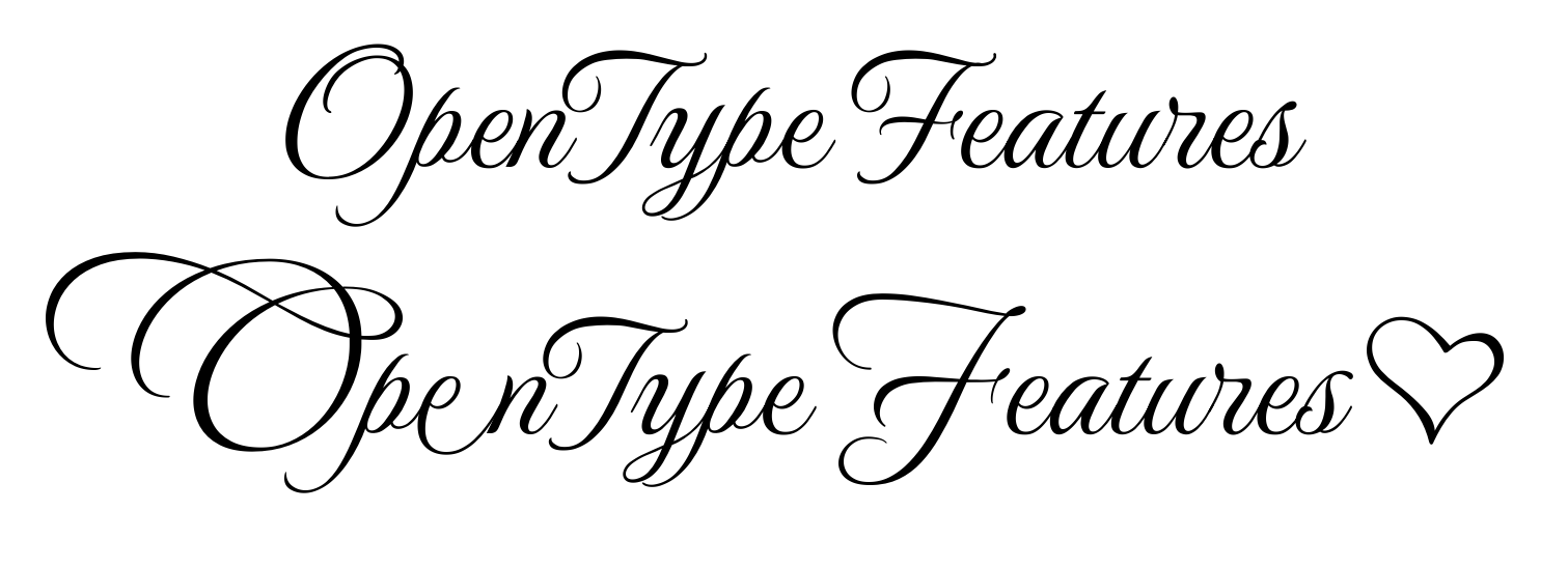
OpenType deals with making the font look good for the given script and script requirements, but a lot of it can be configured by typesetters. The most well known features are things like kerning and ligatures, but there’s over 120 officially registered features.
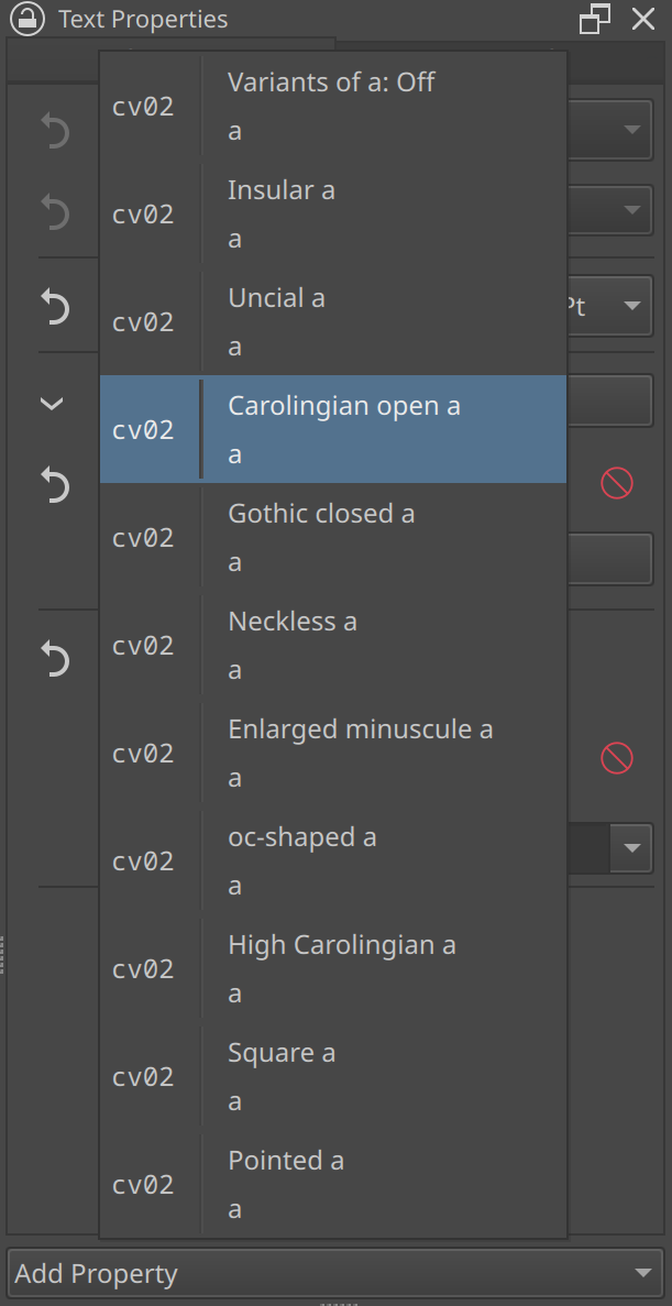
There’s two levels of OpenType feature in CSS. The first type is about generic OpenType features, while the second is about enabling and disabling specific features and glyph alternates, which means we have 5~ extra properties in the docker now:
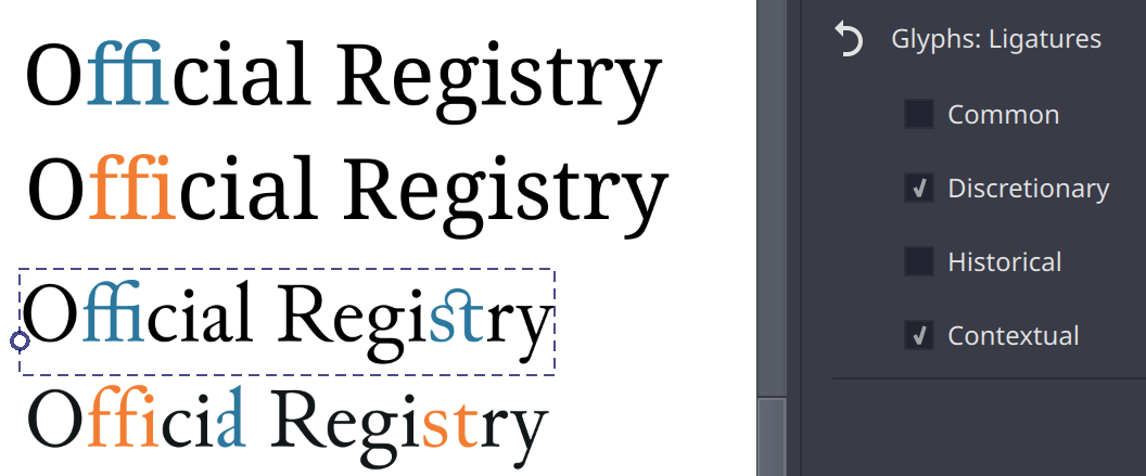
Glyphs: Ligatures controls whether or not you want to enable certain ligature types for the text. By default “common” and “contextual” are enabled, but “historical” and “discretionary” are also very common. The latter two are usually used in decorative or specific historic contexts.
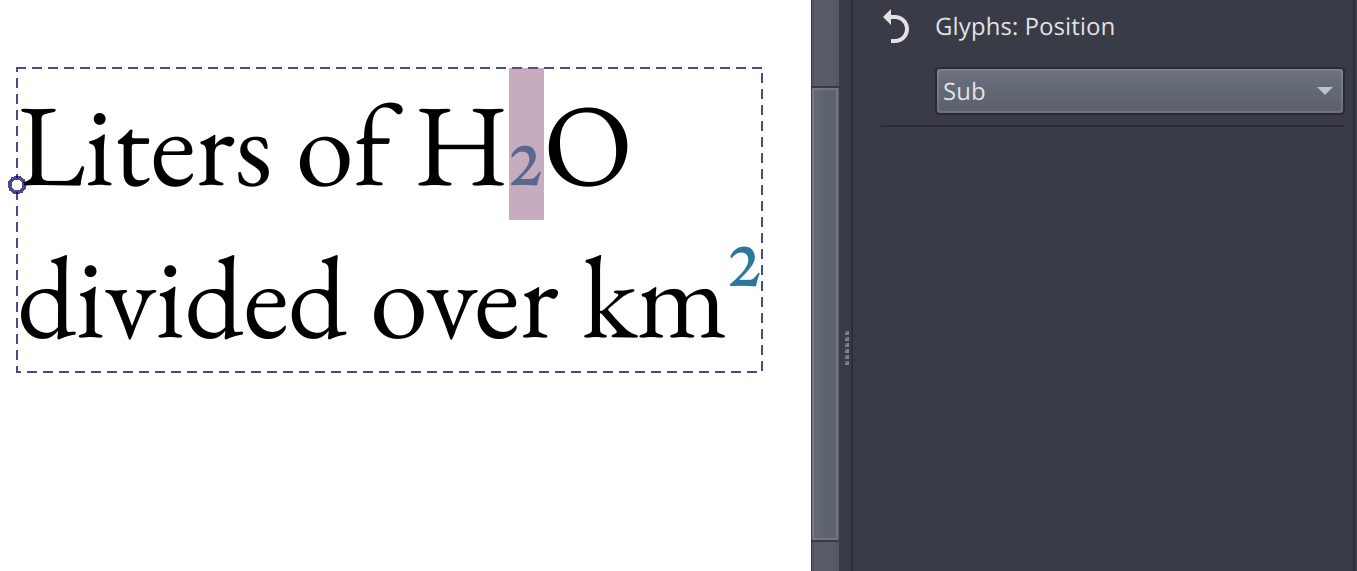
Glyphs: Position controls wether to use subscripts or superscripts inside the font. I am supossed to offer font-synthesis (with toggle) for this, where we manually resize and position a stretch of text if there’s no sub or super-scripts in the font, but I haven’t figured out how to do that yet. The alternative is to manually resize and position the stretch of text with baseline-shift.
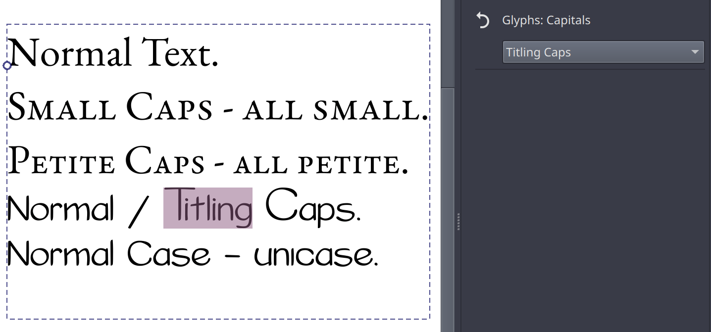
Glyphs: Capitals controls which capital-related feature you want to enable. Typically used for Small Caps, it also has options to select Petite caps (smaller than small caps), titling caps (Note the bigger more dramatic proportions, and Unicase (I now notice I selected a bad example for this, but Unicase makes bicarmel scripts use same-height glyphs, usually picking out the most dramatic glyph for a given situation). Here too I am supossed to offer font-synthesis for small and petite caps, but same as with Glyphs: Position, I haven’t figured out how to do that.
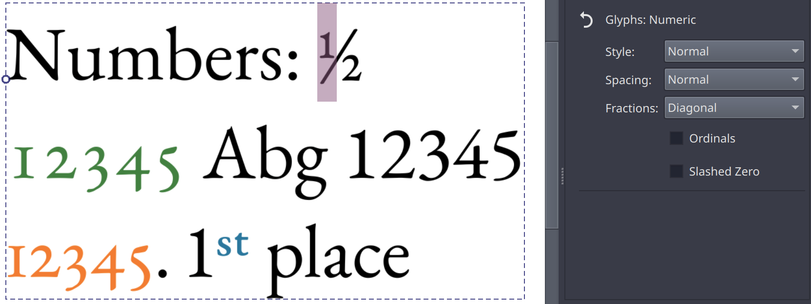
Glyphs: Numeric controls the number-related opentype features, such as fractions, whether to use old style or lining figures (old style is typically the height of the small letters, while lining lines up with the capitals), and whether to make the spacing tabular (that each number takes up the same space so they line up nicely, ) or proportional (each number takes up only as much space as it needs). The latter here is shown in the screenshot above as green (tabular) vs orange (proportional).
There’s also a toggle for ordinals (that’s a kind of superscript you use after numbers that count something, like 1st, 2nd, 3rd, blue in the screen above), as well as slashed zero, which can help to make the font less ambiguous. I didn’t have any font on my system that supported that one though…
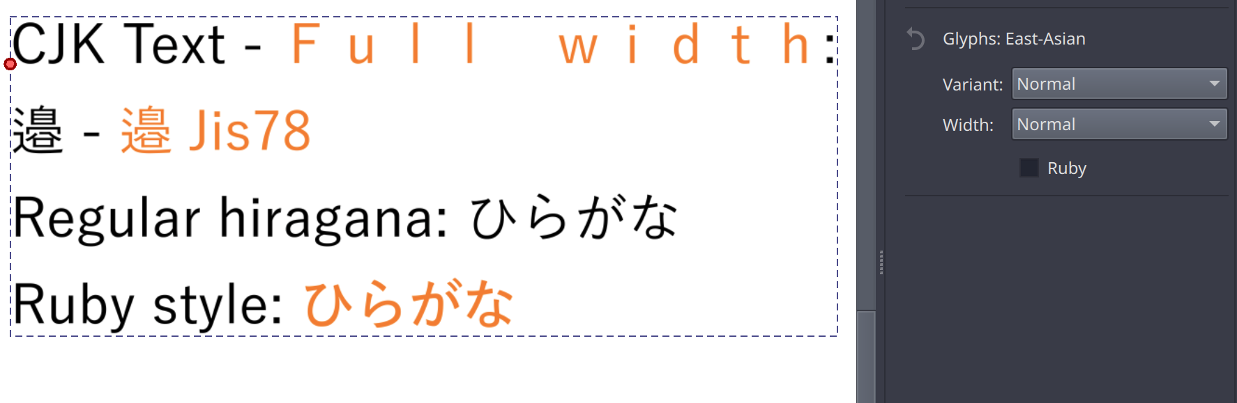
Finally, Glyphs: East-Asian controls features related to CJK typography. Primarily the glyph alternates associated with the different JIS standards, but it also allows toggling proportional or full-width glyphs and the slightly thicker glyphs that are better suited for ruby-annotations. (Note: these are not ruby annotations themselves, that is out of scope for 5.3).
Then, the second type of CSS feature is encompassed in OpenType features:
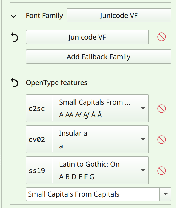
For this, I am scanning the font for available features in the text shape language. You can use the dropdown to add any feature found inside the font, or add any officially registered font feature by typing into the box. Some features, like character variants and stylistic sets, have extra data inside the font to annotate what exactly they do. This data is also retrieved, and in addition to that I spend some time making sure each official feature has a proper title and a small descriptionary tool tip, which can also by localized by the translators.
For this reason, the features are prepended with their OpenType tag, so it is unambiguous what features are enabled, regardless of language. The sample tag is enabled for a handful of features (mostly for speed reasons), and in the future I want to make it so that it actually renders the feature in the given font. Right now, I’m waiting for halla to figure out some code stuff before I can do that.
Now, this OpenType feature control is pretty rough to use, furthermore, CSS does have extra controls for handling character alternates and stylistic sets, but those require better handling of CSS stylesheets, and are therefore out of scope for 5.3.
Instead, I spend some time writing a glyph palette:
This was what I was hinting at last year when I meant OpenType experiments.
This palette is a dialog in the text tool that functions as both a character map, as well as a character-alternate selector, and it can show both Unicode Variation Selectors (These are used in CJK fonts to give very specific glyph alternates, often required for people and place names), as well as a variety of OpenType glyph alternates. The character map can be searched for both typed letters, hex codes and filtered on Unicode blocks.
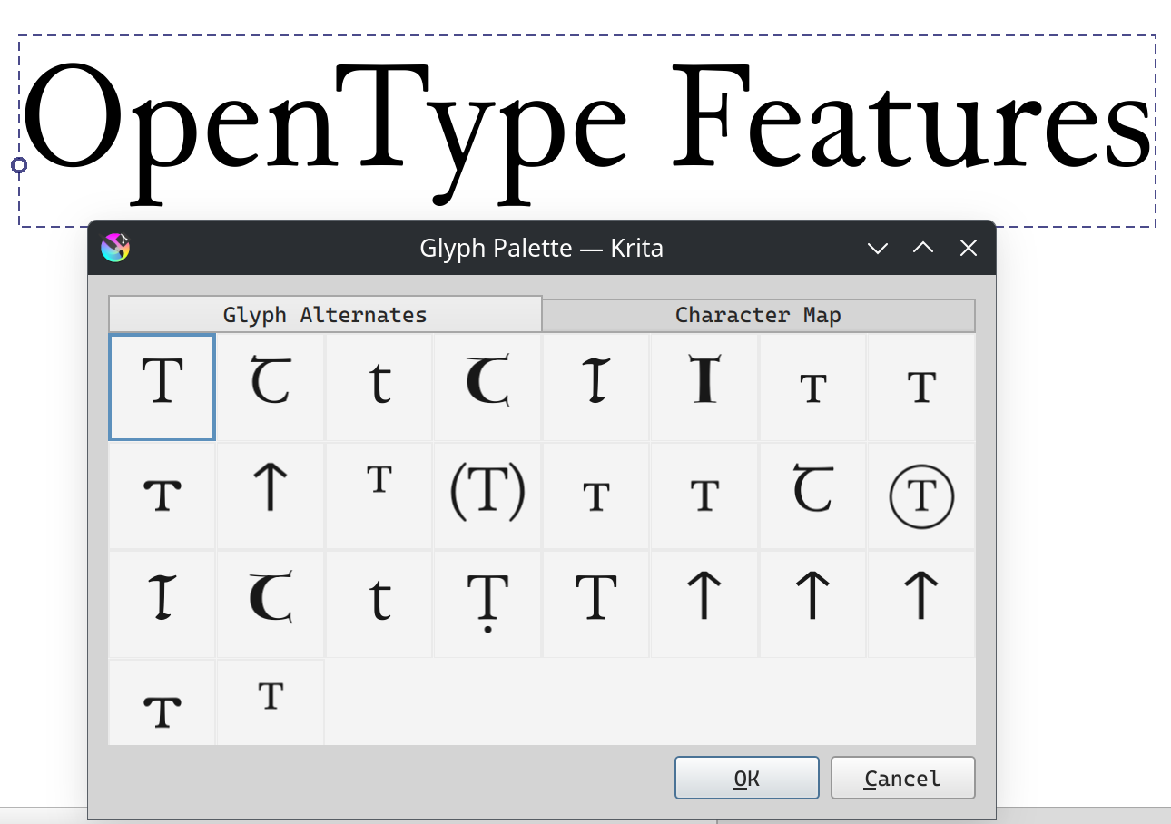
The medievalist font Junicode has been my main tester for this as it has many, many, many glyph alternates.
Now, the glyph palette isn’t perfect: I for one cannot get enough information for Ligatures and the “ccmp” (Also known as Composition/Decomposition) OpenType feature, so it right now isn’t able to show all glyphs a font really has. However, I do think this is a far more friendly way to interact with OpenType glyph alternates, and am very happy I managed to get it to work.
If you want to test this code, I recommend waiting for the next nightly: I found and fixed some crashes today while finalizing the blogpost and writing this introduction.
Beyond that I’ve been doing a bunch of UI tweaks, and I hope to be able to do more when halla figures out the plugin stuff I need. Otherwise I’ll be either working on unit handling for line height or actually getting that language selector in…
Hey came back to check in on the progress of this. Am I misunderstanding or is this not in the current latest version of Krita? I see what looks like a lot of progress in this thread since I last posted 2 years ago, but when I open Krita I don’t see a way to access a text tool of the sort I’m seeing in this thread. Am I missing something?
Ah checking up thread it looks like it’s still in development only builds.
Looking forward to this!
Yeah, I decided to take some time to get font selection work properly, but that ate half a year.
So, small update, and a request for help.
I’ve, since last time, managed to get a language selector in. I’m currently working on font metrics related things. The first part of this was about making it possible to select pixel instead of point sizes, which is already in. Now I’m working on fixing up baseline-alignment and alignment shift.
Now, here I had some questions regarding icons.
These are the icons I’ve designed, which were in turn modified by Animtim. I’m having some trouble with the ideographic and hanging icons.
So, to explain my constraints:
- For new icons, we generally try to follow the breeze icon rules, as we generally use breeze icons where possible.
- The breeze icon set tries to be pixel-perfect. Which means that even though the icons themselves are vector, the points are adjusted so that they’ll look as sharp as possible when shown on a pixel-display. That generally means that the whole thing is snapped to the pixel grid of the desired end-size.
- That means 16x16 grid in this case.
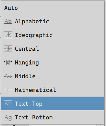
- For each baseline described by the specification, I try to use a character that most clearly indicates the specified metric.
- For Alphabetic that’s “Ab”
- For text-top and text-bottom, that’s also “Ab” (b for the ascender), and “Ag” (g for the descender).
- For middle, that’s the middle of the x-height, so “Ax”
- Now, with mathematical it gets interesting. The specs say that this is generally the line that goes through the minus sign, “-”, however, that’s unreadable in icon size, so I went with the plus sign, “+” instead.
- With hanging, there’s a similar problem: Spec says that if there’s no metrics defined for it, it needs to default to Ka in the given script, (“क”, “ক”, “ਕ”, “ཀ” in Devanagari, Bengali, Gurmukhi and Tibetan respectively). However, for the icon, this isn’t helpful, because someone who has never seen a Brahmic script before might confuse it with the Ascender in Latin script. So, instead I went with “शि” , the first glyph-cluster of “शिरोरेखा”, which is the name for the head-stroke in Marathi (Third image in this article).
- Is this a good idea, or is there a better glyph for this?
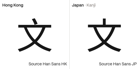
- Similarly, with the ideographic character. It right now uses water “水”, because that’s the default glyph used by the specs to calculate fallback. However, it is also a bit of a weird glyph to use beyond that. “字”, character, might make more sense, however, I’m worried that people might confuse its strong horizontal stroke for the alignment point for the “central” option (the “central” option being between the ideographic embox top and bottom, not aligned to any glyph). The other options suggested when talking to people who can actually read han script, were “文” (because it is used in translation contexts) and “永” (Because it is used as a base character for calligraphy). In the latter case I’m going to need some help aligning it to a 12x12 grid (a margin of 2 on each side so there’s room for the baseline indicator), because on closer inspection my “水” is really ugly looking.
- In short: what character should be used, and can someone help me with aligning it to a 12x12 grid?
Once I get this part finished, I need to overhaul text-decoration (it too has some metrics related stuff that needs rework), and finally, I am going to fix some deeper issues with font-size and finally fix line-height for vertical (Had wanted to do this earlier, but the units stuff was a bit big). And after that I’ll write the introduction for these items.
Maybe अ ? It is analogous to A and is the first character in the vowels in devanagri script.
i think “文” is perfect for ideographic and central icons! in addition to “文字” meaning “text”, the character is also commonly used in language icons so it should be recognizable to non-readers as well. it also should be easier to make icons with due to only having 4 strokes and can be largely symmetrical.
note that HK/SC/TW vs JP/KR rendition of the character is slightly different.
Thank you! Fantastic work!
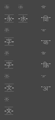
Ok, I just went ahead and drew icons for all possible options I’ve got up till now, you’re seeing them at 16px and 32 px (that would happen if display scaling got applied).
At the left, all potential ideographic center glyphs, with a redrawn “水” for reference. Top to bottom:
- “永”, I studied some pixel art fonts on how to best approach this one.
- “字” based on Noto Sans HK
- “字” based on Noto Sans JP
- “文” based on Noto Sans HK
- “文” based on Noto Sans JP
And right, the hanging baseline ones:
- “शि”, Shi
- “क”, Ka
- “कि”, Ki
- “अ”, A
Usually I’m reasonably confident in my icon work, but not being able to read these scripts makes it really hard to judge for me what makes most sense.
Using 5.3 from 05. April.
Is it possible in that version to make the above shown “text in shape”?
I understood how to make a single line text and use the text properties docker. I also can make hard returns to add multiple lines.
But in that shape examples picture it looks like Krita is automatically alining the text inside a vector shape.
Yeah, currently you can’t make these or text-on-path with the text tool. The reason is that when discussing the architecture, we couldn’t find an easy way to make the shapes themselves editable.
That doesn’t mean that such a way doesn’t exists, but rather I chose to prioritize rich text editing for now. The idea being that if you let a problem rest for a bit, you can come back later and look at it with fresh eyes.
The wrapping code itself exists in Krita, I even fixed bugs in it last week.
Ok, it is already a nice tool even without text to shape ![]()