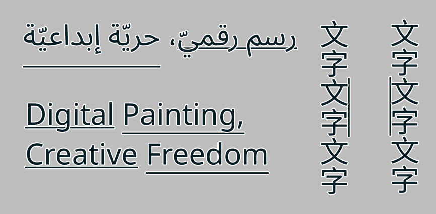
There are no problems with Japanese characters (永,文,字,水).
The detailed structure of the characters can be clearly recognized. OK!
But I think that charactor 水 haven’t been not much for using UI icon for text editing.
For the devanagari icons. I am fine with ‘Ka’ or ‘A’ All of them show the same amount of base line so it does not matter for me personally.
Alright, so lets take a look at, uh… all the features involving font metrics. The accompanying technical blog for this is very long, mostly because I spend a lot of time deciphering mysterious spec details and I kinda wanted to share that with whoever reads those posts.
Font Size and Line Height
So, font size does what it says: Allows you to set the font size. The actual thing it sets is a bit more abstract; it scales the em design size to the value you chose. But no worries, all implementations do this. What is new though is that you can finally set the font size using not just points, but also millimeters or inches or pixels. The latter is document pixels, so you won’t need to create a 72dpi document anymore to get those pixel art fonts set to precisely 12 px. You can also now set the font-size below 1pt, which wasn’t possible before due that Freetype doesn’t allow for it, so we’re adding in an extra scaling factor there now.
You will also notice that you can set values like “0.5 em”, or “2 ch”. These are font-relative values, and what they do is that they take the parent font metrics and then calculate the value from that. So if you set the paragraph to 12 pt, and then take a small selection and set it to 0.5 em, the font size of that section will in effect be 6 pt. If you then change the font-size on the paragraph, this smaller section will scale along. This is probably going to be most useful for style presets when those get in, but you can imagine wanting to have the text-ident be 1.5 ic (ideographic advance), or tab-size at 2 em can be very useful as well.
(In the above, the small text is set to 0.5 em, and the big text to 2 em, which means that changing the font-size will change these adjusted areas respectively)
There’s also font-size-adjust. What this does is that you can set the ratio of the x-height, and then that ratio is used to adjust all other fonts so that the x-height ratio stays the same. This is particularly useful with font-fallback, but can also be useful in general to force some consistency into the x-height. There’s a “calculate” button, which allows you to calculate the font-size ratio of the current font family.
(Above: Script fonts frequently have a much smaller x-height than typical body text fonts. By using font-size-adjust and pressing “calculate” on font-size-adjust, we can set the text to use the same x-height ratio)
As for line-height, I mostly spend a lot of time doing fixes here, so it is calculated more correctly and you don’t get the weird mismatch when doing vertical-rl text anymore. The normal toggle uses the ascender+descender+linegap that is inside the font. It also has a unique unit, called “lines”. This means that the contribution of each glyph to the line-height is their font-size, which is what is used for single and double spacing in other programs. The other values will make the whole line-height that value, which is not quite as nice as having a proper line-grid, but it can at the least give some kind of consistency. The “normal” vertical line-height is also now fully synced with inkscape and the SVG 2 spec, using the em-box width.
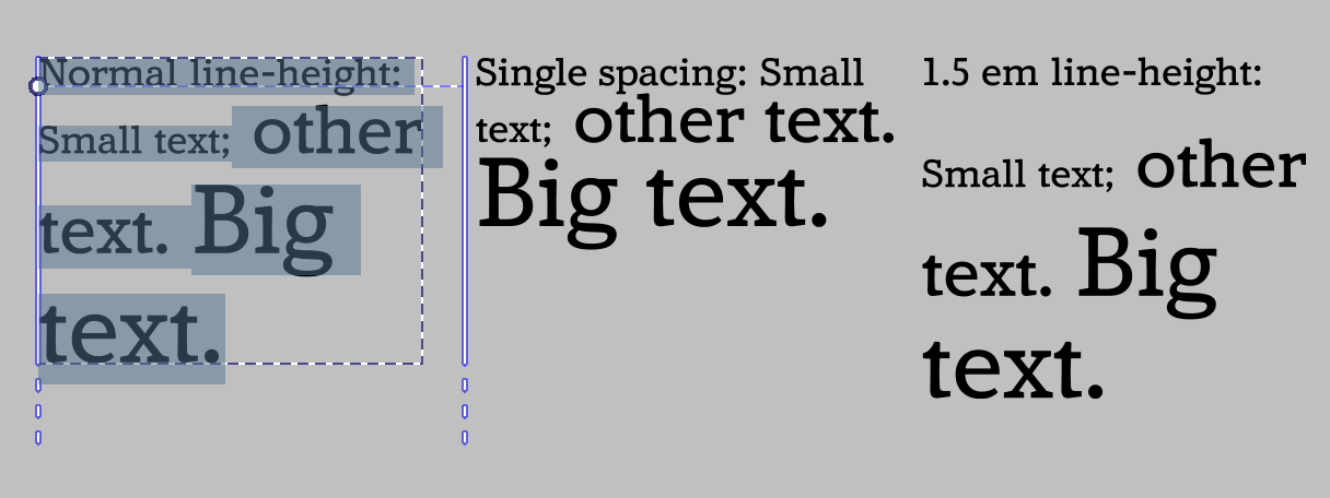
(Various horizontal line-heights, Amstervar Roman)
(Above, right-to-left: “Normal”, “1.5 lines” and “2em” line heights, Noto Sans CJK HK)
Baseline alignment:
This encompasses Dominant Baseline, Alignment Baseline and Baseline Shift.
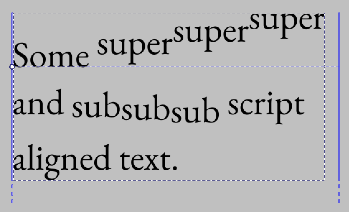
The latter is the most familiar, so lets discuss that first: It allows shifting the text in the paragraph direction, and allows aligning the value to the super or subscript metric.
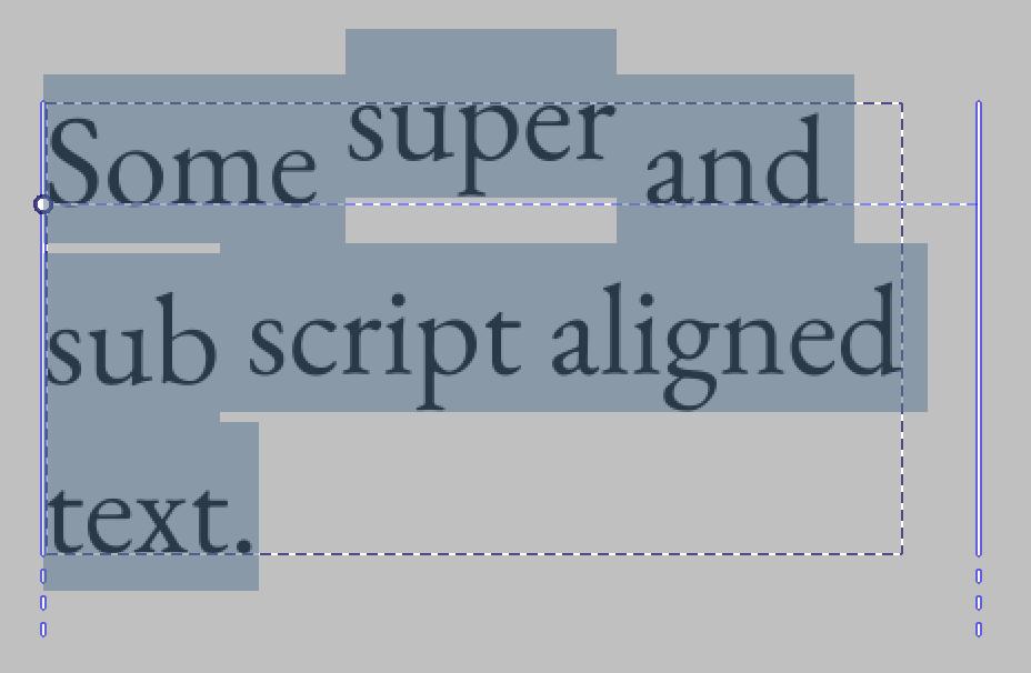
It can also nest, but it is not possible to make such text without editing the svg directly.
Then, Dominant and Alignment baseline. These two are interesting in that I both had to rework them to switch to the new CSS-inline based behaviour, as well that Krita’s implementation right now is the only full implementation of it that I know of.
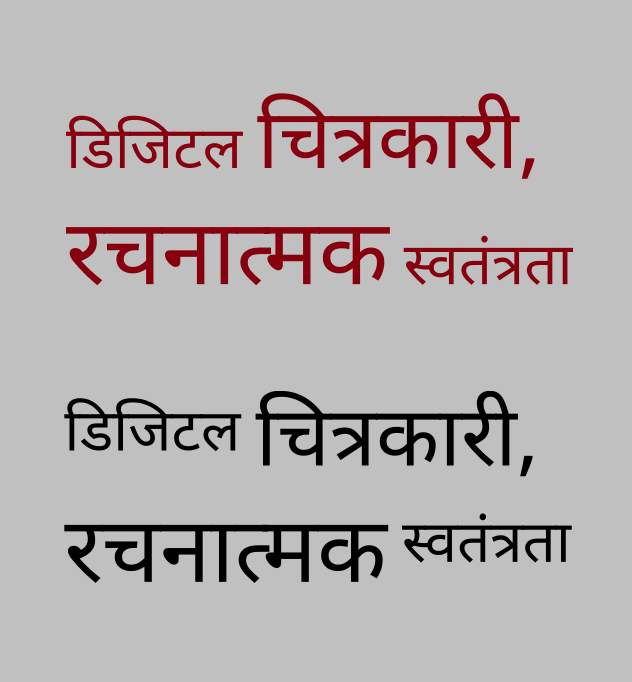
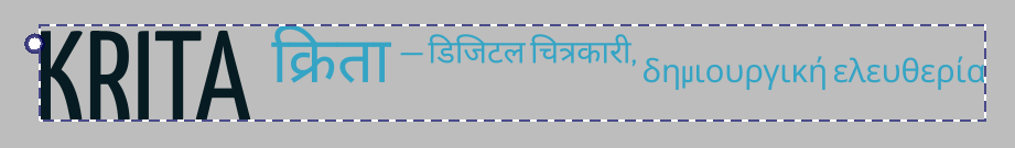
What it allows for is aligning all the glyphs by particular metrics. A good usecase is to have north-brahmic scripts like Devanagari align by their headstroke:
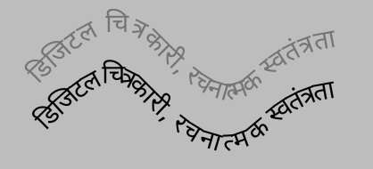
This particularly also applies to text-on-path, as here, where the grey text is default alphabetic alignment, while the black text uses hanging baseline, which means that the head stroke stays a little better connected when doing text-on-path:
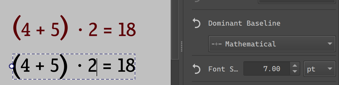
But it can also be used to center brackets in a simple bit of mathematical text:
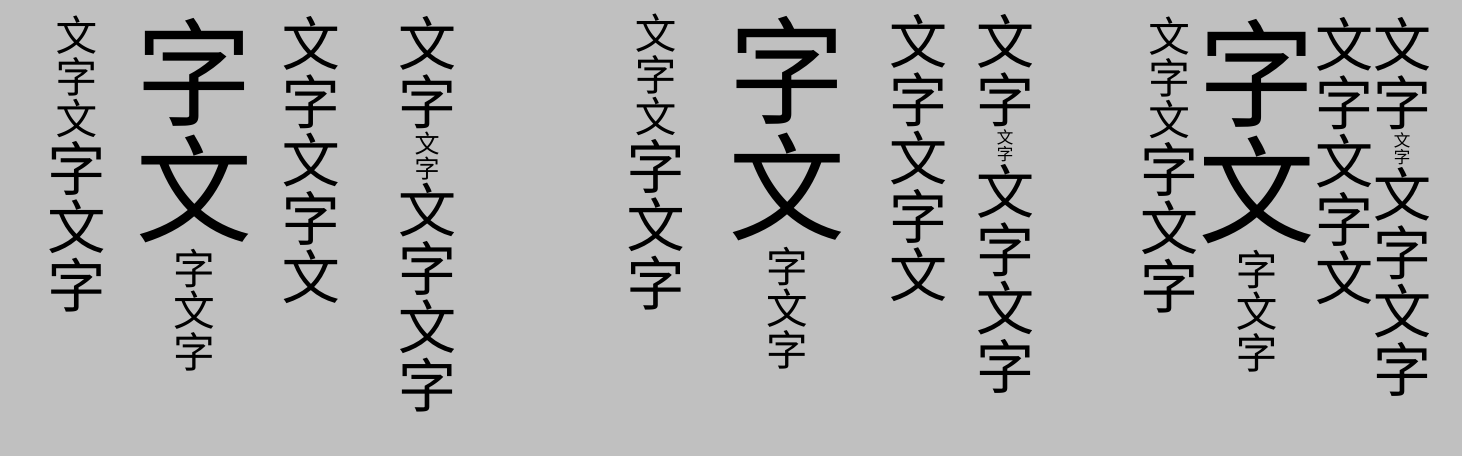
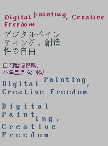
And of course, you can use it to align ideographs to the bottom ideographic baseline or the central line in addition to the alphabetic baseline:
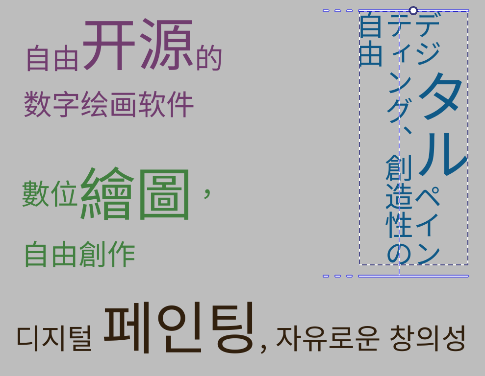
(All of these are just translations of the Krita slogan, topleft: Horizontal, ideographic (bottom) aligned, center-left: Horizontal, central aligned. Right: Vertical, ideographic (left) aligned. Bottom: Horizontal, alphabetic baseline)
Much thanks to everyone who provided feedback on the icons, by the way! I went with “文” and “क” for ideographic and hanging respectively!
Most of the time, you will just be using Dominant Baseline here, as Alignment Baseline follows it by default.
In fact, alignment baseline is only really interesting once you start nesting, which much like the baseline-shift example above, can’t be done without editing the SVG directly.
(Above: nested alignment baselines. First part says “Krita” with Latin, then “Krita” with Devanagari, then the first smaller Devanagari is the first part of our slogan in Hindi, aligned to the hanging baseline to the Devanagari “Krita”, and the second part is in Greek, aligned with “alignment baseline” with the alphabetic baseline to the Devanagari “Krita”. Don’t know why you’d need this, but it is what the spec requires to be possible…)
Text Decoration:
Finally, text decoration needed an overhaul too. Partially to handle the changes in baseline alignment, but also to fix some issues caused by me not reading the spec 100% correctly:
So, the main thing this feature does is allow you to set an underline, overline and line-through.
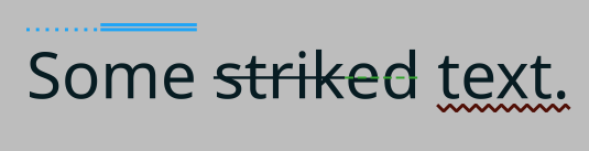
You can also set the style of this line, as well as its color.
With line-through, the CSS specs require me to split the line-through when the font-size changes and there’s no additional baseline offset, so that works now:

The underline and line-through use font metrics to offset correctly, as well as use font-defined thickness to define its size.
There’s a secondary related toggle: Underline position. This allows you to chose between, for Horizontal: Auto (using font metrics), Under (Using the descender, useful for, say, Arabic) and for vertical, whether the underline is at the left or right.
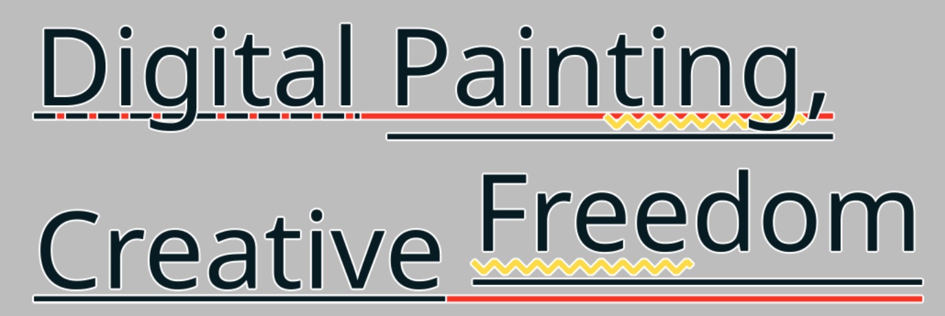
Beyond that, text decoration is also one of those features that nests, and I spend some time making sure that it draws those decorations correctly. As with the other features, this cannot be done without using the SVG source editor.
Next post will be language and line-breaking related features. I’ve actually already done the work for this, it’s just that the actual technical post for the metrics took so long too write ![]()
Amazing work!
![]()
![]()
![]()
![]()
I’m again impressed that you muscle through this complicated topic. I would have given up already. I had to work with font’s a tiny bit once and it already almost made me go insane.
Super cool work!!
![]()
![]()
![]()
![]()
![]()
This one dev is going to single-handedly fix Krita’s the biggest problem, and I’m so hyped.
Well done! ![]()
This text tool is shaping up to be even better than most paid painting softwares!
Not sure if is the biggest issue but definitely one of the most major recurring headaches I had with Krita in all the time. With this, Qt6 migration Halla is working on and eventually native Wayland support, the next big release will be insane ![]()
Just a little question.
Will there be animation support on texts?
Things to animate:
- text changes in keyframes
- style changes in keyframes
- 3x3 matrix transform changes in keyframes
- text on animated path
Use cases:
- opening / closing credits
- subtitles
- “batman” cartoon comics text effects
/AkiR
This is an entirely other beast and doesn’t really depend on the text tool but instead is connected to the ability to animate vector objects and vector layers, which is not possible currently. Of course all the new text options have to be considered but my guess is that for the most part, from an animation perspective, Text is basically an SVG like any other.
@wolthera,I found two bugs while editing the text,sorry if you have already fixed them.
I tried them on Krita v5.3.0 b22ece9, MacOSX10.14
Either way, I think you are making steady progress towards completion!!
About the bugs
-
The Color Infection when select text inside tspan tag
(This happened both of new Text tool and old “EDIT TEXT” dialog) -
The bug in Writing-Mode change with the text contain tspan tag
(This happened ONLY old “EDIT TEXT” dialog)
Details
- This text part will change to the color of the tspan text you click on.
1) The screen capture is here
- About switch writing-mode between vertical and horizontal.
This happened when change setting of Writing-Mode in paragraph tab on Text Properties Docker.
This happened text that included.
What causes this bug?
When edit by old “EDIT TEXT” dialog, add x=“0” attribute,so vertical line spaing become all zero.
<text text-rendering="auto" fill="#deffca" stroke-opacity="0" stroke="#000000" stroke-width="0" stroke-linecap="square" stroke-linejoin="bevel" letter-spacing="0" style="font-family: Archivo;font-size: 9;white-space: pre;"><tspan x="0" fill="#0046aa" style="font-size: 12;">ジョバンニは
</tspan><tspan x="0" fill="#fb3b02">拾った活字をいっぱいに入れた
</tspan><tspan x="0">平たい箱をもういちど
</tspan><tspan x="0"><tspan>手にもった</tspan><tspan fill="#fe65cb" style="font-size: 12;">紙きれ</tspan><tspan>と引き合せてから、
</tspan></tspan><tspan x="0"><tspan>さっきの</tspan><tspan fill="#6cadc6">卓子</tspan><tspan>の人へ</tspan><tspan fill="#fe8b68">持って</tspan><tspan>来ました。</tspan></tspan></text>
2) The screen capture is here
First one is known, second one is… also known, and in fact, correct.
The first is because the text tool is trying to inform you both on what the text color of the text you’re going to type is, but then gets confused and sets that color to the whole paragraph. The underlying issue here is really a UX one (what is getting edited when the cursor is at a given point), but I have been focusing on the toggles in the text properties docker so that when I tackle this issue, there is much more clarity on the whole picture. I want to fix this one before I considering “phase 2: rich text editing” to be finished.
Basically, what is needed for the second is that I implement conversion features to convert between old svg 1.1 text and wrapped or preformatted text that only uses line-breaks. The old x/y transforms are very powerful, and we need to support them to improve backwards compatibility, so I don’t want to completely remove them. However, it is definitely a requirement for the 5.3 text tool to be able to convert to something a bit more user-friendly. It’ll be tackled after I’m done with ‘phase 2’, amongst some other final touches.
A similar issue is that the white-space property for these texts is set to ‘normal’ and needs to be set to ‘pre-wrap’, because otherwise spaces and hard-breaks are collapsed. This issomething which makes sense when you look at SVG as a whole, but is mighty annoying when you just want to have a editable text.
Yeah, part of the reason I’m writing the technical blogs is that I benefited a lot from other folks typing up their experiences, so I hope me writing up mine will help others in turn. In any case, I’ve had a lot of other devs from other projects, like Inkscape, Harfbuzz and Gimp respond thankfull towards my blogs.
This is probably going to be release before the Qt6 port still, because we want to make sure all the major headaches are solved for Qt6 and have a liberal amount of testing time before hand.
Yes. I might have somewhat high standards, but I wanted to make sure that we have a pretty decent text tool once 5.3 is released.
No, @Takiro already pointed out the main issue: No animation for vector whatsoever. Beyond that, I would recommend you investigate software that allows you to program the objects, like Blender or Godot if you wanted to do motion graphics. They’ll be much more suitable for your needs.
I’m eager to test the new text additions, but something in the recent nightly builds (starting around a month or two ago) has introduced a ton of lag pertaining to the UI (particularly when I try to search for a preset or a font). Is anyone else having this issue?
That lag is bug 502472 – Krita 5.3.0 prealpha df5e19f8 : very laggy search function , it’s being worked on.
Er, small update. I will be going on vacation for the coming month, so here’s a short list of stuff I’ve done since the last blogpost:
- That MR freya linked is merged now.
- In the meanwhile I managed to get some text rendering stuff fixed, as well as handling visibility config for each option.
- The OpenType property got some love.
- I am currently halfways through implementing style presets. The actual presets themselves work, but editing them is still very clunky.
After my vacation, I hope to finish the style presets. Then there’s a bunch of smaller UI fixes, and after that we can have some formalized testing.
Then I wish you a great vacation! ![]()
Michelist
Ok, small update (I have been very busy):
- Style presets got merged.
- We now have sliders, and I did a bunch of other UI tweaks (better font search, for one). I’m still going to do more.
- I’ve got a branch with converters for converting between different text types going (So you can convert old Krita 5.2 texts into wrapped text).
- And before the end of the week, we should have a good plan on how to proceed with text-in-shape and text-on-path.
I still need to write up the post about the final set of text properties. Meanwhile, I also want to do some final polishing of the text properties docker. And then we’re at the end of phase 2, and we should be able to have another testing round. ![]()
(Phase 3, for the record, is basically about getting rid of the old rich text editor window, and integrating all the new tool options better in the text tool, it’ll be fairly short)
Alright, lets introduce about the remainder of the text properties. Technical Blogpost here (this time, only twice as long as this introduction!)
Language
There’s a number of places where language selection affects the text layout. Traditionally this has been for hyphenation purposes, and even though Krita doesn’t support that yet, we do use it elsewhere. In particular, some fonts have different glyphs for different languages, like Serbian and Bulgarian have their own variants for certain Cyrillic glyphs. Similarly Romanian uses particular glyphs for s-cedilla and t-cedilla.
SVG requires a BCP47 language code here, but because I suspect few people know the BCP language codes by heart, the UI is as follows:
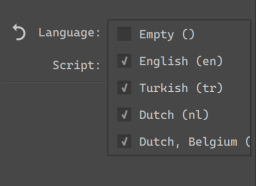
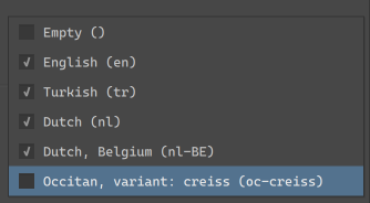
The basic usage is a dropdown, where you can select a set of “favourited” languages (by default, this includes the currently selected UI languages). If you need a specific language, you can type it into the text field, and Krita will show a list of partial completions.
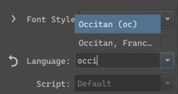
These are all taken from QLocale, however, BCP47 is a bit bigger than that, so I spend some time to make sure that if you paste in any legit BCP47 code, Krita will be able to parse it.
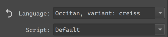
Any languages selected in the current session will be available in the dropdown. You can toggle the checkbox to have them persist between Krita sessions.
There’s also a separate Script dropdown. Generally, we can guess the script from the locale, but in some countries, the official script for a given language got changed recently (or is about to change), so this given extra control to identify which script to use.
This whole thing was designed for people who work in multiple languages, even ones they don’t speak themselves. Furthermore, because I went a little crazy with the BCP parsing, very little known locales should be supported as well.
Beyond fonts, there’s two other places we use language:
Line Break and Word Break
These two control where word wrapping is allowed to happen.
Line Break only really works for CJK languages, and determines whether breaking is allowed to happen after certain punctuation marks. The exception here is Line Break: Anywhere, which makes it so that after any given cluster a line break is possible.
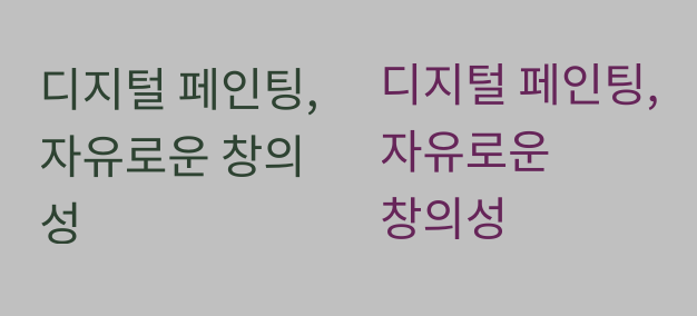
(Here, the Korean translation of our slogan. Left breaks at traditional places, which is somewhat old-fashioned, while right breaks at spaces only, as is typical of modern Korean typography)
Word Break in the meanwhile allows switching between cluster based breaking and word based breaking. This is particularly useful for languages where either is valid, like Korean and Ethiopian.
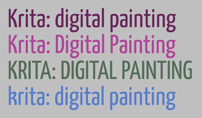
Text Transform
The main purpose of text transform is to set the case of the text to full uppercase or lowercase without affecting the underlying text. This is useful for European typesetting, as uppercase text is considered more formal, and thus frequently used as a stylistic choice for header and logo texts. There’s also Title case, which CSS defines as “Casing the first letter of each word”. In reality, every style guide out there has its own rules for Title case, with many avoiding it on articles (in the grammatical sense), so I am unsure of its use. This too is affected by Language choice, as a language like Turkish has two separate letters for dotted I and undotted I, or in Dutch we capitalize the “ij” in “ijsbeer”(polar bear) as “IJsbeer”.
Besides casing transforms, there’s also two CJK options here:
Full-width refers to the “Fullwidth” code points in the Halfwidth and Fullwidth unicode block. Toggling this will mean that proportional or halfwidth glyphs will be replaced with those fullwidth glyphs if possible. Typically, in vertical text, proportional glyphs are rotated, but when this isn’t possible or required, using full width glyphs can look a lot neater. The full width opentype feature does something similar, but not every font supports that.
Full-size kana will transform so-called “small kana” to “full-size kana”. These two types have separate categories because in regular Japanese they are pronounced differently. However, when the text is super small (like for Ruby annotations), the small kana are sometimes replaced with their full width equivalents to aid in readability. This toggle will make it possible to make such a switch without affecting the underlying text.
White Space
If you were testing Krita’s text tool, you may have briefly seen the White Space property show up, and then, a week later it was gone again. This is because the white space property is a little dangerous: It’s purpose is to hide unnecessary white space, and by default does so. However, if you are not aware of the history that makes the white-space rule work the way it does, that means you have this toggle that, when set to “normal”, makes it so you can’t type consecutive spaces, nor will line breaks work.
For this reason, I have hidden this toggle by default, and you will need to go into the visibility settings to enable it. The Conversion Functions MR, which is primarily for converting old Krita 5.2 text, also handles the white space problem, so it should provide a nice magic “make text work” button.
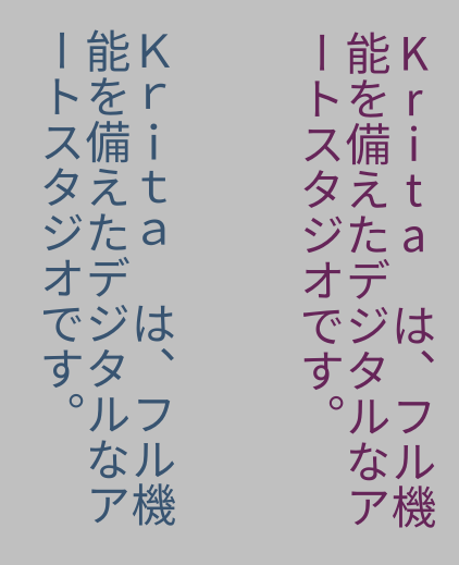
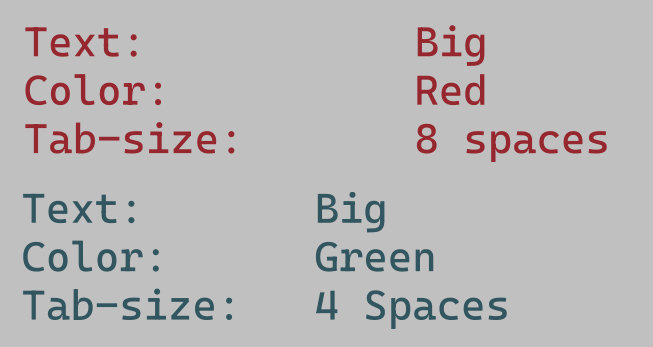
Tab-size, indentation, letter and word spacing.
Now, for a much nicer spacing thing.
(Above: the two “columns” in each text are made possible by inserting tabs, which space everything so that the next glyphs align. Tab-size allows controlling how big the tabs are)
Tab size allows you to control the reference size of the tab character. Tabs are a type of white space that are dynamic size, taking up just enough space to reach the nearest multiple of its reference size. This is typically used to align text without the use of a table.
(Above: showcasing 1 em text-indent, with each-line toggled on the right, and hanging + each line on the left)
Text indent, conversely, is only about adding a bit of white space at the start of a paragraph. SVG only really supports one paragraph per text, however, text indent has a few toggles to support formatting poetry nicely. The first is “each line”, which applies indentation after each hard break, and the second is hanging, which swaps the lines that text-indentation is applied to.
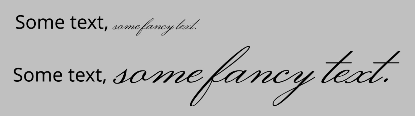
Word spacing controls the size of the space character and several other word separators. Sometimes, increasing the white space between words can be a lot more readable.
(Above: a common formal way to typeset a subtitle is to letter-space it so it matches the main title in width. The red text below shows the typical spacing of this font)
Letter spacing in turn controls the spacing between all letters. This property is a bit of a bother though, as basically every single implementation is different in subtle ways. Krita currently implements the way CSS-Text-3 requires it, but that’s not what Inkscape does, or Chrome, or Firefox, and each of those does it different from one another too. This is usually not a problem, as the main purpose of letter spacing is to do it over a whole text. Large text in particular is often letter spaced to make it extra readable. Where it does become a problem is when people start trying to use letter spacing as a way to do manual kerning, at which point the different implementation peculiarities start rearing their heads.
There is a way to do per-character adjustments in SVG, and that one is pretty widely supported and the same in behaviour, however, it requires Typesetting mode, which is part of phase 3.
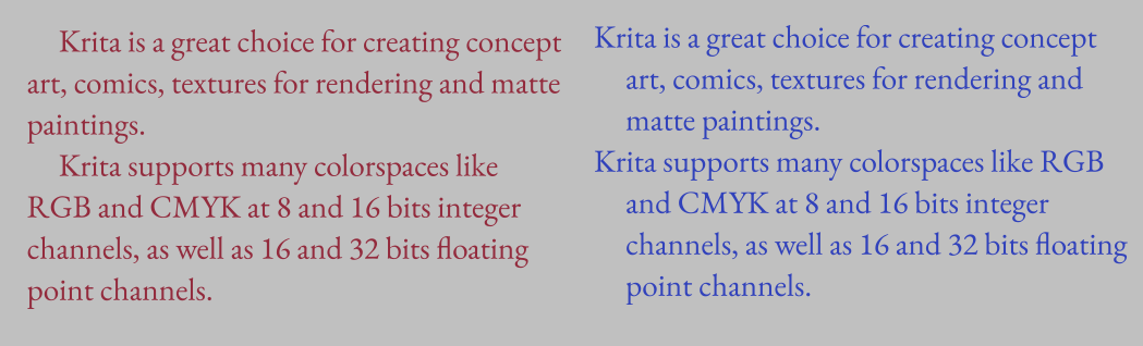
Text align and text anchoring.
These control how the text is aligned or anchored. The difference between them is that text-align controls how text is laid out in a shape (aligning to the left or right side of a shape), while text-anchor controls to which side the text is anchored (whether the start, middle or end is anchored to the starting point).

(Above: In preformatted text, each new line can have its own anchoring, which is one of the two places where text-anchor and text-align stop matching, making my life more difficult)
Here, a peculiarity of SVG shows up: For everything except text-in-shape, you need to use text anchoring. Which means that for the simple inline-wrapped area, you cannot justify text, you can only do so for text-in-shape. Right now, I have simplified the UI to three buttons and a toggle for justify. Once text-in-shape editing gets in, we’ll need to sit down for a bit to decide whether we should create text-in-shape by default, or allow creating the simple wrapping area. There’s benefits to either.
(Above: the red text uses a text-shape, and we’ve set the justification to “justified” and text-align-last to center. Our text-justification algorithm isn’t the best out there, but it is functional.)
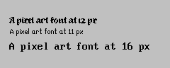
Text Rendering
This basically controls hinting, which is useful for low resolution text. In particular, speed has been set up to toggle off anti-aliasing, as well as making sure that everything (like line-height, letter-spacing, baseline-shift adjustments) snaps both vertically and horizontally, which should make sure that pixel art text will look nice.
(Above: some text in a variety of pixel art fonts and text-rendering set to “optimize speed”. The latin text has letter-spacing applied, and our text layout knows to snap that to the nearest pixel so the pixels stay aligned)
Similarly, optimize legibility will turn on vertical hinting for horizontal text, and full hinting for vertical text. Auto is the same as Geometric precision, which turns off hinting alltogether.
Style Presets
Finally, the style presets I’ve mentioned so often. You can now create presets of the current properties, and assign a nice sample text, and it’ll show up in this third tab. Double clicking an entry will apply the style on top of the existing properties.
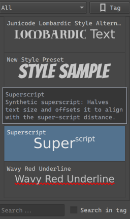
Here the strengths of CSS become clear, as you can have partial style sheets. So you can have a preset for a particular Font family set to bold, with a particular OpenType feature set, and a preset for underlined text in a particular color, and double click both to set both on the current text.
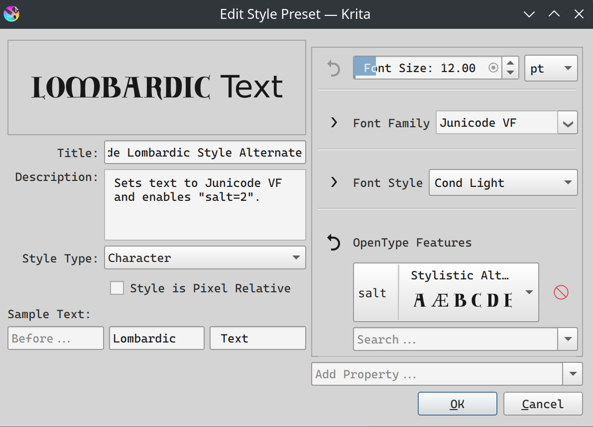
Beyond the properties, there’s a number of buttons on the left hand side here: You can set the description (used as a tooltip), the style type (character or paragraph), and whether the style is pixel-relative. This last one means that the style will be scaled to stay the same pixel-size independent of resolution, which should be useful for pixel art styles.
Finally, sample text allows you to choose the sample text to use. This is set up this way so that you can showcase text being larger or smaller than the surrounding text.
Again, I will need to repeat that this is not style classes, where you’d be able to set a style on multiple texts, and then edit that style, and have every single text that uses that class update dynamically. I am repeating this because it is a powerful feature used by many professional layout tools, and it is the feature that CSS (cascading style sheets) is build around. But the truth is that Krita itself doesn’t yet have the updating mechanism to dynamically update all text shapes at once. It might have this in the future, but not for 5.3, as I would like to finish this text tool some time.
Still, what I do hope to make possible is that for the text tool itself, for creating new texts, you will be able to choose whether you want to use the active style in the text properties docker, or whether you want to use a style preset. We’re not at that point yet.
Final notes:
And I think we’re at the end now for all the phase 2 things. I am going to do one more MR, and then next week, we’ll do a testing round ![]()
P.S. As you might’ve noticed, fill and stroke are currently missing, and that’s because when I tried to work on it I got told “won’t that be too complex???”, so I’ve put it on the backburner for now.
P.P.S. I also need to write the docs, but I think I can reuse most of the introduction texts… Though the screens will need to be retaken.
Amazing, can’t wait for it to be included in full release
I especially love the ability to choose text hinting, which will finally free me from using photoshop when using pixel fonts ![]()