Text Tool Thread

Ok, so I did do some small UI fixes past week, and updated the documentation.

We’re now at the end of phase 2: Rich text editing!

BEFORE WE TALK ABOUT TESTING, LET ME BE ABSOLUTELY CLEAR THAT BEFORE TESTING YOU NEED TO BACK UP YOUR RESOURCES FOLDER, IN PARTICULAR THE RESOURCE CACHE!

Now, this is a little more complex than last time. Because there’s two builds to test. The first build is the nightly. The second is the build from MR 2470. I will explain later in a bit more detail what the difference is. First, let me summarize the work that has been done during phase 2:

Phase 2 Summary

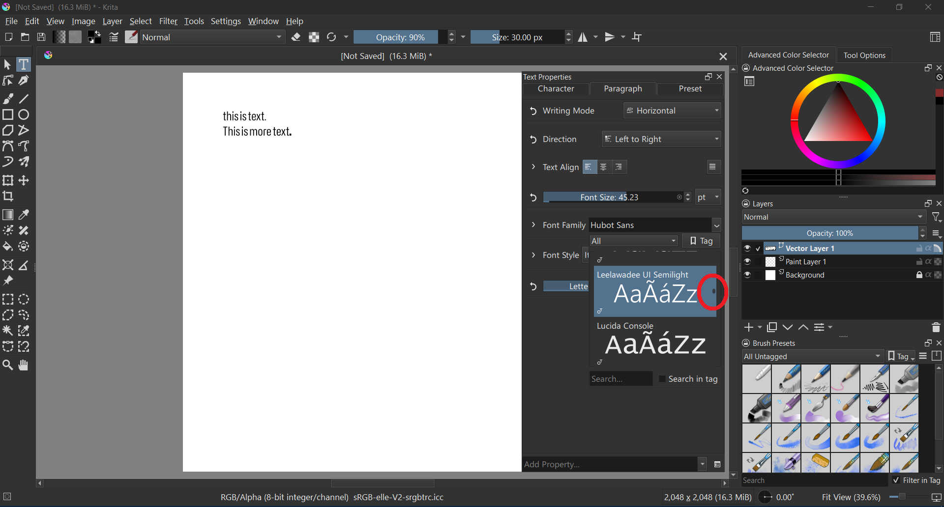
The majority of the Phase 2 work was getting everything in the new Text Properties Docker to work. This is a separate docker from the text tool, because you can also edit texts with the shape selection tool. The buttons in the text tool options will not do anything when editing text, they are, as their description says, for creating new texts only. I will overhaul the text tool options at a later date to make this clearer.

(Similarly, if you have made texts previously with the rich text editor, using Krita 5.2 or older, the editing will not work as expected. There’s an MR with converter functions for these waiting, but it got stuck on UI disagreements)

The text properties use CSS, and thus, CSS inheritance. This means that you can set a property on the paragraph, and any styled text within that paragraph will inherit those values unless they are explicitly overridden. This is a feature I am required to support as a number of SVG/CSS features (notably, relative font units) require inheritance to function correctly.

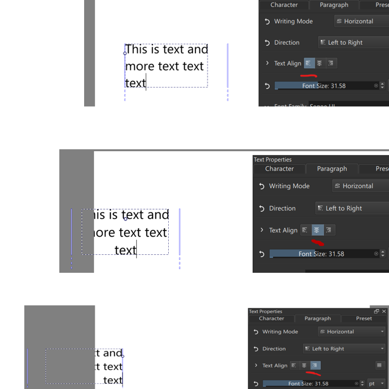
The shape selection tool will only edit paragraph properties, the text tool can edit both. When properties are set on the current selection, the revert buttons becomes enabled, and will show multiple arrows when the property is mixed over the selection. The revert buttons are organized so you can easily see which properties are being set.

Currently the text properties docker will only show properties that are set or inherited, with the exception of Font Size, Font Family, Font Style and Text Align. You can add properties with the “add property” drop down at the bottom. From early feedback it became clear that list of mentioned properties should be visible by default, as well that some people wanted to always see all properties. To that end, you can configure property visibility with the configure button next to the add property button. You can set the default behaviour to “Always Show” if you prefer all properties to be shown, and configure in detail when which property shows. This is all because the text properties docker has a lot of properties, and this should keep things focused and easy to experiment with.

Finally, there’s style presets. These allow you to store your favourite styles, and eventually I want to make it possible to create texts on basis of a preset. You can create a style preset based on current settings, and double click existing presets to apply its settings over the current settings.

The build differences

As said before there’s two builds to test. The nightlies and MR 2470. The difference in these two is how the split between paragraph and character is handled, and how you set either. (Some small fixes were done today (12th sept), so it might be good to wait a little till the nightlies for those are done.

Krita Next

  • Shape Select Tool edits paragraph properties on all selected text shapes.
  • Text tool edits paragraph properties when there’s no selection.
  • Text tool edits character properties when there is a selection.
  • The Direction property is disabled in the character properties when there’s no selection and invertedly enabled in the paragraph properties.
  • Upsides:
    • There’s only one set of widgets, in theory, which makes style presets a little more straightforward.
  • Downsides:
    • I really don’t like how we’re handling direction.
    • It is very different from how, say, LibreOffice handles text properties.

MR 2470

The main difference here is that paragraph properties will show all properties for the paragraph (including fontsize, etc), while character will only show properties on the character.

  • Shape Select Tool edits paragraph properties on all selected text shapes. Character properties are disabled.
  • Text tool can edit either depending on which tab you’re in. If there’s no selection, the character properties will be edited on a word, similar to LibreOffice.
  • When setting the fill and stroke color with any of the color selectors, no selection means setting it on the paragraph, while any selection sets it on that selection.
  • Style presets will be set on the character when there’s a selection only, on the paragraph otherwise.
  • Upsides:
    • It should be clearer now how the inheritance thing works.
    • Direction property is less convoluted.
    • It is nicer for style presets to be able to combine, say, an alignment, font size, render settings and indentation into one preset.
  • Downsides:
    • The character properties are disabled when shape selection tool is used. This might be very unclear, and I worry it is going to cause frustration.
    • Similarly, there’s no way for us to magically determine whether paragraph or character tab should be visible. Should we have some kind of auto switch here when there’s a selection, or just leave it alone?

Documentation

I have updated docs here: text tool, text properties docker, font families resource, style presets.

I also did, over the past year, write introduction posts about a given set of features:

What I need to know

You can comment on anything in the builds, but if you need a little bit more focus, here’s a list of things I’m looking for answers to:

  • Which of the two builds do you prefer?
  • What should be done when all text is selected with the text tool? Right now it just tries to select the lowest nodes and edit those, but that can have different meanings depending on the text. Should it keep this behaviour? Should it only edit paragraph properties are remove any overridden properties in the selection?
  • Should we have any default style presets? If so, what kind?
  • Style Preset right now adds its properties on top of existing properties. Should it wholesale replace existing properties? Or should there be a special button for that?
  • The order of the properties is currently hard-coded, and was initially vaguely based on preference, but now got muddled up. What order should the properties be in, or rather, which properties do you want to always see at the top?

While you guys test, I will try to work on Text-in-Shape UX. Similarly, once we’re done with the testing phase I will enabled translation string retrieval for QML. I’d been avoiding it to ensure that the translators wouldn’t be translating on shifting sands too much.

First quick test on notebook, Windows 11, 1920x1080 pix display.

Q: Which of the two builds do you prefer?

A: MR 2470

Q: What should be done when all text is selected with the text tool?

A: If “character tab” is active, overwrite any current text settings of the characters. If paragraph tab is active, keep current custom character settings (let have character settings higher prioritiy than paragraph settings). Add a toggle button to change that default behaviour, so that changing a value in pagragraph tab overwrites values previously set in character tab.

Q: Should we have any default style presets? If so, what kind?

A: No, not needed.

Q: Style Preset right now adds its properties on top of existing properties. Should it wholesale replace existing properties? Or should there be a special button for that?

A: A button please.

Q: The order of the properties is currently hard-coded

A: No opinion yet

Additional notes:

The font selection list seems to be fixed size and only shows two fonts at a time.

I would be nice if it could show as many fonts as possible at once (maybe open as an additional column going from top to bottom of the screen.

A setting for changing the preview fontsize and text would be nice to have.

The scrolbar is so tiny that it is difficult to use (see red circle).

The alignment is weird.

It seems to align the text but also moves the text box. I would expect it to only align the text but not move the box.

The justify button on the right seems to be non functional.

As of now (2025-10-03), the text tool in the latest Krita has several major usability road blocks for me:

  1. The font-family drop-down is too small, displaying only 2 fonts at a time. It should show at least 10 for better usability. The font name above the preview and icons below are taking up too much space. Each step of scrolling effectively scrolls 3 lines, and it feels uncontrollable. The scrolling experience also suffers from an inertia-like delay. I prefer the font name and icons displayed to the left of the preview.
  2. There is no option to set line-height, which is essential for multi-line text situations—this is a major limitation.
  3. There is no way to change text color within the text tool options or thed text properties panel. While I can select the text and use the Advanced Color Selector, I cannot use Ctrl + LMB to choose font color, which is crucial.
  4. An inline toolbar on the canvas that manages these properties would be ideal—similar to any word processor, as we all expect.
  5. Nothing in the Text Property panel is translatable. I found no related content in krita.pot.

I understand everything is still a work in progress. However, some of the points I’ve mentioned have been around for quite some time. I’m reporting them here just in case.

The program suddenly became incredibly laggy.
Is it because of the changes with the text tool?
I had to uninstall and revert back to a much older version
of 5.3.0 pre-alpha to work without the lag.

Version affected with the lag : prealpha 5.3.0 build b0e126f
Version I use without lag : prealpha 5.3.0 build 8803eb1

Appreciate the work you’re doing Wolthera! It’s much needed in Krita and one of the few pain points since moving from Photoshop.

krita-x64-5.3.0-prealpha-c82f5ae2 portable (2025-10-25), Win 11.

I wanted to try the new text tool, but it seems to be broken.

The font list contains only one font:

It is the font I have set as custom font in Krita’s settings:

Should I report issues like that at all or ignore them? Looking into Merge requests · Graphics / Krita · GitLab it seems the text tool is still under heavy development.

Ok…

I’ve been working on getting text-in-shape/text-on-path to work. All of the functionality is implemented now, but the branch still needs optimizations. I am currently working on type setting mode, but development on that is still early.

In the meanwhile, a bunch of stuff got merged:

  1. The PSD text branch got merged :slight_smile: As noted previously, we can load all fancy features, but we cannot save all of them (only simple text saving is possible), because PSD requires a certain kind of positioning data before it accepts the advanced text data, and I need to sit down and figure out what exact positioning data it needs. Similarly, Krita and PS have fundamentally different text layouts, so I also cannot guarantee text being 100% the same. Krita will ask if you want to load text as a text object or as a paintlayer for this precise reason.
  2. The Rich text editor got removed, with only the SVG source editor remaining. The oncanvas text editor is far more sophisticated than the rich text editor ever was.
  3. The shortcuts that were originally implemented for rich text are now functional with the oncanvas text editor. It’s not every single property that can be configured in the text properties docker, because I right now do not have the time to implement that (though, everything is set up so that implementing new property shortcuts will be a good first contribution, if someone is interested).
  4. The tool options have been overhauled:
    • You now create new texts with either the current values inside the text properties docker or a given style preset.
    • There’s a button to open the text properties docker, so that people who don’t know it exists will be able to find it.
    • There’s a config option on whether you want to paste rich or plain text by default. There’s also two extra shortcuts for pasting either explcitely.
    • There’s a config option to switch between visual and logical mode for bidirectional text.
    • There’s still the two buttons for the glyph palette and the svg source button.
    • Finally, there’s a set of conversion buttons that allows you to convert text from old pre-positioned SVG 1.1 text to inline wrapped or preformatted or back again. There’s also shortcuts for these, even inside the Shape Selection tool, though I haven’t put them inside any menus yet, so you will either need to add them to the toolbar or use the ctrl+enter menu to find them.

I have rebased MR 2470, and would still like feedback on whether it is preferable to the latest. You can download a testing version from gitlab by going here, and selecting the “windows-archive/linux-archive/macos-archive” from the artifacts dropdown:


Yes, this is partially caused by the fact we cannot have popups inside QML that overflow the window. I have a workaround waiting for that, but it’s non-trivial. Probably there won’t be a resizing option before 5.3 because I have an approaching deadline.

Also something that probably won’t be fixed in 5.3. Basically, QML doesn’t have a proper scrollbar, and while within KDE’s kirigami there’s one, that would be a new dependancy, and it’s quite late to add one right now.

I have noted the first down, but for justify, it only works with text-in-shape, which has no UI yet.

“Add property” at the bottom.

Neither will be in 5.3. The fill and stroke got blocked because I was told not to work on it because it would be too big for 5.3. The on canvas menu just was not planned for 5.3 to avoid scope creep. The main issues are design and also because on mobile it would conflict with the mobile text editing menu. The latter might be fixed in qt6.

One minor quibble: As far as I know, only Microsoft Word has implemented an on canvas menu for text.

Yeah, I hadn’t had the time. Halla went and looked at it for me, should work now.

I didn’t touch anything canvas related in those months, so very unlikely.

Thanks!

Please report a bug at bugs.kde.org. What is likely going on is that Krita cannot find the default fonts folder, but I do not have a windows machine, so I cannot immidiately tell what is causing this.

String freeze (my deadline for new features) is in roughly two weeks. Wish me luck.

EDIT:

Should I report issues like that at all or ignore them?

Feel free to report them, feel free to ask about them. Thing is, I can’t force anything, and my instincts tell me that it’s going to be stressful for everyone if I try. In either case it’ll take a bit before I’ll answer (really really busy trying to get this finished).

done:

I tried out the text property style presets in the latest Krita 5.3 pre-alpha.
There, I frequently encountered an issue where the contents of styles I created would arbitrarily revert to their default state. The default state refers to settings like a sans-serif font and a font size of 12pt.
The issue doesn’t occur when the paragraph is set to horizontal, so it seems the problem might be with presets where the paragraph is set to vertical. Even when I set it to Vertical in the properties, when I try to type text on the canvas, it automatically reverts back to Horizontal.

I’m testing this on Windows 11.

Thank you for working on the text properties. I’m very happy that Krita’s text features are becoming more advanced.

So, I think what’s going on here is that right now you cannot have a preset that has both paragraph and character properties. Now, the fact you bumped into this and thought it was a bug indicates that this is a serious UI issue.

Luckily, MR 2470 fixes this, and changes a bunch of other interaction, which is why I was looking for feedback for it… So I’ll consider the fact you brought this up as an indication you prefer it over the behaviour in the nightlies.


Thanks!


Type Setting Mode got done and merged. I will be working on the speed ups for text-in-shape/text-on-path next week. I will introduce both after the latter is merged, and I have more time.

Text in Shape / Text on Path got merged, rounding out phase 3! The technical blogpost thus covers all of Phase 3. But let’s get down to business:

Text in Shape / Text on Path

So, there’s two ways you can create either of these.

The simple one is by using the text tool and hovering over an existing shape. Hovering over the border and clicking will allow you to create a text on path, hovering over the fill and clicking will create a text in shape.

Once you have your text on path and the text tool active, you can drag the handle at the start to move the start offset. Dragging to the opposite side will allow flipping the side the text path is on.

For text in shape, if the text tool is active, you can drag the sides of the text area to set padding (if the cursor is closer to a subtract shape, it’ll set the margin of that subtract area). The padding/margin is also available under “Text Area” in the text properties docker.

The complex way of creating text in shape is to select shapes with the shape selection tool, and use the new options in the context menu. This allows you to set up a complex multi-shape flow. Arrows will be drawn between text shapes to indicate the order of the flow shapes.

In both cases, a new button will show up at the top right, which can be clicked. This brings you into contour mode. This is because we decided to make shapes and paths children of the text for easier interaction. When in contour mode, the shape selection tool can be used to reorder these flow areas through the context menu. Both the shape selection tool and the shape editing tool can be used to modify the shapes themselves.

Out of contour mode, when you scale a text that flows into shapes, it will scale the underlying shapes. This required us to overhaul how updates were propagated, to avoid a massive slowdown here. Unfortunately, we were unable to handle text-on-path here, so scaling for that is disabled.

Type Setting Mode

Then, the type setting mode. This is a new mode that is toggled in the text tool. When toggled, the selection decoration will change from filled blocks into metric lines that are drawn over the text. These metric lines can be dragged to adjust the font size, line height and baseline shift. When the text is not auto-wrapping, you will also be able to adjust the relative positioning of each character (There’s also configurable shortcuts to move the offset and remove all transforms, though I was unsure what else was needed).

When pressing shift, the metrics shift to the baseline metrics. You can select the alignment and dominant baseline by clicking it. This should make the baseline metrics a little less abstract.

This mode was something that became clear from our earliest discussions, where some people expressed the need to be able to sculpt text on-canvas, while others really wanted to have on-canvas widgets avoided. Similarly, I wanted to make sure that there was a way to do SVG character transforms as CSS by itself only has limited options for spacing adjustments. With this new mode you’ll be able to create something like this:

This brings us to the end of the text tool feature work. I will now first take a break, and then shift into documentation / bugfix / polish mode.

That’s great, and it’s more than everything I ever dreamed of!
:person_bowing:

Michelist

Type Setting Mode looks insane, wow.

This is quite interesting, different, dynamic and cool!

Oh :astonished_face: wow! Great work :+1:

I saw those line indicators. Will there be snapping? Or is there already snapping?

Thank you Wolthera for all the great work on the new text tool! This is going to be a huge quality of life improvement!

I initially struggled to notice this widget because I placed the Layer docker below it. The similar shapes inside these dockers make it difficult for first-time users to recognize its existence. (In fact, I finally managed to understand what you meant – TODAY)

Additionally, since I wanted to “Adjust Line-height,” I naturally looked for that term instead of “Add Property.” First-time users are unlikely to associate “Add Property” with their intended actions, leading to usability issues.

While we can change how properties are displayed, I believe we should show all the properties from the old text editor by default. These were included because they are the most frequently used ones and would help new users avoid confusion.

So, while there is basic snapping to all the elements from the snap setting menu available (grids, guides, etc), there is no snapping to the font metrics themselves, and I suspect you mean the latter. This is not impossible to implement, but it would qualify as a new feature, meaning it will not be happening in 5.3.

The type setting mode got delegated as last because it is something that is kinda abstract to explain, but the demo makes its purpose clear. Because of that, there’s a lot of room to expand it in the future. For now I would like to get it stabilized (it’s got some selection issues right now, no biggy, but annoying). I already mentioned some in the technical blog post, but I’ll also be keeping an eye out for stuff like this. :slight_smile:

I am open minded towards showing line height by default, because I know that East Asian script-fonts usually have a too-tight default line spacing, which I suspect is the driving force behind this request. However, I do caution that the opposite, where we show everything will also lead to usability issues. But yes, looking at my notes, I may have been too conservative in determining the default list.

So, as someone who also worked on the previous rich text editor, we didn’t actually include any such properties because of their frequency of use. Rather, those were the only ones we could provide access to and guarantee they’d work (there’s a reason there was so little work on the text tool: the rewrite I did was kinda required).

You can tell, because one of the properties provided was the “font-kerning” toggle, which could be used to turn on and off font kerning. Which seems useful… until you realize that it only would be used in some extremely rare cases, as you’d always want there to be kerning of some kind. Someone figured they could implement it, and then did (It doesn’t even provide the advanced positioning functionality that people need from it, which is what the Type Setting Mode does provide).

On the flip side, the writing modes (and direction) were never in the rich text editor, and only briefly appeared in the tool options because I inserted them during phase 2, but if I am following your argument correctly, these probably should be visible by default.

As an aside, a different thing we could do is to have some default style presets with all the toggles explicitely set for a given type setting tradition. So a european tradition preset with ligatures and kerning explicitely enabled. An indian preset with baselines explicitely set. An east-asian preset with vertical, east-asian glyph variants and line-height set to 1.5 lines? It would require MR 2470 to be merged first, because of the harsh paragraph/character split, but I’ll need to take a break first before I can push that one forward (it’s been rebased, so it’s up to date with the main branch and has text-in-shape).

Ok, now I really need to take a break for a week so my brain can recuperate and is 100% ready for some bugfixing. :sleeping_face:

I read you blog post and the part where you had to dive into PSD/PDF again gave me a slight flash of PTSD again. It is really amazing how much work you put into this already. I had a colleague (about 15 years ago) who was an absolute typesetting/font nerd and would not shut up about it (in a positive way) whenever he got a chance of telling me things and thanks to your blog I learned even more about the virtual hell that is typesetting x3, I’m sure he would have enjoyed it too.
At the end I thought “this would be all of it” but then you followed up with many more things that can be done. I’m again thrilled to see what is yet to come. Soon I will have one less excuse to do comics in Krita.

Instead of being language specific, it’s rather how the text is used in typography.

Take this one for example:

Decorative typography: The four light-green Chinese characters in the top-right serve as a TITLE element. Their primary function is decorative rather than for readability. To create the desired effect, I adjusted the line-height and letter-spacing to ensure even spacing between each character.

Mixed language typography: CJK characters typically have more strokes than Latin ones, resulting in thinner strokes at the same font size. To achieve equal visual density for both Chinese and English within the green box while maintaining readability, I used a larger font size for the Chinese paragraph with a similar line-height to that of the English text. When mixing Chinese and English characters in the same paragraph, I need to manually adjust the line-height as well, otherwise some characters can’t align properly to the baseline.

Font quirks: Some fonts have poor default line-height and letter-spacing. Adjusting these can transform a font from useless to useful. For title text, I often bold the font and increase letter spacing. Sometimes, small adjustments in letter-spacing and character width can make a significant difference. This is not just an edge case.

So, Line-height and Letter-spacing. These two are absolutely essential for doing proper typography. Please consider my suggestion.

Please take your time to R&R! There is no need to rush, and the holiday is coming too.

It looks amazing ! I am awe struck even.