Alright, lets introduce about the remainder of the text properties. Technical Blogpost here (this time, only twice as long as this introduction!)
Language
There’s a number of places where language selection affects the text layout. Traditionally this has been for hyphenation purposes, and even though Krita doesn’t support that yet, we do use it elsewhere. In particular, some fonts have different glyphs for different languages, like Serbian and Bulgarian have their own variants for certain Cyrillic glyphs. Similarly Romanian uses particular glyphs for s-cedilla and t-cedilla.
SVG requires a BCP47 language code here, but because I suspect few people know the BCP language codes by heart, the UI is as follows:
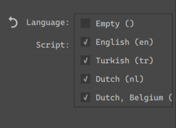
The basic usage is a dropdown, where you can select a set of “favourited” languages (by default, this includes the currently selected UI languages). If you need a specific language, you can type it into the text field, and Krita will show a list of partial completions.
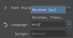
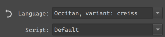
These are all taken from QLocale, however, BCP47 is a bit bigger than that, so I spend some time to make sure that if you paste in any legit BCP47 code, Krita will be able to parse it.
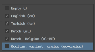
Any languages selected in the current session will be available in the dropdown. You can toggle the checkbox to have them persist between Krita sessions.
There’s also a separate Script dropdown. Generally, we can guess the script from the locale, but in some countries, the official script for a given language got changed recently (or is about to change), so this given extra control to identify which script to use.
This whole thing was designed for people who work in multiple languages, even ones they don’t speak themselves. Furthermore, because I went a little crazy with the BCP parsing, very little known locales should be supported as well.
Beyond fonts, there’s two other places we use language:
Line Break and Word Break
These two control where word wrapping is allowed to happen.
Line Break only really works for CJK languages, and determines whether breaking is allowed to happen after certain punctuation marks. The exception here is Line Break: Anywhere, which makes it so that after any given cluster a line break is possible.
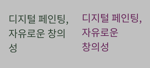
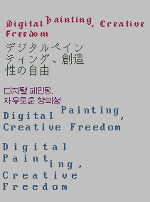
(Here, the Korean translation of our slogan. Left breaks at traditional places, which is somewhat old-fashioned, while right breaks at spaces only, as is typical of modern Korean typography)
Word Break in the meanwhile allows switching between cluster based breaking and word based breaking. This is particularly useful for languages where either is valid, like Korean and Ethiopian.
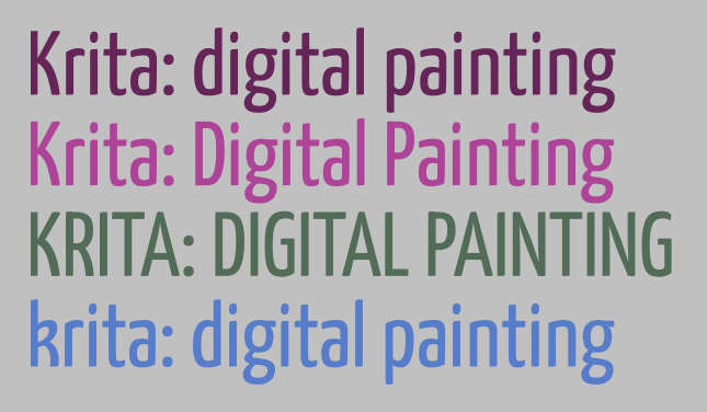
Text Transform
The main purpose of text transform is to set the case of the text to full uppercase or lowercase without affecting the underlying text. This is useful for European typesetting, as uppercase text is considered more formal, and thus frequently used as a stylistic choice for header and logo texts. There’s also Title case, which CSS defines as “Casing the first letter of each word”. In reality, every style guide out there has its own rules for Title case, with many avoiding it on articles (in the grammatical sense), so I am unsure of its use. This too is affected by Language choice, as a language like Turkish has two separate letters for dotted I and undotted I, or in Dutch we capitalize the “ij” in “ijsbeer”(polar bear) as “IJsbeer”.
Besides casing transforms, there’s also two CJK options here:
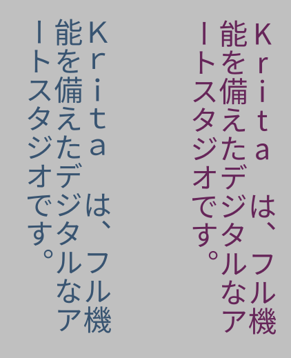
Full-width refers to the “Fullwidth” code points in the Halfwidth and Fullwidth unicode block. Toggling this will mean that proportional or halfwidth glyphs will be replaced with those fullwidth glyphs if possible. Typically, in vertical text, proportional glyphs are rotated, but when this isn’t possible or required, using full width glyphs can look a lot neater. The full width opentype feature does something similar, but not every font supports that.
Full-size kana will transform so-called “small kana” to “full-size kana”. These two types have separate categories because in regular Japanese they are pronounced differently. However, when the text is super small (like for Ruby annotations), the small kana are sometimes replaced with their full width equivalents to aid in readability. This toggle will make it possible to make such a switch without affecting the underlying text.
White Space
If you were testing Krita’s text tool, you may have briefly seen the White Space property show up, and then, a week later it was gone again. This is because the white space property is a little dangerous: It’s purpose is to hide unnecessary white space, and by default does so. However, if you are not aware of the history that makes the white-space rule work the way it does, that means you have this toggle that, when set to “normal”, makes it so you can’t type consecutive spaces, nor will line breaks work.
For this reason, I have hidden this toggle by default, and you will need to go into the visibility settings to enable it. The Conversion Functions MR, which is primarily for converting old Krita 5.2 text, also handles the white space problem, so it should provide a nice magic “make text work” button.
Tab-size, indentation, letter and word spacing.
Now, for a much nicer spacing thing.
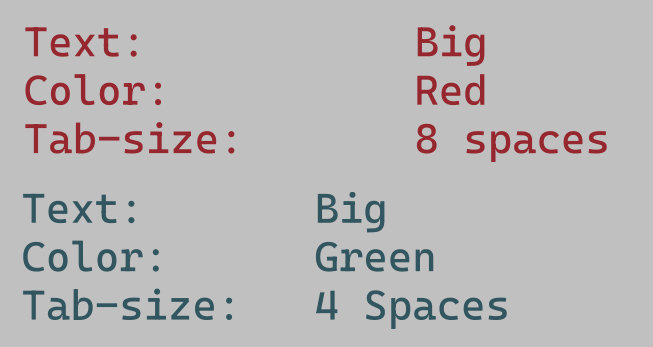
(Above: the two “columns” in each text are made possible by inserting tabs, which space everything so that the next glyphs align. Tab-size allows controlling how big the tabs are)
Tab size allows you to control the reference size of the tab character. Tabs are a type of white space that are dynamic size, taking up just enough space to reach the nearest multiple of its reference size. This is typically used to align text without the use of a table.
(Above: showcasing 1 em text-indent, with each-line toggled on the right, and hanging + each line on the left)
Text indent, conversely, is only about adding a bit of white space at the start of a paragraph. SVG only really supports one paragraph per text, however, text indent has a few toggles to support formatting poetry nicely. The first is “each line”, which applies indentation after each hard break, and the second is hanging, which swaps the lines that text-indentation is applied to.
Word spacing controls the size of the space character and several other word separators. Sometimes, increasing the white space between words can be a lot more readable.
(Above: a common formal way to typeset a subtitle is to letter-space it so it matches the main title in width. The red text below shows the typical spacing of this font)
Letter spacing in turn controls the spacing between all letters. This property is a bit of a bother though, as basically every single implementation is different in subtle ways. Krita currently implements the way CSS-Text-3 requires it, but that’s not what Inkscape does, or Chrome, or Firefox, and each of those does it different from one another too. This is usually not a problem, as the main purpose of letter spacing is to do it over a whole text. Large text in particular is often letter spaced to make it extra readable. Where it does become a problem is when people start trying to use letter spacing as a way to do manual kerning, at which point the different implementation peculiarities start rearing their heads.
There is a way to do per-character adjustments in SVG, and that one is pretty widely supported and the same in behaviour, however, it requires Typesetting mode, which is part of phase 3.
Text align and text anchoring.
These control how the text is aligned or anchored. The difference between them is that text-align controls how text is laid out in a shape (aligning to the left or right side of a shape), while text-anchor controls to which side the text is anchored (whether the start, middle or end is anchored to the starting point).

(Above: In preformatted text, each new line can have its own anchoring, which is one of the two places where text-anchor and text-align stop matching, making my life more difficult)
Here, a peculiarity of SVG shows up: For everything except text-in-shape, you need to use text anchoring. Which means that for the simple inline-wrapped area, you cannot justify text, you can only do so for text-in-shape. Right now, I have simplified the UI to three buttons and a toggle for justify. Once text-in-shape editing gets in, we’ll need to sit down for a bit to decide whether we should create text-in-shape by default, or allow creating the simple wrapping area. There’s benefits to either.
(Above: the red text uses a text-shape, and we’ve set the justification to “justified” and text-align-last to center. Our text-justification algorithm isn’t the best out there, but it is functional.)
Text Rendering
This basically controls hinting, which is useful for low resolution text. In particular, speed has been set up to toggle off anti-aliasing, as well as making sure that everything (like line-height, letter-spacing, baseline-shift adjustments) snaps both vertically and horizontally, which should make sure that pixel art text will look nice.
(Above: some text in a variety of pixel art fonts and text-rendering set to “optimize speed”. The latin text has letter-spacing applied, and our text layout knows to snap that to the nearest pixel so the pixels stay aligned)
Similarly, optimize legibility will turn on vertical hinting for horizontal text, and full hinting for vertical text. Auto is the same as Geometric precision, which turns off hinting alltogether.
Style Presets
Finally, the style presets I’ve mentioned so often. You can now create presets of the current properties, and assign a nice sample text, and it’ll show up in this third tab. Double clicking an entry will apply the style on top of the existing properties.
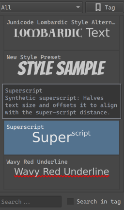
Here the strengths of CSS become clear, as you can have partial style sheets. So you can have a preset for a particular Font family set to bold, with a particular OpenType feature set, and a preset for underlined text in a particular color, and double click both to set both on the current text.
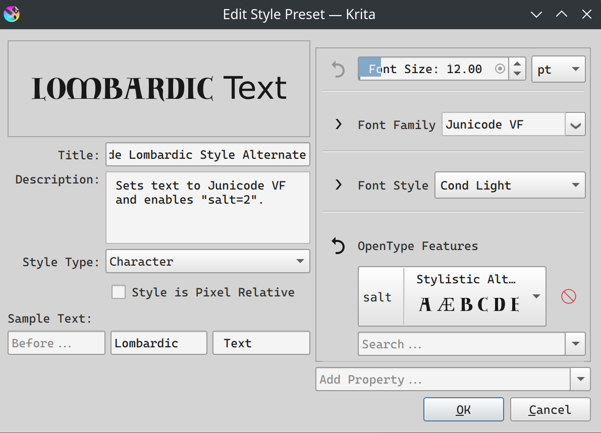
Beyond the properties, there’s a number of buttons on the left hand side here: You can set the description (used as a tooltip), the style type (character or paragraph), and whether the style is pixel-relative. This last one means that the style will be scaled to stay the same pixel-size independent of resolution, which should be useful for pixel art styles.
Finally, sample text allows you to choose the sample text to use. This is set up this way so that you can showcase text being larger or smaller than the surrounding text.
Again, I will need to repeat that this is not style classes, where you’d be able to set a style on multiple texts, and then edit that style, and have every single text that uses that class update dynamically. I am repeating this because it is a powerful feature used by many professional layout tools, and it is the feature that CSS (cascading style sheets) is build around. But the truth is that Krita itself doesn’t yet have the updating mechanism to dynamically update all text shapes at once. It might have this in the future, but not for 5.3, as I would like to finish this text tool some time.
Still, what I do hope to make possible is that for the text tool itself, for creating new texts, you will be able to choose whether you want to use the active style in the text properties docker, or whether you want to use a style preset. We’re not at that point yet.
Final notes:
And I think we’re at the end now for all the phase 2 things. I am going to do one more MR, and then next week, we’ll do a testing round 
P.S. As you might’ve noticed, fill and stroke are currently missing, and that’s because when I tried to work on it I got told “won’t that be too complex???”, so I’ve put it on the backburner for now.
P.P.S. I also need to write the docs, but I think I can reuse most of the introduction texts… Though the screens will need to be retaken.