Alright, so lets take a look at, uh… all the features involving font metrics. The accompanying technical blog for this is very long, mostly because I spend a lot of time deciphering mysterious spec details and I kinda wanted to share that with whoever reads those posts.
Font Size and Line Height
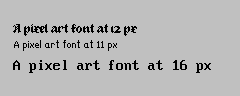
So, font size does what it says: Allows you to set the font size. The actual thing it sets is a bit more abstract; it scales the em design size to the value you chose. But no worries, all implementations do this. What is new though is that you can finally set the font size using not just points, but also millimeters or inches or pixels. The latter is document pixels, so you won’t need to create a 72dpi document anymore to get those pixel art fonts set to precisely 12 px. You can also now set the font-size below 1pt, which wasn’t possible before due that Freetype doesn’t allow for it, so we’re adding in an extra scaling factor there now.
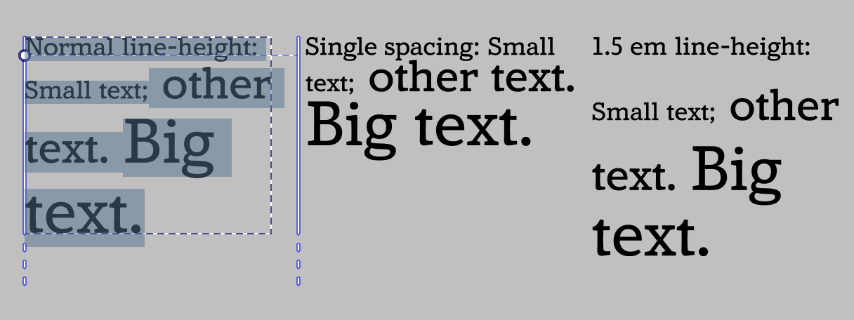
You will also notice that you can set values like “0.5 em”, or “2 ch”. These are font-relative values, and what they do is that they take the parent font metrics and then calculate the value from that. So if you set the paragraph to 12 pt, and then take a small selection and set it to 0.5 em, the font size of that section will in effect be 6 pt. If you then change the font-size on the paragraph, this smaller section will scale along. This is probably going to be most useful for style presets when those get in, but you can imagine wanting to have the text-ident be 1.5 ic (ideographic advance), or tab-size at 2 em can be very useful as well.
(In the above, the small text is set to 0.5 em, and the big text to 2 em, which means that changing the font-size will change these adjusted areas respectively)
There’s also font-size-adjust. What this does is that you can set the ratio of the x-height, and then that ratio is used to adjust all other fonts so that the x-height ratio stays the same. This is particularly useful with font-fallback, but can also be useful in general to force some consistency into the x-height. There’s a “calculate” button, which allows you to calculate the font-size ratio of the current font family.
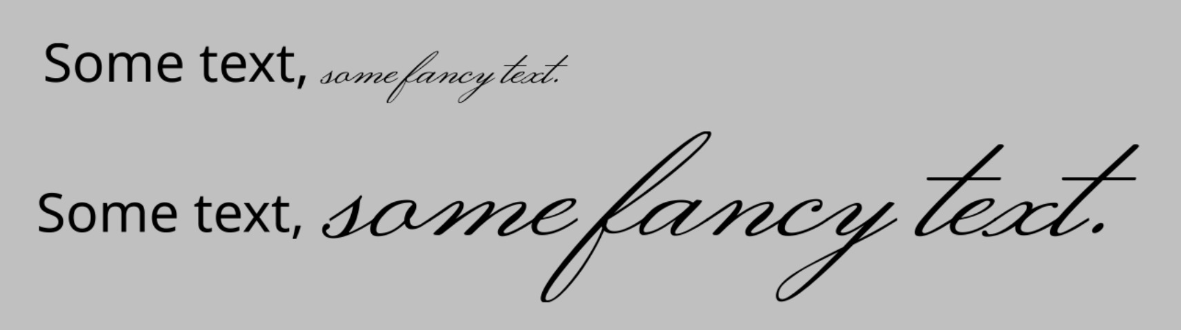
(Above: Script fonts frequently have a much smaller x-height than typical body text fonts. By using font-size-adjust and pressing “calculate” on font-size-adjust, we can set the text to use the same x-height ratio)
As for line-height, I mostly spend a lot of time doing fixes here, so it is calculated more correctly and you don’t get the weird mismatch when doing vertical-rl text anymore. The normal toggle uses the ascender+descender+linegap that is inside the font. It also has a unique unit, called “lines”. This means that the contribution of each glyph to the line-height is their font-size, which is what is used for single and double spacing in other programs. The other values will make the whole line-height that value, which is not quite as nice as having a proper line-grid, but it can at the least give some kind of consistency. The “normal” vertical line-height is also now fully synced with inkscape and the SVG 2 spec, using the em-box width.
(Various horizontal line-heights, Amstervar Roman)
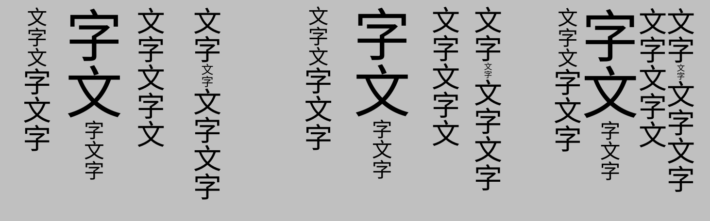
(Above, right-to-left: “Normal”, “1.5 lines” and “2em” line heights, Noto Sans CJK HK)
Baseline alignment:
This encompasses Dominant Baseline, Alignment Baseline and Baseline Shift.
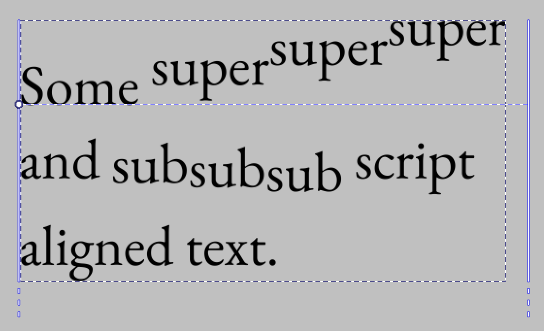
The latter is the most familiar, so lets discuss that first: It allows shifting the text in the paragraph direction, and allows aligning the value to the super or subscript metric.
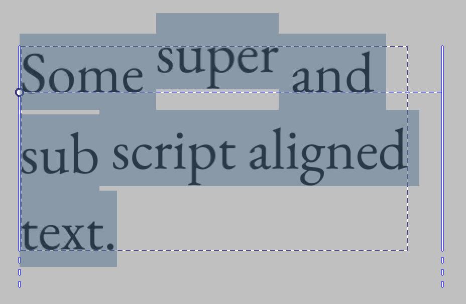
It can also nest, but it is not possible to make such text without editing the svg directly.
Then, Dominant and Alignment baseline. These two are interesting in that I both had to rework them to switch to the new CSS-inline based behaviour, as well that Krita’s implementation right now is the only full implementation of it that I know of.
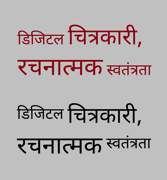
What it allows for is aligning all the glyphs by particular metrics. A good usecase is to have north-brahmic scripts like Devanagari align by their headstroke:
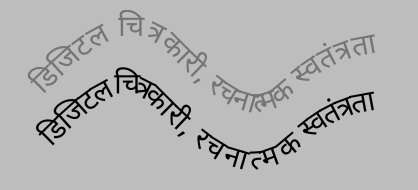
This particularly also applies to text-on-path, as here, where the grey text is default alphabetic alignment, while the black text uses hanging baseline, which means that the head stroke stays a little better connected when doing text-on-path:
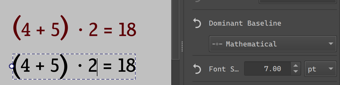
But it can also be used to center brackets in a simple bit of mathematical text:
And of course, you can use it to align ideographs to the bottom ideographic baseline or the central line in addition to the alphabetic baseline:
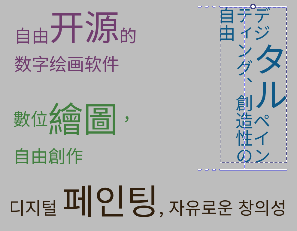
(All of these are just translations of the Krita slogan, topleft: Horizontal, ideographic (bottom) aligned, center-left: Horizontal, central aligned. Right: Vertical, ideographic (left) aligned. Bottom: Horizontal, alphabetic baseline)
Much thanks to everyone who provided feedback on the icons, by the way! I went with “文” and “क” for ideographic and hanging respectively!
Most of the time, you will just be using Dominant Baseline here, as Alignment Baseline follows it by default.
In fact, alignment baseline is only really interesting once you start nesting, which much like the baseline-shift example above, can’t be done without editing the SVG directly.
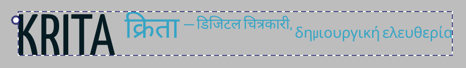
(Above: nested alignment baselines. First part says “Krita” with Latin, then “Krita” with Devanagari, then the first smaller Devanagari is the first part of our slogan in Hindi, aligned to the hanging baseline to the Devanagari “Krita”, and the second part is in Greek, aligned with “alignment baseline” with the alphabetic baseline to the Devanagari “Krita”. Don’t know why you’d need this, but it is what the spec requires to be possible…)
Text Decoration:
Finally, text decoration needed an overhaul too. Partially to handle the changes in baseline alignment, but also to fix some issues caused by me not reading the spec 100% correctly:
So, the main thing this feature does is allow you to set an underline, overline and line-through.
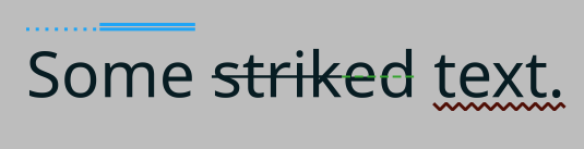
You can also set the style of this line, as well as its color.
With line-through, the CSS specs require me to split the line-through when the font-size changes and there’s no additional baseline offset, so that works now:
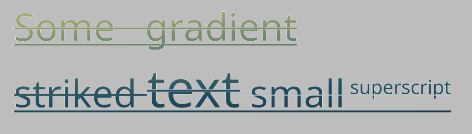
The underline and line-through use font metrics to offset correctly, as well as use font-defined thickness to define its size.

There’s a secondary related toggle: Underline position. This allows you to chose between, for Horizontal: Auto (using font metrics), Under (Using the descender, useful for, say, Arabic) and for vertical, whether the underline is at the left or right.

Beyond that, text decoration is also one of those features that nests, and I spend some time making sure that it draws those decorations correctly. As with the other features, this cannot be done without using the SVG source editor.
Next post will be language and line-breaking related features. I’ve actually already done the work for this, it’s just that the actual technical post for the metrics took so long too write 