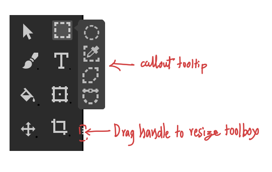
Is it possible to reduce the size of that triangle. it is a bit big now.
Yes. and also I see that the tool boxes have rounded corner but the tooltip doesn’t have it.
Another feedback and suggestion that I have is ability to resize the toolbar. Like how we can resize it now in Krita. This design ignores or drops that aspect. We can have tool tip call-outs and also have resizable toolbox.
The tool box in its current avatar in krita, being one of the dockers, gives our user a choice to snap it or fix it horizontally or vertically or as a box in a corner to make use of the screen space as they wish. With this implementation we will loose this fluidity, the toolbox will be always vertically aligned strip without any customization ability.
The goal is to make the tool icons compact and reveal only those icons which are important, in this pursuit we mustn’t loose existing functionality which is good.
Like this on the popup?
yes. I just updated my original comment adding more feedback  sorry for that
Hmm… the callout would probably need a different colour then, to differentiate from the toolbox if it pops up in that area, I would also have to learn how the tools adapt positions when resizing; but I’m up for it!
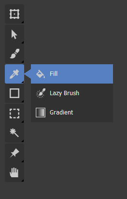
A general question, do you guys prefer this popup with text, compared to my earlier one with just icons? If so, why?
Cheers
In my opinion popout with text is better. It will be a way to make new users familiar with name of the tool. we can have tool tip on hover like we have now on the tools which are collapsed, so that the user gets to know the name of the tool on main bar too.
Awesome. I think you’re probably right about the text!
it can be same color with a border around to differentiate it.
One more thing I forgot to mention is that the tool tip text can also have shortcut mentioned in them. For example both the callout and hover tooltip can show the name of the tool in this fashion:
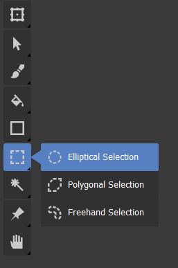
Elliptical Selection J
‘J’ being the shortcut for that tool, this also utilizes the text to educate the user.
Good idea about shortcuts! Would it be better in parentheses?
Yes better in round brackets I think. it should also be dynamic as in if i change the shortcut it should show the new shortcut that I have set. Currently in Krita it doesn’t show what I have set manually
Dynamism is good, I have no clue how that would be implemented  .
.
In general we can see that each component needs much discussion and iteration, this is the reason I requested to keep the discussion to specific component and also to focus on one item at a time and make gradual change.
Definatelly with text and keyboard shortcut. It’s great for new users and makes it easier to select a given tool (more area while picking). I also love the smaller triangle, and I’m happy it works quite well now. Great job everybody!
Personally I believe it makes sense for toolbar to stop being a docker, if there will be enough customization for it. Right now it is always on the top-left corner, but why not let the user to snap it to any canvas corner, be horizontal or vertical, change size of icons, and possibly even scale it. Ability to hide (similar as in blender) would be very nice too. And we don’t need to remove current tools docker immediately. I guess it makes sense to leave it in its current form, with all the tools at once. Though it wouldn’t be a default one then.
Thank you ![]() Are you sure it is needed to lock it to view in subwindow mode (like in blender)? Personally I would like it more to be snapped to the whole canvas at once (quite like it is now, though with all those improvements we are getting here). But I guess it could be a option for customization.
Are you sure it is needed to lock it to view in subwindow mode (like in blender)? Personally I would like it more to be snapped to the whole canvas at once (quite like it is now, though with all those improvements we are getting here). But I guess it could be a option for customization.
And thanks again for your hard work. Such a great thread ![]()
I don’t speak for @Kapyia, but I think your last request might be impossible from a purely Python side :’(
Yes but then in terms of placement, it would be almost like existing toolbar except the ability to resize it to a box or rectangle. I am also of the opinion that we should not just copy blender. blender is great in its own right and the developers must have reasons for making it as it is now. We don’t know if those reasons suit us. by means of copying it we should not be making some mistakes along the way.
I am saying this because in some youtube videos I have seen artists keeping the toolbar below and in various shapes and sizes.
Ow, I’m very aware of that. In fact I kind of forgot that some of those requests are already being made with styles change in python. Sorry 
But with the toolbox not being a docker, and snapped to the edge, I was talking mainly about @fullerhill_art part, which seems to be done in pure C++ and will be added to krita code at some point (I guess?).
Locking it to the corner of the parent QMdiArea rather than the individual active View is very much possible, and should be possible to do in my script with a quick change of an argument 
I personally thought it looked a bit weird having it above sub-windows, but I guess I can see someone wanting that as a an option.
Yes, in blender this toolbox is very much dependent on current window and context, which makes sense for it to be in every subwindow for example. But I don’t think we need it in krita, only one on a given edge is enough. I just like a lot what fullerhill is getting in C++ - it looks great, and could be very useful in mobile version of krita on android. But it looks very like a “no docker”, and part of the canvas. We just need to respect as many current functionalities (many placement possibilities, icon scale etc) as possible.
And just keep a usual docker for now, for those who may not want changes
Keeping it as docker gives me ability to make it a tab if I want to plus ability to resize etc. Having it as a floating icon area makes it loose these abilities. it also makes it odd man out in the UI we would have one extra type of element to code and maintain. Having said that we can choose this later in the end I think.