Toolbox Docker Redesign

If you right click, you could see a bunch of available options to tinker, though I haven’t implemented all, switching the current code to horizontal would be a chore and definitely not ideal. And I don’t know much about what PyQt offers and lacks, but most likely could be done with some python scripting too cause it mostly some drawing with QPainter and nothing else.

For something mimicking blender and more like the touch controls offered by the Android/iOS, I would go for QML instead of doing QtWidgets, but it is an entirely different ball game and I dont think we support that completely yet.

Oh, I understand now what you meant.
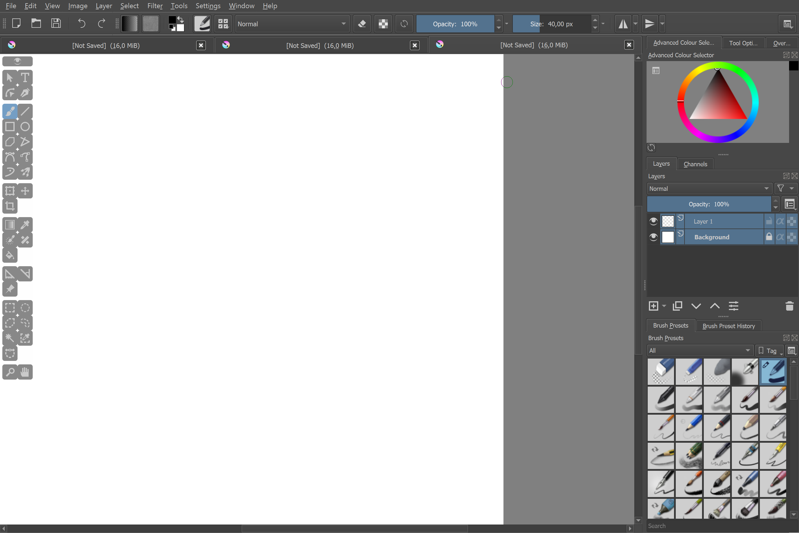
The reason why I thought floating element is better, is that it wouldn’t cause floating dockers problems (separate window on Win10, floating dockers staying in their place when you move or resize the window, some other glitches, like hiding those dockers with a color selector pop-up on linux). And once you dock it, the whole left area stops being transparent, which considering this new design looks better with big icons, is quite bad.

@wojtryb I mean having this in Krita would be nice, but not at it’s current state I think.

As @raghukamath said, it’s probably best to keep as a docker for now.

I think I did something with qml before, but if that’s not completely supported then it’s a bummer :confused: .

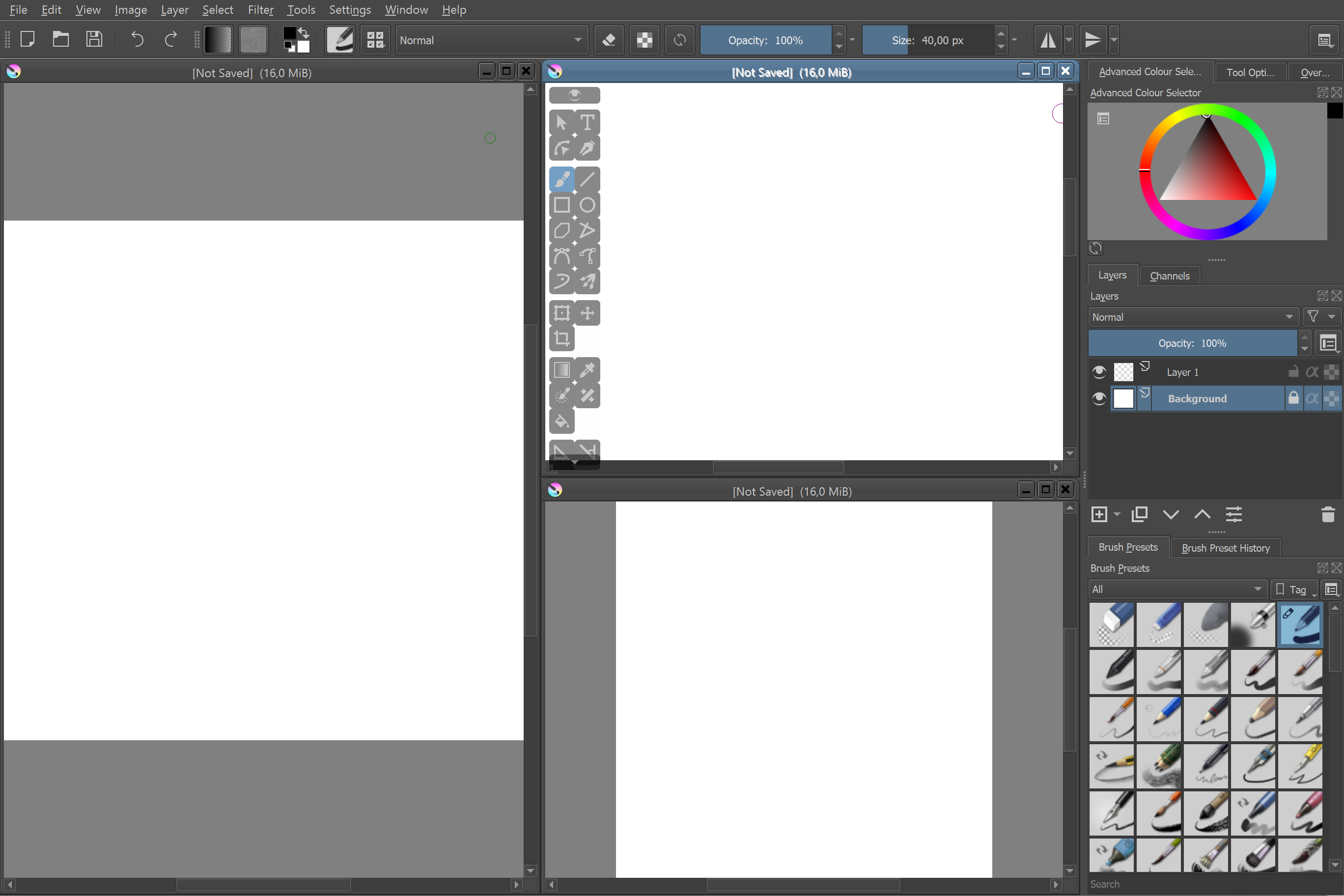
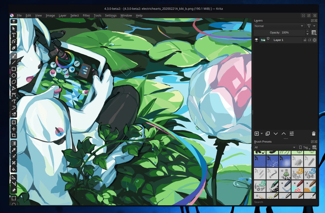
An initial proof of concept for an on-canvas floating toolbox is now available here. It’s not a plugin (yet) but instead a script you run with Krita’s Scripter. You can download the script file by clicking the button that says ‘Raw’, then right click inside of the new page that opens and click ‘Save as…’ (or similar) and open it in the Scripter. Alternatively, just copy and paste the contents of the script into the Scripter.


@wojtryb requested putting the toolbox on the side of the full canvas area. This can be done in the script by moving the initial ‘#’ from line 36 and putting in at the start of line 37 instead. I’m gonna be blunt here and say that I think it’s better to just have the toolbox as a regular docker if you prefer this mode, since it’s just gonna end up on top of the tabs/subwindows when floating.

Looks great!

@Kapyia: Thanks for the screenshot (not tested) but it looks to me confusing and a distraction to get the tools like that over the canvas and seeing it moving messes with my spatial memories in subwindows mode (and selection tools on bottom of the bar are hidden on small subwindows? does it require scrolling?).

So, I don’t see in it a huge benefit. Especially when I can with the current system get a single column of small icons that keeps the same location. Even if my layout/workspace changes.

Thank you again for your work.

First of all - I agree with @Deevad that toolbox moving around the canvas is distracting. That’s why I was talking about pinning it to the canvas (thank you that you did it). Transparency is a matter of taste - I like it more with opaque buttons.

This does not mean that I see no improvement to toolbar current state. What for me got improved with your script is the ability to pin the floating toolbox to canvas for example. Usually when I make it a floating docker, moving the krita window would not affect it. So now it behaves a lot more like a usual docker version, but with some transparency outside the buttons which I like very much.


As I understand, this is still a docker, not some kind of a floating window? So at the end, you could have it as a docked one (just as currently), but when you undock it, you could have this nice transparency around, canvas tracking, and hide button. For me those are some really nice things. This would also answer some questions in the discussion we had if it should stay a docker or be made something different.

And lastly, now I don’t have this bug with floating docker hiding when I use “show color selector (shift+i)” which is amazing.

That is why, if I manage to make it one column and use it on krita auto-start, I’m probably switching to that solution for good.

EDIT: Ok, so I thought some more and have the idea how this all could come together.
Toolbox stays to be a docker. When docked, it behaves absolutely the same as currently. When you undock it, the toolbox snaps to a corner (for instance the top left, but you can change both corner and horizontal/vertical alignment). So this is basically just like docked version, but with transparency and ability to hide it.

Then, if you want to, you could switch its full version to compact one on right click (currently developed by @fullerhill_art) which would be a default one on a Android port, as you want less but bigger icons.

How about that?

Sounds like a great idea with snapping, and a compacted mode would definitely be nice to have as an addition!

Currently I don’t know how the current version I’ve been adding to would work inside Krita (I’m thinking I have to build Krita on my end to get it working properly), but if there can be a mix of the two, great! (But how feasible…)

Cheers

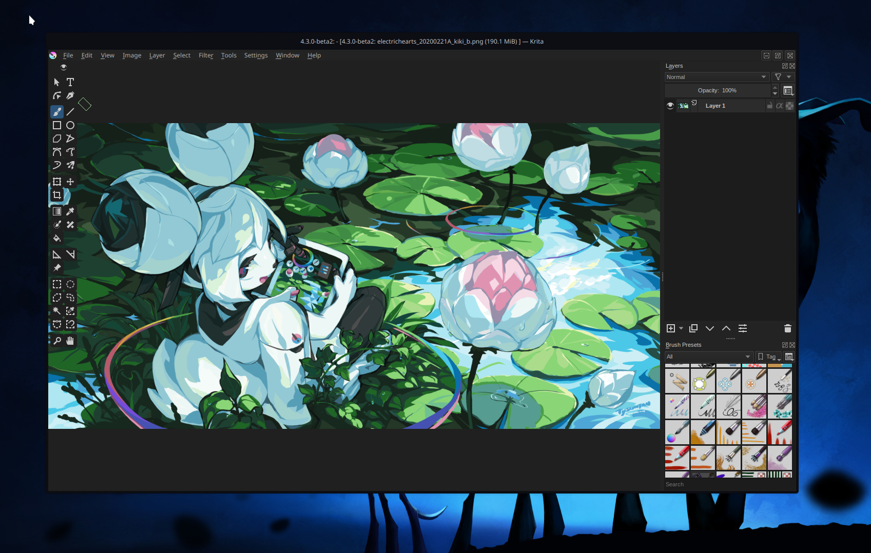
The inspiration for this was how Blender has it’s toolbox fixed to the side of the viewport, with the option to hide it away if you’re able to make do with just keyboard shortcuts. The benefits are:

  • Free up some valuable screen real-estate by not shrinking the canvas to make space for a docker. Especially if the docker doesn’t need to use up the entire side of the screen.
  • You compensate for the space that the toolbox does take up by making it semi-transparent.
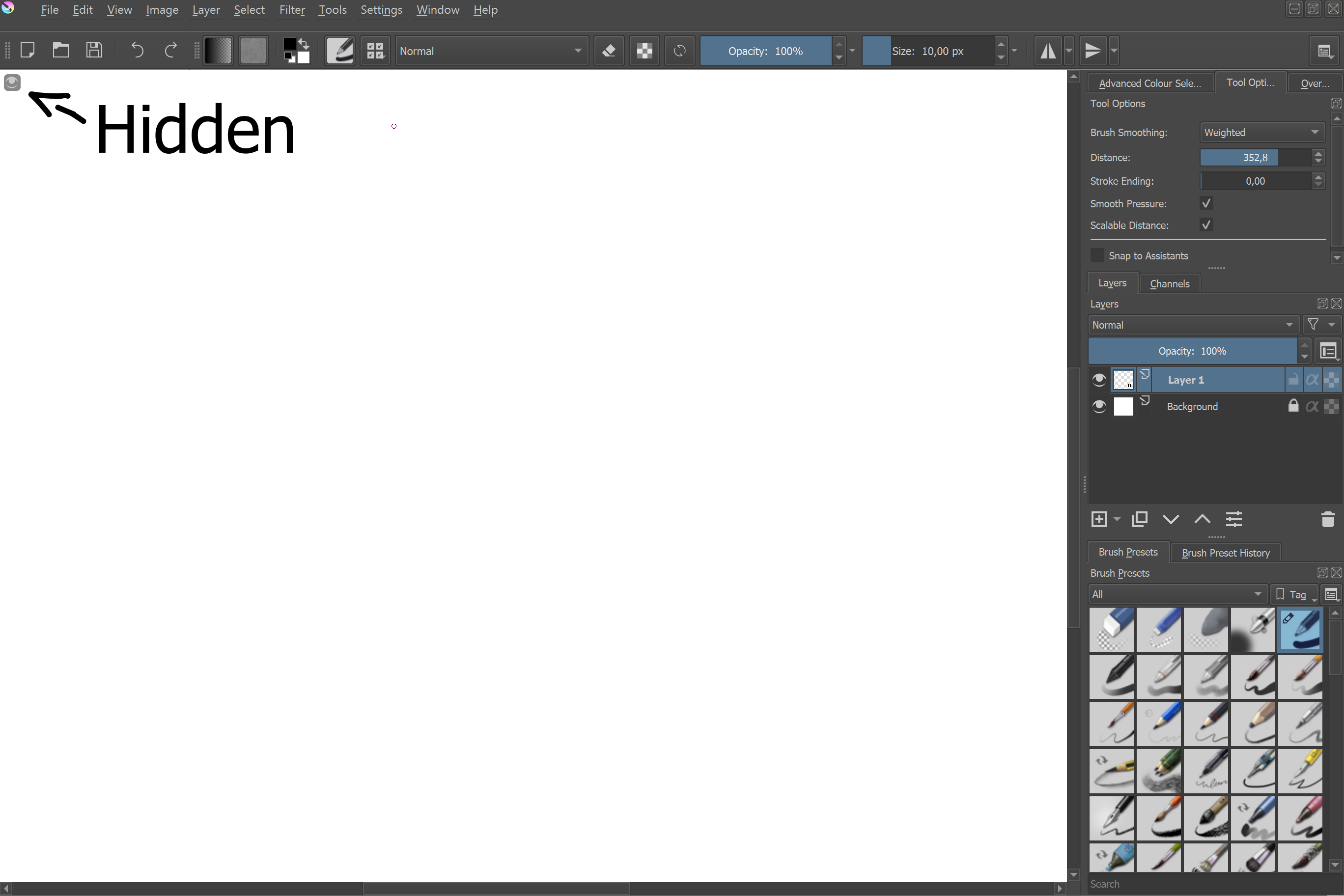
  • The Toolbox is more convenient to hide/show with a tiny button in the upper corner, and even more so with a keyboard shortcut (on the todo-list). I like this personally since I mostly rely on keyboard shortcuts to switch between tools, but occasionally need to go to the Toolbox for something that haven’t got a binding. A discrete button in the cop corner of the canvas is a lot more convenient than navigating the menus to disable/enable the toolbox docker.

It requires scrolling on smaller subwindows, yes. This was just my quick way of preventing the toolbox from sticking out of the bottom of it’s current subwindow. You could possibly have it extend horizontally to keep more tools visible, or maybe hide it when the view is too small (though that seems the least unfavourable).

And this is exactly why this isn’t intended to completely replace the current Toolbox Docker :smiley: this is just a modification for those who like the type of toolbox you might see in Blender and many mobile applications, such as myself. But I can totally see that some would prefer always having the toolbox present at a fixed spot in the UI even with multiple subwindows and I’m not in a position to tell them that’s “wrong”.

I tried to ask you on IRC, but it got lost :wink:
Can I get a hint where in your code you made the design of two columns?
In the end it would probably have to be easily adjusted in gui, but for now, I would like to try to make it one column…

Edit:
I sort of made it:


Now, if I’ll manage to autostart this script, I’m beginning to use it in my everyday painting. Massive thanks to Kapyia for help.

Though right now I hardcoded it with setFixedWidth and setFixedHeight methods which is terrible in terms of responsiveness, so I would like to do it nice and properly.

Which is a fair point. I don’t see the current docker being replaced anytime soon, so there’s always that.

Glad there’s some value to it still :stuck_out_tongue_winking_eye: I personally didn’t like it that way since, like I said, it start covering up some other UI elements in some situations. But this all just goes to show that taste is subjective. @Deevad prefer the current docker, I prefer the per-view floating toolbox, and you like something in between :smiley:

With this script the Toolbox is moved from it’s docker to a new dedicated “widget”. This is to allow myself some more control over this modified toolbox. For example, assigning a custom style sheet that only applies only to this new widget, not the original docker. If you were to disable the plugin the toolbox would return to the docker and get its old look back :slight_smile: You also have some good ideas here and I wanna give some input on them:

So at the end, you could have it as a docked one (just as currently), but when you undock it, you could have this nice transparency around, canvas tracking, and hide button.

This is theoretically how it already works with the script I posted today :slight_smile: I just haven’t implemented a way to “turn off” the script and return the toolbox to its docker.

Make it one column and use it on krita auto-start

Running on startup will be implemented when the script is turned into an actual plugin. As for the number of columns, that’s a different story…

The current size of the modified toolbox is decided automagically by the toolbox’s “size hint”. It’s an inherent property of Qt UI elements; a “recommended size” of sorts. If you were to change icon size of the Toolbox my script would be able to adapt (just hide and unhide the toolbox with the button on top) to fit the larger/smaller icons, but it’s all depending on what Krita/Qt says is the recommended size, and two column is apparently what’s recommended :man_shrugging:

It’s definitely possible to come up with a system where you could maybe specify how many columns you want, or maybe have the plugin favor as few columns as possible, but I haven’t had the motivation to sit down and work all of those things out. It’d be something to consider doing later down the line in my opinion. :sweat_smile:

When docked, it behaves absolutely the same as currently. When you undock it, the toolbox snaps to a corner

I’m liking this idea, but I’m also not sure what would be a good way to handle the moving when the toolbox is undocked. That’s typically handled by the title bar, but when the toolbox is undocked you wouldn’t really want one there to take up space. I feel like this would eventually come down to a number of checkboxes in a settings dialog (docker/non-docker, snap to view/snap to canvas area, snap to corner A/B/C/D). Which isn’t a bad thing, but it’s gonna come down to someone doing the job :stuck_out_tongue:

Glad my script was legible enough :wink:
Basically, anytime you see the combination of “resize(parameters)” and “sizeHint()” is where this happens. Krita decides on the two columns for me. I let it do this because I didn’t like hard coding the sizes the way I did in my earlier version of a transparent toolbox.

Now, if I’ll manage to autostart this script…

It’s a matter of wrapping it all inside of an Extension. I don’t think it should be too difficult (haven’t sat down to do it myself yet) but there’s a pitfall of having to use the ‘window’ argument of the ‘createActions()’ function when you work with Extensions.

Yes, I’ve tried to wrap it - pasted this whole code into a function in extension and tried to run it in createActions(). Right now I can start it with a keyboard shortcut at start (not perfect, but acceptable for testing purposes).

I see that you used
window.qwindow().setStyleSheet()
to get something done on autostart, but I couldn’t find out how to run a krita function there yet.
Normally I would use something like
Krita.instance().action("name").trigger()
but it’s not working there :smiley:
Anyway, keep up with great work, I’m sure this will come to a “publically acceptable” solution that could get into krita someday. I’m definitely try to use it for a while :slight_smile:

God, this is so good, I’ll be sure to give this a try when I have the time. Do you think it’s possible to have this for the tool options docker as well?

This may or may not have been my plan for how to extend this particular script once the toolbox feels solid enough :wink:

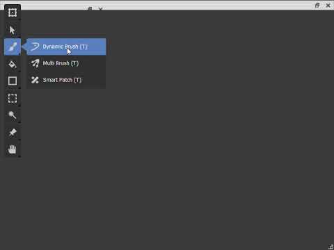
Late follow-up to this thread, but I added in the shortcut keys.

They’re all T at the moment, I think I would have to build Krita to access the shortcut settings, and that’s been a struggle on Windows :sweat_smile:.

Once I get a build running, I think this process will be a lot easier :confused:

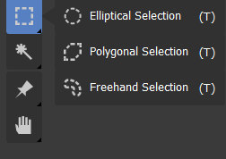
Q: Should the shortcuts come straight after the title, or be aligned to the right margin?

Cheers

It will be good if right aligned. Right aligned will differentiate it and highlight it

Like this? Oh sorry I didn’t see the highlight bit:/

image

@raghukamath I don’t think having the shortcut highlighted would work if it is hovered over, unless the shortcut turns white against a blue background?

No not color highlight. What I meant was that if we right align it it will get automatically highlighted (or more noticeable).