Metallics can be tricky - luckily for you, overthinking is my specialty. Therefore I’ve written a practical, modular guide for everyone. If you want to paint textures, try my brushes (if you haven’t already)!
![]() Also check out the poll at the end to choose I’ll cover next (ノ◕ヮ◕)ノ*:・゚
Also check out the poll at the end to choose I’ll cover next (ノ◕ヮ◕)ノ*:・゚
💎 Why Read? 💎
- This guide simplifies how to render metal with artistic tips.
- It covers the basics (theory and UI setup) so it is accessible to all skill levels.
- While designed for “Metallics by Draneria” and Krita, it’s useful for anyone aiming to paint realistic metal.
- Includes diagrams, videos, gifs and images!
🔥 Gimmie TL:DR plz 🔥
- Go for dark values and high contrast.
- Metal hues don’t shift, but it does reflect surrounding colours.
- Wide Gamut Colour Selector + HSI is best (in my opinion).
- Use the palette for easy metallic colours.
![]() Helper Seal: “If you are struggling to get full coverage with the “foil” brushes, use your mouse instead of stylus, and pick a high brush size (200px+). See “Advanced Technique: Shadow Boosting” for an example gif!”
Helper Seal: “If you are struggling to get full coverage with the “foil” brushes, use your mouse instead of stylus, and pick a high brush size (200px+). See “Advanced Technique: Shadow Boosting” for an example gif!”
🔍 This Guide Covers.... 🔍
![]() ── ✦ Simple basics on how to render metal.
── ✦ Simple basics on how to render metal.
![]() ✦ Setting up and using the palette docker.
✦ Setting up and using the palette docker.
![]() ── ✦ Optimizing your color selector (HSV, HSL, HSI, and more).
── ✦ Optimizing your color selector (HSV, HSL, HSI, and more).
![]() ✦ How to identify the best choice for metallic colours.
✦ How to identify the best choice for metallic colours.
![]() ── ✦ Finishing touches for extra realism.
── ✦ Finishing touches for extra realism.
🔧 The Toolbox 🔧
- Krita 5.2+ ✦ The painting software!
- Metallics by Draneria ✦ Optional but recommended, and free.
![]() Topics! (Click to Read)
Topics! (Click to Read) ![]()
🪙 Painting Metal: Quickstart
⋄✧⋄ ❶ Metal doesn’t shift hue between light and shadow.
✏️ Practical Tips
╰── ➤ Resist the urge to hue-shift! This colour theory technique adds dynamism to your art, but don’t use it for metal.
╰── ➤ If you need your metal to look more engaging: add subtle reflections. This mimics how metal catches light from multiple angles.
💡Explanation
╰── ➤ Metal is very reflective material, with no subsurface scattering. This means it maintains the same hue in both highlights and shadows.
⋄✧⋄ ❷ Metal does take on the colour of it’s surroundings.
✏️ Practical Tips
╰── ➤ When actually painting metal texture, try incorporating the nearby colours into it’s reflections.
╰── ➤ E.g. A silver spoon on a green table will have greenish tints.
╰── ➤ Use filters such as “color balance” to match the metal closer to the background.
💡Explanation
╰── ➤ Metal acts a bit like a mirror, and picks up colours from nearby surfaces and light sources.
![]() Extra Science-y Explanation
Extra Science-y Explanation ![]()
╰── ➤ Metals have free electrons that absorb and re-emit light almost instantly, leaving no time for scattering. This makes metals act like mirrors, bouncing light back smoothly rather than absorbing or diffusing it.
⋄✧⋄ ❸ Metal has naturally high contrast.
✏️ Practical Tips
╰── ➤ Exaggerate your shadows and highlights.
╰── ➤ If your metal doesn’t look shiny - try reducing the overall size of your bright areas or highlights.
╰── ➤ Don’t overblend transitions.
💡Explanation
╰── ➤ Metal has no “diffuse scattering”, the attribute that softens how light looks and makes surfaces appear matte.
If you prefer videos, I found a decent tutorial which touches on many of the ideas written in this quickstart!
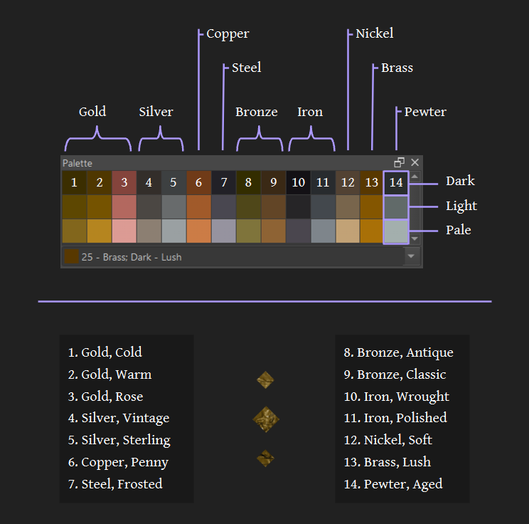
● 🎨 Dockers: Palette - Picking Colours Fast
If you just want to get painting, I have a solution! The palette in “Metallics by Draneria”. It’s not perfect but they are convenient and tested, and it’s very fast to use.
Have a look at this video to add the palette docker to your UI:
Just click on a colour to select it, and paint!
🪅 Dockers: Colour Selector - Setting Up
There’s a lot of options when it comes to your colours!
This section will give you a good setup for general purposes ✧(>ᴗ<) If you happy with your current settings, feel free to skip.
❶ ── ✦ Which colour selector: Wide Gamut or Advanced?
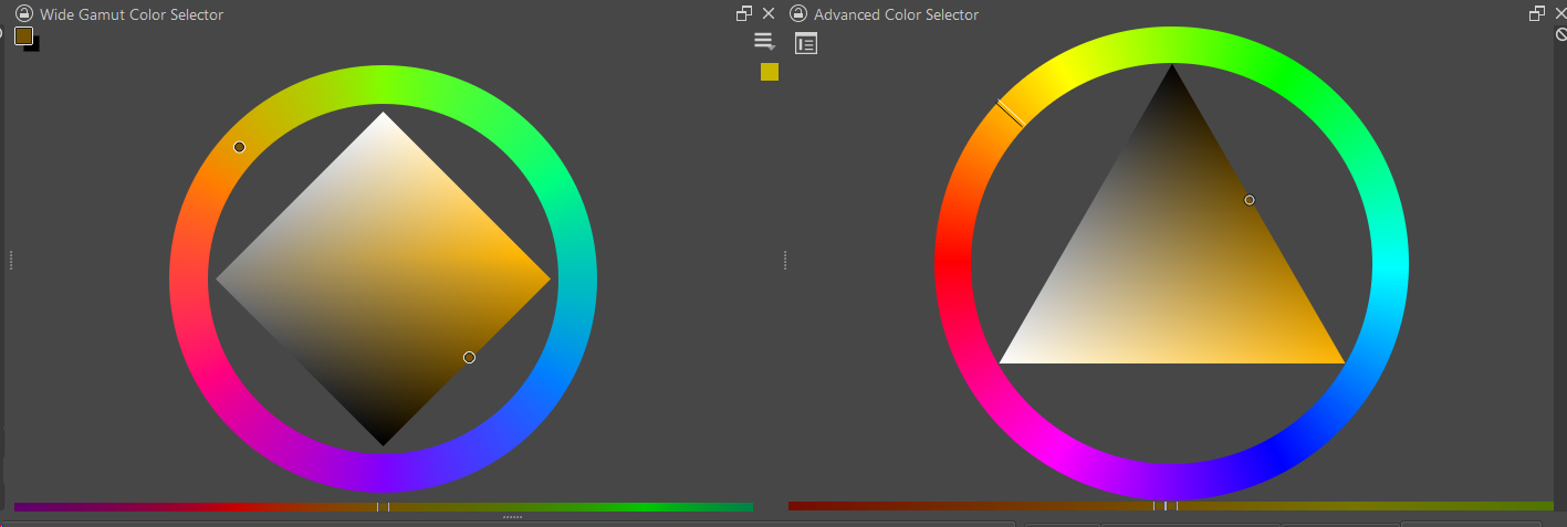
Answer: Wide Gamut
✦ Why?
![]() ✦ It let’s you grab colours outside sRGB, so you can have richer paintings.
✦ It let’s you grab colours outside sRGB, so you can have richer paintings.
![]() ✦ The diamond shape has more space to work with in the centre.
✦ The diamond shape has more space to work with in the centre.
![]() ✦ According to the Krita docs, it will eventually replace the “Advanced” colour selector in future updates.
✦ According to the Krita docs, it will eventually replace the “Advanced” colour selector in future updates.
![]() Bonus Tip: Shout-out to the “Specific Color Selector” Docker, which let’s you easily grab #Hex codes (e.g. #af7bd8)!
Bonus Tip: Shout-out to the “Specific Color Selector” Docker, which let’s you easily grab #Hex codes (e.g. #af7bd8)!
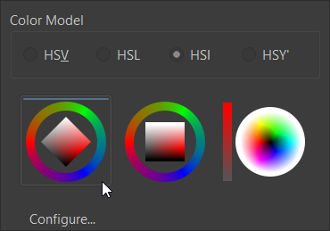
❷ ── ✦ Which colour model: HSV, HSL or HSI?
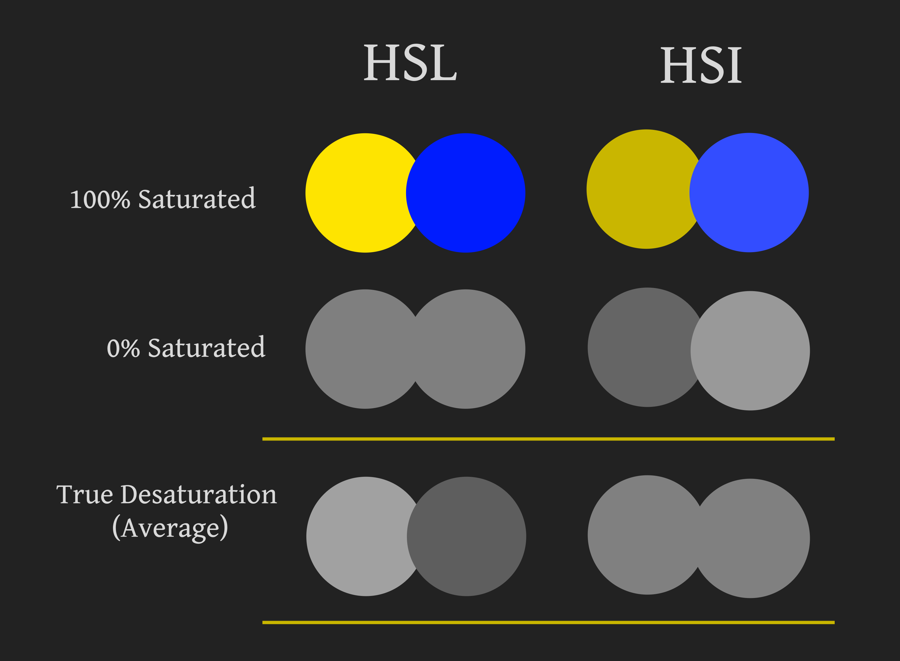
Answer: HSI
✦ Why?
![]() I don’t like the default HSV because when I rotate the colour wheel, the value swings around.
I don’t like the default HSV because when I rotate the colour wheel, the value swings around.
![]() I did a quick test, and found that HSI is the solution to this problem.
I did a quick test, and found that HSI is the solution to this problem.
I still have no idea what HSY’ is for xD if anyone knows please tell me haha
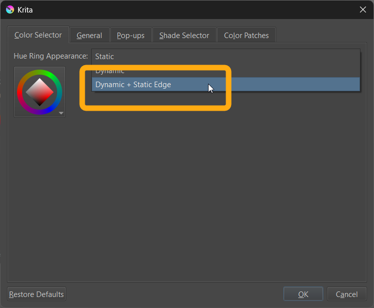
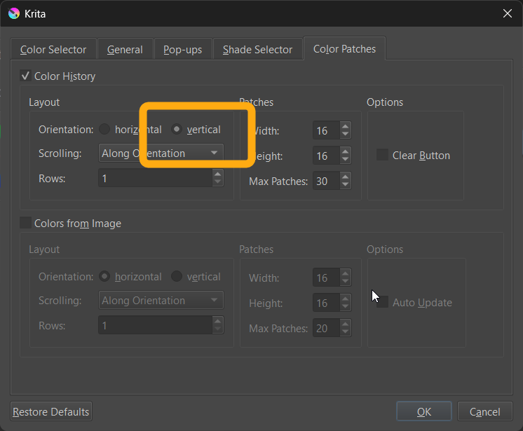
❸ ── ✦ Wide Gamut: How should I set it up?
- Diamond Shape Selector
╰── I think it is the most useful to work with.
- Dynamic + Static Edge
╰── Best of both worlds.
- Colour History Vertical
╰── Similar layout to the “Advanced Selector”.
Congratulations (ノ゜▽゜)ノ you are now ready to paint to your hearts content!
● 📀 Dockers: Colour Selector - Picking Colours Manually
Now everything is (hopefully) sorted out, let’s get into actually picking colours ( ✧≖‿ゝ≖)
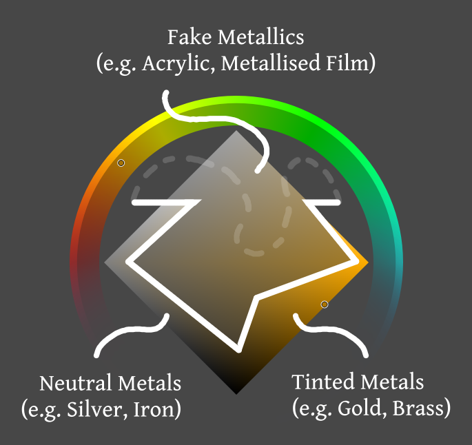
Above is a generalised diagram for choosing the right value and saturation level when working with “Metallics by Draneria” brushes. The exact choice will be dependent on how bright/dark your artwork is, and the metal you are trying to emulate.
![]() Rule of thumb
Rule of thumb ![]()
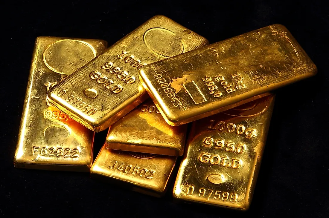
✦ • Tinted Metals: Dark value, High saturation ⊰-⊱ e.g. Gold, Bronze, Copper, Brass
✦ Neutral Metals: Mid to Dark value, Low saturation ⊰-⊱ e.g. Steel, Platinum, Silver, Iron
✦ • Fake Metals: Mid value, Mid saturation ⊰-⊱ e.g. Acrylic, Metallised Film, Glitter
As for hue, you’ll need to look at reference and adjust based on your image. Here is a sheet to help you begin (。•̀ᴗ-)✧
![]() Bonus Tip: Gold is more yellow then you’d expect. In 3D rendering, the base colour is actually #F9E4A4.
Bonus Tip: Gold is more yellow then you’d expect. In 3D rendering, the base colour is actually #F9E4A4.
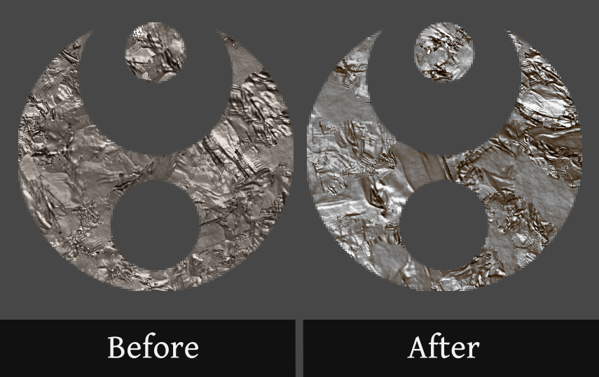
🪄 Advanced Technique: Shadow Boosting
Now it is time for a top secret technique; Shadow Boosting! \( ̄▽ ̄)/
![]() What does that mean?
What does that mean? ![]()
Some shaded areas on metal definitely look saturated - or even seem to have a warmer hue. We can use the “cross-channel adjustment curves” filter to recreate this effect.
![]() NANI ?!
NANI ?! ![]()
But the quickstart section said that “metal doesn’t shift hue between light and shadow”. Have I been lied to my whole life? What is going on??
![]() Fear not! Let me explain:
Fear not! Let me explain:
⚀ ‣ Bright highlights reflect light and wash out colour.
⚁ • ‣ This makes the shadows look richer in comparison ![]()
⚂ ‣ There’s no shift in hue, just saturation.
⚃ • ‣ We can leverage this concept to enhance our own metallic textures!
Now let’s begin (๑˃̵ᴗ˂̵) و
![]() Bonus Tip: This post-processing trick can add extra vibrancy to most art, it’s not just for metal!
Bonus Tip: This post-processing trick can add extra vibrancy to most art, it’s not just for metal!
────ↁ Step ❶ : Add Metal Texture ![]()
First of all, we’ll create the texture(s) that we want to shadow boost.
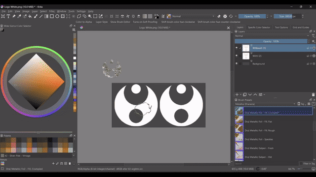
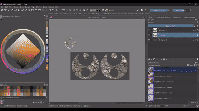
A) ✦ Pick your fill brush. My choice: “Dra) Metallic; Foil – Fill, Crumpled” with the palette colour “Silver; Pale - Vintage”.
B) ✦ Increase the size high! Just don’t fry your PC. My choice: 300px for a 800x400 resolution canvas.
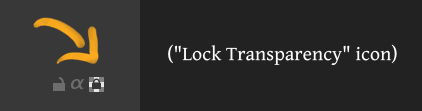
C) ✦ If you want to add the texture to an icon or text, import it now and lock the transparency.
D) ✦ Use your mouse and move over the area you want to fill. If using your stylus, press hard. You may need to lift your stylus and move over the area multiple times.
────ↁ Step ❷ : Cross-Channel Adjustments ![]()
Next we’ll add our filter!
A) ✦ Click the “filter” options from the top settings, then “adjust” and choose “Cross-channel adjustment curves…”
![]() Helper Seal: “Make sure you click on “Cross-channel adjustment curves” and not the similarly named “Color Adjustment curves”!”
Helper Seal: “Make sure you click on “Cross-channel adjustment curves” and not the similarly named “Color Adjustment curves”!”
B) ✦ Move the left node higher, and the right node lower.
C) ✦ Now we make a soft S curve! First, gently pull the middle down until the colour looks similar to the original. You may need to adjust your nodes.
D) ✦ Then, give some lift back to the left side so the shadows remain saturated - see the gif above if you are confused.
E) ✦ You are done, have some sparkles! (ノ◕ヮ◕)ノ*:・゚
Thank you for reading, if you have any questions, corrections or things I’ve missed - let me know!
Speaking of which; what would you like next?
- Simple “how to” technical guides for each metallic brush
- Tarot Illustration Tutorial: Gild, Stamps and Patterns
- Metal Armour Tutorial: Foil and Grunge
- Arts & Crafts Poster Tutorial: Glitter and Faux Brushes
- More general guides for setting up Krita
- More intermediate to advanced guides like “Shadow Boosting”
- No tutorials - Moar brushes!
P.S Confused by any words used in this guide? Here's some extra definitions:
📓 Terminology 📓
-
Value
 How dark or light a colour is. Other words: tones, or shades.
 -
Render
e.g. To render metal. This means to draw, paint, or otherwise express a material. -
Colour Model
HSV, HSL, HSI and all the rest. How your computer lets you pick colours, using different attributes e.g. lightness or intensity. Other words: RGB Model, HSX system, colour coordinate system. -
Node
The points on a graph we can use to manipulate the line shape.
🔱 Disclaimers 🔱
-
All images uploaded in this tutorial are my own work, under license CC-BY-SA.
-
These links direct to content I found useful at the time of posting. I have no control over changes to linked content or external sites. If any linked material is found to contain offensive, abusive, or illegal content, please notify me so I can promptly address it. Please note that the content found in these links is not the responsibility of Krita-artists.org.