This is how it looks like right now:
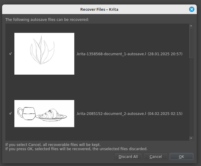
It’s annoying enough on desktop, but it’s way more annoying on Android, when every painting I haven’t saved immediately eventually ends up there, because Android has the tendency to close Krita whenever I open too many other apps. Also on Android all kinds of control is more difficult, so the “Discard All” button is even more dangerous there (and ending up with a thousands of opened recovered files is even more annoying and difficult and tedious to recover from).
This is my suggested change to this dialog:
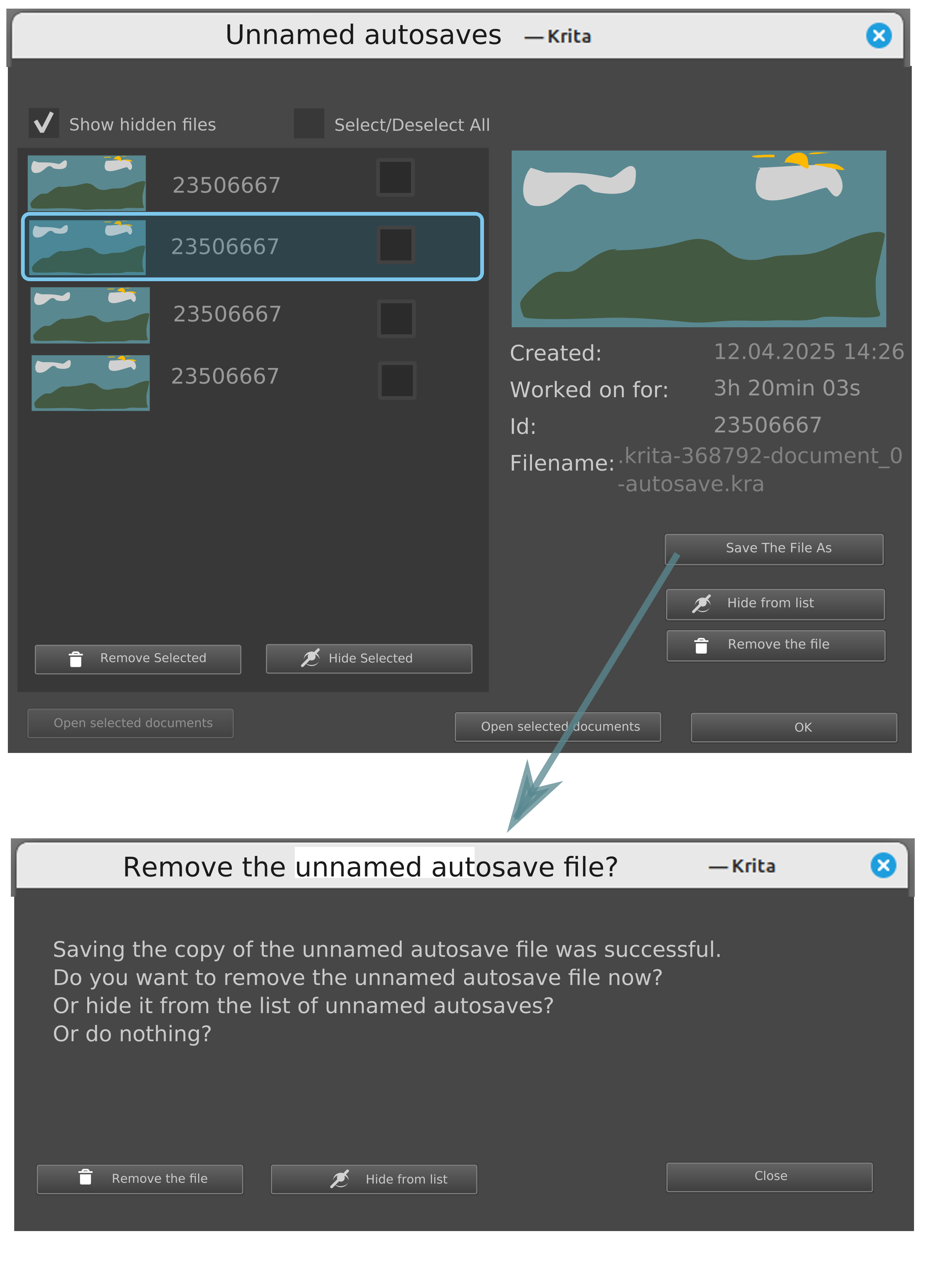
As you can see, those are the changes/advantages:
- You can see the picture in a bigger size
- More information about the painting, namely the working time (you’ll know if you aren’t discarding something you worked for a long time on!), and the other information is easier to read (like the creation time)
- You can hide items on the list without getting the files removed
- You can still quickly remove all files if you want to
- You can hide all the files if you want to, too
- For every file you have the option to Save it normally (so basically Krita creates a copy of that file in a more normal place and with a normal filename, provided by you). After that, you get the option to hide or remove the unnamed autosave file so you won’t have to be concerned you’re discarding something that you don’t have a copy of.
- You can still open all of the files if you really want to, but you can also just open the files you want to edit.
- Of course all destructive actions, like Remove Selected and Remove the file, will lead to a confirmation dialog. Otherwise it could lead to a dataloss by mistake.
- They could have some kind of icon showing that the file is hidden if I turn on the “Show hidden files”. Also there should be probably a way to unhide it. Or, frankly, the user can just deal with it properly individually.
I wasn’t sure whether the button for “Open all selected files” should be on the left or on the right, so it’s kind of greyed out on the left and fully visible on the right, but of course in the end there would be only one. Which one you think would be better?
What do you think? Do you have a better suggestion? Do you have any wishes for this dialog? Is there any workflow that I haven’t accounted for?
You can make and share your own mockups for this dialog too. Iterative approach and cooperation usually leads to best results imho.