Hey I’ve been trying to figure out a way to change the color of my brushstrokes slightly depending on Opacity.
I’ve been wanting to make my lines change from light orange/yellow to more darker red depending on opacity.
I’ve heard it can be done via gradient maps but i’ve not been able to find a way to make it work as it seems to be only able to work with color change rather then opacity.
thanks for any help.
As I understand it, the gradient map converts the Lightness of an input to a colour selected from along the map colours. (I’ve never understood the difference between Lightness, Value and Intensity but they are similar, I think.)
If you can figure out a way to convert the opacity of a painted stroke to a Lightness level then you should be part way there. I’d have thought that putting a white layer under the painted layer would give you that though there will be variations caused by colour differences in the painted strokes giving a separate kind of Lightness variation.
Can you show an example of the painted brushstrokes and the layer structure of your image?
Edit:Add: If you use Select Opaque on a layer that will give you a selection mask where the local value of the mask depends on the opacity of the painted stroke regardless of its colour.
Then you can Convert that selection mask to a greyscale paint layer which can be used as a controlling input for a gradient map after you’ve converted it to RGB/A colour space.
Opacity doesn’t do variation on itself. Many sensors (Pressure, Tilt, Distance, etc…) can influencate Opacity (transparency of a line). That’s why I guess you refer to “Opacity” as something else. I’ll assume here it is “Pressure” as in “Pressure of the stylus”.
You have two parts in the setup, a Value variation, and a Hue shift.
I think it is better to change the two settings depending of your color selected; and not depending of a gradient.
In the Color category of the brush editor, you’ll find Value and Hue categories. You need to change these two.
Here is under an example of only the value, I check the “Pressure” and put a Z curve that goes to dark. (you can make it linear too, adapt it to the pressure sensor of your stylus and your liking).

Once you have this part, you can set the Hue Shift. Select the Hue Category, put Pressure checkbox, and for the curve… Well, I need to explain a bit here:
Hue Shift curves are a bit more tricky to set correctly because one axis represents the degrees of shift on the Hue wheel and to cover the full circle, and it goes logically from 180° to -180° (to cover the 360°). But having a circle represented on a curve graph can be difficult, especially when the default curve is a full diagonal one (making no sens)…
So your initial color selection (yellow) will be always a pure 0° and all other colors will be relative to that. The Hue math representation of degrees is done clockwise, so to reach the Reddish, we’ll need to go on the negative degrees. Around 45° maybe:

That’s why you’ll see under here I place the first point of my curve on the middle ( 0° of shifting for 0% of opacity, meaning at low opacity it paint the foreground color, the yellow color selected ) and I put another node at 100% of the pressure asking for a -45° shift on the hue wheel for 100% pressure.
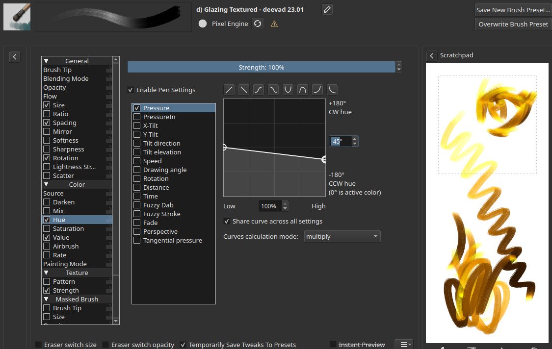
This way, your preset will works with any color selected and not only Yellow. Here is an quick scribble with various color selected.

Have fun into tweaking and adapting this method to build your brush.
Hey thanks for the quick replies!.
So for the brush method, if possible I think I would like to use gradients and filter layers etc, just so I can edit afterwards if need be.
But I tried it out and the pressure is pushing itself towards black rather then reddish(and very quickly too but I assume that’s probably me needing to work on editing the value curve more for my own pressure?)

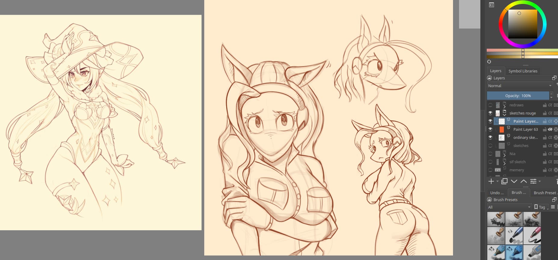
I should’ve specified before but I wasn’t sure if there was some simple option I was missing or something, but i’m trying to emulate the linework of Oxcoxa on the left.
Her lines go from a more desatured orange(it’s more orange then yellow now that I think about it) to a more saturated red.
I’ve actually talked to her about her process before and she says she uses an overlay on top of the lines with a gradient map above everything(I should specify she uses CSP), however I couldn’t find anyway to apply that to pressure in krita.
rn I’m using an overlay layer with a saturated orange clipped to the lines(which I do in a fairly dark greyscale), which gives some of the effect, just not the hue/value shift I need.
Also Ahab to you have an example of what you mean with the selection mask, thanks!.
I could make a technical illustration of what I mean about converting an opacity to a colour via a gradient map but I think that @Deevad’s interpretation of your original topic post is what you actually needed.
The method I suggested was not about drawing/painting, it was about transforming an existing image/brushstroke based on its opacity.
In this case, it’s a dynamic filter on the top, often done at the end of the artwork to enhance the presentation before sharing. I can show you how to do that in Krita.
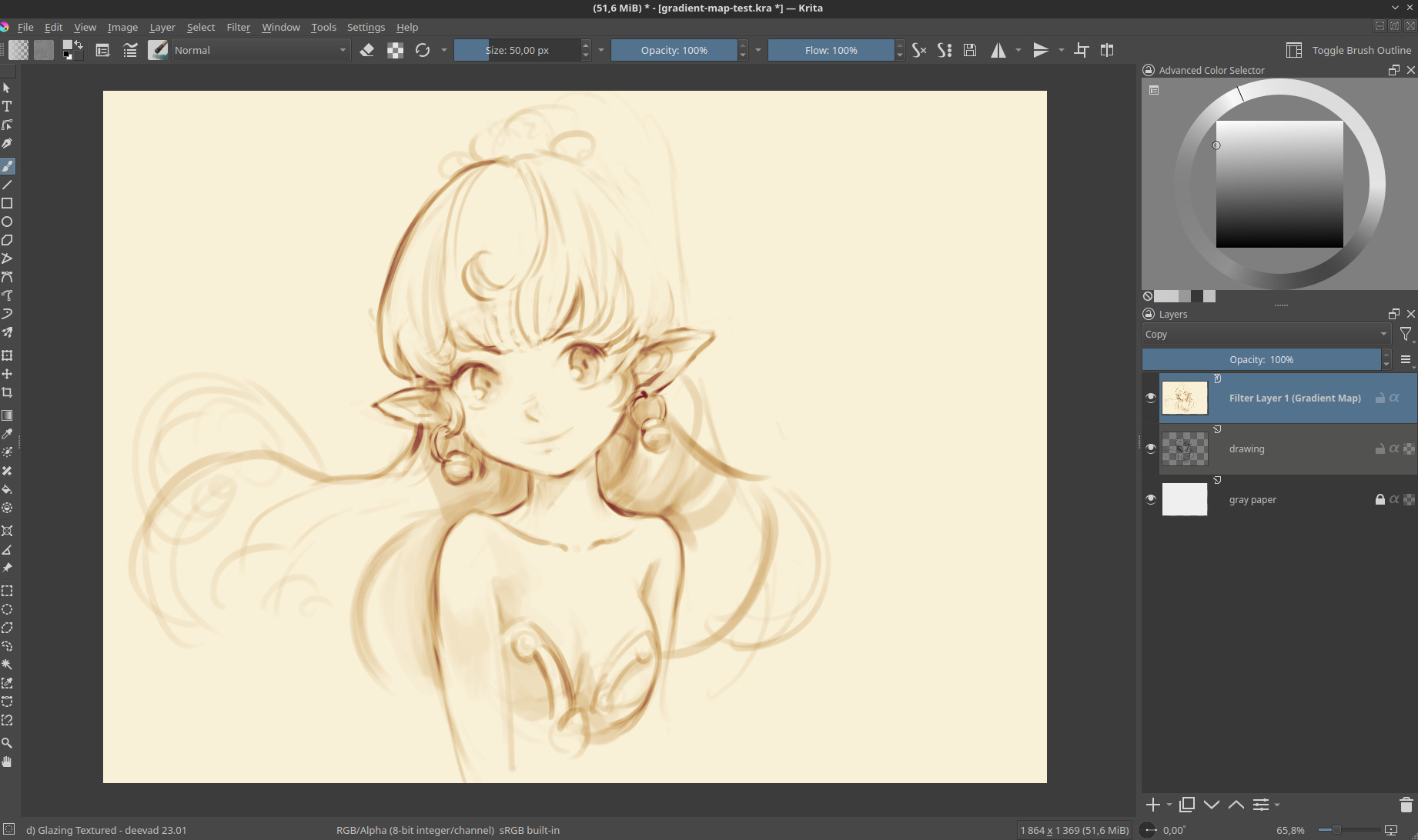
1. Sketch

Sketch on a layer, on a non-white background (pick a light grey), and draw with opacity variation to rich variation of greys in your lines.
2. Add a Filter Layer
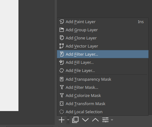
On the little arrow near the ‘+’ of the layer in Krita, you’ll find a menu to add a Filter Layer. It’s a layer type a bit special: it allows you to put a filter in the stack, and it will be dynamic: it will filter continuous every new pixels under. It’s often a bit taxing for performances (it recalculate automatically after each brush stroke) that’s why many artists prefer to keep this step for the end.
3. Set the Filter Layer to Map > Gradient Map

You’ll probably need a little fight with the graphic interface of the gradient in Krita; it’s full of cryptic options and icons grouped for reasons I have also hard time to now what or why; the easiest is to click “Choose Gradient Preset” and select a simple one and edit the nodes. You can name your gradient when you are happy and press the ‘+’ to save it.
Note: If you want to start with an easy set, you can install the set made by Rakurri → Rakurri Gradient Map Set - Free Gradient Maps 😁 .
4. Done 
That’s all, once you press OK, the filter will appear on the layer stack. You can turn it off to paint more, or directly paint under. If you want to adjust it later, you can press the “setting” icon on the bottom of the layer stack, the gradient editor will reappear.
I approve of the images in this tread ![]() The effect looks nice, have to try it one day.
The effect looks nice, have to try it one day.
I do this occasionally with a gradient behind my bacground image, then using erasure tool, I erase ( drawing ) onto my background.
thanks so much! currently away from my drawing software till Thursday but i’ll give this a shot when I get back.