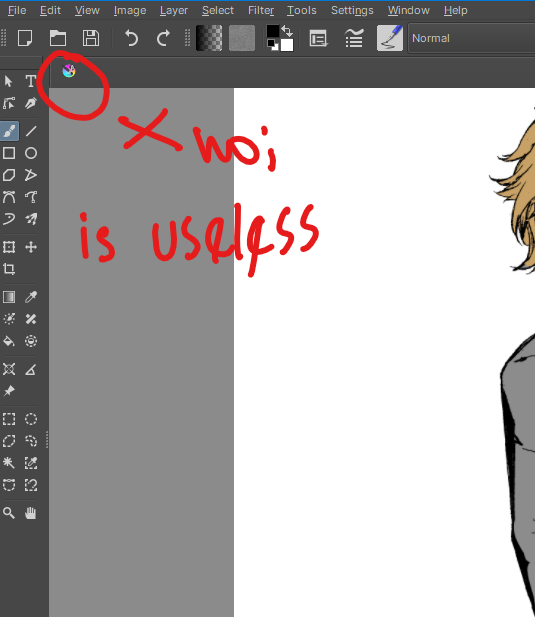
Please remove this icon from Krita tabs.
It’s just not useful at all.
Until the time for a serious UI/UX overhaul for Krita arrives, things like this are not necessary.
2 Likes
That’s a standard Qt thing and it might need a tweak to remove it ![]()
Grum999
When you have only one file you can switch to windowed mode, you will get rid of the whole tab title.
Does it hinder your work or does it create any bug?
The icon isn’t helpful because it doesn’t indicate the file type or anything else about the document. The one other program I use that has generic (not file type-based) icons in its tabs at least uses them to indicate whether the file is dirty (instead of the * that Krita uses).
The icon takes away space from file names when a bunch of tabs are open. When working on game assets, my file names often have prefixes, so the names can become indistinguishable when the tabs are still fairly wide (i.e. not that many files are open), having that extra 20px of space or so would often be enough to make a positive difference. If it had some sort of use, I’d understand why it’s there, but at present, it’s just taking space away from useful information.
2 Likes
Having the file icon based on file format is a neat idea ![]() . I think the file dirty indication also can be shown in the tab, may be with same file icon but with different colour. For the sake of sub-window mode it should be shown in the title bar when sub window mode is active.
. I think the file dirty indication also can be shown in the tab, may be with same file icon but with different colour. For the sake of sub-window mode it should be shown in the title bar when sub window mode is active.
thanks for highlighting the issue more clearly. I do not think it was purposely placed there, I think it is the result of the toolkit that krita uses, like default thing.
2 Likes
Krita already shows the dirty state with a *, and I think that works plenty well. So I think the icon should either show the file format, or just not be there. For my own workflow, I’d prefer the latter, as the file format is rarely distinctive for me, while the extra space is something I can actually make use of xP
3 Likes
Thank you. Though Krita’s window/tab system is currently obsolete regarding this aspect. At least, that’s my opinion. Subwindow mode and tab mode as they are right now, are obsolete. A better ergonomic design is to make a tab to window or window to tab possible just with a drag and drop use case. Like in the case of dockers in general. And then, remove subwindow and tab modes from the settings menu.
There are things which are not related to work hindering or bug, and yet they matter still. Think about it.
They have some importance, even if they’re not the most important things at a given moment. Because of that, they ought not to be forgotten. It’s like engineering with Formula 1 cars and the battle between engineers and visual designers to come up with a car that is not ugly but beautiful while also possessing the functional aspects required before final release.
The thing is krita window/tab system is the one qt provides. If i understand correctly. Except dirty patching. There is nothing that can be done.
That said though. I have in mind looking at external multiplexers. See what can be done ![]()
I highly agree with this!
I also think there should be an option for them to be thinner. Tabs are sometimes fantastic to work with as you can switch between many documents easily at once, but I tend to use Subwindows just because they are so large and I find the Krita-icons unnecessary and almost distracting. The Krita icons on the tabs don’t inform me of anything, and it’s some of the most eye-catching elements in the UI.
I really like the idea by eishiya, it would inform me of what file type it is, which is handy, and be less distracting.
1 Like
The icon for me makes no difference either way. My big UI problem with tabs is actually distinguishing what tab is acctually open or active.
3 Likes