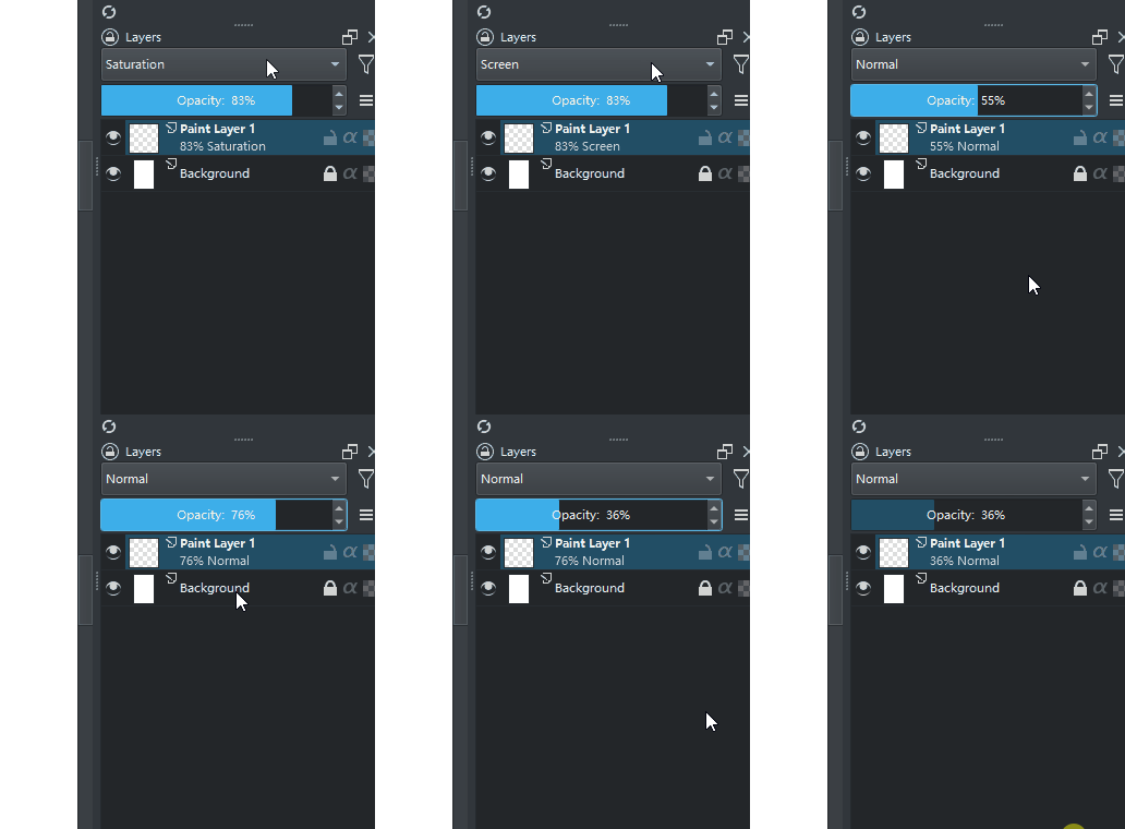
personally i find hiding options from users in config files without a way to toggle them in the interface a huge downside. this will lock this options only for tech savvy users as most common users either will not know about it or be hesitant to mess with a file. I think if there is a way to change it then making it accessible in the program is the way to go.
This for me is not important enough to warden so many settings so I can understand their request. To me it makes more sense to have on and off alone and have cool defaults for the values they use.
I have noticed the train of thought of to many new things have a lot of options added for all requests. “Just add a option for it”. I am all for options but they should be meaningful enough for me to read about them.
I would prefer if “Inline” was an option, because that way maybe I’ll use it (I’d need to paint with it to be sure).
But I think maybe agreeing on let’s say something between 70 and 85% would be a good default for all users and there would be no need for an option, and especially a slider?
If it turns out that some really want it as bright as the layer name, and some others really want it semi-transparent, maybe just a checkbox “Semitransparent subtitles”? It would take less space and maybe it would be less overwhelming than a slider.
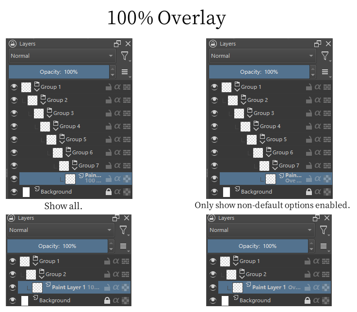
Are there plans to add only show non-default options?
Added as an option to also let people who don’t like to only show non-default not enable it.
(I know this isn’t pretty, but I still think this option is needed.)
In the single-line display of the picture you posted, the default of 100% or normal is also displayed, increasing the text length.
A single-line display doesn’t even require much nesting of layer groups to be directly viewable.
I think this could be improved if the Show only non-default option was added.
As I said before, in the nested multi-layer group, reducing the unnecessary text length, you can easily observe the changes of the layers, and you can not display the unchanged ones.
I have to stress that a lot of isolated use of inherited alpha is required during painting, i.e. using layer groups for isolation.
If you don’t do this, inherit alpha will inherit the alpha of all layers down.
This leaves less room for text to display and makes it difficult to directly view layer names and opacity and blend modes. (When viewing a large number of layers at once.)
In users who are accustomed to using inherited alpha to limit the scope of the painting, as the complexity of the painting content increases, more layer group nesting is also required.
While shorter text lengths don’t solve the problem, it allows more nesting to directly see if layers change opacity and blending modes.
i dont see how a slider can be overwhelming but at the same time after some thought, i wonder if the slider for this function is the best option. as after a certain threshold it will be almost impossible to read. that being said i think having an option to show the labels at 100% opacity is important as an accessibility option.
i think this would be a good compromise in this case.
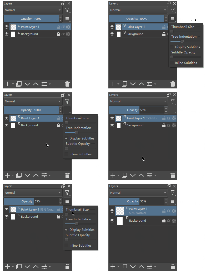
Just a thought, instead of the dropdown for the settings, why not just open a setting dialog for layer docker like we have for the advanced colour selector docker. The drop down was okay when it had few options but I think with so many options it will be better to open up a separate dialog box.
Since it’s only a few options and the “hamburger menu” is probably the menu I would expect this as a user. Also, from project to project it might be different and help organize the working document visually. @raghukamath Settings menus are for fixed settings in my opinion, since this could change anytime in the process of working, so:
Do we change it that many times though? the setting for showing the subtitles may be accessed once or twice once the user sets them in my opinion user will not bother about them again. In any case I am okay with the dropdown
None of the settings in the hamburger menu are changed much. At least i have never seen a workflow where you need to keep changing those. but i don’t think the amount of options so far is a issue that demands a new dialog window. To me the purpose of the hamburger menu is not being fast to access but to hold the options relevant to the layer docker.
Yeah, I mean coming from the saying “if it ain’t broken, don’t fix it”, I think we need to consider an extra menu once the current one is too big or complex → when and if it becomes a “problem”.
I tested krita-nightly-x64-5.2.0-prealpha-d0ff90c698 and got some confusion.
Why is this feature not enabled by default?
After this function is turned on, “100% normal” is not displayed, which is different from other software, which makes people think that it does not work.
(Even if you don’t consider users who have used other software, it seems that there is no change after turning on the function, which makes people think that it does not work.)
Under the default minimum thumbnail, there is also enough space to display two lines of text, but it is displayed as a single line.
I discovered this when I made the description image, just move the layer name up and you can put down two lines of text of the same size.
Is this because it can’t be done in actual programming? (Such as qt restrictions and the like.)
The MR has been merged to Master (5.2.x) in its current state, since any changes can be made later. Apparently it’s also in the Nightly build by now.
I didn’t want to change Krita’s existing behavior.
I’m aware that it can cause confusion when it appears to do nothing, but I also prefer “100% Normal” not to be displayed because it’s less cluttered that way. I haven’t found a solution to this yet.
Did you have inlining manually checked? Otherwise, it should properly check whether there’s enough space.
I never added it. The preferred solution to this issue is a different feature (adding a horizontal scrollbar), right? It’s just on the table for now.
i just tested this on the nightly and thanks a lot for this! its such a small change but really helps. that being said i have some suggestions.
the first one will sound like a contradiction to what i said in a early post but hear me out. I think tiar suggestion is better than the slider:
My main issue with wanting the slider was that leaving the option to put text at 100% opacity to the config file was a bad idea idea, after testing a bit, the variation of the lower opacity doesnt seem that much, i think just the checkbox would be enough.
One way of thinking is that checkbox would set it to either the lowest opacity on the slider or 100% opacity, and any other variation could be changed in the config file. And i know this sounds like a huge contradiction to what i said before, but the way i see, i think that most users would either put it at the lowest setting or the 100%opacity. so in this case i think fine tuning can be left in the config file if we have a checkbox option. But would be better to have more people to test this first.
thats kinda unfortunate i would also like to be able to see 100% normal, but the only way i see everyone being happy with that one is another option in the menu, and just having 3 was already making people complaining about bloat, imagine 4.
Honestly at this point i would be happy with just a config file option to show it (cause i am also a bit tired of fighting to have an option on screen), as i dont think not showing is something that breaks the user experience (like the lower opacity could in case of the people not being able to read it), but its so weird to not see 100% normal when you have one layer that is different.
I can understand not wanting to change the existing behavior of krita.
What I was trying to say was that if enabled by default, users will be pleasantly surprised when they change the blending mode or opacity to see them appear on the layer.
(As far as I know some people don’t check what’s new or changed in krita.)
This may solve the confusion that “100% Normal” doesn’t show up after manually enabling the feature.
Since the option is already provided, users can turn it off if they don’t like it.
So I asked earlier why it is not enabled by default.
I don’t have inlining enabled, but it does appear as a single line on the default minimal thumbnail.
Refer to this gif.
Yes, adding a horizontal scroll bar can solve the problem of long text nested in multi-layer groups, but no one has implemented this function at present.
So I thought maybe adding the show only non-default option could be added to alleviate that.
Also I think showing only non-default options would also reduce the confusion as to why “100% Normal” doesn’t show up when the feature is enabled, if it exists and isn’t enabled by default.
This is my idea, the decision is yours.
Thanks again for your work, I’ve wanted opacity and blending modes on layers for a long time.
This was the topic at the time. (2020 topic.)
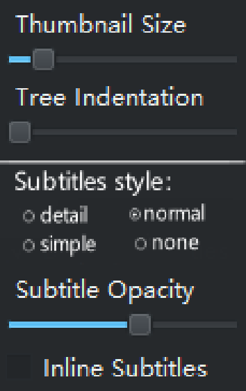
My idea was to change “display subtitles” to a selectable option:
detail、normal、simple、none
detail:Display all parameters, including “100% normal”.CSP is set like this, and many people prefer it (including Halla). It is also neat and beautiful.
normal:This is the current option, which is displayed in cases other than “100% normal”. It is easy to see which layers have been changed. The problem now is that when you open “display subtitles”, it will be confusing to find that the layer display has not changed (100% normal). I saw Halla express the same doubts in Mr.
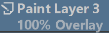
simple:Separate opacity from blending mode and show only the changed options. For example “100% overly” only shows “overly”. “45% normal” only shows “45%”. If the two values change together, they appear at the same time. Many times we do not adjust both at the same time, it is beneficial to compress the space.
None:Not displaying any information, as in 5.1 and before, is equivalent to closing “display subtitles”.
It looks like there’s just barely not enough space, when taking into account the need for spacing/borders.
Edited from your Gif, using the “Paint Layer 1” string because it has text that goes below the line (“y”).
Compared to when you have it set taller;
For comparison, this is how it looks for me on the shortest setting (HiDpi, fullsize screenshot). It just depends on the setup.
Thank you for your reply. I just found another problem in my testing:
When I switch blending mode, the parameters change quickly. But it sometimes has a 3-4s delay when adjusting the opacity.
Is this an intentional setting and will it bring performance issues?
Thanks for the clarification, now I know.
Considering the need for the spacing between the upper and lower lines, the default minimum thumbnail cannot be two lines.
(If I understand correctly.)
But this brings a new confusion.
After it is enabled, it is found that it is a single line, and the thumbnails need to be adjusted to be larger to display two lines.
And the options don’t tell that.
This can lead uninformed users to think that it can only be displayed on a single line.
Maybe this should be stated in the option mouseover description?
Or modify the default size of the thumbnails to be larger thumbnails, enough to display two lines?
In addition, consider from the convenience of other software users to get started with krita.
I think maybe it should show two lines by default when enabled?
(Other software displays multiple lines by default.)