I think we should keep it simple 
I don’t think it’s complicated, it’s not 4 separate settings, it’s a 4-choice window. Two of them correspond to the current “display subtitles” on and off. The other two are the way that many users prefer. The rest of the settings have not been changed (except for the addition of a horizontal line to distinguish between them)
In addition, I personally think it is important to keep things “simple” where there is not much demand. At present, many people have mentioned other ways, and even developers may be confused. So I think it’s not a bad thing to add appropriately.

Yay! Bravo 
+1  .
.
I find labels (detail、normal、simple、none) confusing and requiring big tooltip to explain what it does. Future users might need to select all of them to get an idea of what they do and do more reading. Not fan.
If it is required to get “a less info” to “more info” option, I would prefer in the GUI a simple slider for verbosity going from no info, to subtle info, to maximum info.
You can see in the Gif that it changes when you mouseover the layer. The reason for this is because your test layer is empty- it doesn’t bother updating the opacity because it doesn’t change the rendering, at least that’s my assumption. With a layer that has something on it, it should update automatically.
Maybe a tooltip on the “Inline Subtitles” option that says something like (rough wording)
"If enabled, show subtitles on same line.
If disabled, show on a second line if there is space."
Re: “Subtitles style” option; it’s probably better to use a combobox (like the blending mode) than a list of radio buttons.
In the MR there was also a suggestion to change the “Subtitle Opacity” slider to a slider spinbox (like the layer opacity), which lets you precisely input the value. (And to change the “Thumbnail Size” and “Tree Indentation” sliders as well.)
For something like this I think the easiest way for a user to figure it out is to test out the options and/or read a description. There’s not really a way to “simplify” it other than giving no options.
I think a slider from less to more info sounds confusing, since it doesn’t really tell you what it does, and sliders are more for numerical inputs.
What I meant is that I wasn’t going to change existing behavior without a good reason. If there’s support for enabling it by default, that can be done.
Good point.
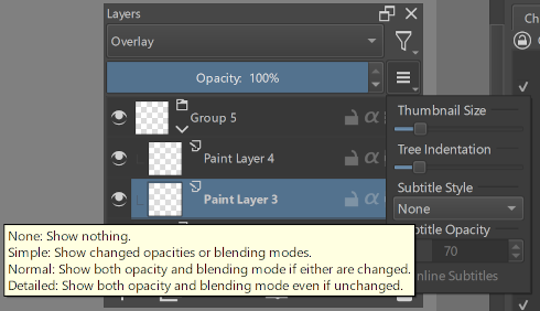
looks great.
Your description is more accurate and concise than mine. However, there are not many hovering prompts in krita, so it may be difficult for users to detect it…
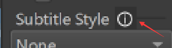
I have two ideas. One is to add a prominent symbol for hovering prompt information:
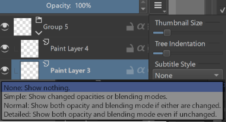
Another is that we directly display sufficient information in the drop-down menu, but keep the selection box concise.
Another option is making the “subtitle style” just a plain submenu with 4 radio actions.
What i would do is grouping all the subtitle options under a “subtitles” submenu. Then inside have a “style” submenu, and the other options.
In the mr I suggested the use of slider spinboxes primarily because they can have a text, so those section headers can be removed. I think it would look less cluttered.
Amazing progress! Thanks to everybody 
I’m not the only one who thinks that Simple or Normal subtitle mode without inline would be a reasonable new default, right?
For the first idea, I’m not sure if it’s possible or advisable to put an “information icon” there.
For the second idea, as far as I know it’s not possible to display different text for the dropdown and the currently selected item. I’m also not a fan of putting that much detail in the dropdown selection (as shown).
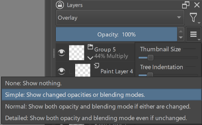
It only takes a second of hesitating over the option to find the tooltip, so it shouldn’t be too much of a problem.
Here’s what it looks like with the label properly displayed on the slider spinbox, and a tooltip on “Inline subtitles” (still not sure about the wording). Hopefully it’s clear enough that “Opacity” (minus the “Subtitle” prefix) is under the “Subtitle Style” heading.
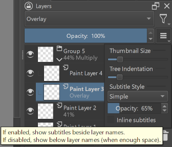
Submenus three ways:
First, with a combobox:
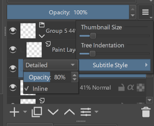
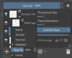
With radio buttons:
With radio buttons in their own submenu (it’s a bit awkward how the menus overlap with the docker attached to the right side of the window):
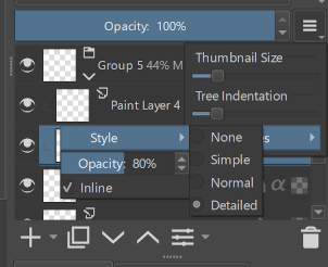
I still prefer a combobox to radio buttons; there’s no need to see the options unless you’re choosing one. I’m not sure whether putting a submenu inside the hamburger menu is a good idea. If more options were to be added to the Layer Docker Menu space might become an issue, but right now it isn’t.
I’d also like to express my appreciation for everyone’s help and feedback. 
I mean, the hamburger menu is a menu but it does not look like one with all the custom widgets. Both the radio buttons and the “inline” entry can be normal menu entries.
Even the sliders could be changed to a list of entries with predefined values.
Thank you for implementing this new feature! It’s very helpful when working with a lot of layers with different settings. And I’m using 5.2 from now on, just because of this!
However, I really had difficulties with its UI and the default settings. I was unable to figure out – literally anything – at first. Because when I was casually testing it, I created Normal layers (of course), so nothing has changed, no matter what I clicked!
It was a very confusing experience. The name “Subtitles” did not help either, I thought it was something like subtitles on the bottom of a movie screen…
And coming from an experienced Krita user, and an experienced translator, my complete failure to figure this out before consulting this thread, was a real concern to me.
I think the following things would be essential to improve the user experience:
- Display the “subtitles” on all layer blending modes, including “Normal”. In this way, a new user can easily figure out what this option is for.
- Automatically increase thumbnail size when “subtitles” display is enabled.
- OR, Inline by default, use the checkbox to enable double-line. In this way, you won’t have to worry about the height not being enough.
The same happened to me
The proposed solution is changing the checkbox to a list of style modes. In “Detailed” mode subtitles will display on normal layers.
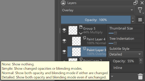
(Also, I’ve been thinking maybe the “Normal” style (3rd option) should be called “Balanced”, mostly because “Normal” sounds odd here.)
The intended meaning of “Subtitle” is “Subheading”. Maybe the latter name would be less confusing?
It would require finding a way to calculate the required height, and it would change the height which the user might not expect.
This might be a good idea. I didn’t think it would be confusing, but having inlining on by default would avoid the default appearance depending on the ratio of font size to layer row height.
“Subtitle style” can be changed to:
- “Improve readability”
- “More Information”
Which of the two do you like?
Four options can be changed to:
- “None”, “Show after change”, “Show only change”, “Detailed”
- “None”, “After change”, “Only change”, “Detailed”
- “None”, “Change”, “Only change”, “Detailed”
There are three in total, which one do you think is better?
I think this is a better illustration of what actually works.
In addition, can the spacing be reduced to solve the problem of not being able to have two lines under the default thumbnail size? For example, reduce it to 1px.
Or just use the two-line special case at the default thumbnail size.
I too find the ”none, simple, normal, detailed” options pretty undescriptive. But is “Normal”, where both opacity and blending mode are shown if either of them are changed from default, something people have called for? To me it seems pretty granular, and maybe just something like “none”, “non-default only” and “always show” would be enough? So these would map to “none”, “simple” and “detailed”.
I think subtitle could also be changed to something like “layer info”, or something that relates to the layer status.
One thing though, it would be good if in the tool tip it was described what the change was, like “display opacity or blending modes if they are different from normal and 100%”. As the way i see changed could be also seen as going from 40% Multiply to 100% Normal and in this case it wouldn’t be displayed.
The actual problem is that user’s font size varies. If you have a small font size, you’ll be able to fit multiple lines. If you have a large font size, it won’t fit. All I can do is check whether it fits or not.
They aren’t meant to be descriptive so much as short and clear.
Something like “None, Either on change, Both on change, All” is both unclear and not going to make sense at all unless you read the full description.
“None, Simple, Balanced, Detailed” describes the intent of the options.
(Meaning, if you want simpler or more detailed information, use the corresponding option. If you want to know what the option actually does, read the tooltip.)
Yes. I think all four options are useful. The reasoning for this particular option was that it looks better in some circumstances.
“Changed” is meant to imply that the user changed something from the default. I’d like to keep the tooltip concise.
Re: “Subtitles” → “Layer info” or similar;
I think “layer info” is a bit vague, given it’s the point of the entire docker.
“Subtitle”/“Subheading” at least describes where the information is (“this specific text below or beside the layer name”).
I think I’ll start cleaning up my current changes to put in a new MR.
The main change I’d like to commit is changing the on/off checkbox to the list of four styles; this adds new functionality. Any other changes would just be UI tweaks and deciding on the default settings.
Then maybe I can take a break from all this UI discussion (and work more on an unrelated feature request).
How about adding a checkbox and mention the components that can be shown. example
Show with layer name:
[x ] Opacity
[ ] Blending mode
And If user ticks any of these show component by default even if it is not changed.
I think this will make it straight forward and will eliminate the need to show other options such as none or both.