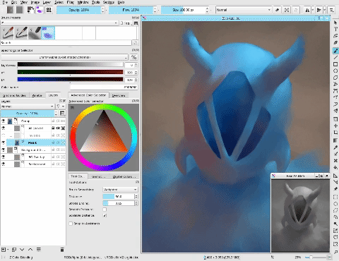
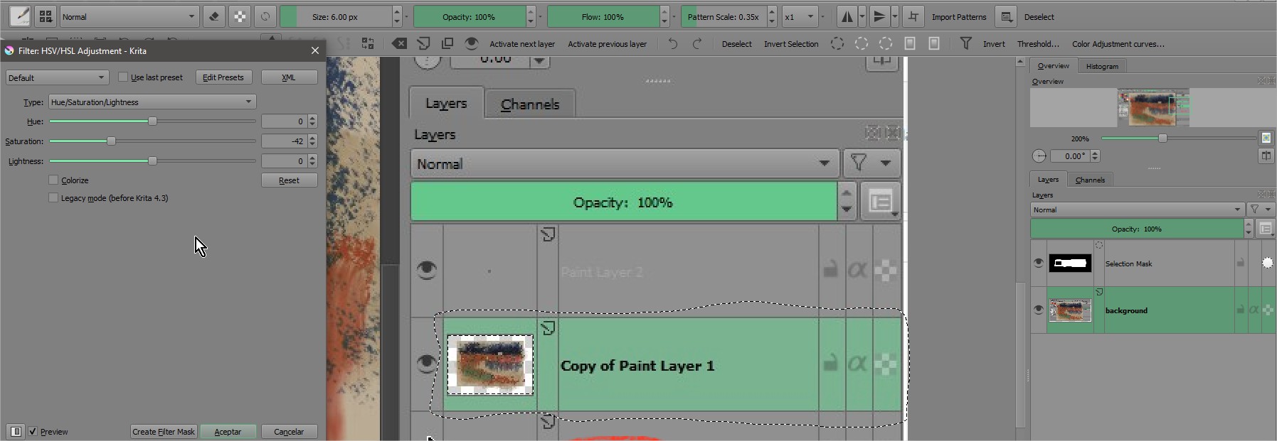
・Contrast of items, dockers and texts are better balanced now
・Made the undertones a LOT more subtle
・Small change in accent colors
・More consistency across themes
・Changed the themes names to be shorter
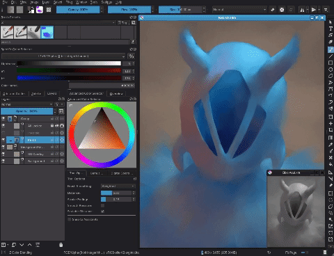
There are a lot of themes to maintain, so this will be the last update with undertone and the goth themes. Soon I will make some changes in the themes:
Remove the undertone
・Having undertones in themes makes them harder to maintain since it takes a lot more work to make any change at all Remove “goth” themes
・Even it is almost gray, the undertone can mess up with your color perception
I’ll modify the dark and darker themes to be darker (darker will probably be as dark as the goth theme are)
You are still able to download previous versions if you want the undertone
The name of the themes has changed, so replace the old files for the new ones
The green would be perfect if i can reduce the saturation a bit. So i tried to reduce it in the captured screen and then discover that the greens in bg as no active screen focused are better for my eyes.
Interesting
Also the barely visible note is when you isolate a layer. MAybe you then decide to go to other layer and a not so “barely visible” would fit better imo. Maybe this is too custom for me. Anyway thanks.
Hi Ramon, thank you a lot! Sorry for not replying you sooner, I was offline the past days.
About the different icon colours, this is a bug, icons colours are automatically handled by Krita based on how light/dark the theme is, some things don’t change when you select another theme, then you have to restart Krita for it to change.
About the low contrast in isolated layers: I never use it, so I didn’t knew about this issue. I tested and this happens in the neutral theme that comes with Krita by default, then I guess it is just how Krita behaves, apparently it always makes the text on this mode to be a mid-grey no matter what theme you are using (maybe a bug report is a good idea, but I don’t know if it is worth it).
Since you pointed out about saturation in the green theme, I think the accent colours of neutral themes may benefit from being less saturated/less brighter (since it’s kind of the point for neutral themes to be as neutral as possible). To finish, I don’t think there is a way to make the transparency of the selected brush less transparent, probably handled by Krita as well.
That said, thank you for your feedback Ramon, I’ll take notes to the next update!
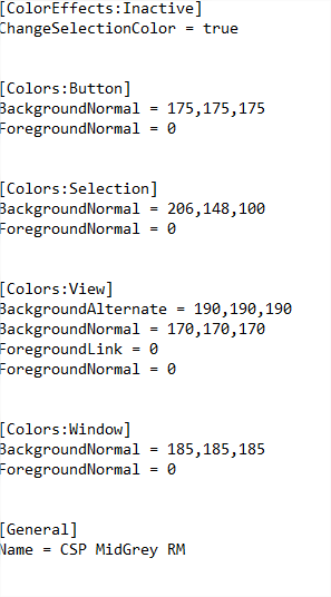
Unfortunately no, there is no option to change de scroll bar color, it’s automatically choose, the 2 base colors to create contrast between the scrollbar and scroll bar background.
Does this work with the recent version of Krita? (5.1.3) I did everything that could help set/install the themes, but it didn’t work
I understand if it’s only for v2.1 I just really wanted a different theme than from what Krita gives.
Edit: It actually does! I just didn’t think that you’d have to set the theme into the file of Color-scheme and delete the prev file. Ty for your time ^^
When can we see neon lights in krita?
And thank you for your appearance, they saved TE’s nonexistent eyes.(ah…need not try to understand this sentence)well…good day every day!
Hello, could you make these brushes for the new version of krita? I liked them very much, but I can’t download them to a new one, because another old file krita…
This IS NOT about brushes, but about modifying the look of Krita.
Furthermore, these themes work flawlessly for new versions of Krita, it just seems you do not know what is what and how to apply or install something to Krita …