I’ve been looking into the bug for a little bit, but a doubt has arisen. Where are the translations stored when cloning the repo @halla ? I’ve searched for “subexposicao”, which is a portuguese term included in the blending modes, but I couldn’t find that anywhere in the repo.
Also, this bug doesn’t happen in Portuguese, so I’m intrigued. The brushes box appears to be correct, which adds more to the strangeness.
essa palavra nao leva traço? “sub-exposicao”
percebo a falta de til e cedilha mas o traço parece internacional o suficiente para ser incluido se for assim que se escreve.
Short answer: Nowhere, because translations are not in the git repository (yet, at least).
They are in the SVN repo for KDE translations, and they are somewhat scattered because the repo is divided by language at the top level, and then by app below (which makes sense from the point of translators, but is not so convenient for us developers)
But boud recently created a Python script as part of this merge request that fetches the translation files:
It worked fine for me to download all the files into the po/ subdirectory, you just need to rerun CMake so it gets detected and added to the build targets.
I have to say that seeing this plugin work well on translated krita, and all the buttons having the right size was very pleasant. Big thanks for spending this time on bug fixes
I’m only doing it because you guys are awesome, and it feels great to be a part of this community If I can do anything to improve this awesome tool, then it’s time well spent!
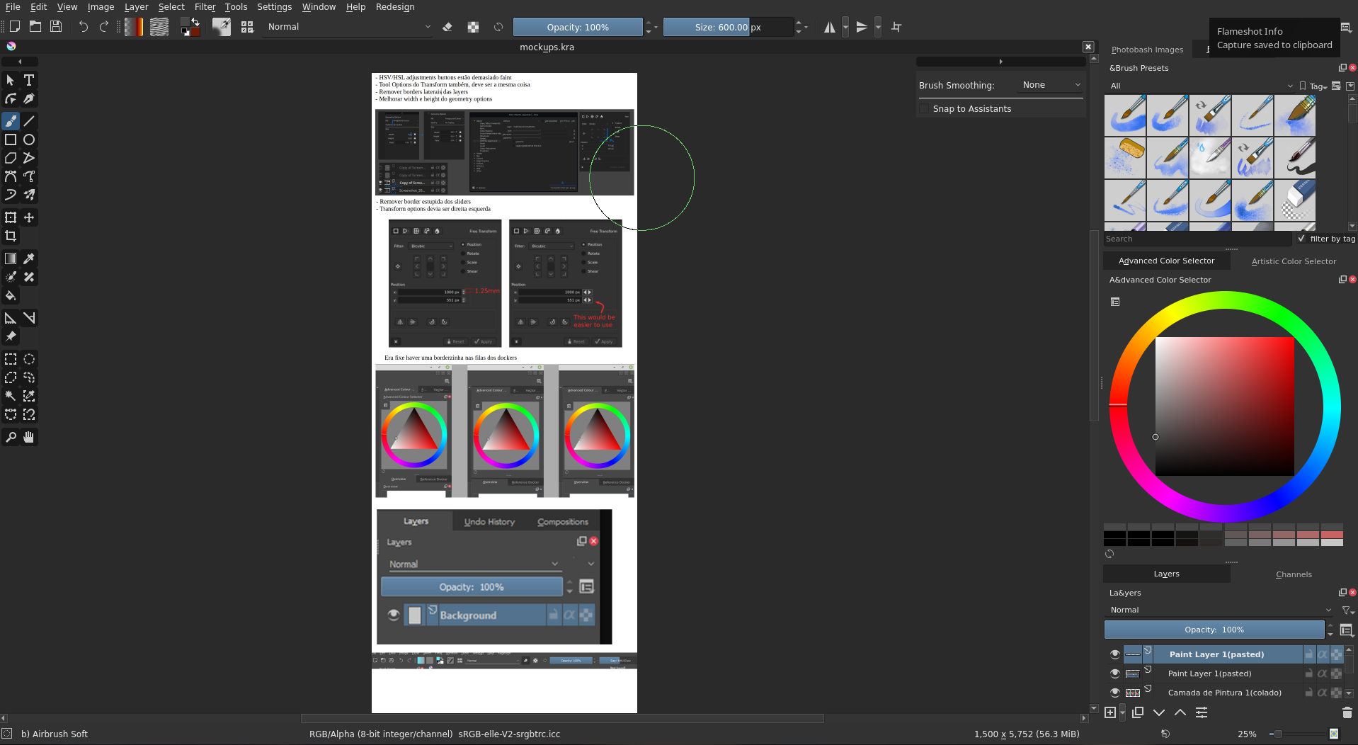
Removed button outlines
I think the icons without the outline are much less attention-grabbing. I feel that my eyes focus more on the canvas when the buttons have less contrasting elements. Activated buttons could still keep their shaded box. Though, there are some things I really like with the outlines! For instance elements in the UI, “OK” and “Cancel”, or dropdowns in menus, the outlines work pretty well!
Having thin lines beneath wide dropdowns
The downside of not having the outlines are elements like the Blending Mode dropdown, which kinda looked like it was floating in space without them. Therefore I think something like a line beneath, connecting the text with the dropdown arrow, would make it look like a dropdown again. It could also look nice to have the current outlines on just those elements.
Having separation lines between dockers
I think the lines above tabs can contribute making the dockers easier to identify, and visually separating them! I think the extra lines add order to the interface.
@slightlyangrydodo first of all a lot of thanks to you! I really like how this theme/addon makes Krita cleaner looking and I see that it is a lot of work. @rakurri I totally sign the removal of the button outlines and the “split” lines between the dockers. Nice ideas!


 Thank you!