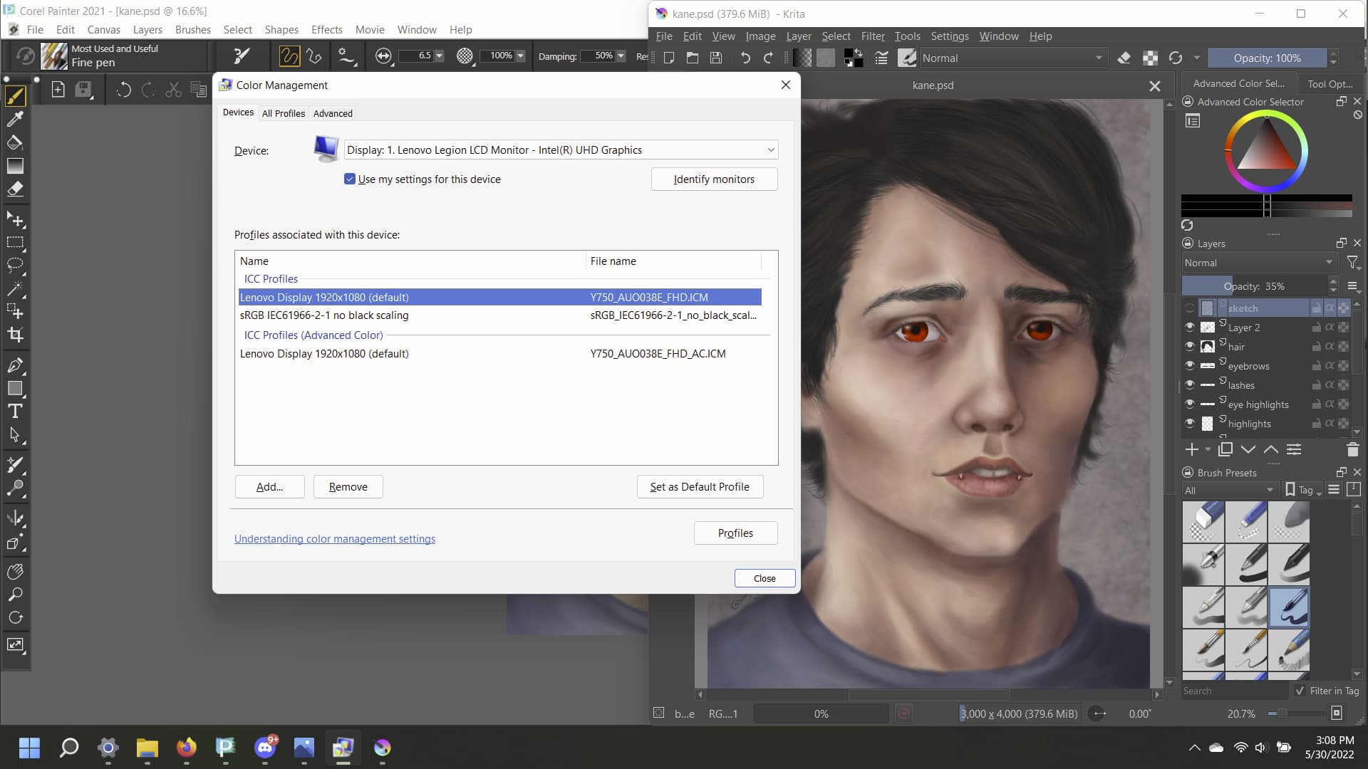
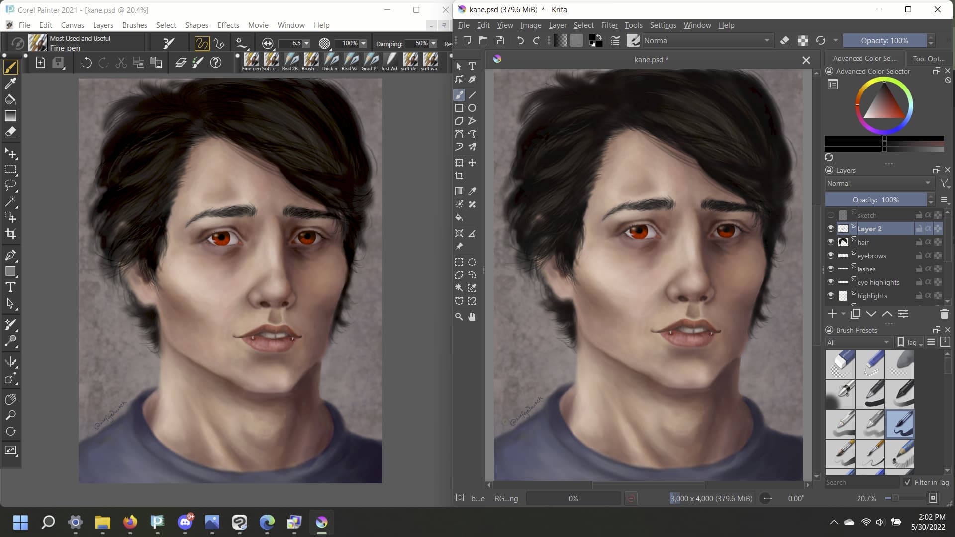
This is the same PSD file open in Corel Painter on the left, and Krita on the right. They are both using sRGB IEC61966-2.1 color profiles. Can anyone tell me why they look so different?!? When I save the files as something that can be read by my default photo app, they look like the Corel Painter version rather than the more saturated Krita version.
1 Like
I noticed the same between my Laptop and my xp pen artist 12 pro, thought it was my xp pen, cause this is new ![]()
In your case, it is most likely due to the difference in color gamut between your laptop screen and tablet screen. XP pen 12 pro covers 100% SRGB and I assume your laptop screen has more or less.
I think Wolfe is still on the screen of the same device.
1 Like
Welcome. I don’t know the answer unfortunately but this sort of divergence has haunted me since I’ve been doing this… we be interested in seeing the responses.
Do you have a display profile loaded in either program?
This is on the same screen. And yes, i have the same color profile loaded on both. I actually went through all of the color profiles Krita has built in, and none of them looked like the original artwork.
I didn’t mean the document’s colorspace, I was wondering if you have a different profile loaded under the display configuration settings.
No, I just double checked; the display is set to sRGB IEC61966-2.1 as well.
Is there a solution for this? Because if an art program doesn’t display colors correctly, I can’t use it.
How do the image look in photoshop? And what’s your “default photo app”?
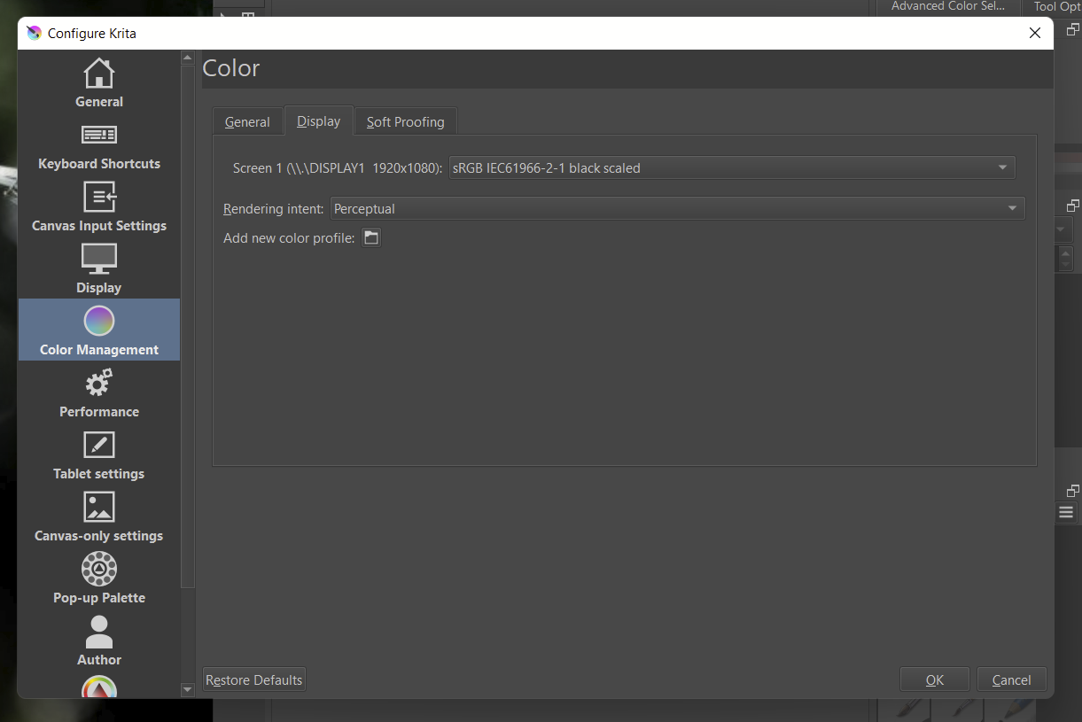
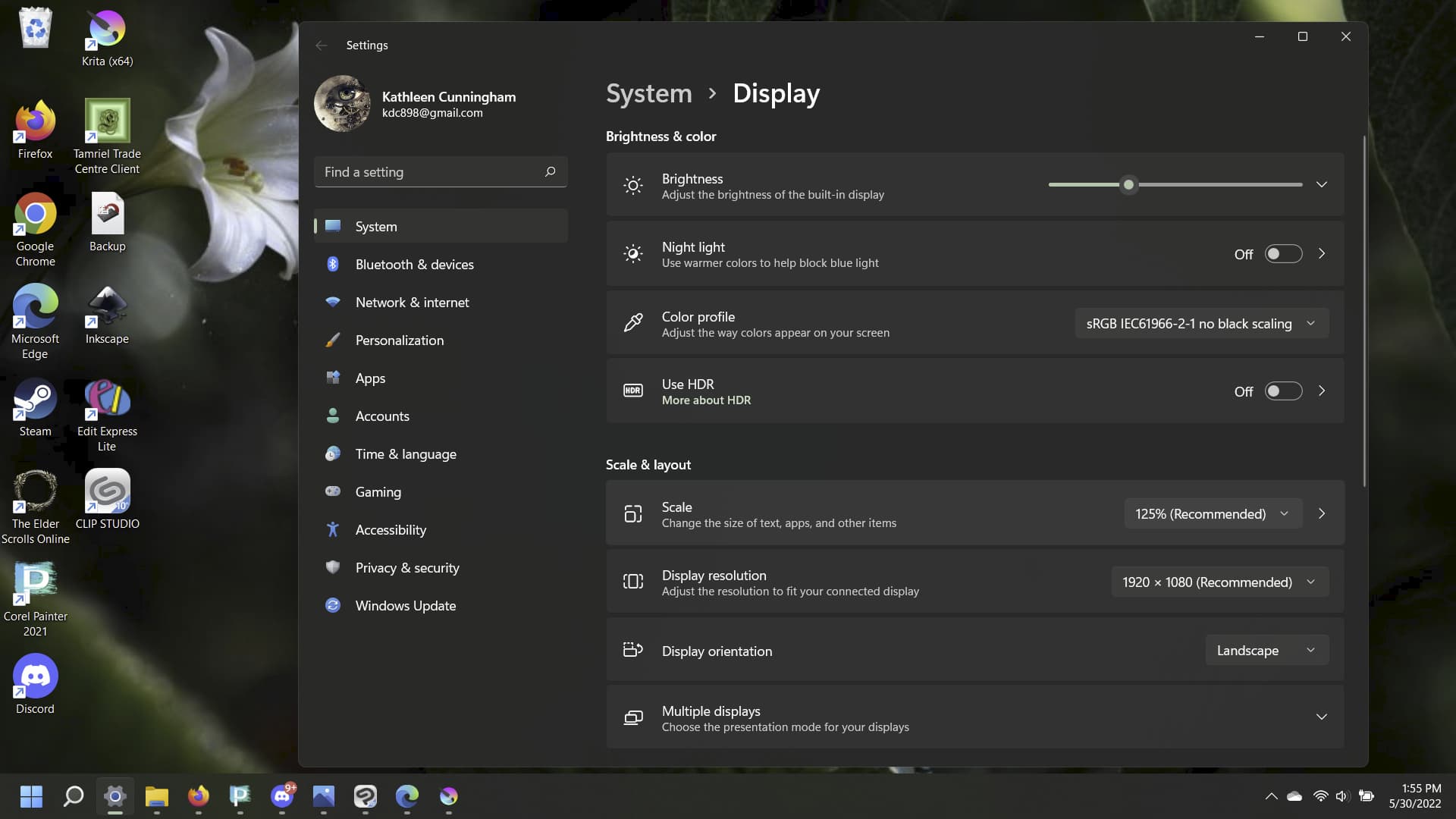
And just to be sure, you also don’t have “use system monitor profile” checked under color management / Display ?
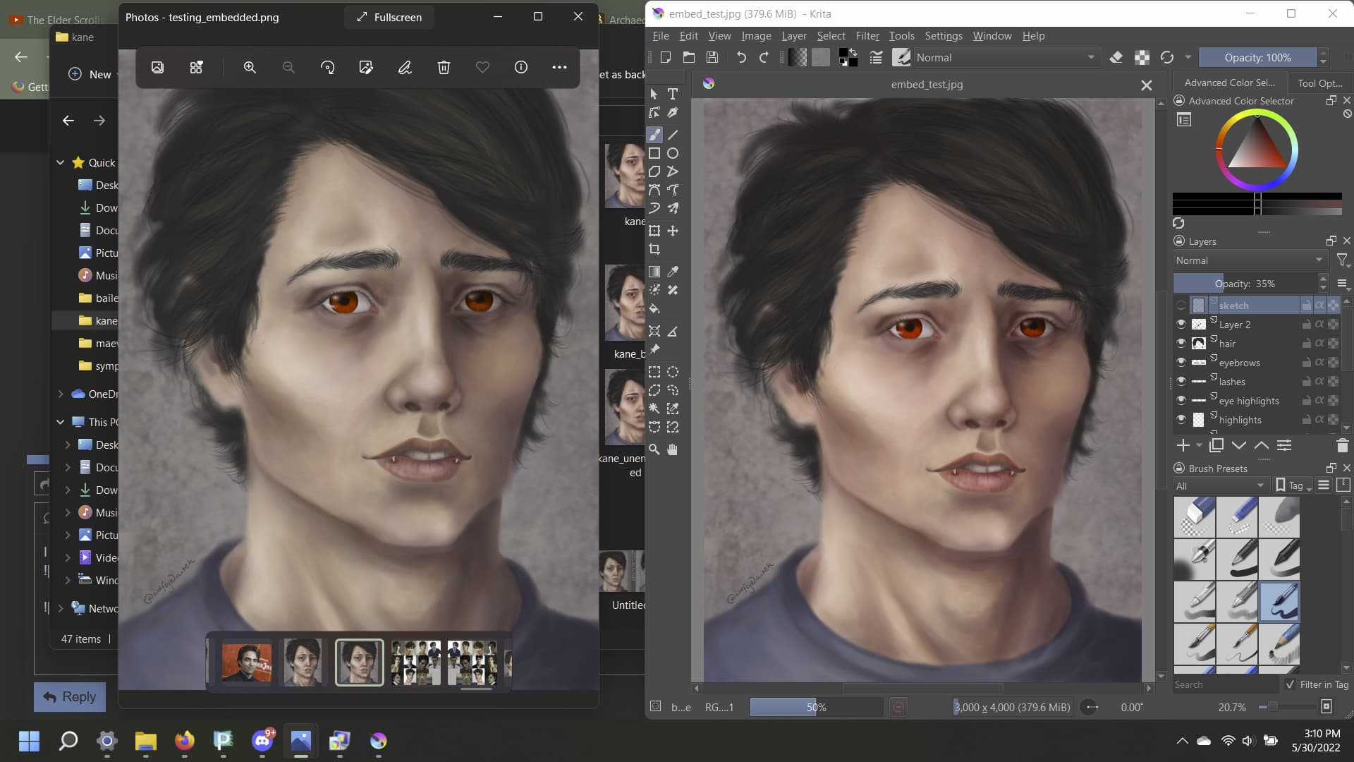
I don’t have Photoshop, so I can’t answer that. I do have the trial version of Clip Studio Paint, where the image looks like the Corel Painter version when previewing it with the sRGB IEC61966-2.1 color profile. My default photo app is the Windows “Photo” app. I’m using Windows 11. When I upload the images to the web, they look like the Corel Painter version.
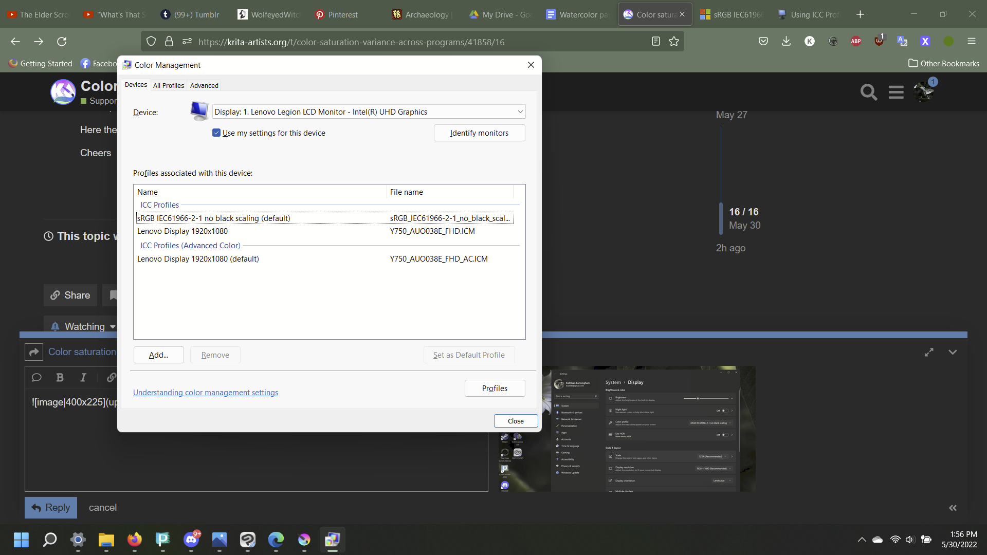
As for the color management, here’s some screenshots:

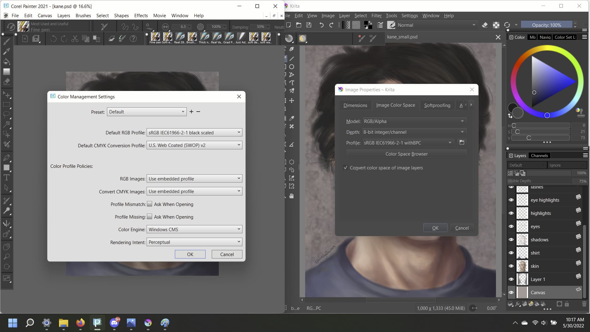
This one shows Corel Painter on the left and Krita on the right.
Did you tried unchecking the Blackpoint Compensation in Krita? By the name of your color profile I would assume it already has blackpoint compensation.
Maybe in your case this operation is being do it twice in a row messing with the color?
@Daishishi just tried, didn’t make a difference
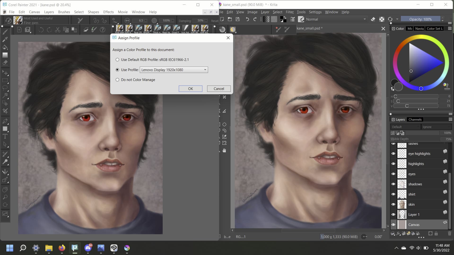
I did manage to make the Corel version to look like the Krita version by changing the color profile to Lenovo Display, if that helps.
Then maybe Krita isn’t pulling the profile from your custom color profile, and using the default one.
Or Windows is messing around and overwriting Krita profile with the system one. (Never underestimate MS Windows ability to intervene in programs)
I saw this post on Microsoft Help Page: sRGB IEC61966-2.1 not working in Windows 11
Don’t know how relevant this is or if it is already fixed.
Another thing, I also remember helping an user downloading this specific profile. On the following topic: Anyone have idea where we can get the sRGB IEC61966-2.1 color profile file
If you don’t already have, you can trying the .icc file provided in the topic above (A sugestion of course). Maybe then Krita will use the correct color profile. Also note that this file has no black scaling.
Here the page of the color profile if you are in a hurry: IEC61966-2.1 No Black Scaling
Cheers
Okay. I downloaded the .icc file and installed it on my computer. I set it as the default. I uninstalled and re-installed Krita, just to be extra super sure.
And upside is, both my art programs now display the file the same way!
Downside: it doesn’t display them the way it’s supposed to look, or how it looks when uploaded to the web or opened with Photos.
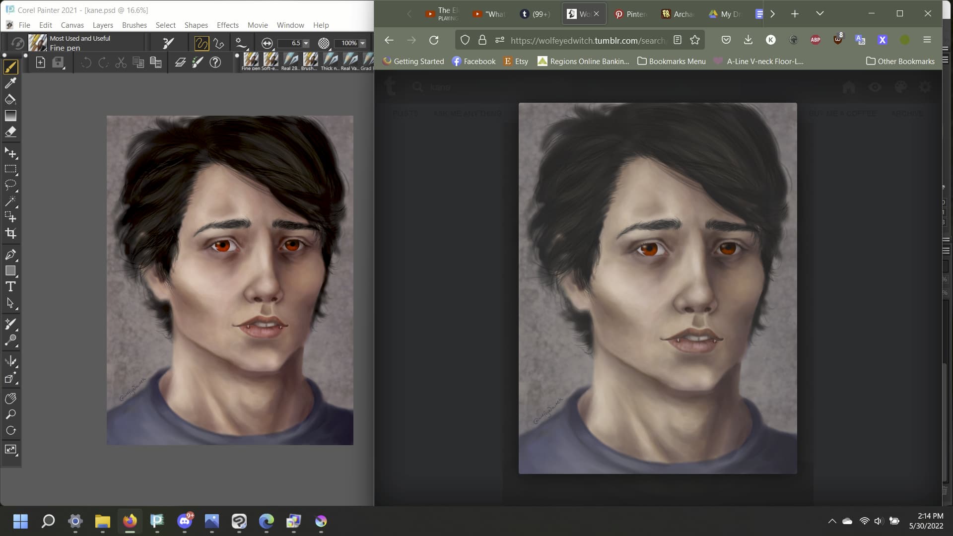
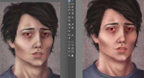
Left: Corel Painter, right: tumblr (how I intended the image to look)
So basically instead of fixing Krita to look like everything else, it made everything else look like Krita, which is not what I want.
I was able to swap back my default color management in Windows to get everything looking the way it was, thankfully. This is frustrating, because it feels like we’re right on the edge of solving it but not quite managing.
Are you sure the Photos/web look is the ‘right’ saturation for this profile? Maybe Krita was displaying the right saturation all along, and Corel showed the right color profile with the new .icc file.
Some possibilities about the exported image:
- The web browser and image viewer use a default color profile, ignoring the IEC61966-2.1 embed in the image
- Are you double sure your exported image is embedding the color profile you’re using?
On another note:
You swap back to the original Lenovo Display (Default) or a previous IEC61966 you had on your computer?