Looks amazing.
1 Like
beautiful work!!! May I ask you a question?: when you draw buildings and interiors as in the first post, do you use some 3d program or do you construct perspective from scratch in krita? If so, what is your secret to draw fast and without making mistakes?
2 Likes
You can follow @Deevad artwork process on his blog ![]()
Specific blog topics about making-of
And this one might be interesting for you:
Grum999
3 Likes
Thank you @Moliraza and @chetanranjan !
@Anna_Rita_Verni : for this ones, no 3D, I just try to paint large shape at first (as if everything was wrapped in a large clothes, tied up closely), it helps me at shading and keeping solid edges. But I also use 3D sometime, for complex view angle in my webcomic, or for illustration (thanks @Grum999 for pointing to my making of, a lot can be found in it).
I also published a DVD training in 2010 (obsolete now) about that technique (new and a bit taboo at that time, it had same feeling than artist painting over AI generated art now I guess; always the good old fear of anything new).
A trailer is still available Blend & Paint, Blender Foundation training video - YouTube , and the content can be found also on Youtube (but as I said, it uses an old version of Gimp and Blender, the content is mostly obsolete to learn nowaday).
3 Likes
A Kiki but with another color palette, fixing bugs.
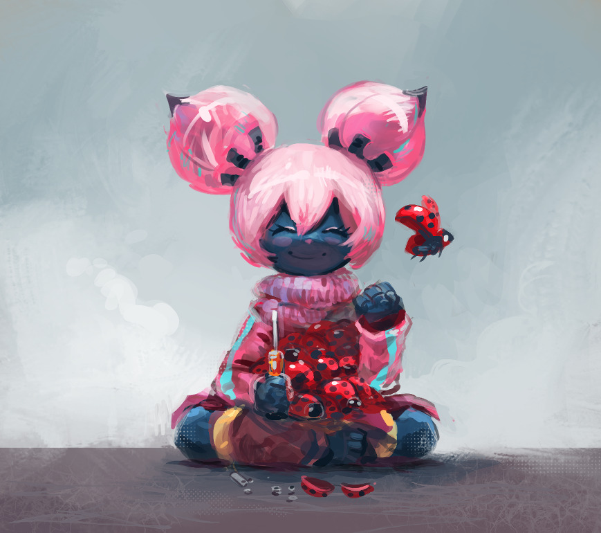
Maybe an artwork to help to illustrate future krita.org blog post reports ( CC-By ).
21 Likes
That kiki look like an anime character that is cute and all but it will rip your heart out just for shit and giggles. LOL. Love it
1 Like
A fan-art of Tifa Lockhart from FinalFantasy 7, to test the Sketch brushes bundle of @RamonM , very good bundle, highly recommended. → SK Sketching in Krita V1

14 Likes
tifa! ![]()
1 Like
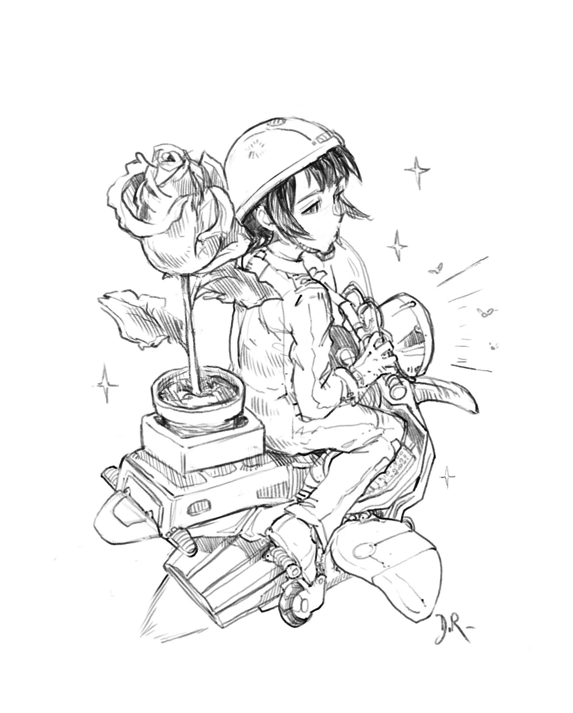
Here is a little delivery girl on a flying motorbike, delivering a huge rose in the sky.
A sketch I sent to the family of Kim Jung Gi for support. I tried to draw it directly and improvise on the way just to do a quick tribute my way. I hope they’ll receive plenty of drawings and little words of support in the dedicated email.
21 Likes
That’s lovely - I thought of him as soon as I saw it. ![]()
1 Like
RIP kim jung gi… its so sad.
1 Like
Studies: training anatomy, with references, thanks quickpose website.
10 Likes
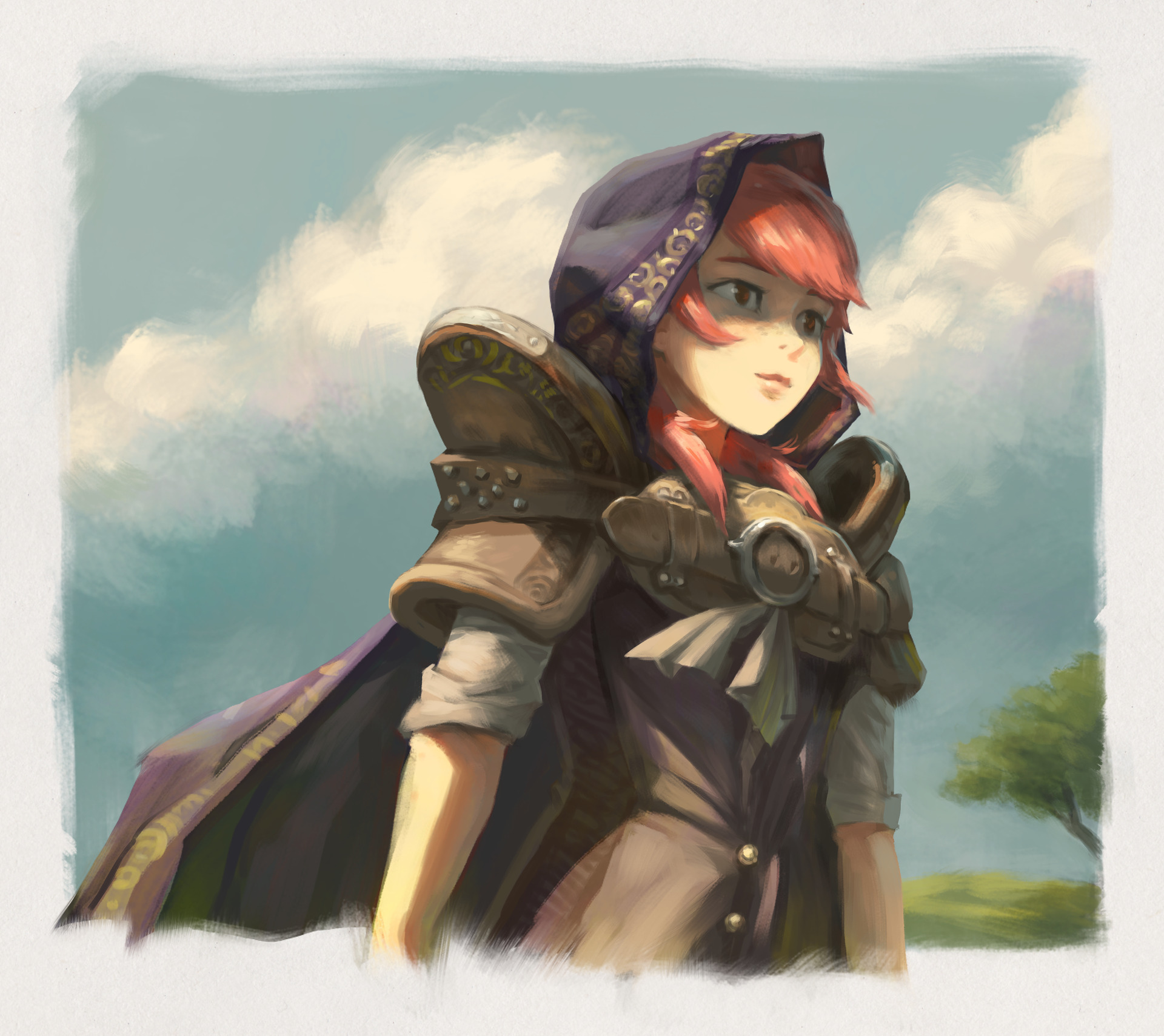
Here is a workflow experimentation that turned ok. I’m trying to capture a feeling of nostalgic (J)RPG, like a mix of old Zelda, Secret of Mana, but also series like Record of Lodoss War, all of that mixed with the high fantasy I also loved at that time, D&D, Magic the Gathering, DragonLance, etc… Hard to balance a painterly style, the type of design, and the mood. I study that for future P&C episode because I want to go into this direction.
Process
I also try to speedup and optimize my process a lot. I created new brushes for that, but I also learn to start painting differently. I’ll give you a quick overview under:
Step 1: I keep a step where I draw before painting. I struggled a lot over the past year if I should keep this step as I saw I was more and more able to directly start with painting. But on my recent research, this temporary layer saves a massive amount of time. Getting the volume right (approximatively), the perspective and the proportion really avoid many post fix and post correction while painting. I’m resisting the urge to detail or design at this step; it’s much more like a wireframe or a light outline of the ‘low polygon’ version of my topic.Working with segments not connected and a low opacity brush preset helps me to just draw what’s necessary. Anyway, there is not a lot of pressure because I know all the pixels of this layers will never be visible on the final result.
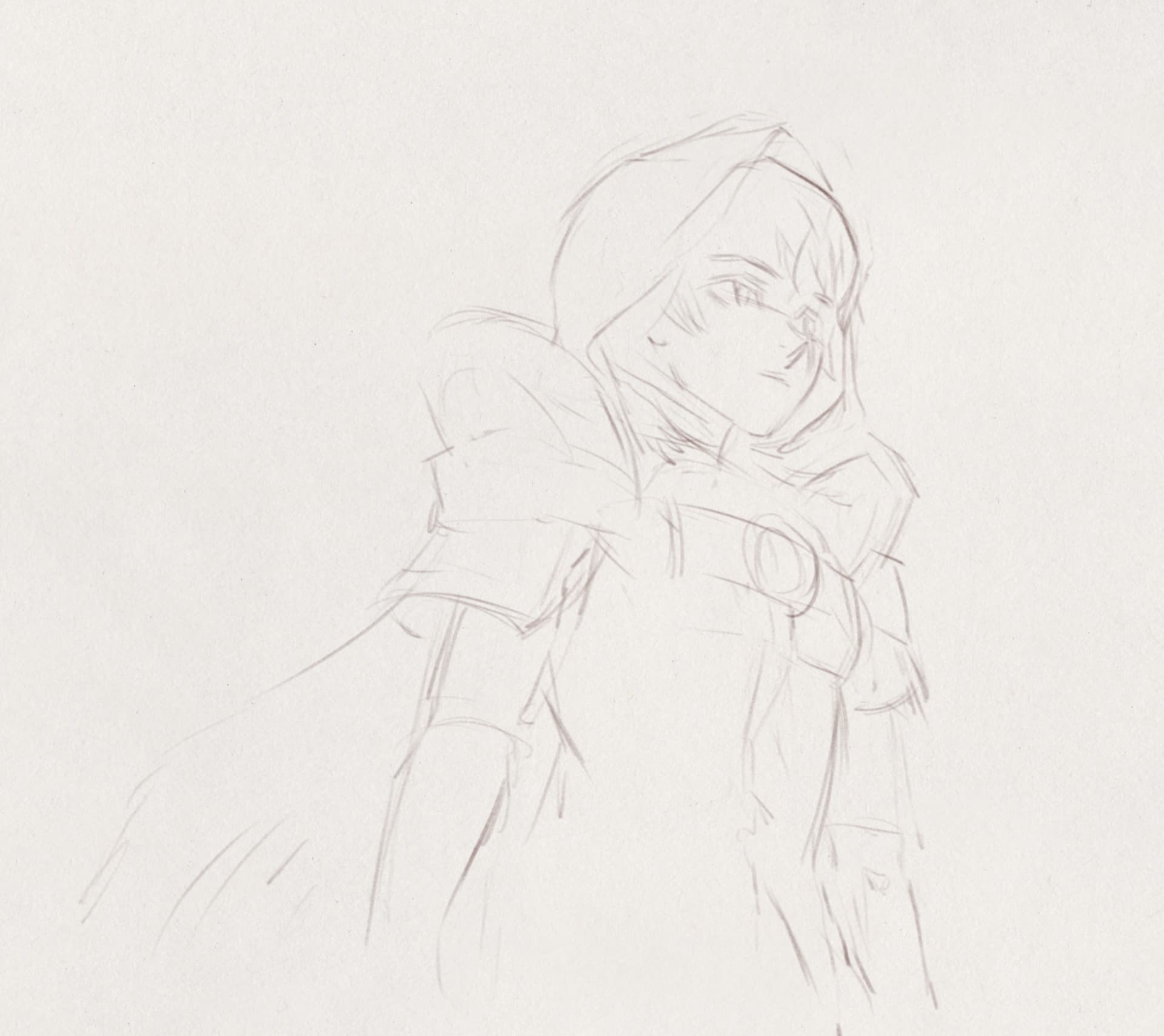
Step 2: I changed my habits for this step too: I paint flat colors under the low opacity guideline. I usually will paint a ‘precolor’ with shadows and all. But I decided to merge some ideas of what I learnt with the ‘comic/cartoon workflow with line-art’ to my painterly workflow. During the process, I eventually turn off the visibility of the lines in mid way. I’m not only painting flat area of colors: I’m also painting the creases, the part where light can’t reach. It’s a sort of ambiant-occlusion; but not detailed. The goal here is to get my ‘model’ colored as if it was standing under a (cold) white neon light doing a 360° all around it. For some reason, it’s easy for me to paint this way. I made myself a brush preset on Krita with hard edges and almost no opacity (unusual for my taste) to paint this step. Because of the omnipresent light, it’s a good time to focus on the design of the shapes; how they read in perspective as 3D volumes, and how they feels as 2D shapes language: the angles, the primitive shapes (circles, triangles, etc) and a variety of them. I also can start to manage decoration and patterns at this step. It’s totally not boring to paint this way (if I compare that to flatting for a comic line-art) I keep a real freedom and the guideline of (1) are quickly obsolete and removed. I can really see myself managing prototyping comic pages and start to work on the storytelling at this step.
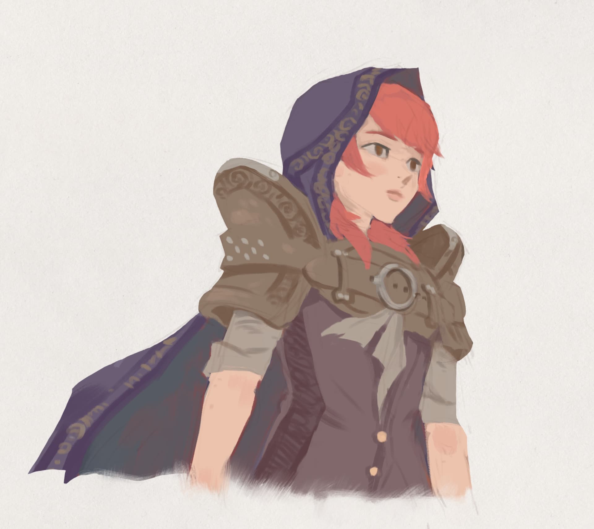
Step 3: I try to approach shading very binary: or in light, or in shadow. I exclude the half tones, and this is not (here again) my comfort zone. I’m used to paint and do modeling directly with opacity on my brush. I made a softer brush to paint this step, because it allows me to do a little bit of modeling, I couldn’t remove too much this habit. If the brush was too hard (eg. with a hard rounded brush, very clean) I wouldn’t like to paint this step, I tried. I’m used to shade using one layer (with the “Hard Light” blending mode), but I discovered some advantage now to use two layers: a first one in “Multiply” to set the tone of shadows (the depravation of light, with a residual light coming from the surrounding), in this case a greyish cold to simulate a bit of color coming from a sky box. And for the other one, I create on the top a “Color Dodge” layer and paint with a warm grey on it. I found two advantages to manage my shading this way: the layer are flexible and I can summon the HSV adjustments anytime to adjust the delta between the light and the shadow, how cold/dark or how warm/bright they should be. I can imagine this might help with the consistency of light from a panel to another one. The second advantage is about using the E key of Krita as an eraser with my soft painterly preset on the light (Color Dodge) layer. I can adjust the good angle of the light and compute my brain-raytracing more easily. It’s a good flexibility for the control of the art-direction, because you can test various setup if you get stuck. It’s amazing how splitting that much light and shadow, in a more dramatic fashion of what I’m used to can improve the readability of the shapes. I can’t wait to try that on comic panels.
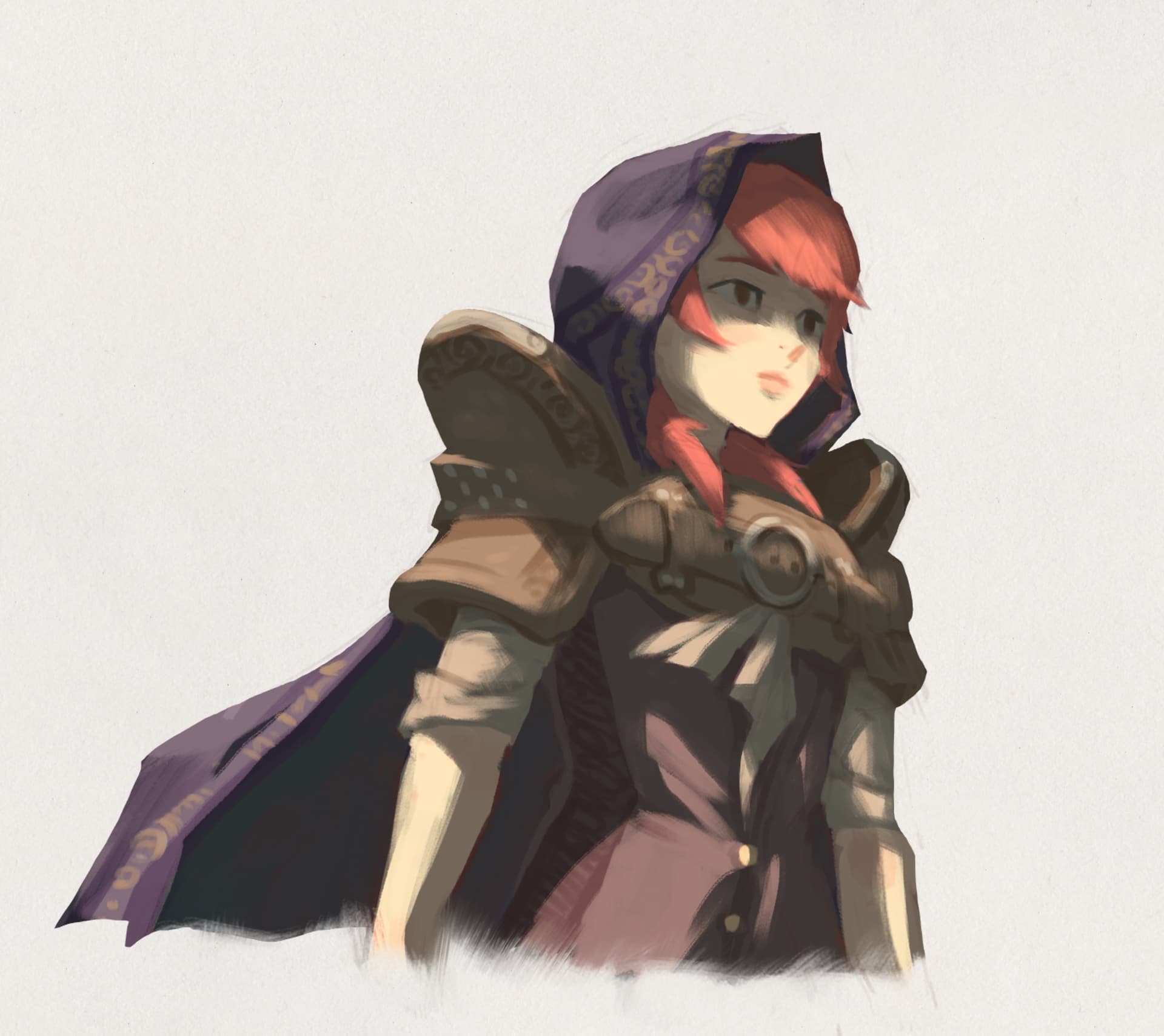
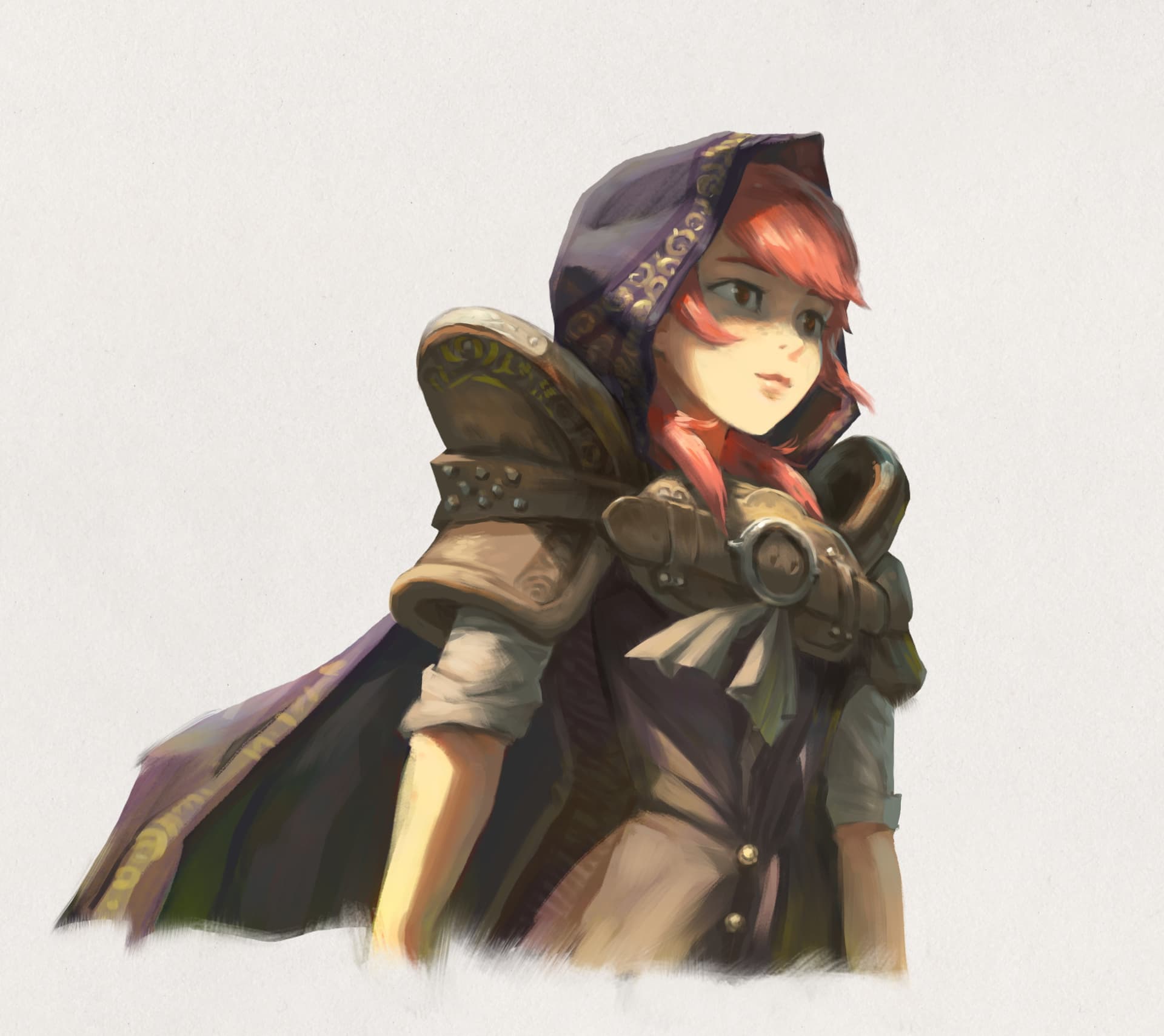
Step 4: I flat all the previous steps to one “Normal” layer. Then I do some post adjustments. For example, a layer in “Overlay” on the top will manage very well some spikes of saturation (eg. see her hair or neck) and also manage the secondary light source (the bounce of green light on the floor, coming from grass, or the blue skybox from the top that neutralize many hue). I put a little Color Balance to yellowishify the tone of the picture. That’s one advantage to flat all to a single layer (for the character): you can then use filters, or Gmic filters for color grading. I also adjusted the contrast (an important note here: I try to not crease to 100% black or white, tones should looks a little bit in a reduced color gamut , avoiding high saturation or to deep tones; it reinforces −probably because of our visual culture− the feeling of a painting). That’s something I observed recently in many old school non-digital fantasy gouache painting scanned. My last step is to detail with a small rounded brush, but you’ll see here I only painted on her face and around. It’s not really about increasing the resolution of the whole piece, but just placing some accents of density of details here and there. That’s also possible thanks to an advantage of this workflow: because there is no drawing or lines baked in the artwork at an early step, there is no need to perform an overall ‘clean-up’ at the detail step. Parts detailed are a bit blocky but still easy to read. That’s a precious place to save time.
I’ll continue to test this method for sure, and if my new brushes stabilize over the next week, I’ll share them.
16 Likes
Thank you so much David for sharing all those process with us.
I already learned a ton from your YouTube videos but to also have you here in the forum posting pics is the cherry on top !
Thank you !
Btw i also really love your art style, for me it would be fine if you stay with it ![]()
1 Like
Thank you @zam_zam !
Confront the Dragon
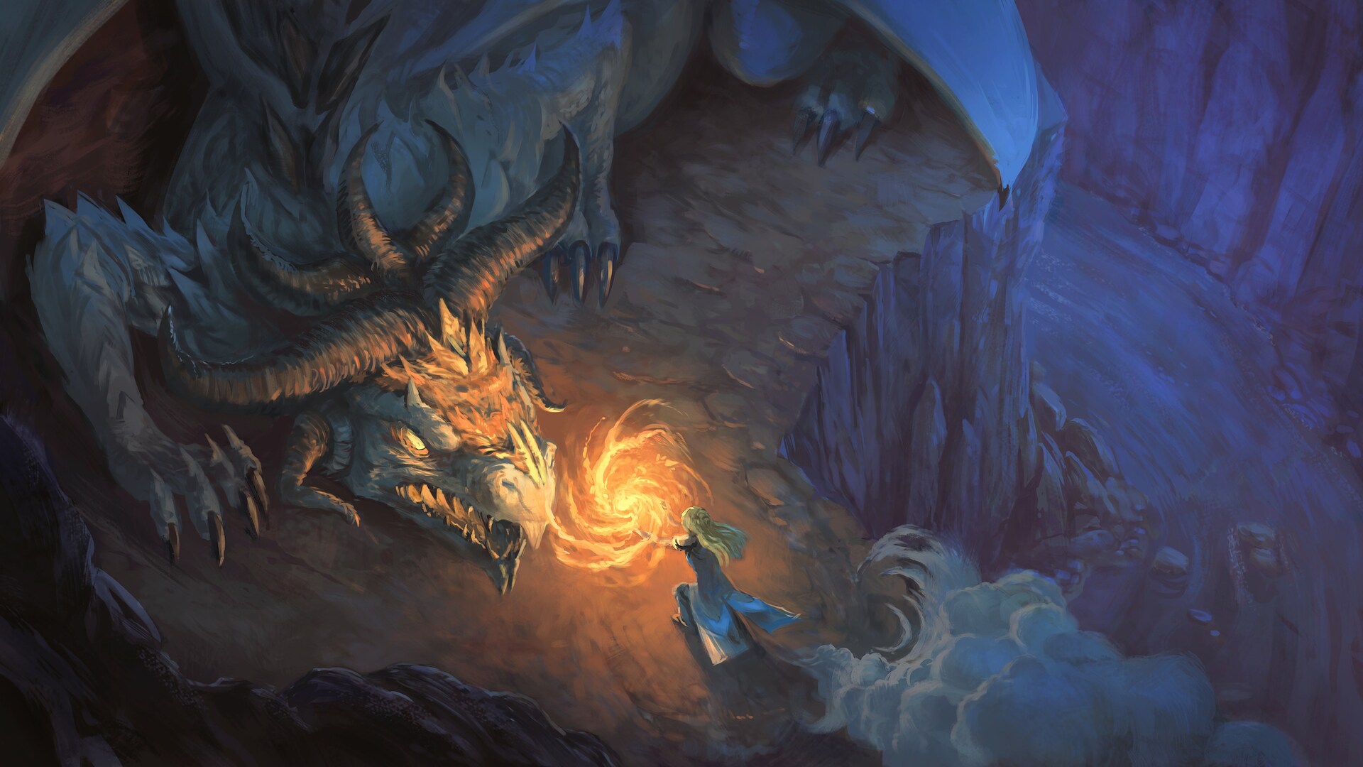
I’m still continuing my research and I had to do a test to stress my new method even more.
My stress test: I had to paint visual effects (fire), night ambiance, fog, a foreground/middleground/background, a perspective system, etc… And because I’m doing all of that in a larger plan to solve many other bottleneck in my production, I decided to go for a theme of “Confront the Dragon”. It has an opportunity to study many material at once.
Unfortunately for my test, it failed. I don’t get exactly the rendering I wanted. I pushed the artwork anyway so I could post it and the file doesn’t sleeps on my disk system.
I wish I had a better way to preserve the silhouette of the ground (foreground/middleground/background/dragon/character) and the layer stack of Krita did not help about that. The alpha inheritance workaround for clipping mask is not fluid to work with, except if you have only one or two group like that in your file.
I’ll continue to explore.
12 Likes
Hi David, thank you for all the continuous help you give everyone! Seeing your process steps is so illuminating! I usually do it the hard way ![]() , yours seems way easier, I’m going to try it out!
, yours seems way easier, I’m going to try it out!
Beautiful art style! I would hang any one of these up in my house.
Hi @SoniaBennett good to see you around here, and thanks for your nice words. Oh yes, splitting shading and local/base color as advantages. At least, I’m learning a lot from this approach right now.
@Bobrowsdower Thank you!
2 Likes
Discuss with the Dragon
SO, after the previous “Confront the Dragon”, I continue my research. This time, I wanted to study a more cinematographic shot, with depth of field and again, multiple light sources (obviously a contrast of a cold and warm one).

I think I improve a bit in the way I’m letting more and more expressive brush stroke visible but in place where they are not an issue for reading the picture. Firm edges and sharpening are ok, but I need to find a better solution because I used here the “clipping mask” workaround in Krita, and it was really unbearable how many layers where necessary and buttons to press to just shade a shape and then merge back. I start to really wish if Krita had real clipping mask.
On the downside, I spent a bit too much time at the drawing and the flat color. I saw later on the artwork I could really solve most of the sketch at the flat color step, and I could also do a less precise flat color because the shading sort of broke a lot of its precision. So, I have two rooms for optimization in my next test.
My goal is to find a way to crunch the time and optimize it until I can do something like that in 2 or 3h max. Right now, I still spent the double on it.
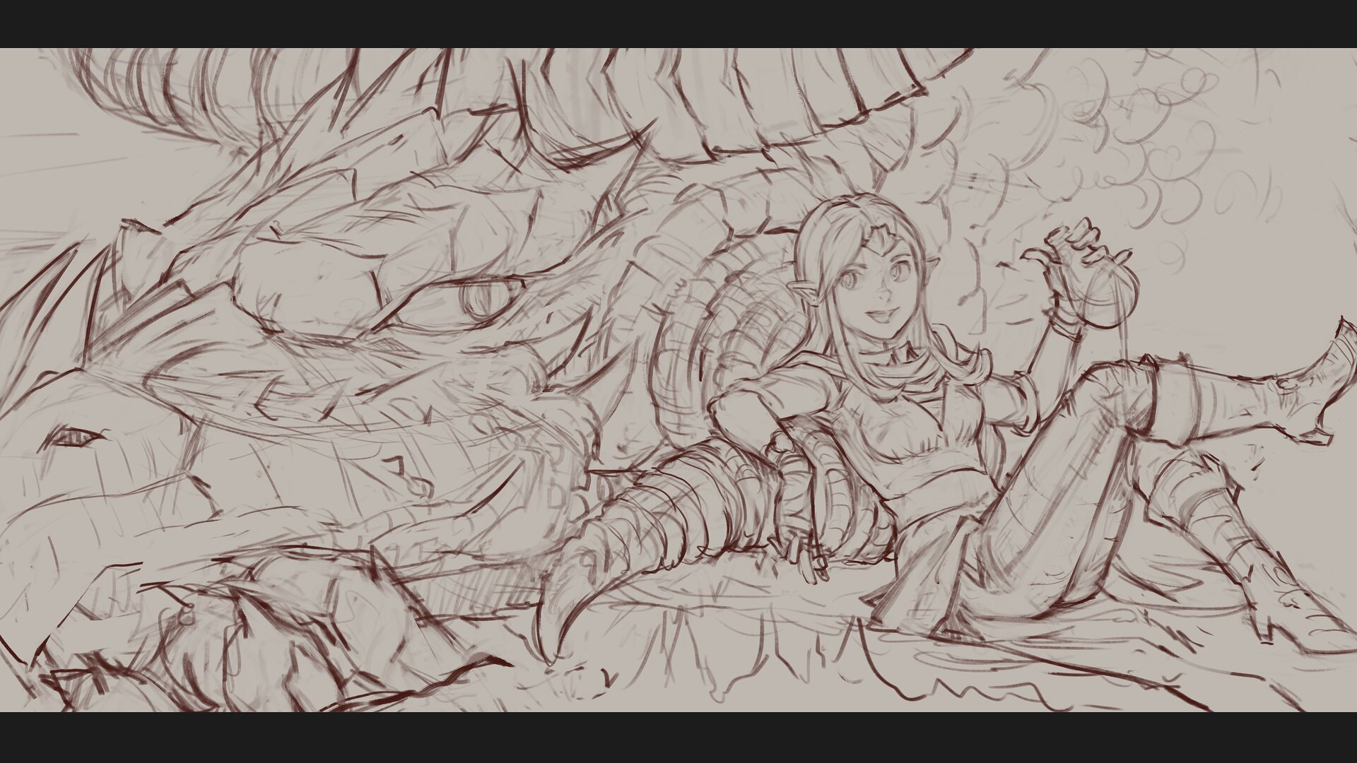
The drawing
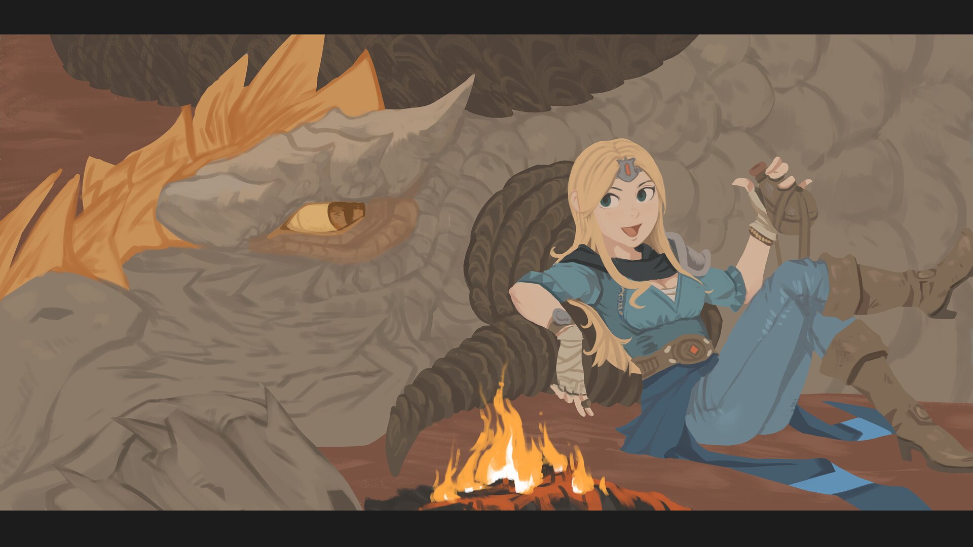
The color flat
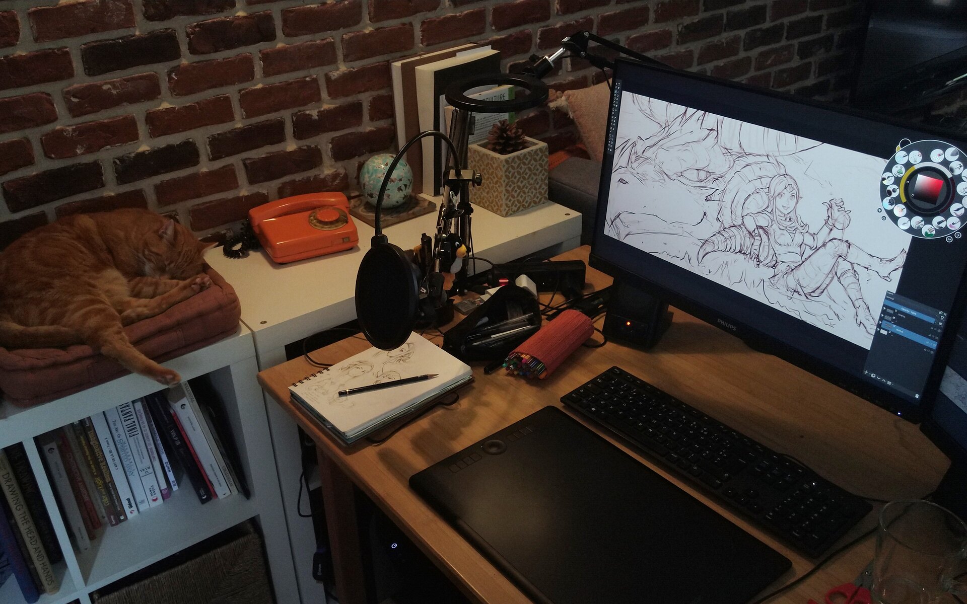
my desk and setup: Intuos Pro Large, Fedora KDE Linux 36, Philipps 245E monitor
16 Likes
You forgot one thing in your setup; Carrot. ![]()
4 Likes