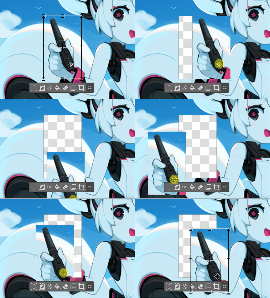
Yes, when moving the selected content, the ‘Selection Actions Bar’ still stays in place, which causes obstructive blocking. I made a gif to help illustrate this.
Have you also tried the one in Drawpile that’s similar to Krita’s ‘Selection Actions Bar’? It is fixed in the bottom left corner by default (but can also be pinned to other corners).
I think Krita’s ‘Selection Actions Bar’ should always follow the selection (including the content selected under the transform tool), and it should also allow setting it to be fixed in corners like the bottom left.
It sounds to me that this should be like a regular toolbar, except that its visibilty and position are tied to the selection.
So why not make it a regular toolbar? Is there any downside compared to the current approach which seems like it’s reinventing the wheel with a QObject?
It could even be part of the XMLGUI, then the actions would be configurable without any extra effort. The user would be able to put it wherever whenever, but I don’t think that’s a bad thing.
When a selection is active, optionally show the bar, optionally move it near the selection at a configurable distance. (Well, move it first and then show it.) When the selection becomes inactive, restore the previous state.
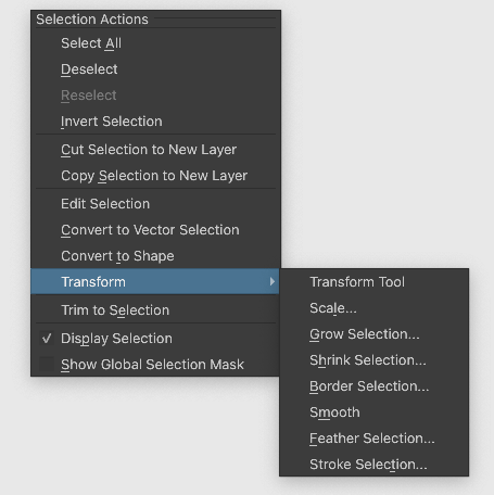
If an action has no icon, it’ll automatically show the text instead. (Showing only the first letter is bad UX.) And there are plenty of (iconless) candidates for actions to put in there, as shown by the selection tools’ right-click context menu (which doesn’t even include the “Fill Selection with Color” the bar has… which is not the only Fill action):
I don’t think it’s a good idea, it would be too large and bulky, take up too much space. And it would be far away from what you’re actually doing. Its proximity to the selection is a big part of why it’s useful imo.
Tho i do think there should be an option to fix it in place
@Eranthis_stellata@Deevad@Agitato@oopsonlydelta@BeARToys@EyeOdin
What do you think about this kind of behaviour? I used something similar to what assistants are having. It keeps the position on the canvas under the selection, but moves with the canvas, so it feels more “sticky” to the selection and doesn’t go over it. And when the selection moves out of the bounds, the bar also goes that way except it stops at the edges. Exactly like assistants do.
It’s just a rough draft for now (for example trying it with the transform tool would introduce blinking) but I plan to have it remember the offset the user introduced in case you wouldn’t like the 100-pixels-below rule. And so far it doesn’t update properly when rotating. But I will make sure it will work well with both (though it probably won’t follow the transformation until you apply it).
What do you mean? A toolbar would be about the same size and can be positioned near the selection.
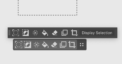
A customized existing toolbar on top, selections action bar on bottom:
Hmm yes, but it is difficult to say without trying… if I am making a selection at the top and then want to select something where the action bar is, the bar stays in the way and that’s a problem.
You only selected first and then moved. That behavior is ok in my opinion.
I think it’s probably a good idea to somehow make sure the user wants to deliberately save the offset. If you move it to quickly get it out of the way, as is often the case, you probably don’t want it to be called up next time in the random place you swept it aside to.
I think it’s great that the ‘Selection Actions Bar’ in the video can follow the selection better, but intentionally keeping a distance from the selection is not good, as this increases the time needed to move to click it.
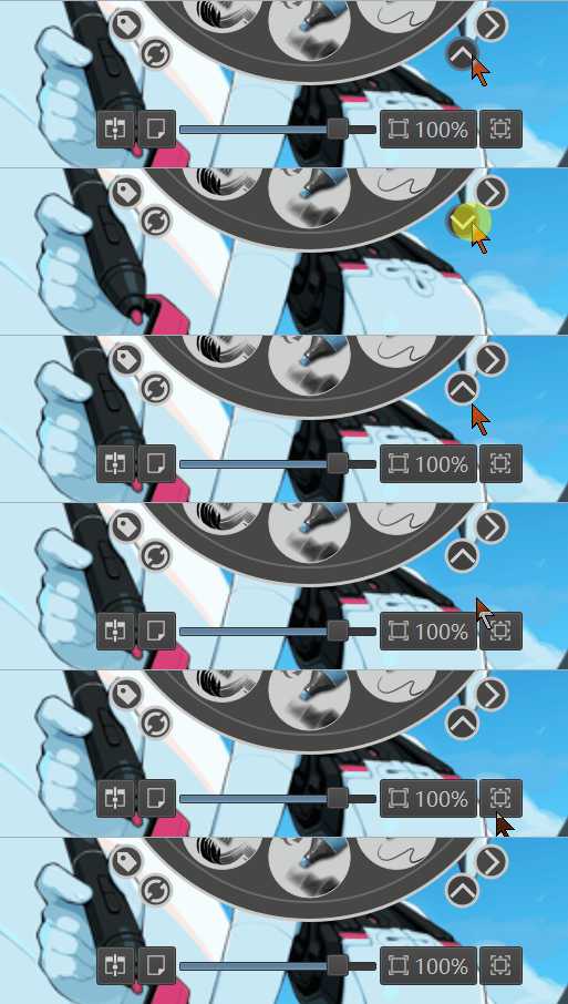
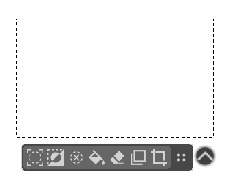
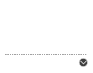
Why not add a button to expand or collapse in the ‘Selection Actions Bar’, similar to the ‘Show/Hide Bottom Bar’ in the ‘Pop-up Palette’? Like in the GIF below.
I made the following image based on the above gif to help illustrate.
In addition, setting both the ‘Selection Actions Bar’ and the expand or collapse button to 60% opacity can further help solve some screen obstruction issues.
This can reduce occlusion without the need to deliberately move away from the selection area. It also reduces the extra time required to move over and click.
Is this expand/collapse button really that much easier to use than just dragging it out of the way? Seems clunky IMO, and if the bar is following the selection (unlike how it currently behaves), it shouldn’t be in the way that often anyways.
That looks really cool. Like you can move it to the side so it is not in the way and it will remain there until the situation changes with the selection.
I mean it would make easy for everyone to configure that behavior because when we draw we make often wrong clicks and that would be a little annoying. Its just a humble opinion of course.
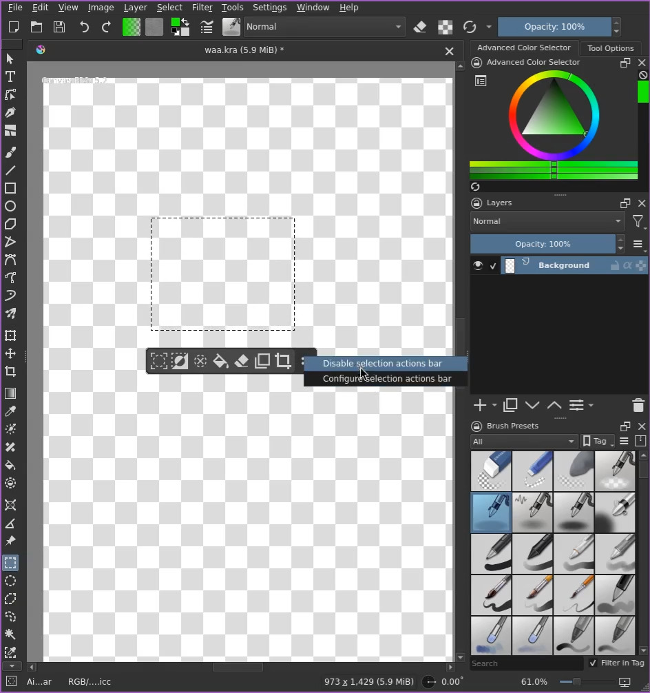
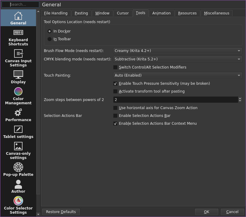
Yes, but even if can be by configurate by a shortkey, but in the optional checkbox would be ideal. I mean i like how you propose that. But after trying a lot of times the right click in the selection action bar tool i believe that you have right. It gonna happen less times that someone click by mistake. But the image it captures the idea that i am talking about. But in theory it would be possible?
Enable/disable context menu or the SAB itself? Either way i’m not sure it’s a good idea, since the SAB is present as long as you have an active selection, not just when using a selection tool, so for a lot of the time that toggle wouldn’t be available.