I watched a video on youtube explaining how the vivid light blending mode works in photoshop, I’ll link the video below as well but what it came down to was how it can be used as a ‘contrast fixer’.
The way this is done in photoshop is by using the fill opacity slider rather than the normal opacity slider.
Krita doesn’t have such a slider though making it impossible to apply the mode in the same way to my knowledge.
Does any of you know of a way to get the same effect in krita?
I have been searching how to do this in Krita and I was not able to do a perfect behavior for this sadly.
The effect is very interesting to use and liked all the results I got by testing this tutorial. As stated on the tutorial using opacity voids the usefulness of this blend mode.
I also noticed Krita clipping pixels to a full white or black on certain areas with the blending modes while PS had no clipping of colors.
However I found some blending modes that at low opacity “kinda” behaved like Vivid light at low fill.
Color HSI
Soft Light (IFS) (weak)
Overlay (only affects darks)
All results are not as interesting though because they don’t start from 50% grey to do it usually or just go in one direction of the gradient.
If there is some way to do this I also would be interested to know too.
never mind, this is being used with a solid colour so my proposal doesn’t make sense
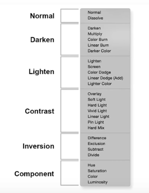
From Wikipedia:
" Vivid Light: this blend mode combines Color Dodge and Color Burn (rescaled so that neutral colors become middle gray). Dodge applies when values in the top layer are lighter than middle gray, and burn applies to darker values. The middle gray is the neutral color. When the top layer’s color is lighter than this, this effectively moves the white point of the bottom layer down by twice the difference; when it is darker, the black point is moved up by twice the difference. (This increases the perceived contrast.)"
So, I suppose this could in principle be done by creating two copies of the layer we want to apply the blend mode to. One of them would get a mask that shows all pixels that are lighter than middle gray, and that lay er would be set to “dodge”. The other layer would have a mask that’s the inverse, and would be set to burn.
Maybe this is something to request they implement because it potentially is quite a powerful feature and a slider or other control for it could be applied to many other effects.
I’m unclear to its workings myself, just saw what the difference between the opacity and fill sliders was in the video
I think the best way to answer your question is the link below, don’t know what to make of that in the context of krita though
What I would like to ask you in return, is what the vivid light blending mode’s functionality within krita is without such a slider
@tiar
yeah I was looking for that information too but I haven’t find it yet. I only found the similarities and differences between opacity and fill like the link above.
But a reference note I got was that there are 8 PS main blender modes that react different between opacity and fill all the others blend modes it is indifferent what you use.
As ussual people in PS know alot but don’t know nothing about it beyond “making it look nicer”. I don’t have my hopes up to find this info sadly. but my eye is open for it.
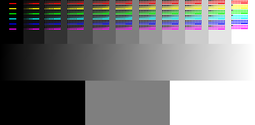
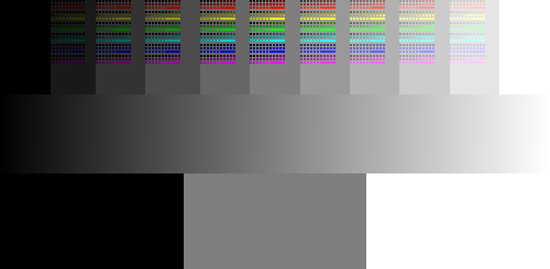
for the rgb I placed 0 to 255 and did 10 point increments for each. for the black and white I went in 10% increments. I donno if this helps any but yeah… @tiar it is not the formula but I think it is visiable the shift.
The difference between Fill and Opacity in PS is that fill only affects layer pixels and not the layer styles. Both control opacity of the layer, but one controls only the layer content and doesn’t affect layer styles. I doubt we would have this feature or this would be useful in painting context, but that is my personal opinion.
There are other threads asking for similar feature here
@raghukamath , I don’t think this is a complete explanation as it doesn’t explain why some blend modes, such as vivid light, behave differently with opacity vs fill adjustments.
I had an intuition when I read the thread. From a memory of my usage of Photoshop 4.0 before 2000; it was actually pretty bad at opacity for many layer operation. As in many video editor (if you know Kdenlive/Blender) the opacity is rarely premultiplied with the projection of the ‘picture under’ but with pure rgba(0,0,0,0) black (read here for full details). So, I thought it might be that the “Fill slider” is not an ‘opacity’ as we could think about it on modern term, but one of this ‘compositing to black’ opacity. And was kept this way for retro compatibility with old PSD.
So, in this context, ‘Fill’ sliders is just a darkening slider: create a layer, fill it with the pure color, put the layer into ‘vivid Light’ blending mode (part of ‘Lighten’ family of blending mode for a reason), then Press Ctrl+U to access the HSV/HSL adjustement and slide the ‘Lightness’ slider down to emulate it (and then manage the strenght of the effect with usual opacity slider).
Here is a short video I made with screencapture from this video to try to reproduce [edit, but it is not 1:1, it miss a subtle kick in the light] :
Mmm… No, I was too quick and happy to reproduce the effect. It’s not 1:1 with a screencapture. It’s close; close enough to be happy with it. But it miss a saturated dodge in the light and contrast; that’s probably where Photoshop still think the layer is a bright magenta and triggring the math for the part that dodge the ‘Vivid light’. (from this source)
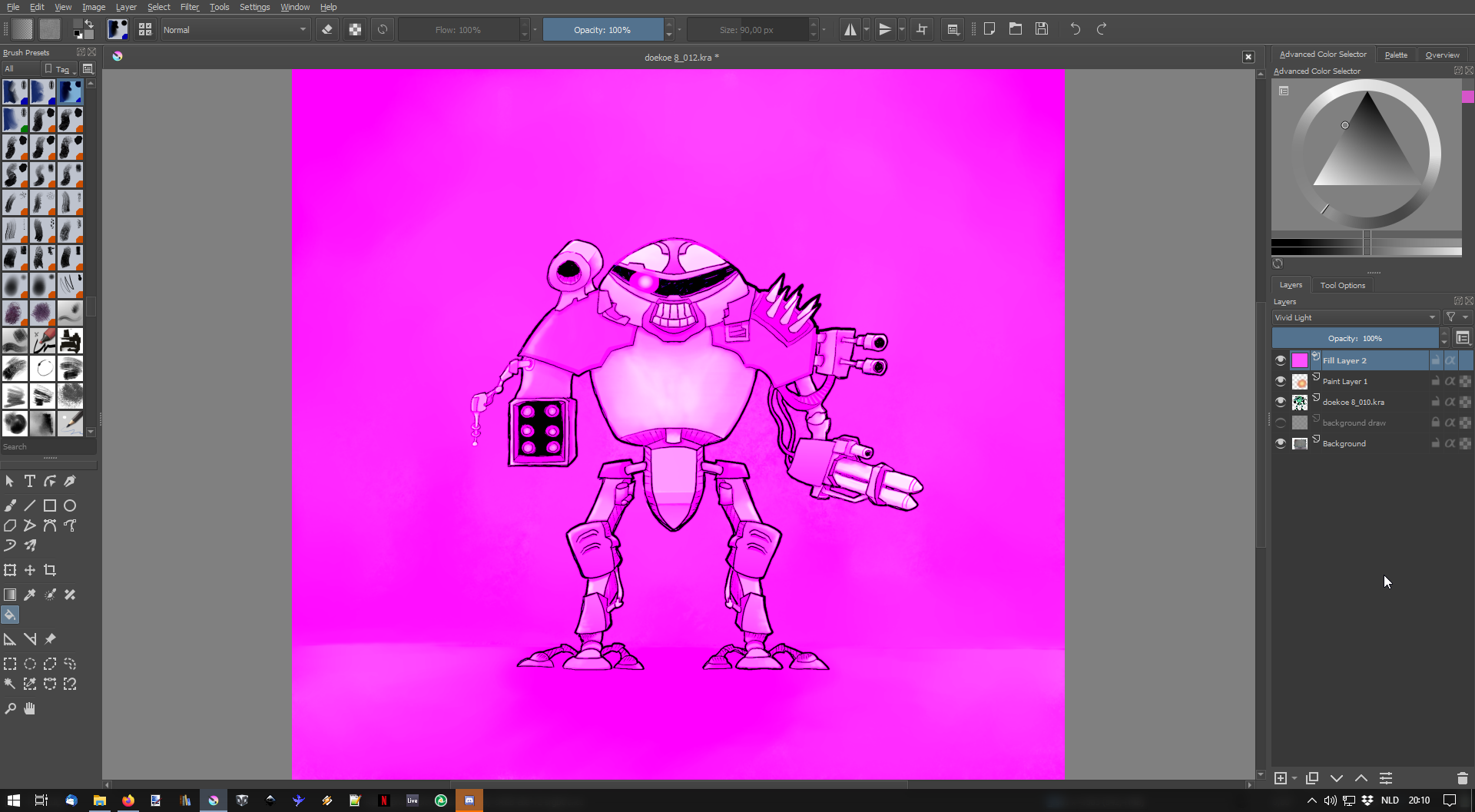
OK, so thinking out loud: Going by the description on Wikipedia (or the Photoshop manual for that matter), it doesn’t, at first blush, make sense to use Vivid light on a fill layer, since the point is to apply a different blend mode depending on the value of the colour on the top layer. So I’m guessing the trick here is that the colour is a very specific one: it is more or less R255,G0,B255. Meaning it would dodge the R and B channels while burning the G channel.
What I don’t quite understand is why nothing changes in the example result when the fill layer is first set to “vivid light”. It is only once the fill is less than 100% that we start to see the bottom layer come through. In Krita, this is obviously not the case.
I wonder if there is a way to sample values from a standard image using a script. That way you could plot the points and get a estimation of the math curve progression.
I did pure hsv colours over monochrome colours for the blend but I wonder if there would be a better way to test the blend and gain more information.
I think the issue there is the fact it only captures half of the effect so it does not make the contrast it needs. I tried to mask grey up and then grey down and for each apply the given effect but it still sucks because of the color selected. I think the color applied needs to change too if there is no remapping so doing it manually is an ungrateful task.
Actually this bothers me a bit because what the effect is supposed to do, judging from the yt video example, is apply something that appears to be a burn and dodge effect at the same time.
I experimented a bit with it myself and even though the color applied (I stuck with the magenta for the sake of the experiment) has a mood effect and ties together the colors a bit, I’m not completely sure if it enhanced the contrast.
This is on this particular drawing though and I had the lightness slider set to 50%.
There’s also a downside to this method in that the color isn’t customizable(?)
Edit: it is, in the properties of the fill layer.
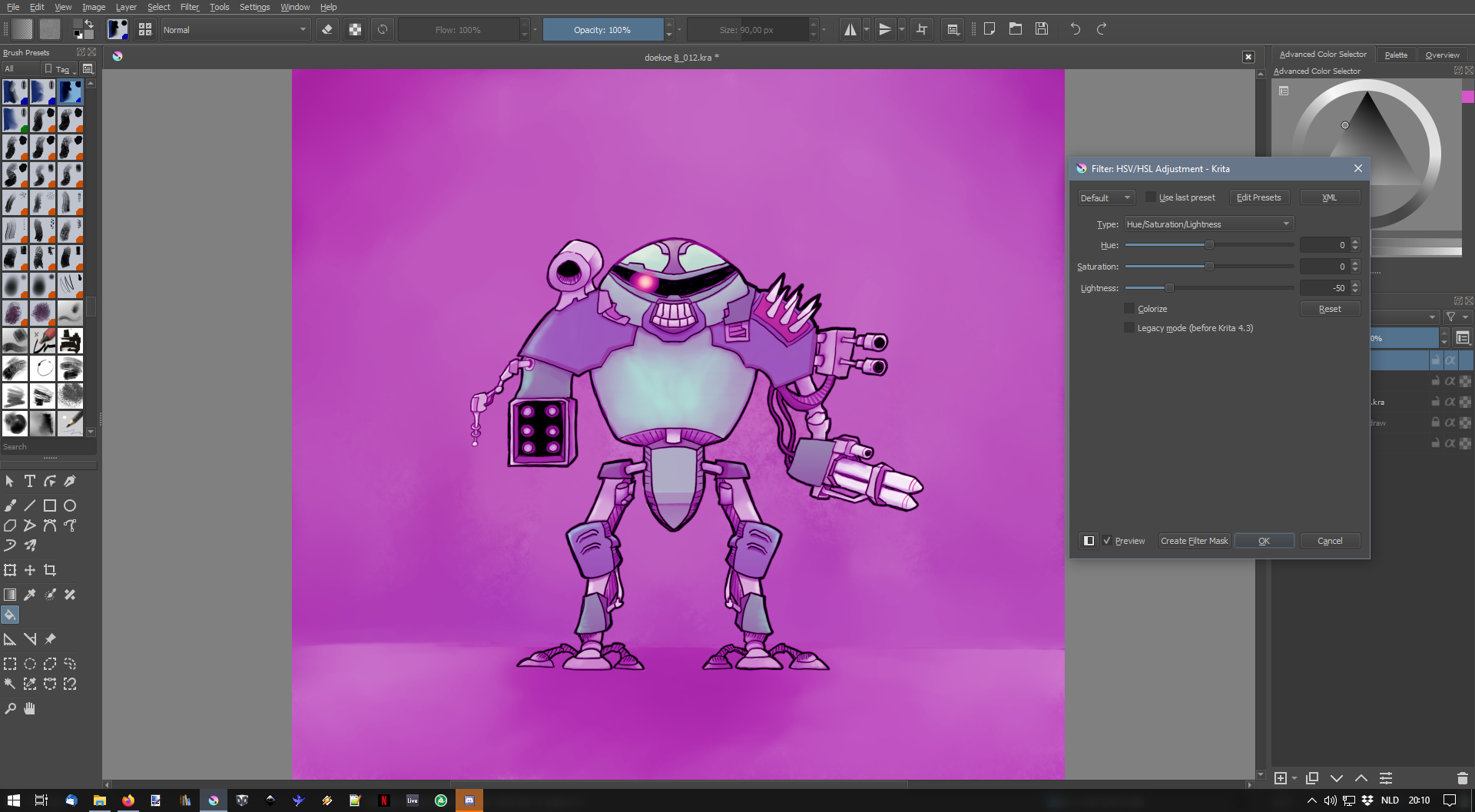
An interesting thing happened when I applied the HSV adjustment to a fill layer which I think is a bug:
I applied the HSV adjustment as a filter layer which was fine in the preview but then turned out much darker than the preview, which also had a profound effect on the opacity percentage of the end result.
When just saving the HSV adjustment (destructive method) it worked like in the preview.
Here goes:
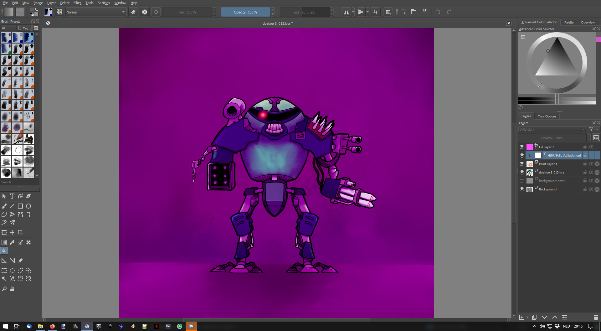
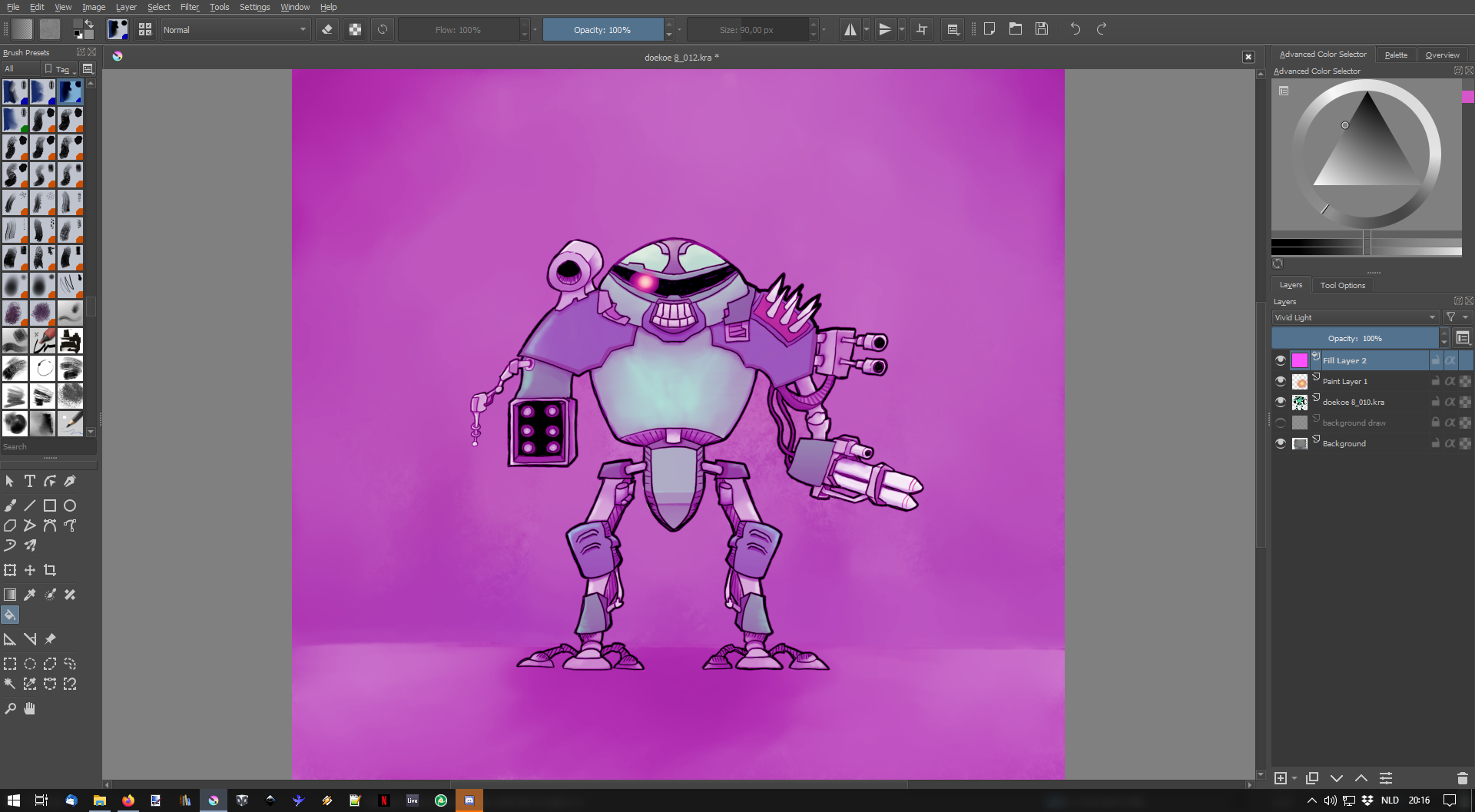
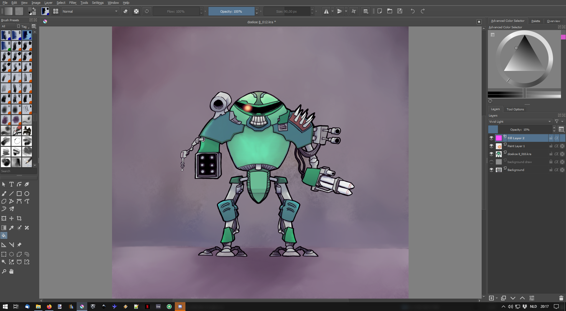
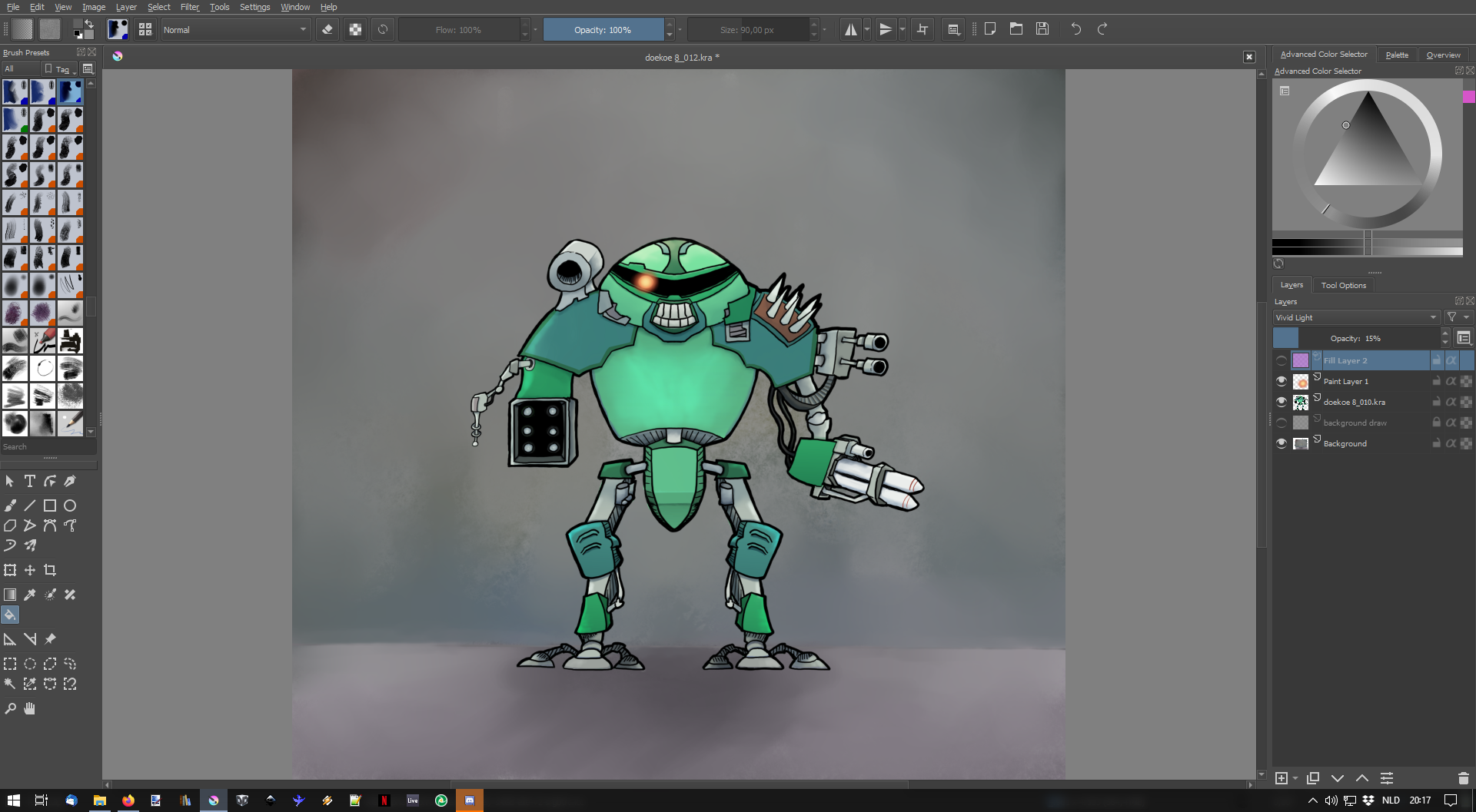
Fill layer set to magenta (note that the behavior of krita here is indeed different from that of photoshop, it doesn’t completely cover!)
The author of the Youtube video in the example above has it right: this is a blending mode that is split into two: half about ‘mid’ value brighten and other half under darken. That’s probably handled with if(src < halfValue<T>()) { condition on the source code. But it cannot work with a pure Magenta/Pink color on it ; this hue being above mid-value will only trigger the Dodge/Screen/Brightening part of the algorythm/blending mode. If I reduce the luminosity to a dark violet/magenta; it triggers the multiply/burn/Darkening and the subtle saturation in the bright parts are missing…
So, it means the Fill slider does something else on PS. I suspect it fills the layer with a projection of the entire stack under; this way it ‘knows’ what part to send to dark, what part send to bright simultaneously.
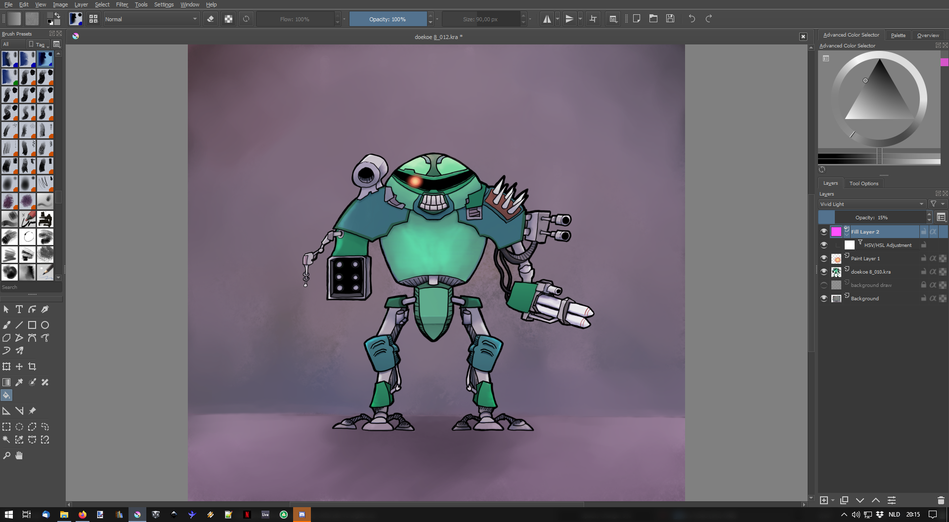
I simulated something with a result this time way closer than on the video with duplicating the projection (the full stack, in my example it’s a single layer) and then used HSV/HSY-Adjustement to colorize the layer to a bright color. Then I applied the vivid-light blending mode. This way, the dark part of vivid burns and the brighter part of vivid dodge correctly, all of that tinted to the dominant magenta color. Post adjustement with Luminosity can be made. (video under)
It’s not of course user-friendly; and it is destructive as I need to copy the whole picture; but it can probably help at knowing what this ‘Fill’ slider in PS does. (Maybe)

 ?
?