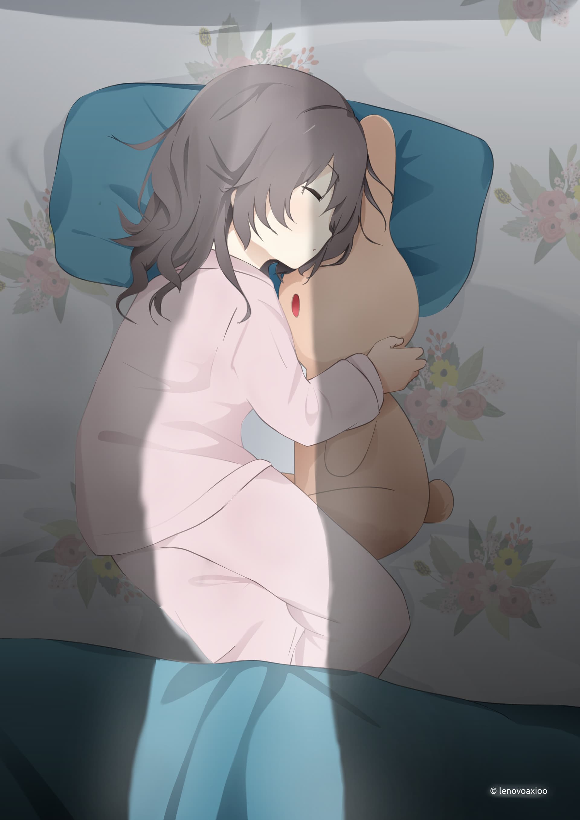
So many of my artworks just straight up looks washed up. . . this included.
22 Likes
The question is, do they look good in Krita using a calibrated environment? If you can not make sure that the initial creating environment is calibrated, you can not truly judge the outcome on any following device you view it with. Sadly.
But usually I have to admit liking your works very much, it is extremely seldom not the case with your pics.
Michelist
By the way, if you want, I can search for a way to manually calibrate your environment. I have it somewhere on my hard disk’s.
maybe its the values of the shadow. Maybe you can try my ColdWarmPalette plugin to help with shadows.
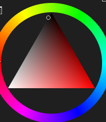
Your shadow seems to be going like this;
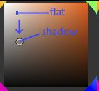
with barely a movement to the hue.
If you want to experiment it can help you with picking shadow color - normally you would want it to be a little bit colder than your flat. Also dont be afraid to go bit darker [though this my problem as well] hahah its scary to go lot darker in the shadow. ![]() but sometimes thats whats needed for the depth.
but sometimes thats whats needed for the depth.
Either way your drawing is fantastic ![]() , line work is good. love the clean look :3
, line work is good. love the clean look :3
2 Likes
I have an art instructor who recommends a similar technique:
For shadows (from your base color):
Shift the hue slightly cooler
Darken the value
Saturate it more
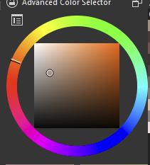
On the square color selector (like @kaichi1342 showed) this would be best described as a diagonal shift downwards from your base color.
For highlights, simply reverse the recipe. (Shift hue warmer, lighten & desaturate.) ![]()
1 Like
Beautiful. I was going to suggest the same as the others too.
2 Likes
That’s a good advice! A slight hue change and a bit more saturation should make it more vibrant.
Another thing to try is radiosity (light bouncing off things and illuminating the shadows) and probably a bit more contrast in the shadows where the direct light is (to stimulate eyes attuning to the strong light, maybe?).
But yeah, I’m not too great with light and shadow myself, so easier said than done! ![]()
1 Like
thanks for the tips, I’m using triangular one btw. . .
1 Like
is ColdWarmPalette the actual name of the plugin?
1 Like

I don’t think i have ever done any calibration. . .i though I need some expensive device to do calibration . . . and thanks for the compliment
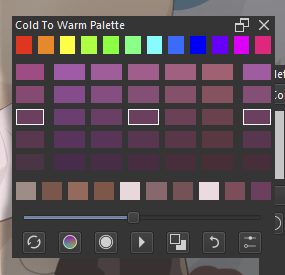
its apparently cold to warm;
as for calibrating ; if you have a fairly good phone you can download some reference image and reference white sheet to use .
If you are on windows - windows has calibrate color display thing. It will walk you through your gamma, contrast , brightness balance. When you get to the section of color - you can use the white sheet on your phone to see if your color leans on cold or warm. Then balance out if its too red/ too yellow / too green - that’s where the reference pic in your phone will come in handy.
You can have the calibrate mode into window format and pull the same pic you have on your phone there and see if you can get close.
[its hard to get them exactly alike especially if the monitor and phone color specs are not equal but you can get close].
2 Likes
I think it’s possible to change it to the square one in Krita. I was trained on the square color picker, and I recommend it heartily because it separates the values (lightness/darkness) from the saturation like this:
- Up/Down is Value
- Left/Right is Saturation
For me, the triangle blended these things in a manner that was difficult for me to use - but use whatever works for you. ![]() I just wanted to let you now that it can be changed in Krita if you’re interested.
I just wanted to let you now that it can be changed in Krita if you’re interested.