Greetings here.
I’m opening a new thread related to Krita’s UI redesign.
Please feel free to participate doing your best too.
Now, what will I do myself ? Well I’m going to drop the best UI mock-up I could come up with for Krita here. Possibly go into the details, so at the end, a pdf file will probably contain all of my work.
Of course there will also be some preview image files. But in the meantime, I open this thread.
Hello! I like the modern interface Krita, as an option for a tablet, it is possible to look at this program.
https://www.youtube.com/watch?v=5DJ8IBxojQk A very interesting solution. Of course, this is a little toy, but is it possible to make a simplified version for drawing. Thank you!
Just for reference: here is the previous discussion
and this is the summary
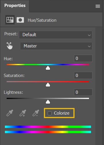
There’s something I’d like to see changed in Krita.
And it’s the UI of some adjustment filters.
I will mention the HSL and Color Balance filters here.
The thing is : the gauges are not showing the color of the hue.
Recommended :
VS what Krita currently has :
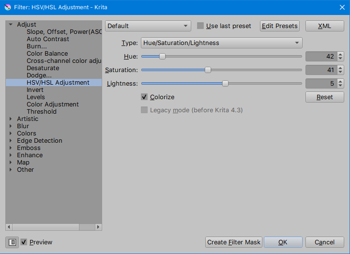
This will help to target the wanted color hue faster, especially in colorize mode.
I pray this change come to Krita 5.0
6 Likes
That probably won’t happen, but it isn’t very difficult to get what you want without it.
Yes, without it is not recommended.
The literal starting point for a custom titlebar, or for another style for the user interface( Flat + tiled is my current fav. this style however is against the use of shadows around frames for the most part; for the UI, multiple shades can help better define the UI hierarchy to keep it appealing and beautiful).
Could be useful at a later time, but nevertheless, it shows that QML if mastered well can help you with any UI design you’d need.

Also if this is true, then one of the problems previously faced with custom titlebar can now be resolved and allow for system call of functions without needing to reimplement the whole thing.
That’s interesting. Is this something you’re working on?
I’m researching first. No concrete work yet.
2 Likes