(There’s no specific topic for pop-ups redesign yet, so I’m posting in main thread)
Ok, I kind of mentioned it before, but now I created this mockup, for the idea not to be lost.
How about changing the look of the “show color selector” (shift+i) like that:
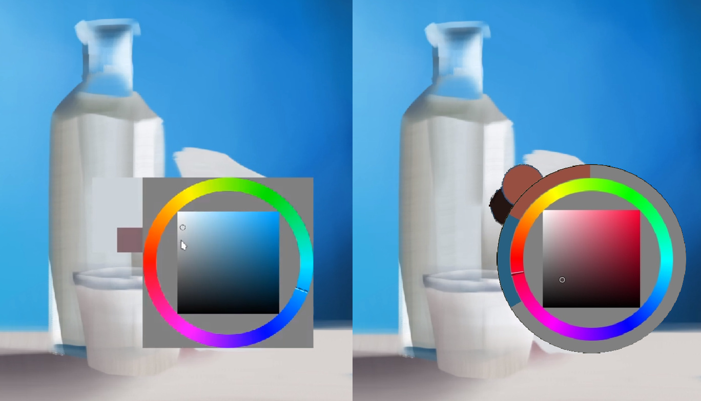
I used @Anurag_Ekka idea, that I thing would fit perfectly there. This would apply to all types of selector that are circle-based (those square-like could stay more as they are).
I know that it’s a type of change that don’t really affects usability, but at least looks quite pleasing. Should I add this mockup to Google doc?