I definitely think there’s use for a radial menu to toggle some settings on or off, or perhaps you could have a radial toolbox to switch tools with a quick gesture. I’m personally not entirely sold on a radial menu being used to bring up entire dockers or settings panels though. I feel like one of the big selling points of radial menus is the idea of press-drag-release-done. One gesture to change one thing, until that action becomes muscle memory.
Bringing up a full menu to change something that requires a bit more precision (picking a color from the wheel, changing brush size, finding and picking that one brush you want) is better left for something like the Pop-up Palette or KanvasBuddy. But this is all my personal opinion, not factual by any means
As for including KanvasBuddy in Krita by default, I’m a bit hesitant to do so myself. For one, I think the quality of the code isn’t up to snuff but also because I’m not willing to maintain and develop it myself more than what I’ve got going right now (which isn’t a whole lot). There’s also the question of which plugins should come bundled with Krita as the list of plugins grows, and which should be up to each user to add the plugins they need. I think it’s an important question since I’d like to avoid bloat .
That being said, anyone can fork KB to develop it further and push it to Krita’s mainline repo if they like, as long as they comply with the license. Or just make their own (better) version there’s plenty of things to improve with the plugin (crash handling, bug fixes, refactoring newbie scripting to something more appropriate, maybe a dedicated settings panel to manage what dockers, buttons and sliders are on the plugin dialog, etc.)
I agree that having plugins in Krita by default is a question that asked to myself…
My plugin Channels to Layers is now in master, I accepted for these reasons:
I think that Krita needs more plugins
Having some plugins by default may help users to decide to use them and it would certainly help potential developers to discover what’s possible to do with plugins
More plugins Krita will have, (I hope) better API will be provided (currently, API is currently pretty good, but suffer of bugs and might need to be improved, but I think it’s currently not the priority)
My plugin is very simple and may not need to be improved: this point is very important, because some other plugins more complex (code + provided functionalities) may need an active development to be completely mature and I think it’s not really compatible with Krita release frequency
Having plugin in Krita master need to understand how git works (and for my own experience, I’m currently not able to understand how it works so it’s difficult to include more plugin in master )
I won’t pollute anymore this topic (for which plugin is not the subject); for interested people, I already opened this topic where I try to expose some ideas about how improve plugins:
(and in synthesis @Kapyia, rather than having plugin in Krita bundle, the ideal thing for me will be to have a ‘store’ where users just have to search and click to download and install plugin )
If you are using the Windows OS, for example, you are using the “fusion” style. If you are on various flavors of linux, it might be picking the “breeze” application style.
Systems can often have multiple available styles. Krita just picks one and is something you might not have realized. What this patch does is let you switch the application style. You need to restart Krita for it to take effect (unlike changing themes). If you are on Windows, these are a few differences that switching the the “Breeze” style will give you…
There are probably other things, but I didn’t really spend too much time. I also have a 4K monitor, so some things might look a little off with my screenshots if they are large.
Not sure how many people will use this option, but thought I would share it with all this UI discussion going on.
Just to clarify - I meant if its functionality could be recreated as a native feature rather than a plugin. I’m assuming that would be more efficient than running it as a plugin?
Bearing in mind I’m not a coder and have no idea what I’m talking about!
Is the existing floaty-brush-palette-thing a plugin or part of the main code?
That looks fantastic Scott! You wouldn’t believe how much I have wanted this! The “Breeze” style looks superb! Thank you so so much for the great work you are doing with this! I am excited to test it out when it gets merged!
Referring to that idea with all my respect i think ArtRage UI is not really so well designed. Even when i used time ago. latest version i tested was 5 and they included a new way to show the interface and has some important fails. i say only 3
*Windows decorations (old interface)
*Overlapped things
*Presets management.
*some improtant things a bit hidden
I think we have good UI, of course can be improved but following the Artrage, not for me.
There’s a number of limitations that you have to work around when using the Python API, which you wouldn’t have if you were to recreate KanvasBuddy in C++. On top of that, someone well versed enough to make such a feature for Krita in C++ would probably be able to construct better overall logics than I am able to in my script
If you’re talking about the list of brush presets in KB, the Python API let’s you create instances of the presets list from the main code.
So many awesome additions to these topics, I’m having a hard time reading them all .
@Kapyia Kanvas Buddy is a great plugin! I think if something like that was made in C++ then it would awesome!
I also agree with your radial menu ideas, I don’t think there should be precision-based options like colour selection included, just more common functions with set values maybe?
Thanks for the great topic!
A store for plugins would also be amazing, making it less daunting for users to implement plugins I think!
@scottyp Thank you so much for the insight . From what it looks like, I’m really excited for this feature being included!
@RamonM I agree, there are so many sources of inspiration for Krita to draw from. What I like in the example of Artrage shown are the togglable dockers, and perhaps the emphasis on canvas space.
It’s great that this topic is getting a lot of reference from different sources, because that’s all part of the design process right? Combining the best working bits of different programs, and then implementing them in a way that’s unique and beneficial to Krita!
(There’s no specific topic for pop-ups redesign yet, so I’m posting in main thread)
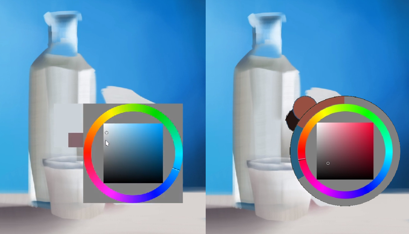
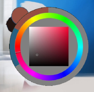
Ok, I kind of mentioned it before, but now I created this mockup, for the idea not to be lost.
How about changing the look of the “show color selector” (shift+i) like that:
I used @Anurag_Ekka idea, that I thing would fit perfectly there. This would apply to all types of selector that are circle-based (those square-like could stay more as they are).
I know that it’s a type of change that don’t really affects usability, but at least looks quite pleasing. Should I add this mockup to Google doc?
I love that redesign wojtryb! It also fixes most of the tangents I dislike, having a grey circle instead of the box is superb!
Maybe having a tiny amount of space between the square and the ring like this would in my opinion make it just a tad more pleasing. Barely noticeable but I feel it makes the picker feel a bit more calming
@wojtryb Looks great! It would be good to add to the Google Doc, there might need to be more of a ‘workflow’ reason to change if it there ever was a proposal made I think.
@slightlyangrydodo Would it be a good idea for people to add their mockups personally to the Google Doc, or is that something you have a preference for? Also I think that mockup belongs in the artwork category thank you very much .
Perhaps this docker could have a darker background for darker themes? That might look more aesthetic, something like this:
That’s the most empowering GUI to ever face the Earth. With that rich, silky, and contrasy UI, artists everywhere in the world would be creating artworks at an exponential route. Indeed, it would have seem that @slightlyangrydodo has discovered the solution for every digital artists. So, yes, this thread can be closed and the Krita developers should get on it ASAP.
This idea is by Anurag_Ekka - I just copy-pasted it to place it in context of selector pop-up (or maybe a floating color selector docker? Hmm…).
Of course its very low priority as there is no change in workflow, but I think that as we are imagining possible UI improvements (both in workflow and aesthetics) it would be cool to have it in docs, You never know - maybe someone would feel inspired and will decide to do something like that.
I have been playing with the tab styling a bit. This is what I have so far. The active tab stands out a bit better with this change. Is this a good change?
I would say so, but I feel like the hover reduces the legibility, instead of increasing it. Other than that, that’s pretty good! If you would like to, you can add your code to the repo, I just need to add you as a collaborator on GitHub.
I didn’t have any styles with the hover state, so maybe that is what it is currently doing. I did this directly in C++. I will have to spend a bit of time trying to convert things, but I am afraid it is going to overcomplicate things. Usually in Krita with styling, you don’t use hard-coded colors, but you take them from the “palette”. This is how things shift when going from a light theme to a dark theme. The widget styles are the same, but the colors are just swapped. This is kind of the way it is coded now. It does look like you already have a lot of styles specified in the github repo, so maybe I just won’t touch this for now.