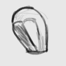
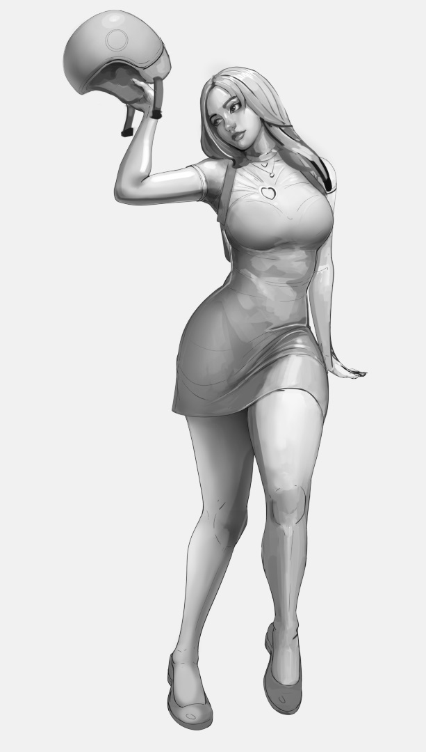
I’m wondering why you made the head a rectangular prism at first? That simplification doesn’t seem to match what it’s supposed to be. For comparison mannequins usually have the head rounded at top and back, with a sharp edge where the nose is and flat faces on either side where the cheeks are, which better matches a face.
Sort of like this
1 Like
Oh the shape wasn’t actually a simplification for the head, I just use the 3 visible sides of the rectangular prism as “anchor”/comparison points for the value being put every where else. Think of it as color palette, well, value palette in this case.
I did it because bit by bit I was changing the contrast and placement of the shadows away from the reference image. If you find it weird, you’re not alone.
I have a process but I can’t follow it well so I usually just follow the mindset of the process, in this case making a constraint of the values being used when shading because this time I just can’t simply read the values in the reference.
It is similar mindset when drawing face with loomis method. The lines that are built is to constraint the placement of face features. A shaded simple shape give you idea how dark or light the surrounding area should be. Sorry if this doesn’t make sense. I always have hard time explaining theories in English.
I somewhat expected a more spectacular idea behind the block head (like, blockhead and square head are used to describe people’s character) ![]()
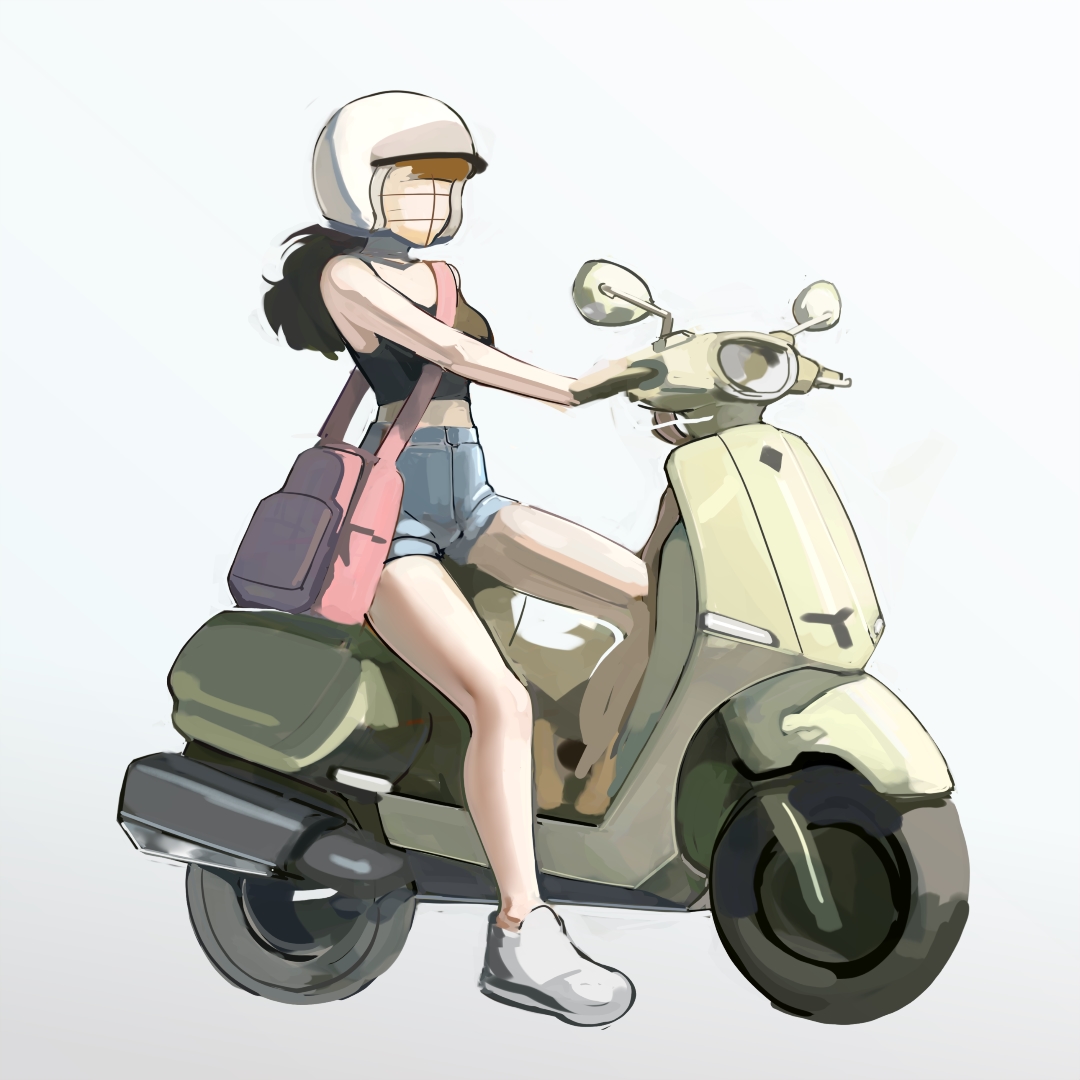
And slightly unrelated, that scene just reminded me of an artist who seems to like painting office ladies with scooters (but plenty of other things too), different style but I like it a lot:
https://www.deviantart.com/nnnnoooo007/gallery
Though I wonder what background you have in mind (if not abstract), probably not a Taiwanese cityscape…though an Italian old town sure would qualify as cliché…
3 Likes
Wow, thanks for the link, this artist is amazing!
Honestly, this is roughly what I’d like to achieve with my art. Very simple rendering, but peak character, storytelling, composition… all that stuff. Highly rendered art is breathtaking, of course, but to me somehow the simpler it is (yet impactful) is what really impresses me.
@Lynx3d Thank you for the link! It is always nice to have more reference especially with style like this artist. I learned drawing better lines by studying artist work that has more stylized looks rather than from photo nor realistic painting, taught my self to translate realistic edges into lines by doing that.
lol, no my mental fortitude can’t handle deep thinking like, if I tried, the other part of my brain won’t shut up ![]() .
.
@YRH I think you should try doing artist study from this artist. A redraw is very good way to learn people’s process. As long as the intention is just to learn the process, you don’t need to worry if you’re gonna get too attached to the style.
Study note: I think the mark of design process, is it is never looks good the first few times.
Notice most artist on Instagram never show the actual sketch process from blank canvas? I think the hard part is there in the sketch process. Painting or rendering is mostly technical once the idea is already fully realize by the sketch process.
2 Likes
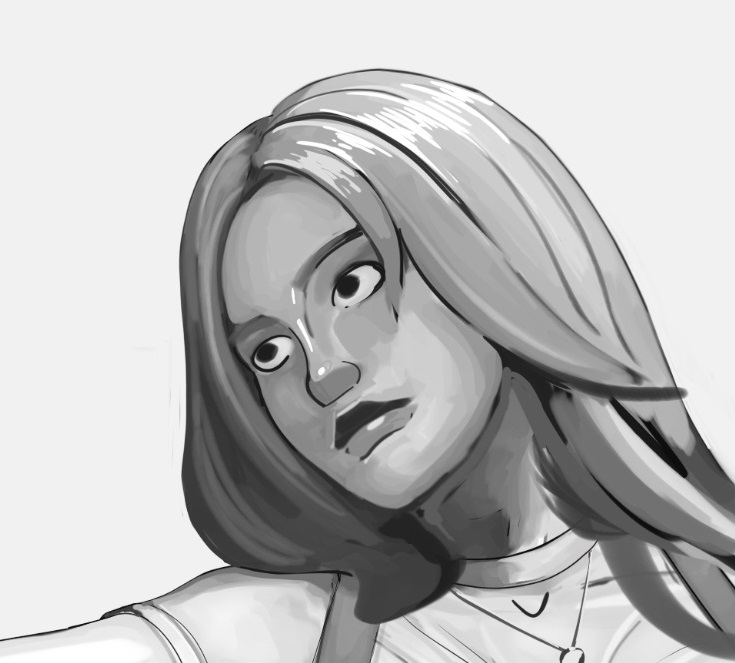
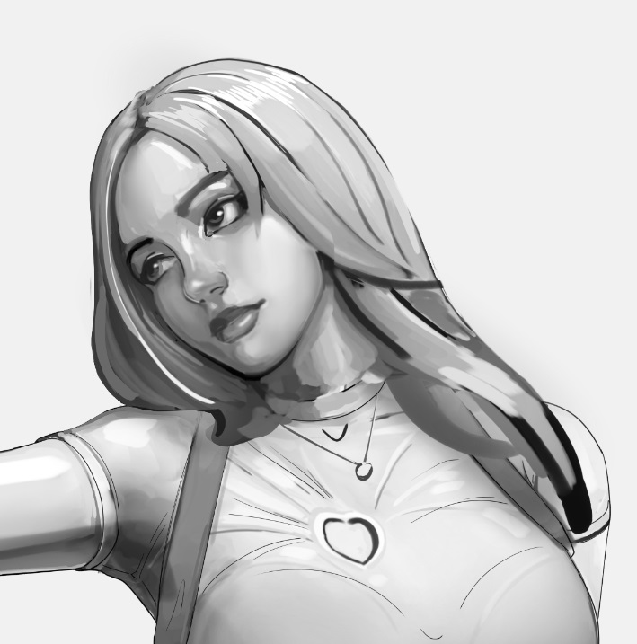
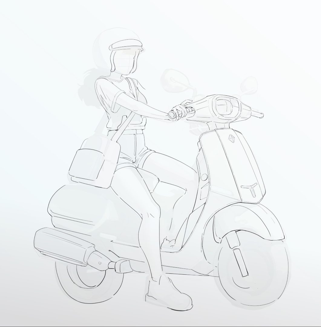
artist study, original by nnnnoooo007, https://www.deviantart.com/nnnnoooo007/art/walk-the-dog-1122347444
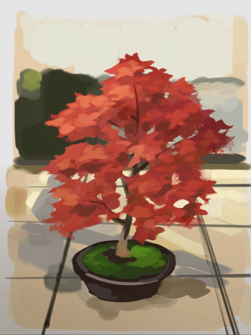
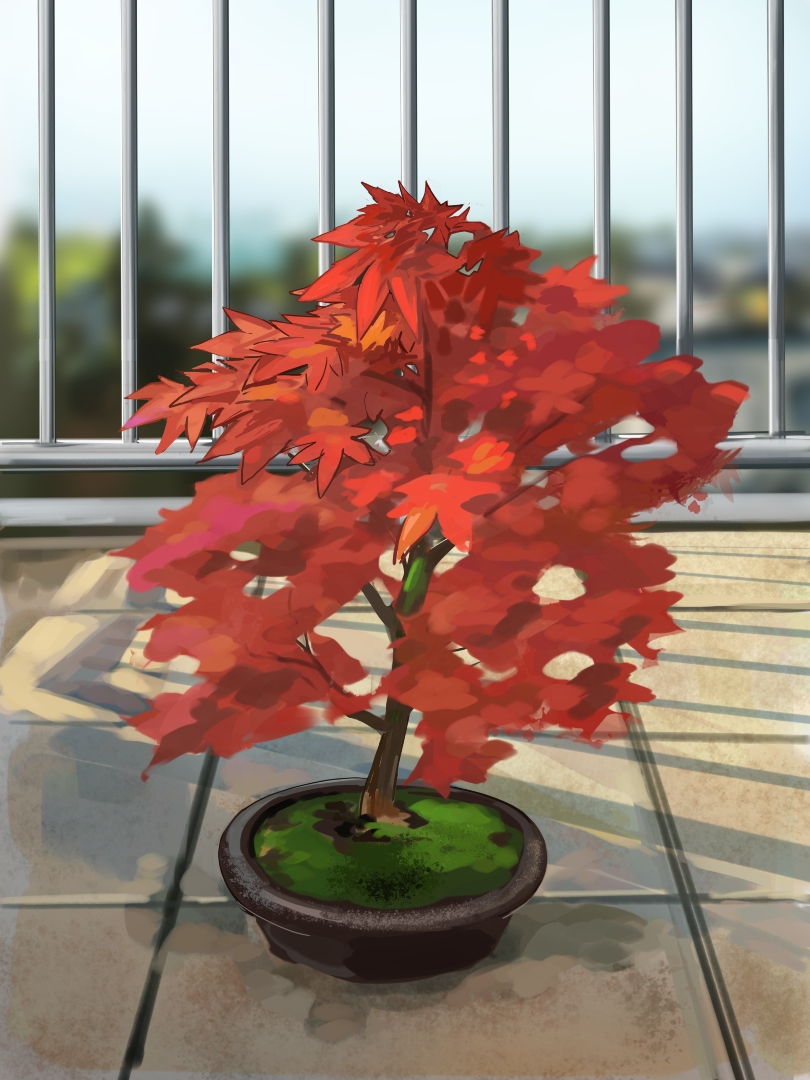
I think I understand a more about the basic light scheme making (for this direct lighting scheme). I compared the ref for this with Rinotuna’s demo stream again on youtube. The important part is the edge that mark the core shadow area, which he immediately indicate after the flats is done.
Other artist like Marc Brunet explain the technique to separate light and shadow, but he fast forward the shading part and if I can recall correctly he attributed his shading process to his familiar to 3D model without explaining it further. I think I know the information being withheld.
so
- flats, but for me is color blocking (basically simple shape flats) or border marking (selection tool).
- Core shadow indicator, border of shadow part and light part (familiarity with the object 3D shape needed).
- Shading the shadow part in separate layer according to Marco Bucci explanation for color in shadow area (right contrast/Value distribution, Reflected light, occlusion shadow)
- Shading light area if needed also with color concept, check mr gurney’s book for better consideration for the local color and its variation given the surrounding color. oh this should probably number 3.
- Highlights
- Texture if I am diligent
4 Likes
I most likely saw that same video.
I find his videos are typically a condensed version of the topic which forces the viewer to do a bit of mental hustle to keep up. Which is fine for a review or an introduction but it’s probably best to follow up with a real time follow along, something that clearly demonstrate the topic.
Unfortunately, the tube’s algorithm and our attentions spans generally favor one over the other so the longer ones don’t get the attention they deserve.
1 Like
@dragonscales There was this artist with youtube channel called ctrl+paint, that did that format which explain things in more details and with examples even gave insight what most beginner will do that count as bad practice even before they did it and give solution on that. He close the channel after few years because lack of interest from youtube audience. He said it is hard to make proper tutorial videos without much audience. I think even thought many people interested in learning but the moment people realized how much effort needed to train the skill they just lose interest.
I think ctrl+paint was the only artist I remember that give advice to passionate artist to hold back and take it easy on their practice because it will lead to injury. I actually had injury with my hands and shoulders few times, almost needed surgery for my carpal tunnel problem. I think I post it here somewhere that I had to change my workstation setup to minimize injury.
Anyway, I think most artist on youtube will probably keep their content on surface level only, like introduction to fundamentals, common techniques and its steps, or process on drawing certain theme/object, unfortunately.
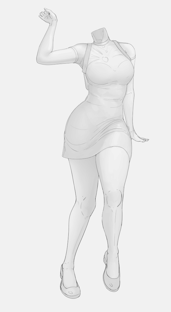
So I am having trouble controlling my brain again. Was thinking I should do the process that I have clear understanding even tho it is hard for me to do because there’s gonna be experiment that I need to back off to the last check point the moment I move away from the planned test. But I just can’t make myself do clean lines.
A year ago, I had hope that I can work with a friend that I know uses the manga process, so maybe I can borrow her linework + flats. I am willing to do trade or collab where I sketch… maybe I should ask other artist again. ![]()
This one I did after I had breakfast, and I did it fast because the moment something annoys me my hand will stop moving.
But I still can’t color inside the lines unfortunately
Edit:
I might be on to something
Oh no,
3 Likes
lol fixed the depth, took 2 years… and I am actively looking. What if I didn’t look? a decade needed to put 2 and 2 together?? some advice is just dangerous.
Fix is done with just theory.
Edit:
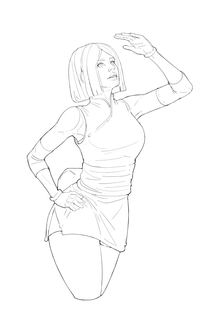
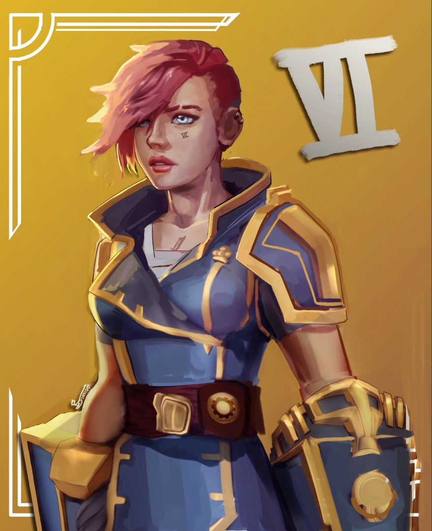
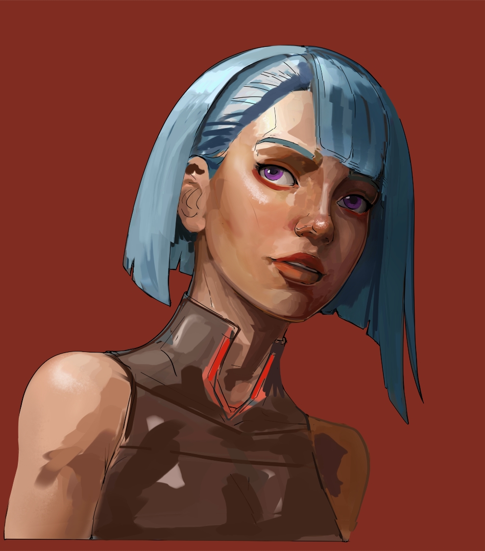
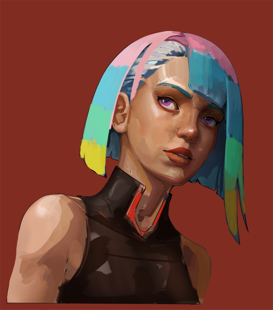
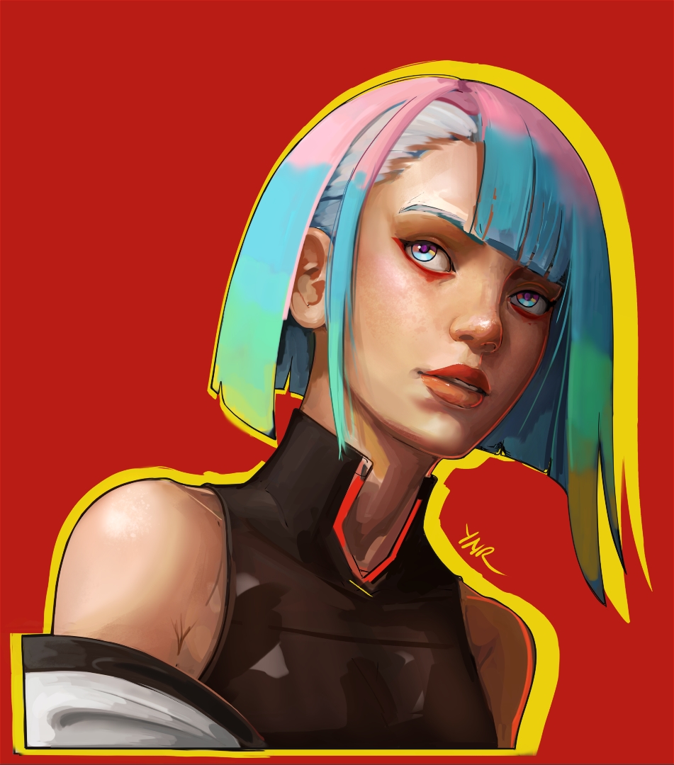
I asked @zeki if I can do similar test to her artwork that is posted here and she said yes if I put credit to the original. So here is the link Arcane Vi
The intention was to create a good depth while maintaining the lighting scheme. One of my weird quirk is my proportion detection works well when the depth is around 70% in, this is why I am having hard time shading from flats, this is why it give immense stress doing linearts because I know the proportion is gonna be wrong and I can only see it after more than half of the shading is done.
5 Likes
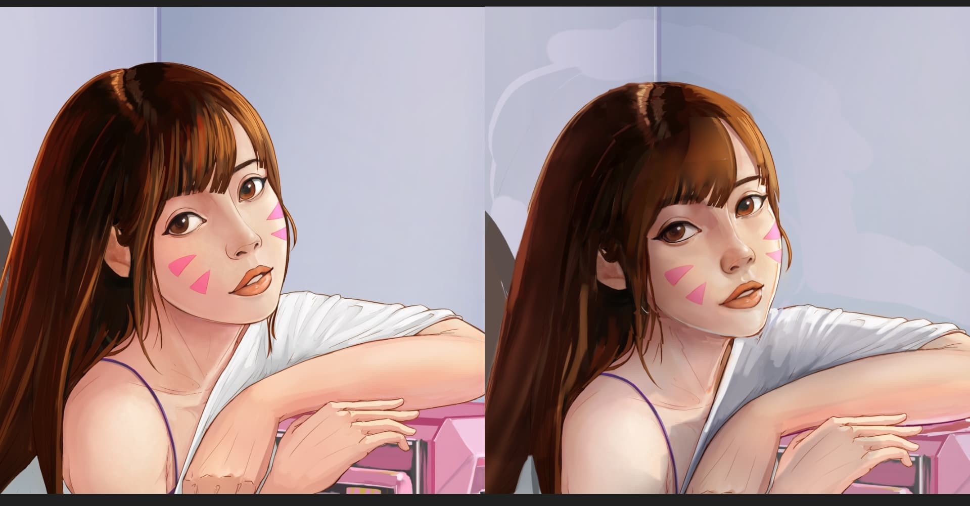
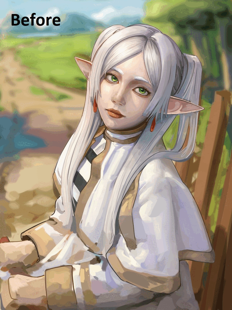
Oh wow, the top one is a huge improvement.
Not just the lighting, the pose and proportions definitely look much more natural. I probably wouldn’t really have noticed how far the ear position was off without the direct comparison… ![]()
The Arcane Vi edit looks good too, though you sure changed the character a lot, and unless I’m imagining it, you also subtly changed perspective. The original gives me this impression of looking slightly up from about waist height (though the inaccurate transitions from neck to jaw and torso somewhat ruin the impression, I think), yours looks more like shoulder height to me.
1 Like
Thank you, I did bring both into a more familiar perspective. D.va has her head rotation changed and with Vi, I made the decision to change the perspective after the first cut to the chin.
I think I had the decision to keep the head tilted up or bring it down into straighter view. I decided to do the later, because I am more familiar with that. Both edit made in quick succession and heavily rely on theories I learned and I think now that you mentioned it, visual memory also.
This give me an idea what to test next. Since I don’t have much experience with not so common angle of view, if I were to draw extreme angle perspective then pull the reference away mid process, will I automatically normalize the perspective also? This would explain my problem with unifying a perspective of objects that previously draw in different perspective (my previous Frieren drawing).
Thank you again for the comment ![]() , gonna make note about this. Deevad mentioned this too when I redraw his OC, I guess this is actually a habitual action.
, gonna make note about this. Deevad mentioned this too when I redraw his OC, I guess this is actually a habitual action.
Did some discussion with @zeki about how to draw seemingly random shape. In my opinion just need to get the bulk of the look of the overall shape first, then slowly filling in the details. But I do wander for people that use manga process, how do they do it?
Just in case my lazy tendency kicks in again, i’ll put these wips here
5 Likes
Wow, that’s wonderful. At first glance, at 5:30 am, I can’t see any laziness in that.
Michelist
1 Like
Thank you, I said that because I know that the things that previously difficult for me to do, now require less effort to do, yet I don’t try to do more ![]() . Having greater mileage is always beneficial for any skill, yet I prefer sleeping instead.
. Having greater mileage is always beneficial for any skill, yet I prefer sleeping instead.
Continuing the previous practice. So yeah the key is contrast, once the core shadow placement has been established the divided part will have its own range of value, but there is also a cross section where similar value level is present in both parts. How much these 2 groups of value overlaps is determined by the type of lighting. Check mr Gurney’s book again for types of lighting and its pattern/behavior.

3 Likes
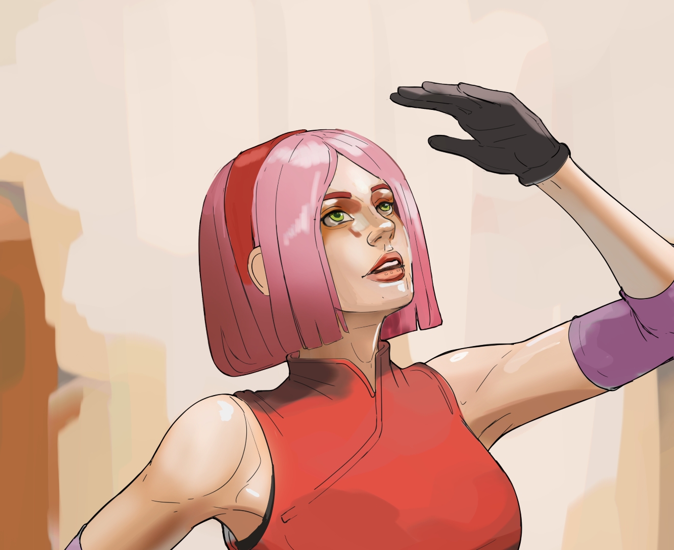
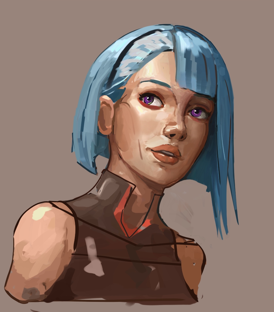
According to my own word, this is a sketch. There’s something missing when I draw from memory, I know for me it’s never clear when I try to remember stuff. Anyway I think my lighting improved quite a lot now even without ref, but the color still suck lol.
edit:
edit 2:
There must be a clearer way to determine the position of core shadow, I just don’t know it yet. What I think that is currently serve as logical solution is to simply draw similar face in similar lighting condition. That means, for Lucy here, I need to find east asian female faces with this kind of lighting scheme. BUt that just means I am at the mercy of experience and the existence of such reference images. There must be mid point in this… I just couldn’t figure it out
I tried to fix those eyes around 6 times already, if I went back and forth like that it means I don’t understand some key points why it gave warning to my eyes.
edit 3:
I think the biggest difference of people who have experience and the ones who doesn’t is the ones with enough exp are somewhat already know what their drawing gonna end up look like. If they can already see the end result, then the difficulty will fall back into ‘reading’ again, but instead of reading what they see it’s more like reciting what they have ‘read’.
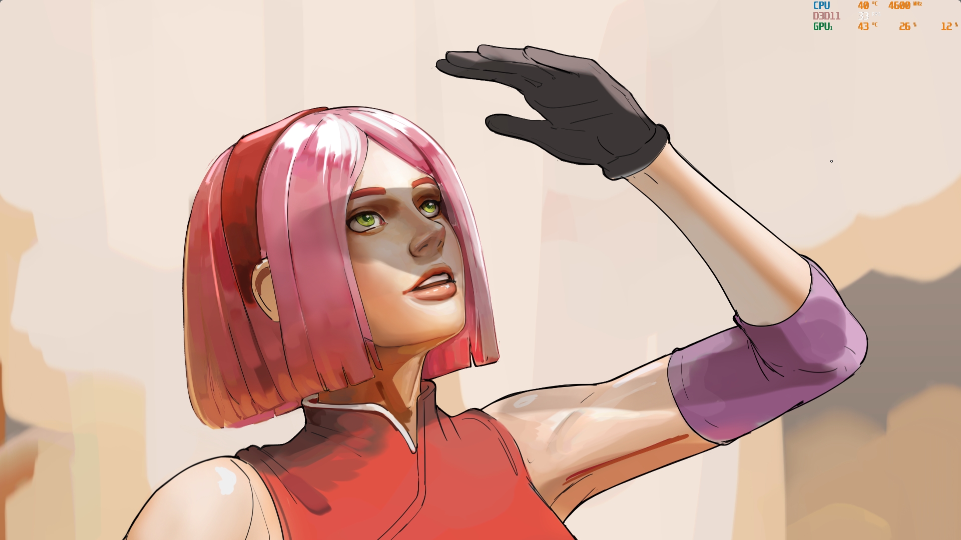
I only got this much 6 hours in. If I were to draw from a picture of someone cosplaying Lucy, I am confident I can finish it in less than 2 hours. All this just takes me back to the conclusion that I lack practice.
Or maybe I practice wrong
8 Likes
I should be quiet for today
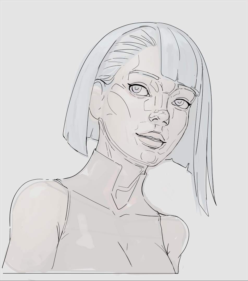
First session, 1.5 hours in.
Edit 1:
second session, 3 hours in.
Edit 2:
3-4th session, 5 hours in, back started hurting can’t sit for long.
9 Likes
Original by @dragonscales DS Sketching 2025 - #23 by dragonscales
Drawn using my cousin’s samsung tablet, my place currently have very spotty electricity, there’s storm raging right now. Water sprout formed few kilometers from my house, insane.
3 Likes
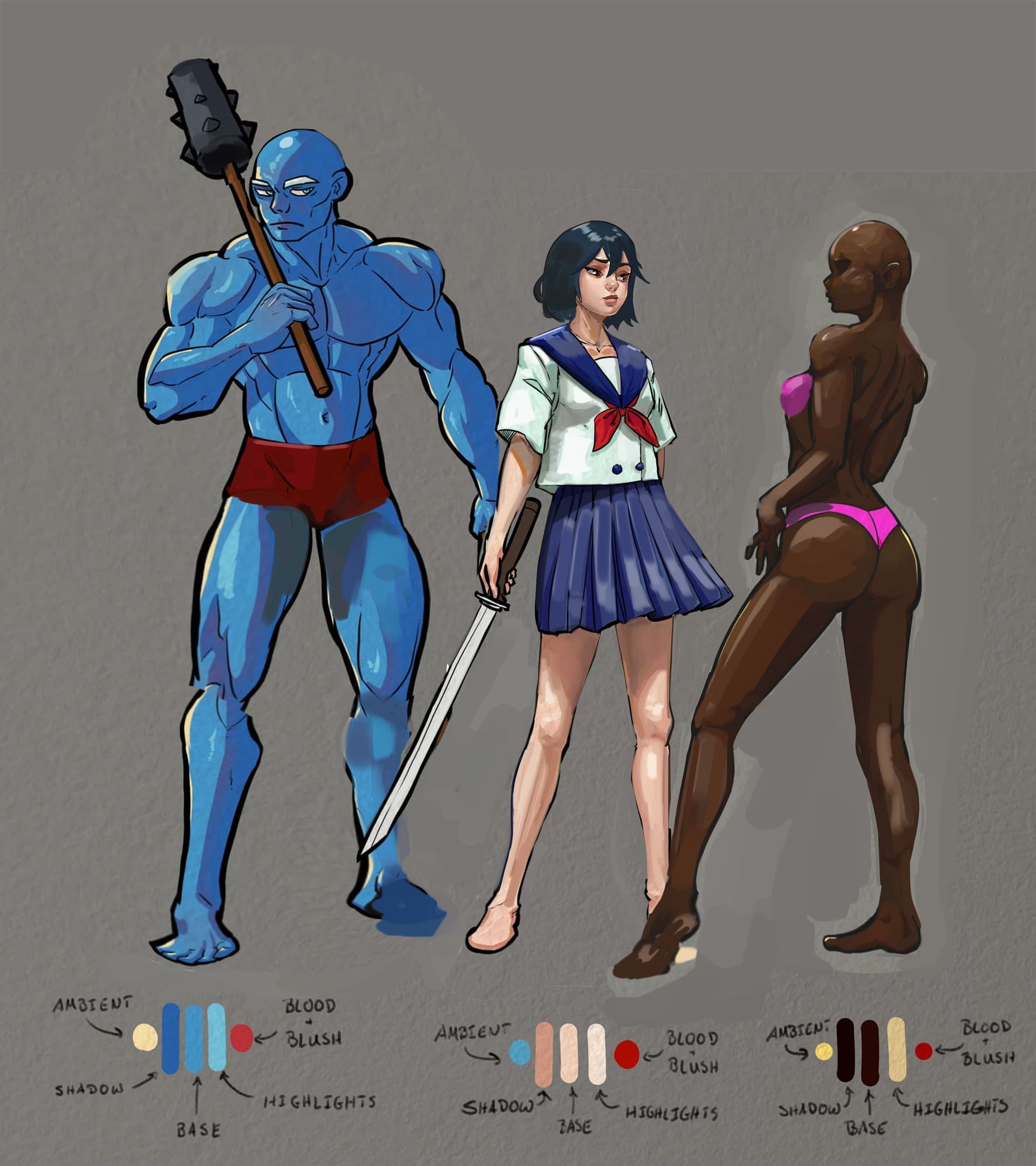
I really like what you did with the middle one. The smirk on her face and the sword makes for an unpleasant combination.
1 Like
I might have come into the wrong conclusion.
It might be like this
Environment > light scheme (type, position, intensity, color) > character shading;
character shading ( local color, core shadow, other shadow types (maybe stacked depending light source quantity), reflected light, highlight);
So environment first, even it is just basic scene like ‘default space in 3D program’

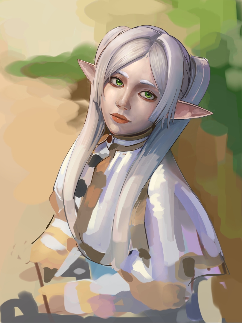
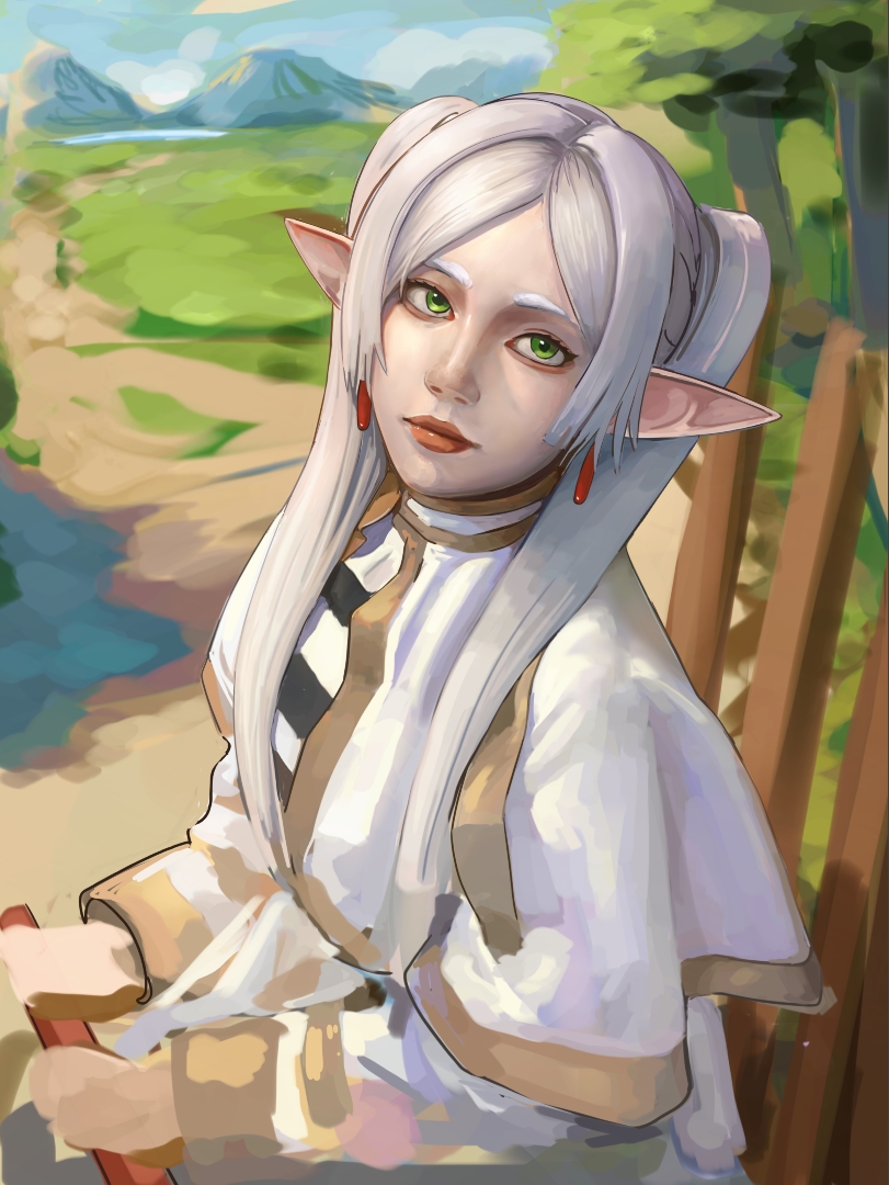
Testing on my hypothesis, I change the overall lighting for this a bit
7 Likes
Still alive, got a bit sick.
This is kinda dumb, but idk how to use textured brush (what brush edge, what texture, how to stack and what the sequence are?). So my best way to test my theory is to just lower my usual brushes’ (pencil, pen, charcoal, chalk) size to create the texture and shading gradation even more manually.
The shading of an object is tied to its surrounding, in theory if I can do this I should be able to make my own choice on how everything should be.
Edit:
This took too long, so I tried to add textured brush… but there’s still no valid reasoning when things work or not. Sometimes the textured brush works for a plane but sometimes it doesn’t, even when applied to similar plane of similar object. I can’t just do this randomly and hope things work out in the end, there should be an explanation why things happen the way it does.
Edit 2:
I can not pull this off just by imagining things, I need to see similar artworks and how each artist make representation of distance objects.
3 Likes