From recent color study. Trying to shift the character’s colors to match the bg and vice versa. Started with my usual neutral color and shift them all with filters on top. A bit back and forth when tuning the bg. Idk if it is right, but I made the attempt. So far it looks decent and comparable with the original photo but with different main hue.
Okay this one below drive me nuts. Original by Guweiz, and I am trying to implement what he told in a workshop about dramatic lighting. So this time I said to myself I am gonna rebuild his painting from ground up and only take a peek occasionally. Manage to figure out a couple of stuff, like object separation with value and lineweight. Also things that similar to bluing in machinist job, like marking work area with flats that has nothing to do with that part’s color. I still draw in the wrong layer and keep flattening layer by mistakes. In the end the hardest part is to draw the non-existing lower bodyl. I guess black leather pants is too hard for me currently.
Archived, too important to keep on my old HDD, I’ve lost many practice files these past 5 years. The hardest part for me is to maintain the steps because they are needed to do calculated broadstrokes AND that is against my nature of randomly putting colors on the canvas and see what I can find in the blobs. So this is actually really stressful to me.
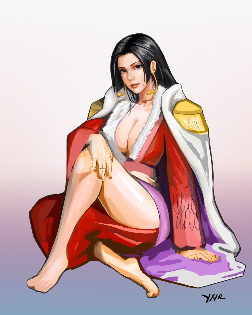
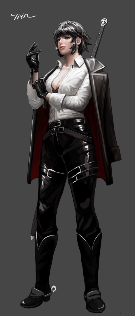
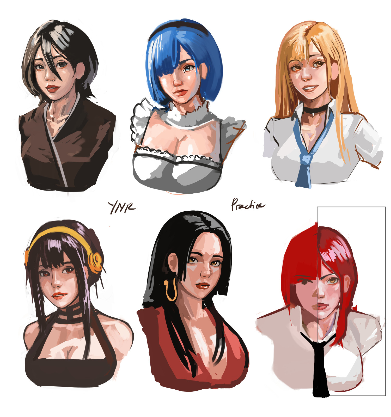
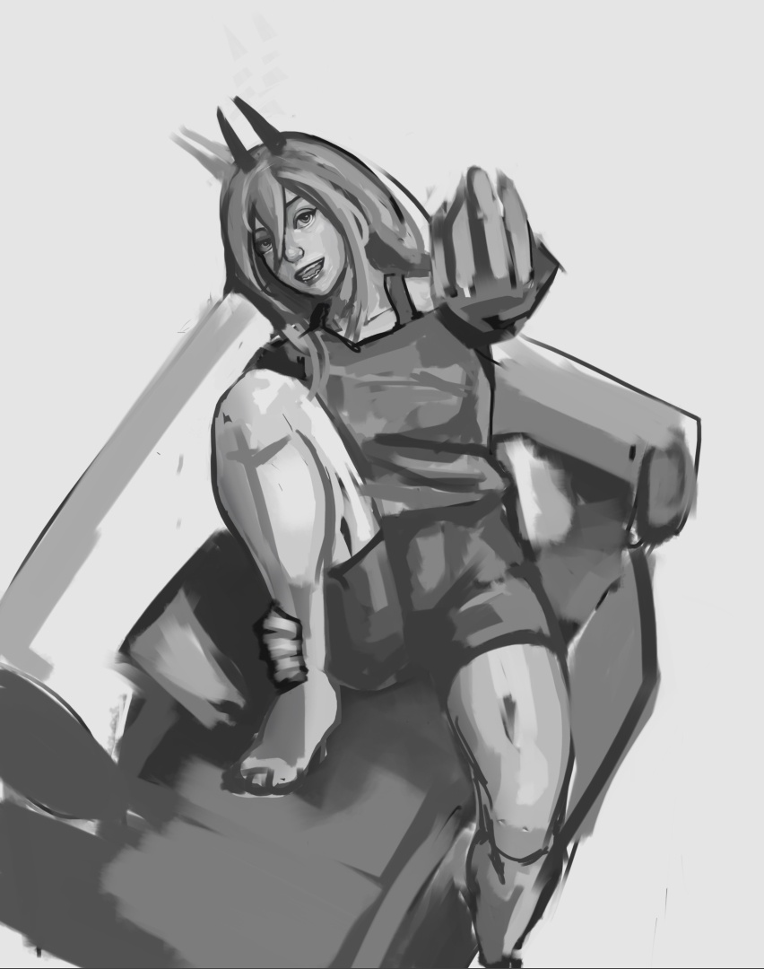
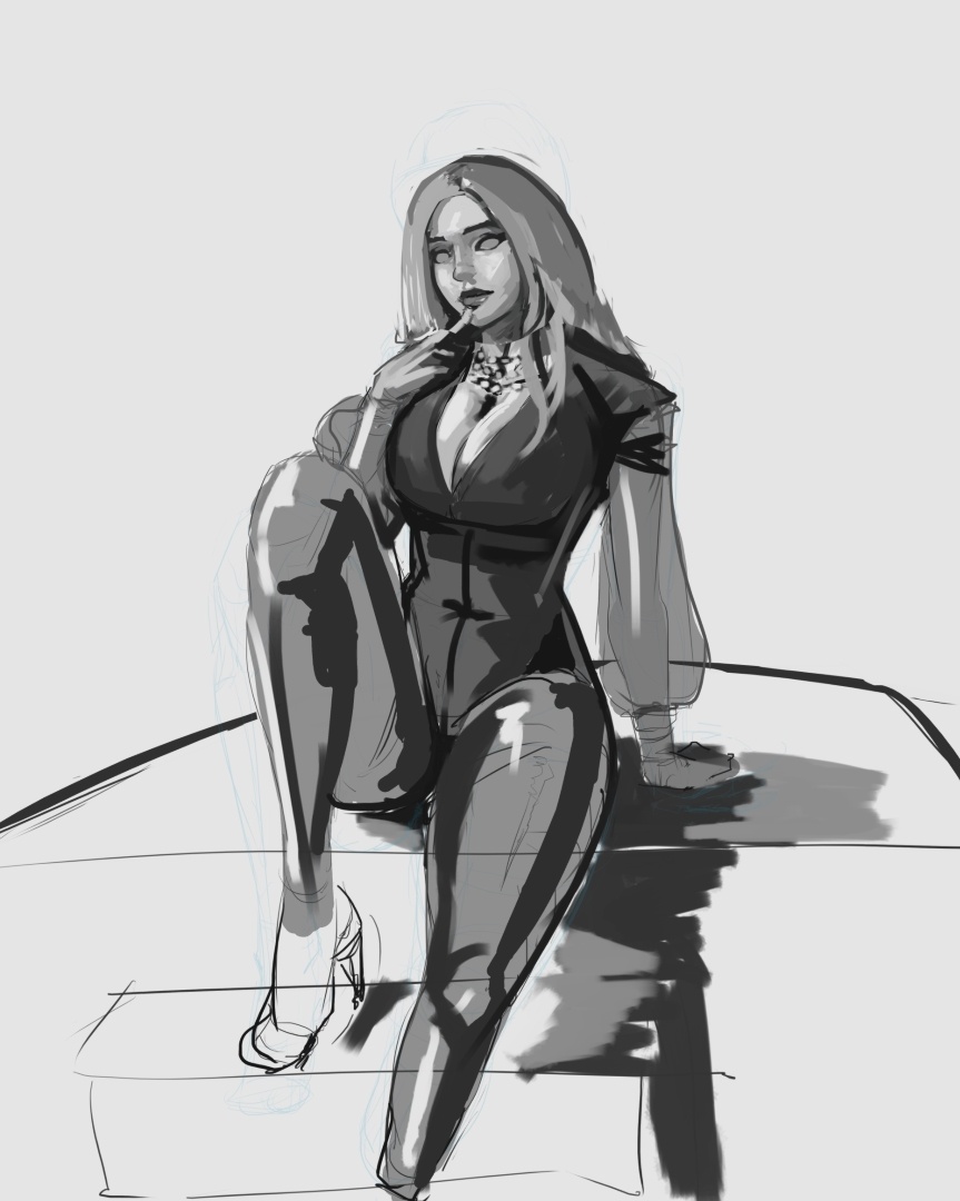
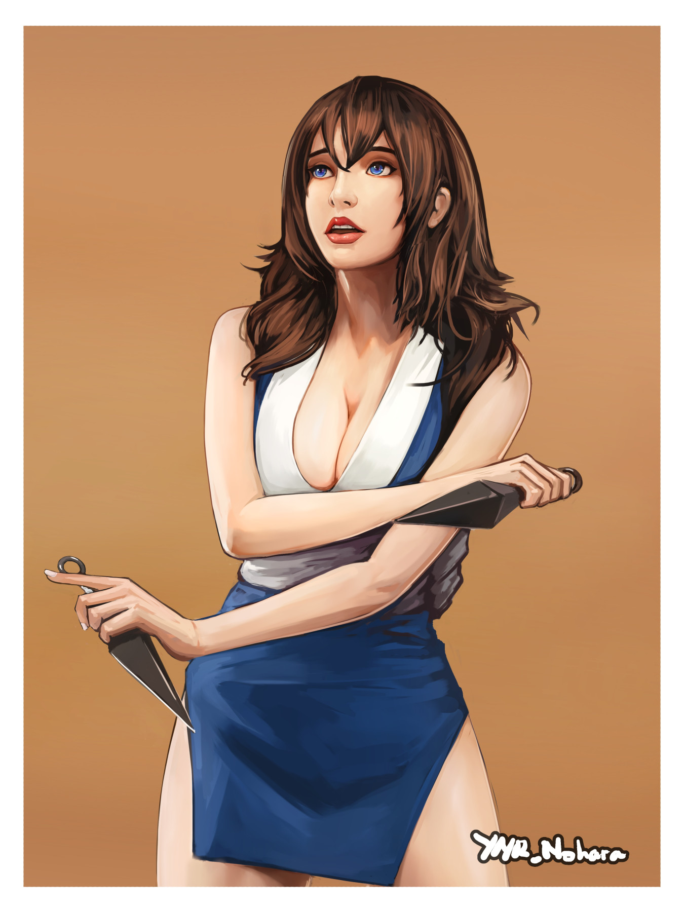
Great renditions of female characters! I don’t know who’s depicted on the first image, but I have a feeling that it is a self-portrait, judging by the pen on her hand… and the depicted woman looks like an artist, a mangaka! The second image looks like a selfie.
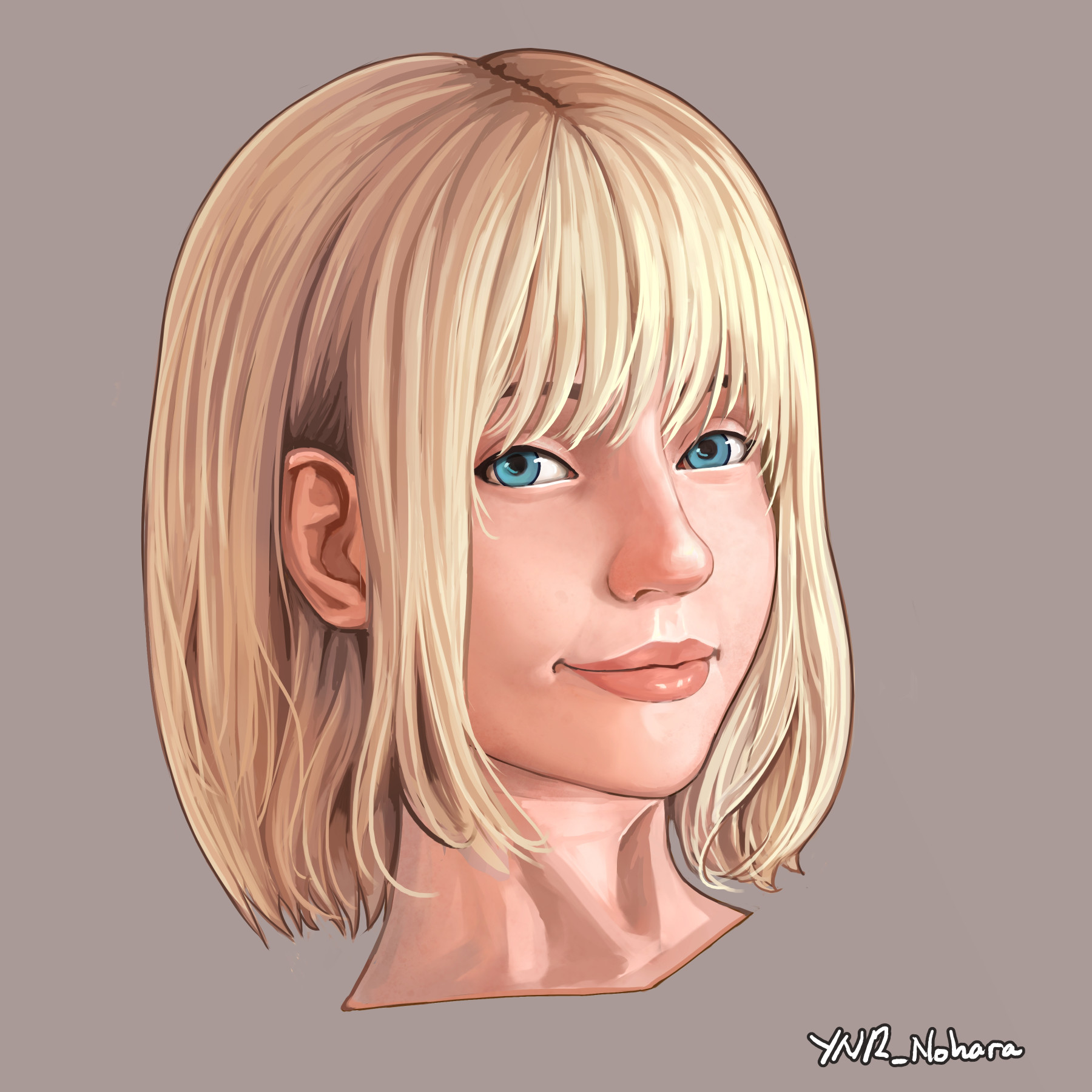
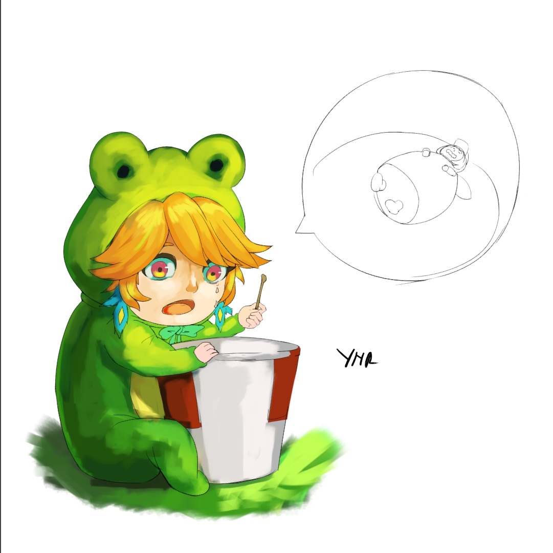
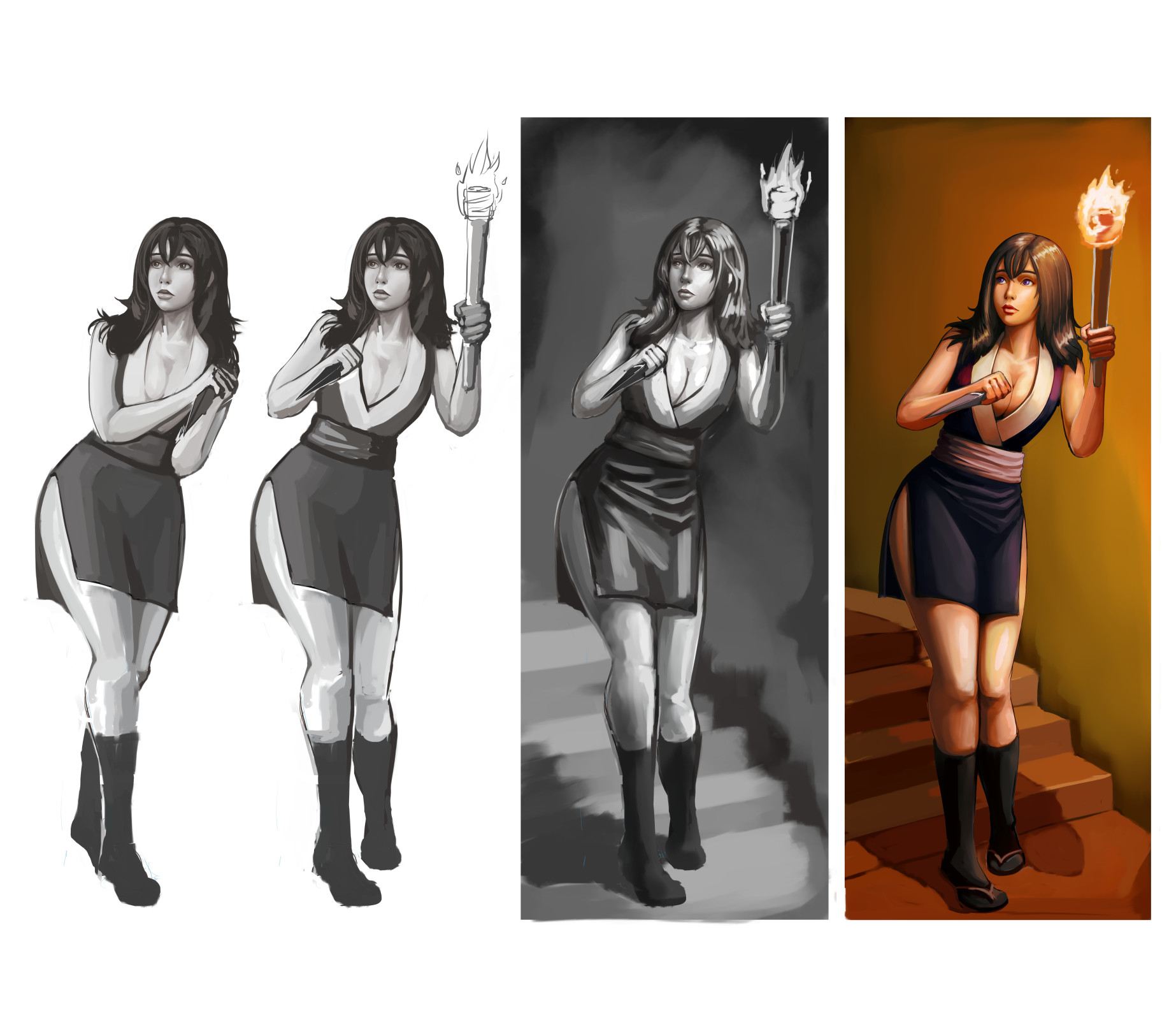
As for the image with the bonnet girl with three different shadings, I would choose the first shading as the most stylish, and the second shading as the most realistic.
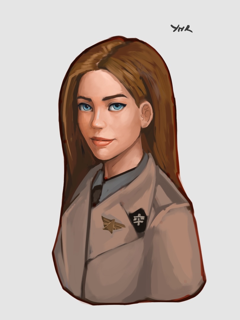
@swrutra ,thank you for the reply . The girl with the pen is a Japanese singer called Aimer, at the time it was a self test for myself to see if I can add her bottom half body since the original ref is from her single cover picture that only shows her torso and above.
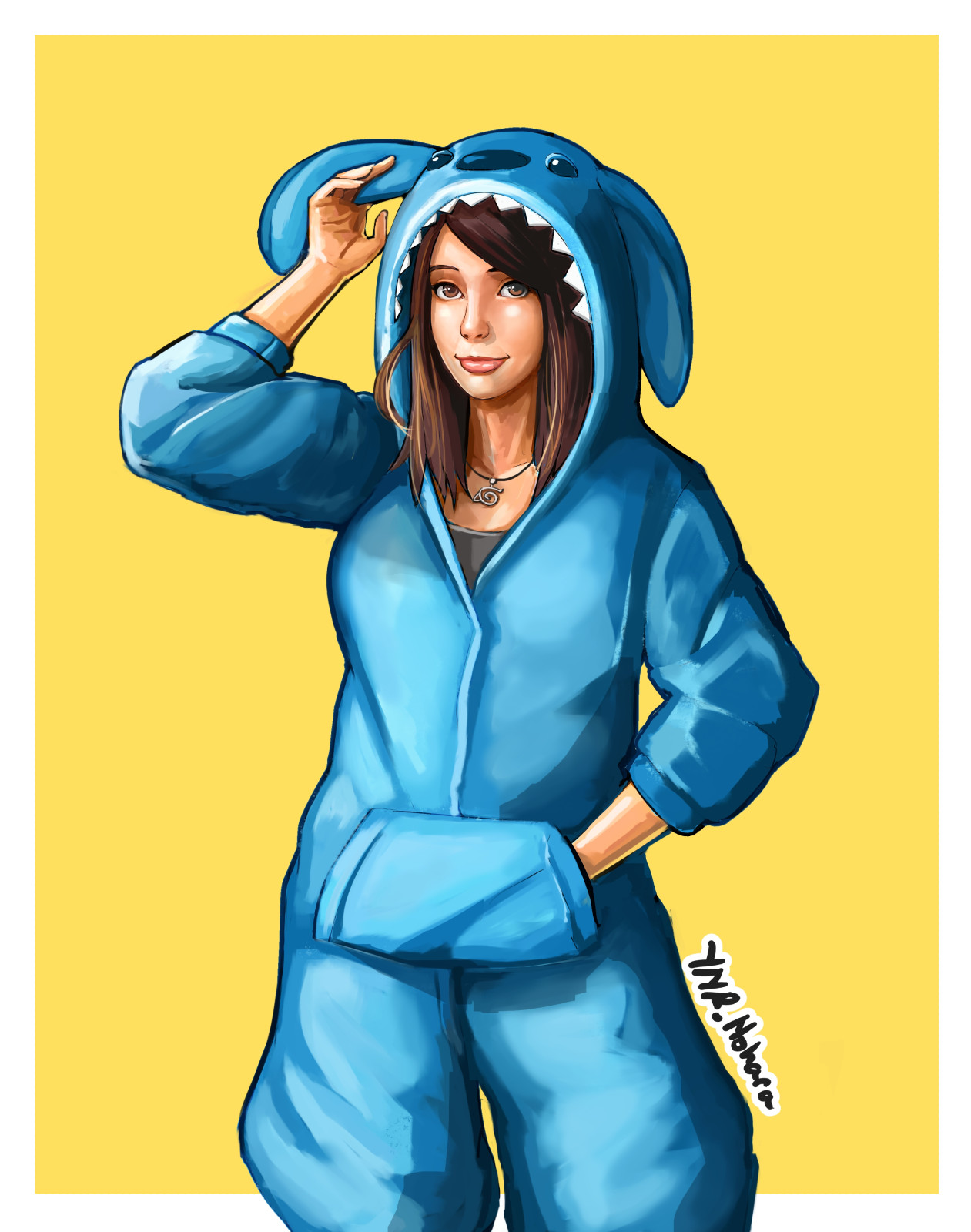
Second image was a selfie from a twitch streamer called Emiru.
As for the girl with different shadings, the first one is actually from the ref, second and third is just me trying to maintain the same face with different light placement.
From my recent practice. Result of my study of Stanley Lau aka Artgerm’s works. I am trying to figure out how the pro artist is so confident when making brush strokes, traditional or digital.
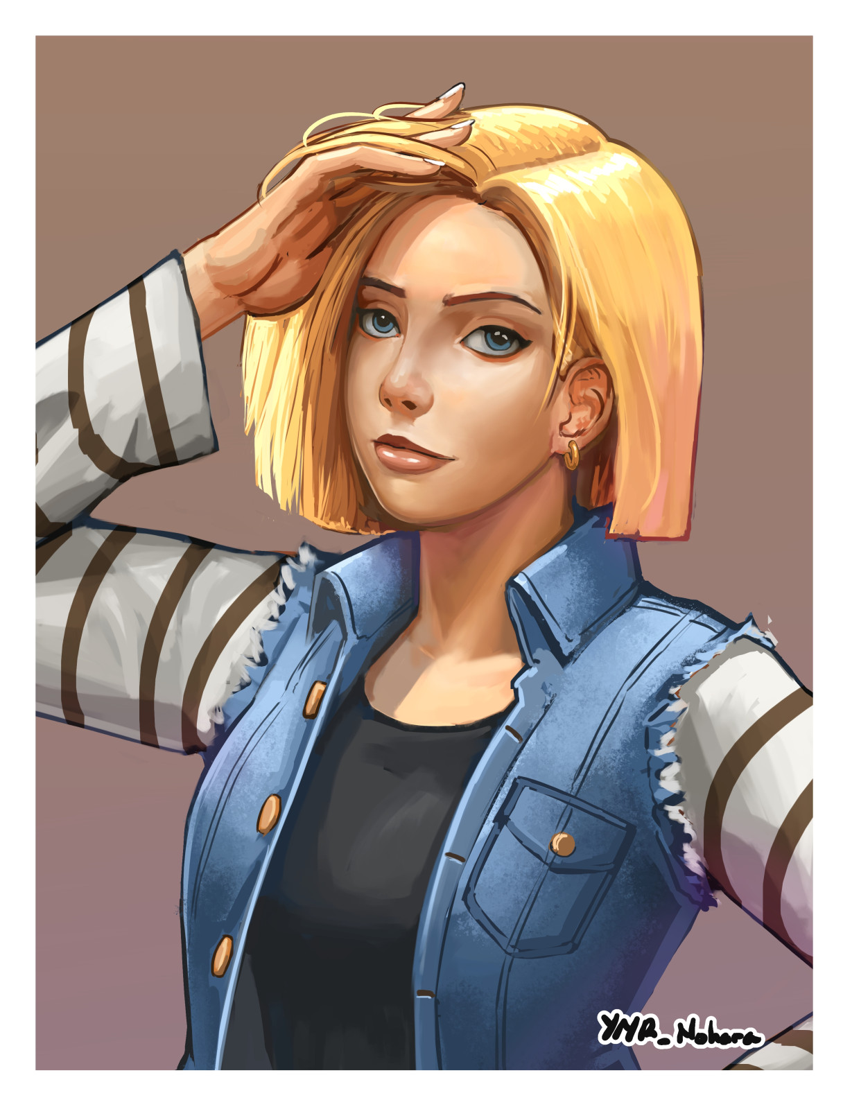
Face alteration, since there’s no exact face ref, I tried to just find closest ref on similar face angle and try to imagine the face features in the orientation of the base painting I made.
All the advice I got from a more experience artist is to find a good ref to support the process of making the illustration, but when I saw their demo there’s a good amount of leap of logic with how the reference were used. Like different perspective, different light and color, very different shape sometimes… More often than not I wish it wasn’t an example of best use case, but appropriate use case in beginner-intermediate artist level.
From recent practice, gonna try some different type of light condition, have been watching Marco Bucci’s video on color, light, shadows and ambient occlusion.
This is my usual alteration when given a face ref. The ref is from an acquaintance of mine, I have her permission. Sometimes there’s DM asking me to draw other people, but truthfully I am just afraid, maybe of the model, of the model’s fans or both. So I stick to few I know that don’t mind I drew them over and over. Also the ability to draw someone’s likeness do transfer to other faces if you don’t draw with grids. Think of artist in police station who drew suspect face.
Love the color palette on this one! The whole composition has a very ‘Mario’ vibe to it. (To me at least). She’s like a cousin of Princesses Peach and Daisy.
And speaking of personal preferences, I liked your ‘default’ first face a little more. I think it matched your composition better. (Or maybe it’s just prettier to my eye.) All from the standpoint that I think your default faces are very lovely.
And if you’re afraid of using recognizable models, there are free use sites like Unsplash, Pexels, and Pixabay where you could find alternative face references (that you could use w/o fear. )
It’s hard to finish more complex character illustration just for practice. Knowing that I have to stay up late and use more of my instant coffee stash… I don’t wanna complain since many other in my area have it tougher than me, but yeah it’s hard to shake off the frustration.
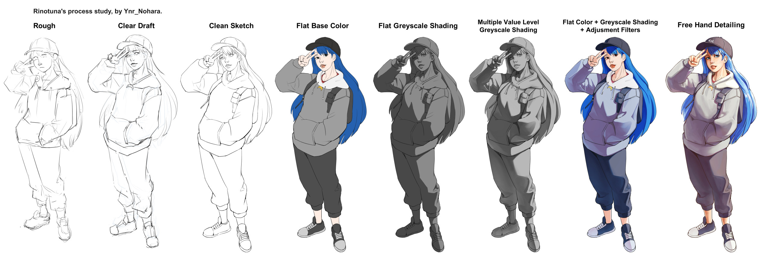
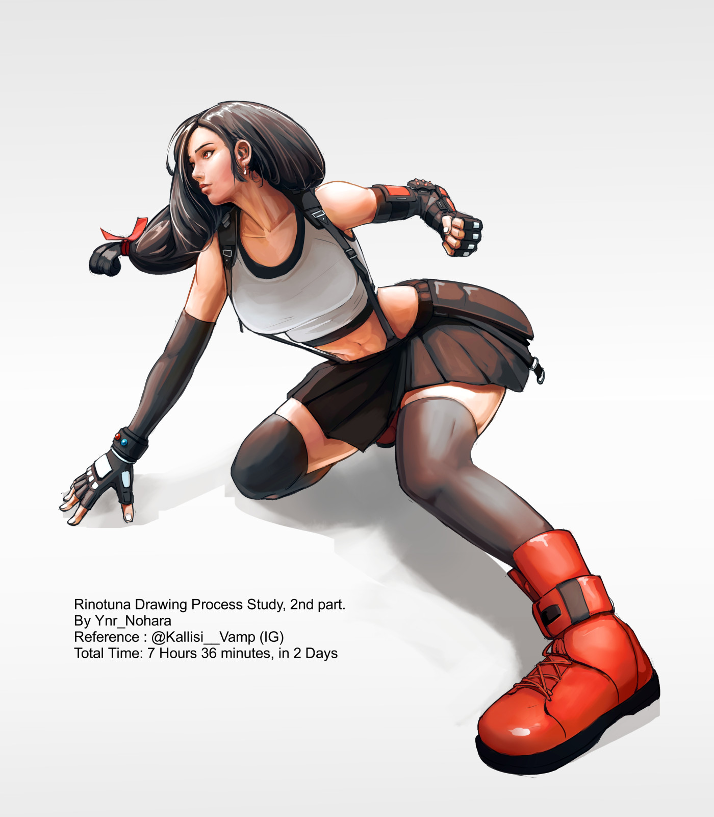
This is the Original video of the realtime drawing by Rinotuna on his youtube channel that we analyzed and try to recreate. Glad my friend knows Photoshop UI, because I have no clue when he switches brushes or change layer and/or use what filter mode with those layers.
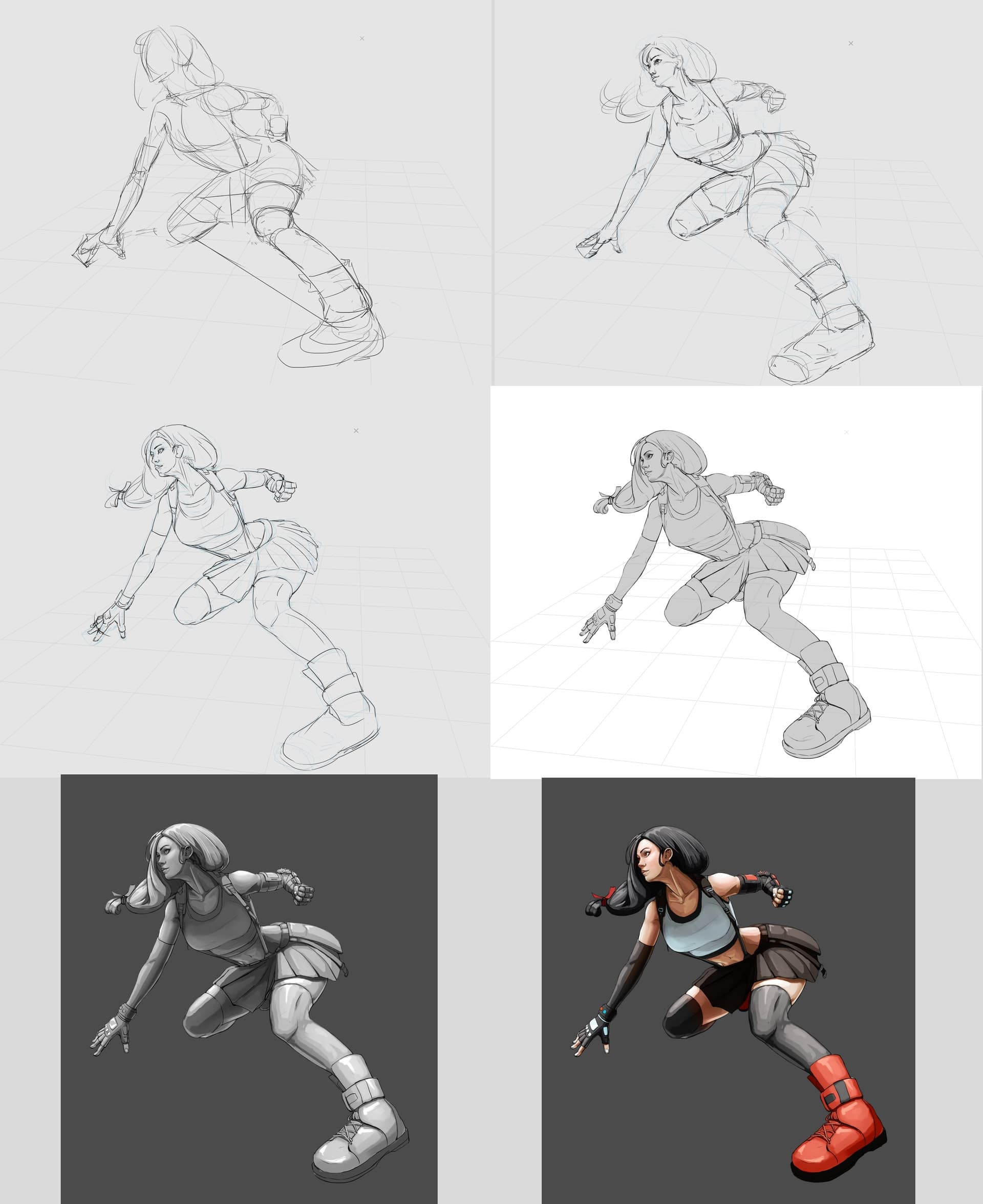
Continuation from previous study. I think if I draw without following a ref, it is better to be front heavy and really take my time sketching the character. This though still has a ref even though I do not follow it closely. Gonna do one more test with this process.
I reviewed my old process compared to the new one. My conclusion is I need to prepare more snacks and beverages. It’s gonna be even more stressful to learn from here on out.
Yeah, this new stuff really is on another level. But I think a lot of it is just being patient and painting carefully. You spent much more time and it shows. And probably if you spent even more, it could be even more refined But yeah, I would totally move on at this stage as well.
Great progress, and indeed, a testament to the good execution given it only took you this much time for this result (12 hours is rather fast in my book).
 - Demon Slayer Cosplay Painting P2023046, Timelapse By Ynr_Nohara.")